Abstract Botanical 27 August 2018

Angela Porter 27 August 2018 small

Started yesterday, finished this morning. Another intricate, abstract botanical

I coloured the paper first and worked with the patterns made, mostly. Intuitive drawing with detail and intricacy and black lines is my favourite to do. Botanical things, abstract motifs, from my imagination are also some of my favourite things to draw.

My colour choices are a bit different for me, the way I blended the colours resulted in some unusual, subdued, almost grungy tones. I think I like it.


BuJo September 2018

Angela Porter Bujo Sept 2018

It’s nearly the end of August so it’s time for my BuJo pages for this month.

I used Tombow Dual Brush Pens and a Chameleon Detail Pen for these pages in my Leuchtturm 1917 dot grid notebook.

My colour scheme is quite autumnal as September is the month of the Autumn Equinox here in the Northern Hemisphere.

I’ve used a simple dangle design for the Monthly Cover Page. My tutorial book, A Dangle A Day takes you through dangle designs step by step and has lots of ideas for charms and dangles. It’s available for preorder now.

I kept the monthly planner simple as that really suits my needs.

For my mood tracker, I used leaves, acorns and seeds, perfect for an autumn theme. I’ve not added colours to my key yet, but I will. I may add more leaves and seeds as the month goes on and I fill in the elements I’ve already drawn. Or maybe I’ll add some autumnal quotes instead. I’ll let my mood and the events in the month dictate what I do.

Bookmarks

Angela Porter 25 August 2018

I’ve been playing around with a different kind of material and techniques and created these bookmarks. I’ve had a bit of fun doing them, something different, the same kind of drawings but different techniques.

I’ve used parchment paper and various ball tools to draw the images and Tombow Dual Brush markers to colour them.

I like the one on the left a lot. Surprisingly, the more muted, pastel tones really appeal to me.

I do have other bits and bobs of parchment here that I’ve tried things out on, and there’s some skills to develop for sure; but it’s a nice way of working, to draw in white on white then add texture and colour. I don’t think the textures show well on the photos though.

A nice way to spend a Bank Holiday Saturday – being quietly creative and learning new stuff at the same time.


Dangle Day

Angela Porter 24 August 2018

It’s Friday so it’s time for one of my occasional dangle designs.

This one involves elements from my latest bits and bobs of abstract botanical art.

Want to learn how to draw your own dangles? Just follow this link for my upcoming book  ‘A Dangle A Day’ to preorder.

It’s furbaby friday over on the Angela Porter’s Coloring Book Fans facebook group – join to share pictures of your furbabies! You’ll be most welcome there.

It’s always furbaby friday in the Happy Tails facebook group. If you love animals, this is a lovely group for you to join.

Abstract Botanical 22 August 2018

Angela Porter 22 August 2018

Another day, another drawing/artwork/illustration/design. This one is only a little one; it’s approximately A5 in size.

I used some new watercolour paper from Canson – Moulin du Roy. It’s smooth, slightly off-white, pure cotton mould made and seems to work nicely with Intense pencils and a waterbrush.

I’m waiting for some metallic paints to arrive so I can add some highlights to this – there are places where a dot of gold will really work nicely, but not too many places methinks.

Also, I chose just seven colours to be my palette – sherbert lemon, apple green, iron green, lagoon, violet, red-violet and sienna gold. I thought that a smaller number of colours could result in a more cohesive feel to the design, and I think that it may have done so!

For this one, I drew the design first in pen then added colour.

When I draw first I do tend to fill the space with drawings. When I add colour shapes first I end up with more white space and a more random ‘edge’ to the design.

Why that is, I don’t know, other than it may have something to do with me filling spaces in with pen and ink habitually.

A habit I need to modify I think.

All the same, it’s nice to do little designs. I already have another drawn out waiting for colour!

Angela Porter 18 August 2019

Here’s today’s drawing, design, artwork; yesterday’s ‘just colour’ design.

I did try a small design using coloured pens to add lines, but it just doesn’t feel or look right.

I’m happy with this one, like I was with the one yesterday.

These last couple of artworks have been a bit of a change in the way I usually work. Perhaps more of quite a change.

Usually, I start by drawing my design and then adding colour. Over the past couple of days I’ve been drawing the basic shapes/design with colour from a brush, starting with the broad structure of the design. Then, I add the architecture of the design in pen.

The laying down of colour first means there is, for me, not a lot of control over the gradation of colour/tome and the precise shapes. Using watercolours means that colours can bleed from one shape into another if I forget to move to another area and let each shape dry before adding another next to it.

The resultant colour design, the variations as mentioned, is then the basis for my drawing. I work with the shapes as they are, trying not to be overly concerned if my pen lines done precisely match the edge of each shape. I try to work with the variations in colour/saturation/tone as I add the patterns.

I have tried doing something like this digitally, but so far haven’t been all that happy with the results. I will keep trying though. I know eventually I’ll work out how this will work for me.

It’s a nice way to spend a Sunday, no matter what I do precisely.

WIP Wednesday – 15 August 2018

Angela Porter 15 August 2018 WIP 02

Another bit of hand lettering or hand writing along with my particular style of entangled design.

This is very much a work in progress. I’m just laying down the ‘skeleton’ of the design before I add colour and pattern. you can see the dotgrid ‘paper’ I use as a guide for the size of the elements of the design.

Not sure I’m at all happy with the writing, but I do like the bit of wisdom for a Wednesday.

All drawn using a Surface Pen on my Surface Studio in Autodesk Sketchbook.

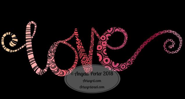
Love – 14 August 2018

Angela Porter Love 14 August 2018

Another day, another word in the same kind of style as yesterdays. It’s fun doing these for sure! And it’s giving my hand-lettering and writing skills on a digital platform a bit of a workout.

That’s appropriate as it’s World Calligraphy Day today!

There is a difference between hand-lettering and calligraphy.

  • Hand lettering is about drawing the letters, which are often decorative.
  • Calligraphy is about writing the letters.

Both require discipline and control. However, there is a little less control over the letters formed when writing calligraphically than there is in deliberately drawing letters.

To create my word ‘love’, I first wrote the word using a digital brush. Yes, that’s right, I wrote the word! I didn’t pencil out the letters first. Then, I got to doing the colour and pattern ‘thing’.

Not sure if it counts as calligraphy, but I still think it’s a fairly pretty example of a nicely written word. I hope any calligraphers will forgive me and recognise that I’ve entered into the spirit of the day!

Joy – hand lettering

Angela Porter Joy 13 August 2018

I did hand-letter this one, though I did do it digitally using a Surface Pen on my new Surface Studio.

I love my Surface Book, which was a joy to use most of the time. However I was beginning to become a little frustrated with turning the screen around and losing the use of the keyboard and not being able to see the whole image I was working on at the actual size it would be printed.

So, as I officially take my teacher’s pension early today as I reach the illustrious age of 55, I decided to invest some of the lump sum in a shiny new Surface Studio for my business of art, illustration and writing.

The Surface Studio isn’t without it’s frustrations, not least of which were the hours and hours it took to download and install all the upgrades for Windows and the Surface system, and then installing the software I used (not done all of it quite yet).

I did get a Surface Dial with the Surface Studio, and it works interestingly with the free Autodesk Sketchbook, but it doesn’t work at all with the Autodesk Sketchbook Pro version, which is the one I prefer, perhaps because I’m familiar with it and find it easier to access the functions I make use of.

These are minor things, the Surface Studio is a joy to use (though I do need to remember to change the tip on the surface pen to one that glides more easily on the screen!)

So, it seemed appropriate that today, the day I turn 55 and become a semi-pensioner, that I hand letter the word Joy, in my own inimitable style.

I actually quite like the neon colours on the black background. I have a feeling I’ll be doing more like this now my mind has worked out that I can do stuff like this digitally.

Will I be turning my back on more traditional art? Not at all! If anything, I treat digital art as if it is traditional art – the pen means I draw like I would on paper.  All it means is I have access to tools that make some styles a little easier, the ability to use colours and textures that would be difficult for me in traditional media possible, and the ability to edit without frustrating use of white inks a dream!

Don’t forget, I do tend to work directly in ink on paper, often with no pencil lines at all.

Joy is also an appropriate word as I share my artwork because I share my joy in creating it with others, and I trust that viewing it (and hopefully my witterings like this one) joy for you.

What doesn’t bring me joy is when I find my artwork is shared or used without my permission, particularly when people use it to make money for themselves without any regard for the creator of the work. I try to protect my work by watermarking it, signing it, sharing at a low resolution, but still I find people steal my work.

That is not joy. Not joyful at all.

It is stealing too. I don’t know where people get the idea that artwork shared by artists on the interwebs means the artists give up their copyrights.

We DO NOT give up our copyrights in any way.

I sometimes create ‘freebies’, but even then there are limits to how they can be used – personal use, not for resale either coloured or uncoloured, not for inclusion in publications, and so on.

People who steal work like this, and let me be clear it is stealing, make me feel very un-joyful and on the point of removing all my accounts where I share art so people can view it and enjoy it, sometimes even buy it, or prints of it or products with it on, but not to steal it and use it without my permission.

I’m sure those of you who read this will agree with me on this and don’t need to read it, but if my words reach just one person who takes the work of others for their own personal gain in someway, without asking permission of the artist, without even crediting them or providing a link back to where they got it from, stop to think about the harm and upset they are causing to those of us who want to share our joy in our vocation with others, then my words will have done some good. Pricked a conscience or two maybe.

Perhaps then the days of me getting upset and writing emails that go unanswered to websites where I find my artwork offered to others will stop, and there will be more joy.

I can hope this will happen.

Returning to the theme of joy rather than not-joy, I do hope you find my little artwork of today brings you some joy too. Do let me know if you’d like to see more like this, or if you have suggestions of words that you’d like to see in this kind of style!

Finally, do have a joyful day yourselves. Do something that brings you peace and joy, be it art, coloring, baking, reading, dancing, playing music, a sunset walk in nature … whatever it may be, do something joyful every day.

Abstract botanical drawing

Angela Porter 8 August 2018 coloured 01

Happy times drawing! I drew this one with a Lamy Safari fountain pen with black ink on some mixed media paper from Claire Fontaine.

The colours are digitally added after scanning the drawing in, just for a bit of fun. I have ideas I want to try out digitally, but I’m going to wait for my Surface Studio to arrive for those explorations.

My own piece of wisdom for #WednesdayWisdom is that when you get to a point in a creative project where you think it just isn’t going to work out, don’t give up. Push past your own doubts. It can help to put the project to one side and come back to it later with ‘fresh eyes’ and a ‘fresh mind’, but don’t give up on it.

When you think you’ve finished the project there may be bits you don’t like, but there will be parts you really do like about it. The bits you like are ones to take forward and work with further.

What I’ve noticed over the years is that sometimes it’s the bits I wasn’t sure about that are the ones I really like when the project is completed. Often, the bits that are ‘mistakes’ end up being ‘happy accidents’ or ‘creative opportunities’ – discoveries of new things to try out again in the future.

I’ve most probably said this before, but I’ve been getting a lot of self-doubt lately in work I’m doing. As I often work directly in ink on to paper, my mistakes are permanent, so I have to work with them and incorporate them into the design. That’s what happens when you’re an intuitive artist; I’ve learned to trust to the process and that I can work with whatever happens.

You too can do this! I promise you, you can!

It’s also #wipwednesday over on the Angela Porter’s Coloring Book Fans facebook group. Plenty of people show their works in progress, but there is always, always room for more! We all love to see what people are up to.