Golden Mandala 16 Dec 2018

© Angela Porter 2018

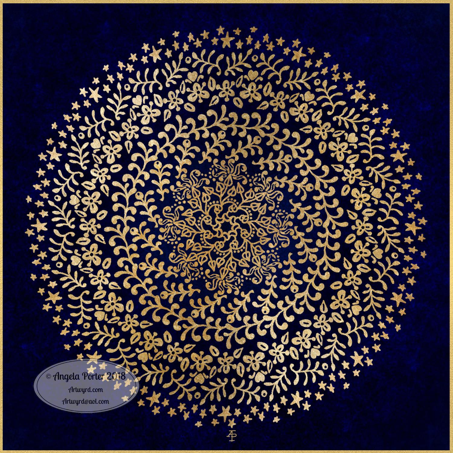
A little bit of playing around with textures and so on and I created this fun mandala, more like a concentric series of ‘wreaths’, but it was fun to do and I’m quite happy with the result. It’s fun, whimsical and just a bit shiny.

I used simple foliage and floral motifs, with the odd berry and heart thrown in for good measure, not to forget dots and stars! It’s amazing how simple motifs can result in a fairly complex looking design.

Instead of a black background for the design I went with midnight blues, with some texture added, though it’s rather subtle. Blue and gold is a classic colour combination – rich and opulent. Mind you, I rather like a rich burgundy with gold.

I have no idea how this would look when printed out, however it’s pretty to look at on the screen.

However, the main purpose of me creating these kinds of mandalas is to have fun and to explore more in the way of digital art and how I can make it work for me.

My tools for this were Microsoft Surface Pen and Studio, Autodesk Sketchbook Pro and a gold texture that I acquired in a set from Creative Market.

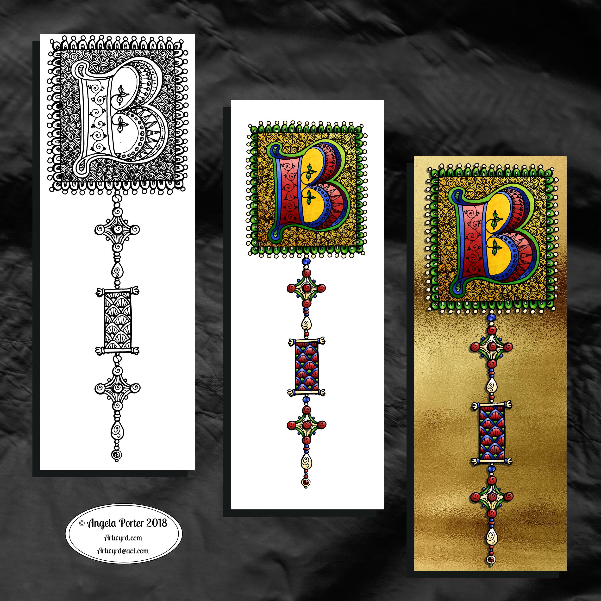
Yesterday I didn’t do that much in the way of art. I did get a template done for New Year, but I’m not at all sure about it. My mood was ‘off’ yesterday so I just spent a fair amount of the day relaxing and resting up. Sometimes that’s what is needed.

I’m feeling a bit more upbeat today, but I have a case of the sniffles. I know I have things to do later on in the day, but this morning, now I’ve tidied up the house a bit, I’m going to relax and maybe do some arty stuff.

Monogram B – another version

©Angela Porter 2018

This version is totally digital. I used the pen and ink drawn version to re-draw the design in Autodesk Sketchbook Pro, making use of a glitter texture.

I think I got my head around how to do this, and colour the images in and I’m kind of pleased with it, though I’d like a bit more of a highlight/shadow on the glitter bits. That will take some thought and experiments as to how to achieve that, but for now my head is overloaded with working in layers and with digital art techniques I’ve barely used before.

I’m pleased with how it looks rather medieval in style – medieval drawn using modern technology. This version doesn’t even exist in physical form, which is crazy!

I have no idea how this would print out as, say, a book mark or note card. As it’s a fairly high resolution file on my computer it would print as a photograph. Of course, there wouldn’t be any real glittery sparkle and shine.

Yes, I’m fairly pleased with this and for myself for figuring it out how to do it, though there’s lots of improvements that could be made.

I think I’d like finer ‘glitter’ on the texture background I used – that’s just a matter of creating another tiled image via GiMP. However, until I do something I never quite know how it’s going to work out, nor do I know if it’s going to be a good idea.

It certainly satisfies a part of me that likes glitter and sparkle and shiny things.

All I have to do now is try to remember how I did this so that I can repeat it in the future, if I’m so inclined.

I am waiting for some metallic inks to be delivered today, so no doubt I’ll be drawing with them on paper.

Mongram B

© Angela Porter 2018

One monogram dangle design, three different versions.

The first is just the black and white line art. This was drawn with Uniball Unipin pens on dot grid paper then scanned in so the dot grid and faint marks could be removed as well as making a transparent background. This dangle design is much more ornate in terms of pattern than is in my book ‘A Dangle A Day’ but is still easy to do if a bit time consuming.

The second is the line art coloured digitally with some texture added.

The third has the coloured line art floating on a golden sheet.

I’ve not quite managed to get my head around how to convert the black and white line art into golden line art where I can add colour. I suspect it’ll have to be re-drawn, which I’ll most probably do while I’m waiting for a delivery.

I kind of like the gold background, but it is a bit too much as well.

Which version do you like best? Let me know your thoughts!

Golden mandala

©Angela Porter 2018

It’s stupid o’clock here in the UK and just as I was getting ready for bed I had an idea that I just had to try out. So, this was a very quick mandala where I used a gold texture background and drew on top of it.

Digital art this time. Had to try it out. My idea kind of worked out. Now how to figure out how to use this with dangle designs! But I think I may have to sleep first!

Microsoft Surface Studio and Pen, Autodesk Sketchbook Pro and a texture I found lurking in my files.

#createdonsurface

Snowflake Mandala – WIP

This one is very much a work in progress. Drawn using a Microsoft Surface Pen on the screen of a Microsoft Surface Studio, I made good use of the symmetry tools in Autodesk Sketchbook Pro.

When ice crystals form they have a symmetry based on hexagonal shapes, so my mandala is separated into 12 sections, though I’m choosing to bring out the six-pointed patterns in different colour schemes.

I’m not sure if that makes sense – I know what I mean!

Of course, there’s only so much pointy-ness I can have in anything I draw, so curves have to make an appearance. And this is very much apparent in the fine detailed patterns within each section. Here I’ve used simple line patterns to more complex pattern fills using spirals and swirls. I’ve played around with adding a drop shadow and a highlight to these patterns to add a sense of dimension, not that it’s easy to see in a low-resolution image for the web.

I do like my colour choices of cool purples, blues and aquas so far. I think I’ll go with a more blue-purple to complement the purple in the design so far.

I do have an idea or two as to what I can do about the black lines as well, though they may not work out. As I’ve said often before, I do like black lines in my art; I like the way they define spaces and patterns and often give that feel of ‘stained glass’ to my work. However, sometimes I think they look a tad childish too, but that’s mostly on days where I doubt myself an awful lot, rather than the usual little to a lot.

The design isn’t quite as open as perhaps a snowflake is considered to be, but I rather like filling spaces in, though I may leave some of these spaces open so the background, when I add one, can shine through. That means I may end up erasing some of the colour I’ve added already to created a more open feel to the design.

It’s a lovely way to spend a Sunday morning, especially now I’ve finished downloading all the Amazon invoiced for the last financial year in preparation to getting my accounts to my lovely accountant, Leah.

Noel – Entangled Design

©Angela Porter, Artwyrd.com

I always have fun when drawing and creating, including this design. In it I’ve combined some of my entangled design elements along with winter/Christmas doodles. 

To start, I hand lettered ‘Noel’ using a guide for the shape of the lettering I wanted. Then, I printed it out so I could add the black and white line art using a 0.8 Uniball Unipin pen.

Once that was done, the finished lineart was scanned back into the Microsoft Surface Studio, a transparent background created and some smudges cleaned up. 

Finally, I could colour it. Today, I chose to use the color gradient tools, which does make the job of colouring a bit quicker, but it also results in a rather ‘shiny’ look too. Or perhaps that’s simply due to the colours I choose for the gradients.

I had fun adding the glowing stars and sparkles to this one, though I’m not sure I’ve got that right.A nice way to spend the morning and early afternoon as the weather has been wet and very windy at times here. 

Wednesday Work In Progress

©Angela Porter 2018

Wednesday is #wipwednesday around the interwebs and sometimes it manifests itself on this blog.

This is my current work in progress, well just a part of it. I drew the design using various pens on paper and then scanned it in. I’m part way through colouring the image. It’s going to take me many hours to finish it, but that won’t be today. I have appointments this afternoon.

I am coloring it digitally with the usual tools – Microsoft Surface Studio, Microsoft Surface Pen and Autodesk Sketchbook Pro. I’m trying to keep to a winter/yule/christmas kind of colour scheme. That means the purple coloured ‘berries’ may have to be changed, but that’s easy enough to alter when working digitally.

#createdonsurface #quartoknows #autodesksketchbook

December Dangle Design for BuJo

It’s Friday, so that means it’s #dangleday! As it’s the last day of November it seems appropriate that I design a dangle design that would look fantastic as the monthly title page for a BuJO, journal, planner or just a fun design to color and frame or, printed out smaller, used on a greetings card.

As usual these days, I sketched the design out on dot grid paper and then scanned it in. I used Autodesk Sketchbook Pro and a technical drawing pen ‘brush’ to ink the design, as well as make adjustments to the design.

The final steps were to add a background colour and watermark it for sharing on the internet.

Naturally, I used my Microsoft Surface Pen along with my Microsoft Surface Studio to do the digital drawing. I think I’m going to print this design out so it will fit in my BuJo and colour it with traditional media.

I’m going to make this available as a coloring template in the Angela Porter’s Coloring Book Fans facebook group. So, if you’d like to download and print the template, pop along to the group and join in!

This is quite a complex dangle design to look at, but it’s not that complex to create. In my book ‘A Dangle A Day’, released on 8 January 2019, I take you step by step through the process with loads and loads of examples of monograms and dangle designs for all seasons and all occasions, along with ideas of how to use them. There’s also a fair number of tips and encouraging words within the book.

If you do download, print and colour this design, I’d love to see how you’ve coloured and used it! You can find me on twitter, Instagram and facebook.

Inspire – hand lettering

©Angela Porter 2018

Yesterday, after completing the basic hand-lettering reference sheet and my blog musings about believing in myself, I was inspired to hand letter something. So the natural choice was the word inspire. I also added a little dangle to the initial letter.

I used dot grid paper to help me keep the letter sizes and heights consistent, though I can see there are places where the width of the letters has varied. I’m working on telling myself that is fine, that it is all part of my hand lettering style and journey, that it adds that ‘human’ quality of perfectly imperfect to the design.

I scanned the design into the computer and used GiMP to remove the dot grids and then create a transparent background.

I could’ve printed the word out and used traditional media to colour it, but I decided to use Autodesk Sketchbook pro along with a Microsoft Surface Pen and Surface Studio to digitally add colour, a drop shadow for the image and a colourful background. Today, I chose to use the gradient tools as I have a limited amount of time before I head out for an appointment.

Colour certainly brings the lettering to life!