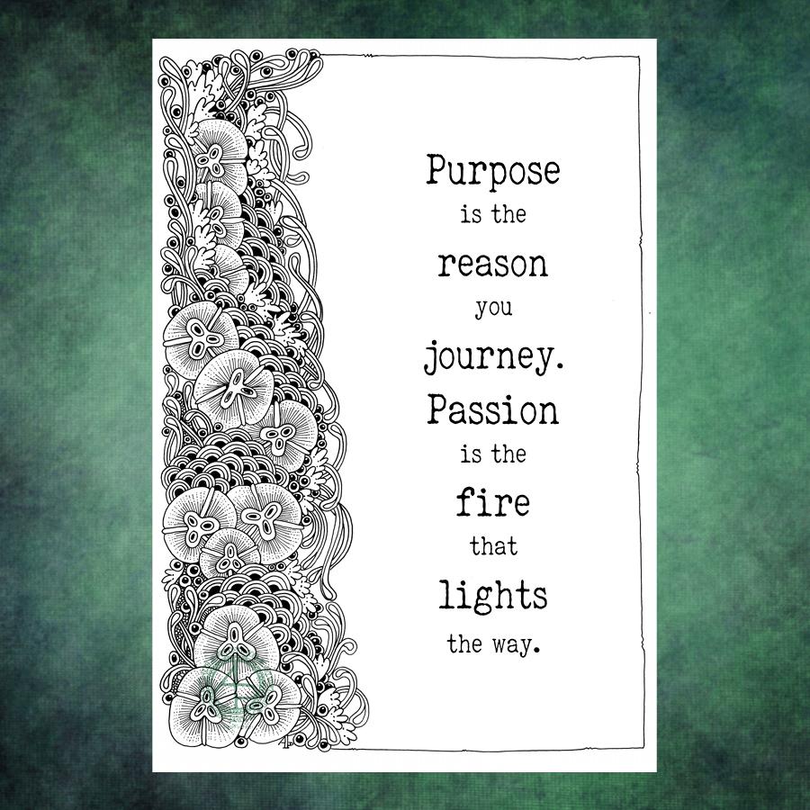
What to do with an entangled design that seems to want to take up just one side of a page? Add a quote!
The design was drawn on Bristol Board with a fine Uniball ‘eye’ gel pen and a 01 Unipin pen for the fine lines. The quote was added in Affinity Designer.
It was a quote that just ‘spoke’ to me this morning. Art is one of my passions and something I indulge myself in daily, whether for work or pleasure. I’m so grateful I can combine my work with my passion. Not only that, my coloring templates and books allow others to share in my passion and expressing theirs through colour.
I do get disheartened at times. I doubt myself often. I often judge myself very harshly, especially if I compare my work to others. It’s not always plain sailing. But, I’ve learned that if I persevere, I end up with work that I’m happy with, including this one.
Thursday seems to come around both quickly and as if it’s been an age since last Thursday. As it’s Thursday, that means it’s time for a new colouring template /coloring page for the members of Angela Porter’s Coloring Book Fans facebook group.
This week’s template is a typically ‘Angela’ entangled style drawing. A stylised dragonfly floats above an entangled background containing arches and seed pods, flowers and foliage, along with various patterns and an intricate border.
I’ve chosen to part colour the template in a monochrome scheme of greens. I don’t really pay attention to light source much. mostly I use light and shadow as part of the patterns and a way to introduce a sense of depth and dimension to my art. This is something I realised only recently.
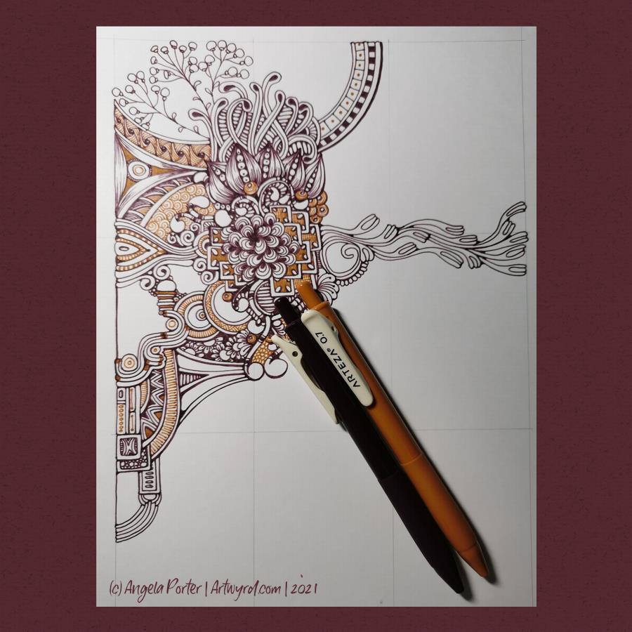
All my life, I’ve had a love of bright colours. I’ve shied away from the more earthy, natural or vintage tones. Recently, however, I’ve been using a lot of brown and more subdued colours in my art. When I saw Arteza had a box of vintage coloured gel pens, I thought I’d give them a go! So, I got out a sheet of bristol board and started to draw with the Vintage Grape Purple and Ginger pens.
Usually, I have huge problems with gel pens. The ink doesn’t flow smoothly due to the way I hold the pen (very upright) and it tends to blob. The pen soon stops working as well – and I don’t choose cheap pens. However, I was very pleasantly surprised at how smoothly the ink flows from these pens. No globs. It dries quickly. I can colour small areas smoothly. And the colours are rich. A bonus is I’m able to get the pen to produce thinner lines when I ‘flick’ the pen to add hatching lines.
Normally, I’d only draw in black. However, the darker tones of these pens may very well change my mind, for some projects any way.
The pens are non-toxic and acid-free. They are definitely smooth writing – the first gel pens I can say that work that way for me. And they do dry quickly, so no smudging!
So, one happy artsy me today. Always nice to have new pens that play nicely with me!
This is one of a couple of drawings I have on the go at the moment. The scan has washed out and altered the colours a tad. The gradations of colour are a lot smoother too. But I think you get the idea.
This was was drawn with Copic Multiliners on heavy smooth cartridge paper by Daler Rowney. I’m using Staedtler and Chameleon fineliners to add texture/pattern to the drawing. The larger areas of colour were achieved with Carbothello pastel pencils and a paper tortillon.
I was going to stick to a monochrome colour scheme, but some of those tendrils, fronds and leaves just needed a touch of a muted green. And then that led me to including that central ‘orb’ of turquoise (which isn’t as pale or lacking gradient as it appears).
I’m getting to the point where I need to decide how much white space to leave in the design, and where I’m going to add colour and/or texture and pattern. I also need to think about whether some of those coloured spaces need either more shadow or lightening up a bit. That means it’s time for me to take a break from this particular artwork and go and do another or something else completely different!
Before that, there are elements in this design that I really like – the strange columns/antenna at the top and bottom left, the organic trellis of fronds in the largest part of the design. That horizontal bar towards the top. however, just jars with the rest of th design.
Yesterday’s coloring template for the Angela Porter’s Coloring Book Fans facebook group all coloured and shaded. I used Chameleon alcohol markers to add the colour and some shading. I also used a graphite pencil and a tortillon to darken the shading and add shadow to the lighter areas. It’s turned out OK.
I’ve been working on this drawing for the past three or four days. I finally finished it this morning. Here’s a list of materials used: A4 Daler-Rowney Bristol Board Copic Multiliners (05, 025, 02) Sakura Pigma Micron (01) Various shades of brown Stabilo fineliners Grey and sepia Uniball Unipin fineliners
I’m finally becoming comfortable with leaving open spaces in my art, though I still do like a clear border/edge. The spaces give a lighter, more airy feel to the design. I’m learning that I don’t have to fill every available space with pattern. I think that is a good thing.
I’m also really enjoying using shades of brown to add patterns to the design, and some grey too.
If you’d like to know where I started this drawing, it was with the small arrangement of boxes just above the blueberry-ish berries just above the left of centre. Everything else grew out from there.
I think this one is finished, though as I look at it now, I want to use a white Gelly Roll pen to add dots in places. Also, the shadows need to be tad intensified around the motifs to give the illusion of depth. I may use alcohol markers – Chameleons or Copics – to do this as the Copic Multiliners are alcohol ink safe.
I was potching around last night with how to add colour to a drawing with traditional media. You’d think I’d’ve learned not to do this by now, wouldn’t you? I was getting nowhere except to the land of frustration and feeling useless.
This morning, as I tried wrangling still further, I thought to myself, “let’s break out the Chameleon markers”. I did, and I also dug out some marker paper and started to draw. And I was happy with the design.
And then I started to add colour … and that’s where it all went to pot.
Oh the colours are lovely, individually. Just not when put together.
I’d also forgotten how much I like to use Chameleon markers. However, I really need to stick to monochrome! And, I think the Chameleons will work well in a monochrome manner. But not just yet. First I need a nap.
Lack of sleep was the usual overly hot at night stuff and also the early morning Wednesday wake-up for my Abel & Cole groceries delivery. What energy I had has now gone. I’m starting to go cross-eyed with tiredness, so I think I’ll need to nap very, very soon.
Note to self : Use a paper size that fits the scanner bed, or leave slightly larger margins.
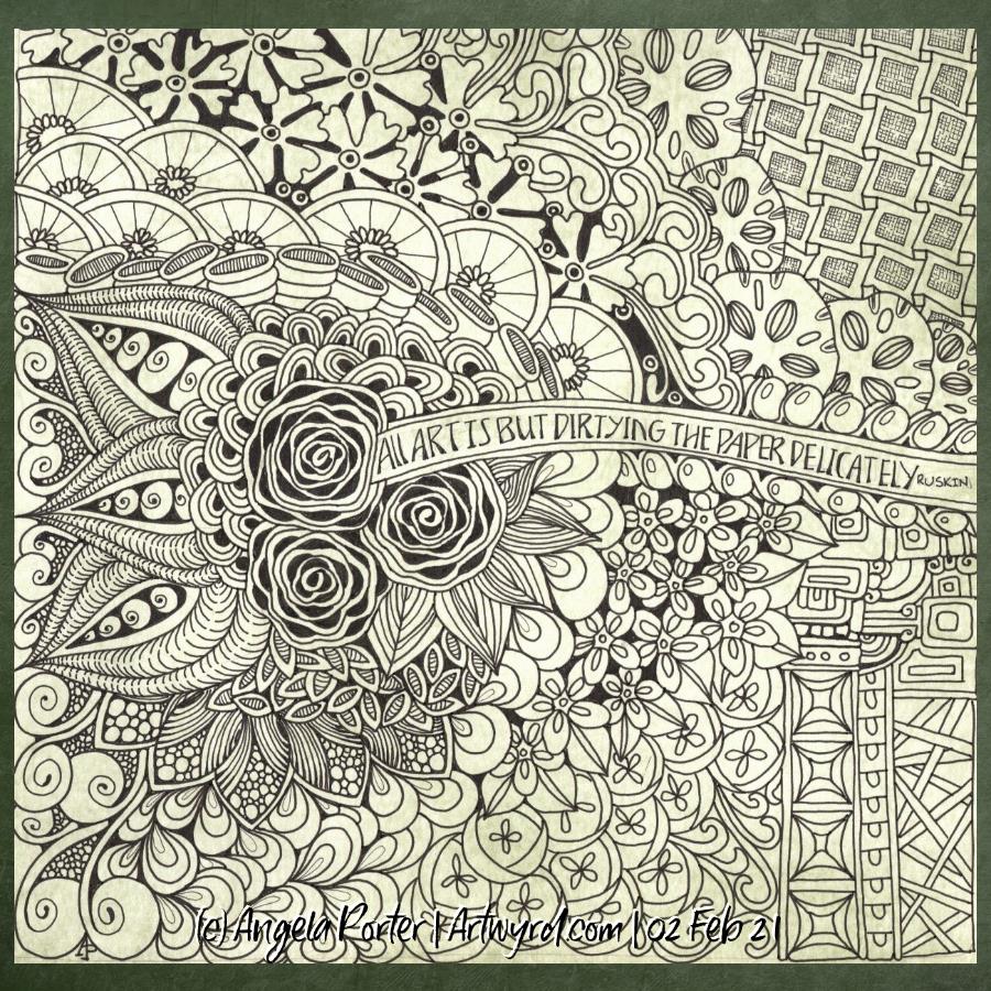
I found this delightful quote by Ruskin yesterday and knew I wanted to use it in a drawing. So I did. Some of my favourite motifs, and some I don’t often use.
For this one, I used Strathmore smooth Bristol paper and as I cut it down into a square shape, I forgot that the width was too big to fit my scanner.
Anyway, I used bundled sage Distress ink to colour the paper before setting to it with Uniball Unipin pens. I’ve not added any shadow/highlights yet.
I’m fairly pleased with the vast majority of this drawing. There are bits at the bottom right I’m not happy with. However, shadows and highlights may help to sort that out.
Another entangled/zentangle style drawing. 21cm x 21cm square piece of Claire-Fontaine Paint-on mixed media paper coloured with rusty hinge distress ink (I think). Drawing done with a mixture of 03 Uniball Unipin and 01 Sakura Micron pens. Shading is in the process of being added with a deep red-violet Carbothello pastel pencil and a blending stump.
I think I’ll need to use a darker colour to really bring out the edges of layers as well and to help to separate each area of the design. I also have a hankering to add some gold to this one. I may or may not act on that very tempting idea though. I have a way to go yet before I decide on the final embellishments. White may win out!
This mixed media paper really holds on to the pastel pencil; it’s really difficult to blend out. However, that also gives an interesting finish and stops me from blending it out so much everything looks the same!
This was lovely to do, as art usually is for me. It’s quite different for me and it doesn’t seem to flow as well. Perhaps that’s simply because it didn’t feel like it was flowing as I was drawing it. I started with the large motif of three weird seeds and the ribbon border wrapped partly around it. Not something I would usually do and I think it threw me a little. But it’s done now, and I just keep reminding myself every drawing is an experiment. it’s only some time, paper and ink, so if thing’s don’t work out, nothing much is wasted and new lessons are gained along the way.
I often say to myself, “Angela, what on earth were you thinking?” This is one of those times.
I started with hand lettering the words. Ok-ish Good enough to mess around with. And mess around them I did – with an “aura” and pattern, then more patterns and repeated motifs … until I’d mostly filled a square sketchbook page.
The drawing was OK. I liked some bits, others I didn’t.
Then, I thought, “What would it look like with colour? Let’s try Inktense and water!”
How often have I mused here about how I struggle with colour? All was going OK-ish with just pinks and greens … and then I added blues and browns…
The geometric pattern at the bottom were colours that didn’t fit well. So, I added watercolours to glaze the colours. Big mistake. I lost any sense of shadow and highlight …
So, I used a white graphite/chalk pencil to try to add the highlights back in …
YEUCH!
So, I put it to one side while I did some other stuff and had lunch.
Then, it caught my eye and with fresh eyes I thought that maybe it’s not as bad as I thought it was .. maybe.
I constantly do this – try to add colour with traditional media and fail. Monochrome seems to work best for me. Monochrome where I can play with shadow and light. Monochrome colours that are added digitally seems to work the best of all.
No matter how often I tell myself this, put notes up to remind me of this, I still insist on trying to use traditional coloured media.
I just think that I hope one day that something will just ‘click’ with me. Today wasn’t that day it seems!
So, back to either white or simple coloured backgrounds, and adding monochrome colours for the sense of dimensionality I like. And I have no hopes that I’ll remember this in a day, a week, or a month or two and I’ll end up asking myself the exact same question; “Angela, what were you thinking?”
The end result may be something I’m unhappy with, but adding colour was enjoyable. I just seem unable to stick to just one or two colours, with variations in their intensity and tone. Then, I descend, bit by bit, into insecurity and self-doubt and incredulity that I did it again!
Ho hum! Not to worry, it’s only pen, paper and some other media. It’s yet another experience to help me, hopefully, learn more and be more comfortable with my artistic style. If we did everything perfectly every time we’d never learn and grow.
So, back to a blank piece of paper with pens I go, and may make some art to remind me, “Angela, monochrome is best!”