I was potching around last night with how to add colour to a drawing with traditional media. You’d think I’d’ve learned not to do this by now, wouldn’t you? I was getting nowhere except to the land of frustration and feeling useless.
This morning, as I tried wrangling still further, I thought to myself, “let’s break out the Chameleon markers”. I did, and I also dug out some marker paper and started to draw. And I was happy with the design.
And then I started to add colour … and that’s where it all went to pot.
Oh the colours are lovely, individually. Just not when put together.
I’d also forgotten how much I like to use Chameleon markers. However, I really need to stick to monochrome! And, I think the Chameleons will work well in a monochrome manner. But not just yet. First I need a nap.
Lack of sleep was the usual overly hot at night stuff and also the early morning Wednesday wake-up for my Abel & Cole groceries delivery. What energy I had has now gone. I’m starting to go cross-eyed with tiredness, so I think I’ll need to nap very, very soon.
Waking at stupid o’clock meant drawing until I could go back to sleep. I got all the inking done for this particular drawing. Now, the colouring needs to be completed.
Materials: 21cm x 21 cm (8.25″ x 8.25″) piece of Claire Fontaine Paint-on mixed media paper – natural colour Aged Mahogany Distress Ink and a piece of cut and dry foam to distress/grungify the paper 03 and brush Uniball Unipin fineliner pens 01 Sakura Pigma Micron pen Staedtler Triplus fineliners Chameleon fineliners Water brush White Sakura Gelly Roll pen
Started yesterday evening, worked on during my hours of mid-night waking, and on waking this morning, this measures 21 cm x 21 cm (approx 8.25″ x 8.25″) The paper is natural coloured Claire Fontaine Paint-On mixed media paper coloured with Aged Mahogany Distress Ink. The design is being drawn with a mix of 03 Unipin and 01 Sakura Micron pens.
I’m using a mixture of Stadedtler Triplus and Chameleon Fineliner pens to add colour to the design, along with a barely damp waterbrush to spread the colour out. Interestingly, some of the colour lines added remain visible, to a greater or lesser extent, depending on how much I work the colour with the waterbrush. Also, I’m finding that I really enjoy adding colour and texture like this.
The finishing bright white highlights are added using a Sakura Gelly Roll pen.
I find the fineliners used in this way give me much greater control over how much the colour spreads in the small areas in my drawing. They also don’t spread as much as, say, Tombow Dual Brush pens or Inktense pencils. That helps to control the spread of colour too.
I rather like the vintage-y look that the palette of browns and olive greens confers on the design, helped along by the background colour and texture of the paper.
Oh, I do intend to leave a ‘hole’ in this first layer of designs. I’m not sure I’ll do inside the space; a quote, more layers of design. For now I’m not sure. But once this first layer is done, I can scan it in and use it in different ways digitally.
There are lots of my favourite motifs appearing in this one, rather organic ones for the most part. What will appear from the tip of my pen in the rest of the design? I don’t know yet! It could be more of the same, or not. All I know is that the intricacy, detail and revisiting old favourite motifs is making my arty crafty heart smile.
Cognitive dissonance
“The state of having inconsistent thoughts, beliefs, or attitudes, especially as relating to behavioural decisions and attitude change.”
Finally, the penny dropped as to why I’m feeling so out of sorts. Oddly, it was while I was listening to a documentary about the cult NXIVM as I was drawing during the stupid o’clock hours of drawing. Don’t worry, I’m not a member of a cult! However cognitive dissonance was mentioned and that was the ‘ta-da!’ moment for me.
Cognitive dissonance causes emotional distress related to holding contradictory beliefs or values. I’ve experienced this before during breakthrough moments in therapy where I’ve had to accept that I was a victim of trauma, that I really do have CPTSD and I’m not (as my mother would tell me) making it up, for example.
I’m poised on a knife edge, wanting to make a decision to leave something, but feeling guilty about thinking that way. I need to find a way to find some clarity to help me make that decision, and it has to do with my core values and beliefs.
Recognising this doesn’t make me feel any better, but it helps me understand what is going on, and that understanding will help me work my way through it! Making a decision won’t make it any easier for me to act upon it as there’ll be a lot of guilt and the old reactive feeling of believing I’m letting other people down.
However, I can’t put other people ahead of my own mental and emotional well-being. It’s never been easy for me to say ‘no’ to people, to leave organisations or people who are contributing to emotional and mental distress in myself. But I have done so occasionally, more so in the last year or two. And I will do so this time if it’s what I need to do to find that sense of balance, harmony, peace in myself once again.
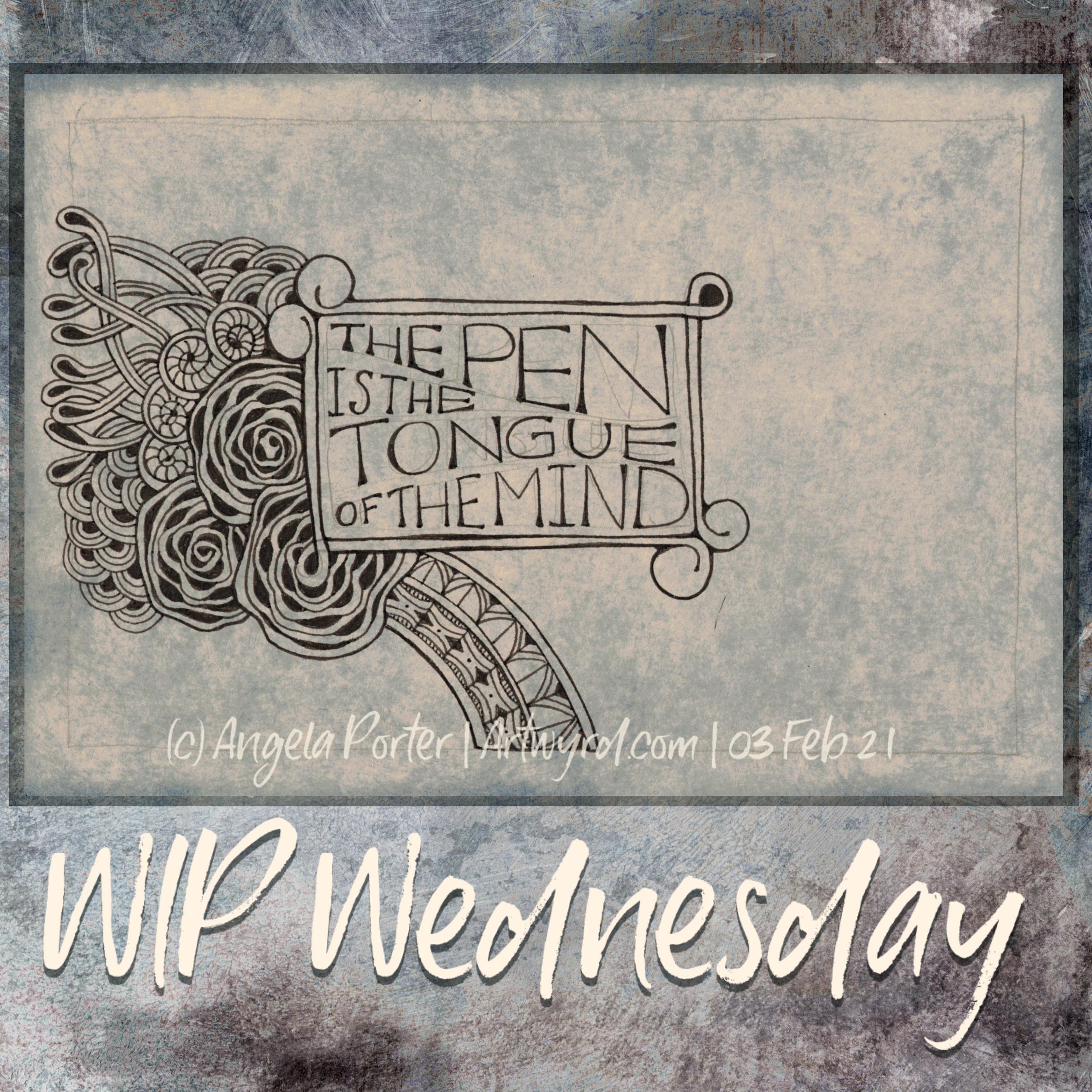
‘The pen is the tongue of the mind’ is a quote by Horace, a Roman who lived between 65 BCE and 8 BCE. Today, we may add that the keyboard is the tongue of the mind too. Though sometimes I wonder how many people actually think before they type what they do in social media!
The quote refers to writing, but I also think it refers to art. Not all of our thoughts are in words. Our subconscious/unconscious mind takes in a lot more information than our conscious mind does. Also, the subconscious mind works in metaphors, symbols, stories.
Sometimes I can manifest the abstract and symbolic thoughts that wander around my head in writing. Others need to be brought out in conversation, by questioning by another. And then there are times, when words aren’t adequate. That’s when art has its role to play.
I rarely plan art out, other than perhaps a vague guide as to where I’d like particular motifs to be. I tend to let it flow as it needs to. If I overthink my art, it all goes to pot. It feels disjointed, contrived to me and I end up quite dissatisfied with it. Going with the flow seems to work best for me.
This particular work in progress does have a little planning in it – the placement and arrangement of the quote along with the pencil border. I do like a border to work within and up to.The rose motif is a current favourite, so roses were the first part of the drawing to be done. Everything else will flow from there. I do like a border to work within and up to.
I’d like to finish this today. However, I do need to create a template for this week’s Template Thursday.
For those of you are curious, here’s the details of the materials used: A5 natural Claire-Fontaine Paint-On mixed media paper Faded Jeans Distress Ink 04 Sakura Pigma Sensei pen 05 Sakura Pigma Micron pen
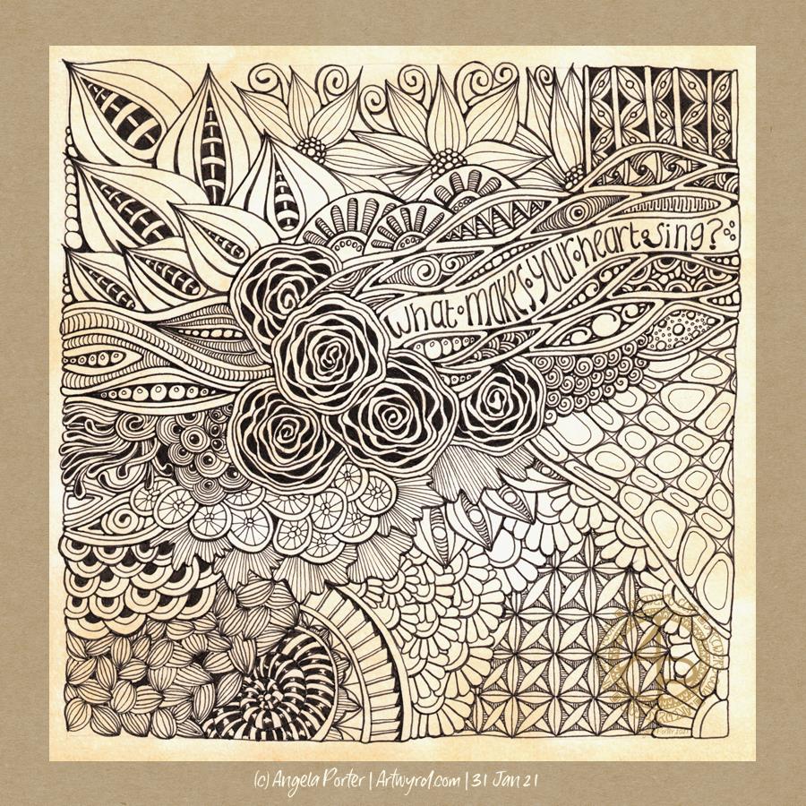
Lots of things make my heart sing. Doing art, particularly creating intricate, abstract drawings. Music. Nature. Architecture. Patterns. Archaeology. Geology. Astronomy. Stories and films that transport me to somewhere else with characters that feel like friends. Sunrises and sunsets. Birdsong. Tea at just the right temperature to enjoy it fully. Time with friends. Deep conversations about life, the universe and everything. Driving for the sake of driving. And so much more.
In this drawing, I’ve put in some of my favourite motifs and patterns, as well as a bit of (clumsy) hand lettering. I think I’ll be doing some more drawing this afternoon. It’s snowing out and the best place to be is at home, in the warm.
Materials used: 21cm x 21cm piece of Claire Fontaine Paint-On Mixed media paper coloured with Tea Dye Distress Ink 05 and 01 Sakura Pigma Micron pens 04 Sakura Pigma Micron Sensei pen 03 Uniball Unipin pen
Here’s a plethora of small drawings I’ve done over the past couple of days when I’ve woken up repeatedly through the night and needed to cool down before I could sleep again..
The various sizes are : circles – 8.5 cm and 10.5 cm diameter squares – 7 cm x 7 cm and 7.5 cm x 7.5 cm rectangles – 12.7 cm x 7.7 cm
Media used : Sakura pigma micron and sensei pens Distress Inks to colour the backgrounds Inktense pencils and Kuretake Zig Clean Colour Real Brush pens – colour spread with a damp brush Claire Fontaine Mixed Media Paper and St Cuthbert’s Mill Bockingford watercolour paper.
I sure do have a lot of colour, shadow and light to add to these! It takes me a lot longer to add colour and so on than it does to draw them!
Also, I have a larger drawing that is a work in progress. I think I’ll turn my attention to that one for a while.
I often say to myself, “Angela, what on earth were you thinking?” This is one of those times.
I started with hand lettering the words. Ok-ish Good enough to mess around with. And mess around them I did – with an “aura” and pattern, then more patterns and repeated motifs … until I’d mostly filled a square sketchbook page.
The drawing was OK. I liked some bits, others I didn’t.
Then, I thought, “What would it look like with colour? Let’s try Inktense and water!”
How often have I mused here about how I struggle with colour? All was going OK-ish with just pinks and greens … and then I added blues and browns…
The geometric pattern at the bottom were colours that didn’t fit well. So, I added watercolours to glaze the colours. Big mistake. I lost any sense of shadow and highlight …
So, I used a white graphite/chalk pencil to try to add the highlights back in …
YEUCH!
So, I put it to one side while I did some other stuff and had lunch.
Then, it caught my eye and with fresh eyes I thought that maybe it’s not as bad as I thought it was .. maybe.
I constantly do this – try to add colour with traditional media and fail. Monochrome seems to work best for me. Monochrome where I can play with shadow and light. Monochrome colours that are added digitally seems to work the best of all.
No matter how often I tell myself this, put notes up to remind me of this, I still insist on trying to use traditional coloured media.
I just think that I hope one day that something will just ‘click’ with me. Today wasn’t that day it seems!
So, back to either white or simple coloured backgrounds, and adding monochrome colours for the sense of dimensionality I like. And I have no hopes that I’ll remember this in a day, a week, or a month or two and I’ll end up asking myself the exact same question; “Angela, what were you thinking?”
The end result may be something I’m unhappy with, but adding colour was enjoyable. I just seem unable to stick to just one or two colours, with variations in their intensity and tone. Then, I descend, bit by bit, into insecurity and self-doubt and incredulity that I did it again!
Ho hum! Not to worry, it’s only pen, paper and some other media. It’s yet another experience to help me, hopefully, learn more and be more comfortable with my artistic style. If we did everything perfectly every time we’d never learn and grow.
So, back to a blank piece of paper with pens I go, and may make some art to remind me, “Angela, monochrome is best!”
I’ve been feeling out of sorts for the last day or so. It’s gradually intensified. A broken night’s sleep really hasn’t helped. House freezing cold (deliberately so!), Angela boiling hot in waves (not illness, just age).
I did draw in the darkest parts of the night when I couldn’t sleep, but what I produced was just a reflection of my ‘out of sorts’ mood. I added words and reflections to the drawings to try to elucidate where this has come from. And then that went to how I could use art in a journal, could I create journal pages, little areas for thoughts/words of meaning, and so on. So I jotted those ideas down.
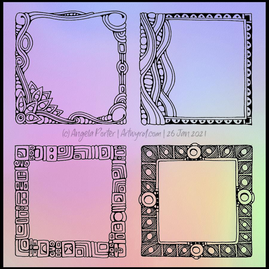
The larger drawings I was doing in the night just overwhelmed me. The more work I did, the more overwhelmed and dissatisfied I felt. So, in an attempt to create some art that would soothe rather than disturb, I decided to create some small pieces of art and some borders seemed the right thing to do. This quartet of drawings is the result of that solution I sought to help me with my mood and my attitude to my efforts at drawing.
Today’s mandala includes a couple of Zentangle patterns – Taiga by Tomas Padros and a variation on Fescue, an original Zentangle pattern. Plus some ‘orbs’.
This was fun to do. It’s not often I use such a large area of a pattern, but Taiga is such a lovely pattern and it’s taken me a long time to work out how to do it well. I didn’t think I’d managed it this time, until I added shadow and highlight. Then, it just became so dimensional and, to use the crafty vernacular, ‘popped’.
Today, I just wanted a mossy, spring-like green. There’s still snow lying on roofs and hilltops, cars and shaded pavements. The days are noticeably growing longer, and the bright sunlight today is most welcome after the fog of yesterday.
It won’t be long until I see brave snowdrops and crocuses breaking the winter-hard ground. They herald that the return of spring is nigh!
I’ll be waiting until the snow has mostly disappeared before I go and take a walk.
These are two drawings I’ve been working on over the past three or so days. The whole page is A4 in size.
To draw them, I’ve been using Pilot Kakuno fountain pens with black ink. To add shadow and colour I’m using a mixture of Stabilo Carbothello, Daler-Rowney Artist’s Drawing and Prismacolor Ebony pencils. Along with some paper tortillons to blend the colour out. I’m also keeping the colour palette pretty limited – graphite black, two green Carbothello and Sanguine and Sepia Drawing pencils.
It’s fun to draw with a fountain pen. It’s also a lot of fun to use graphite and colour to bring depth and dimension to the drawing on paper rather than digitally for a change. I like to work both digitally and traditionally. Art is art!
I suspect the rest of the day is going to be filled with artsy pursuits, including finishing adding colour to these drawings.
We had snow overnight and the air is filled with a white fog too. Even though the layer of snow is just a couple of centimetres thick, it’s enough for me to want to stay inside. Snow is pretty to look at, but my sense of balance means it’s safest for me to stay cwtched up in the warm!