Mixed media index cards – 3 June 2016

AngelaPorter_3June2017_MixedMediaIndexCard1

Two more index card done!

I drew the fungi then coloured them with the Chameleon Color Tones and Color Tops pens.  Cogs have appeared in the background once again – gotta have a lil bit of steampunkishness!

I’ve used 3D Crystal Lacquer on the fungi caps and on the stars in the background.

I’m liking the slightly bigger format of the index cards compared to ATCs.

Mixed media index cards

AngelaPorter_1June2017_MixedMediaIndexCard3

I started these 5″x 6″ cards yesterday and finished them (I think) this morning.

The focal images I drew myself on watercolour card.  I used Caran D’Ache Supracolour watercolour pencils and a damp brush to colour them.  I was quite happy with the colouring; I do find pencils a lot easier to use than traditional watercolours.

Nex, I cut three of them out around their edges and used a black marker to colour the white edges (and disguise my poor cutting out skills).  I had to use a craft knife in a couple of places.  The other two I cut out as small panels.

The drawings are a little bare of detail, mabye, but I can go back and add detail once I’ve decided what I’d like to do.

I’m not all that happy about the torn paper behind the focal images; you try things out and learn, maybe.  The torn paper is Gelli printed tracing paper made using PaperArtsy Fresco paints.  I then ran them through my Sizzix Big Shot in various embossing folders, and on some the embossed images have had some metallic waxes gently brushed over them. I also added some Inktense to the papers to darken the edges and add shadows.

What I am really happy with are the index cards themselves.

I started by covering them with gesso.  Then, I used some foliage stamps from IndigoBlu with grey Archival Ink by Ranger to add patterns.  I really liked this, as the patterns were softer and already ‘ghostly’ in the background, a much better choice than black Archival.

My next step was to add colour using ink blending sponges and Distress Oxide inks, followed by a spray of Gold perfect pearls mixed with water.

This is where there was an unexpected effect – the wet Distress Oxides were repelled from the Archival ink.  I loved the result, as well as the way the colours mixed as they pooled around the stamped patterns.

Here’s a close up where you can see how the Archival Ink has repelled the Distress Oxide inks:

AngelaPorter_1June2017_MixedMediaIndexCard1

Then, I used Versamark Ink to stamp more foliage on some of the cards, and mini-mandala type patterns on others.  I then sprinked WOW Embossing powder (clear holographic) over the ink then melted it with a heat tool.  This added an extra layer of interest – a subtle layer as it can only be seen from certain angles.

I framed the cards using black Archival ink and a foam blending tool to give a distressed looking edge.

Then, it was just assembly of the focal points and so on, before sticking the index cards to some really thick card to get them nice and flat; the cards are so thin that they curl a lot when working on them, even with the layer of gesso to seal the card in.  Cosmic Shimmer’s Specialist Acrylic Glue worked beautifully for this.

I had intended to make more ACEO cards, but I drew the focal images a tad too big for that format, so thought I’d try out an index card instead.  I quite enjoyed working on the slightly larger scale.

Never give up and Foamiran flowers

AngelaPorter28April2017_01

Back to playing with mixed media today, and this is the result…

It’s around 8″ x 6″ in size and 300lb Smooth watercolour paper by Daler-Rowney is the substrate.

First, I coloured the paper using Distress Oxide inks, with a light spray of gold mica mixture.

Once that had dried, I added the diamond motif and text to the background using texture paste through stencils.  Once the paste had dried, I used a rich gold System 3 acrylic paint from Daler-Rowney to paint the texture paste.

Yesterday, I had used embossing folders with my Big Shot from Sizzix to emboss coloured card which I then added metallic and iridescent colours to.  The dark red-brown layer of cogs is part of one of these papers. Behind it, there’s a piece of patterned paper.  Both have had their edges roughed up (distressed) and then inked using black Archival Ink from Ranger.

I next chose an ACEO or ATC card from my stash to act as a focal point.  I also firtled through my stash of steampunk diecuts to find some cogs and a clock dial to add to the background.

The diecuts were all made from kraft card and I used Distress inks to add the base colours of a rich blue, an intense blue-green and a red-brown before dry brushing metallic and iridescent acrylic paints from Liquitex over them to give the appearance of old metal.

Finally, I assembled everything together in an arrangement that pleased me.  I used a Payne’s Grey Inktense pencil and a water brush to add shadows, and finally a few sparkly gems (I can’t resist the use of sparkle!).

I thought I’d finished, however, the postman brought me a box that contained some Foamiran sheets I’d ordered a couple of days ago, and I just had to have a go at making some flowers.  You can see one of the flowers on the mixed media piece.

The flowers are quite easy to make.  I die cut flower shapes from the Foamiran.  I then used a couple of Faber-Castell Gelatos and a damp baby wipe to apply colour the the front and back of the flowers.

Next, I used my heat tool to warm the foam so it curled up a little and then shaped the petals before using hot glue to stick the layers together to make fluffy flowers.  Finally, I used an alcohol marker to colour some clear gems in so they complemented the flowers and attached to their centres.

I think I’m going to be making more of the flowers, they are easy to make, if a little fiddly given the current manicure I’m sporting.  Next time my nails are done, I’ll make sure they are kept fairly short!

More mandalas

Mandala3AngelaPorter26April2017

Mandala4AngelaPorter26April2017

Two more completed over the past couple of days.

Background colours done using Distress oxide inks and a light spray of mica infused water.

Mandalas – Angela style!

Mandala2AngelaPorter24April2017

Mandala1AngelaPorter24April2017

The last few days have seen me working in my sketchbook, and I may post some pictures from that later on.

I’ve spent some time the last day or three revisiting mandala drawing in my own inimitable way – definitely not symmetrical, with lots of flowing lines and intricate line patterns filling in the spaces, though not all.

I prepared the coloured backgrounds first, using Distress Oxide inks along with a light spray of either copper or pearl mica sprays.  The spray adds a gentle sparkle to the background, which hasn’t been picked up in the scan.

I used various pens – UniPins, Sakura’s Pigma Sensei, and Pilot Hi-Tec pens with nibs as fine as 0.25mm!

It’s been a long while since I indulged myself in these kind of mandalas.  I know that I really enjoy drawing on coloured paper.

Hope – flowerpunked. Art and my mental health.

IMG_0605

Just finished this one.

Hope.

Sometimes I have to walk away from something I’m working on as I despair it will work out to be anything near good enough.  Actually, it’s not sometimes, it’s most of the time!  However, I do persevere.

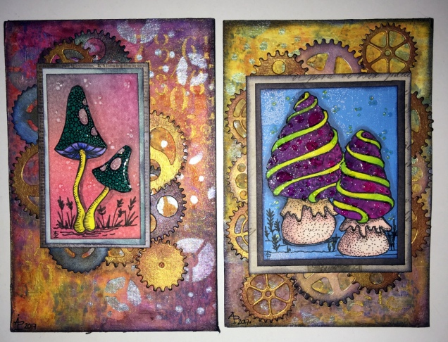
When I went to bed last night, this one was looking horrible.  I had the background done, the first layers of collaged patterned paper and the kind of hessian looking die-cut added too  I really wasn’t happy with it at all.

However, a good night’s sleep and a bit of inspiration on waking meant I knew where I wanted to go next, especially after I sorted out the jumble of die-cuts I have (note to self-get some way to organise these!).

Once started from the point of inspiration, the picture just grew to it’s finished state (well, I think it’s finished, that may change when I look at it again later on).

Hope.  A really good word here.  There’s always hope that no matter how bad I think something looks, , pushing past that often results in something good.  Indeed, sometimes the work can just be cut into pieces for use in another piece, which is how the iridescent, textured circles came to appear in this one.

Hope.  Making art always gives me hope that I can overcome the trials I face when my anxiety/depression/complex post-traumatic stress disorder kitcks itself up a few or several notches.  Art always gives me a place where I can lose myself in something that is meditative, mindful, self-soothing, and shows me that I can succeed even when the self-critic is telling me I’m useless, I can never get anything right, nothing is good enough, I’m a failure, and so on.

This past week or so, challenging myself to work with mixed media – something I’ve tried in the past and not really felt I was successful at – has been good to help me with the aftermath of a couple of rather strong anxiety attacks.  I’ve not had any for around a year now.

I was surprised by them and at their intensity and how they have impacted on how I live my life at the moment.  I find it difficult to go out into the world, want to hide away from people, and when I do go out it’s often in the dark hours so I’m not seen.

It also surprised me that this is how I used to live every single day for a very long time, most probably most of my life, until a few months ago.

Even though these two episodes have happened, I know I’ll get past them; I have in the past, and I can learn more about the triggers for them and also where this all comes from, which will help greatly in the counsellinge process.

So there’s hope I’ll improve in the long term, and blips are just that.  Just as I’ve hoped that my confidence and skill and expression via mixed media would improve.  I’ve just had a look back at the mixed media I’ve done in the last fortnight or three weeks, and even I can see how it’s all developed, in a positive way.

What’s made the difference for me with mixed media is finding the confidence to do my best to do it my way and to explore it in my way.  I have a lot more exploring to do, and a lot more confidence building in what I do with it. I will journey along this road, along with my drawing and illustration skills, maybe even writing, and with healing what I can of my mebtal health issues.

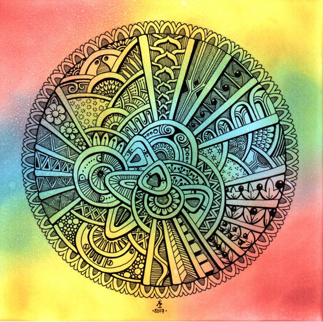
So, choosing the word hope for it to appear on this piece of art was most appropriate.

Flowerpunked

IMG_0602

This is todays mixed media creation (approx 5.25″ x 11.5″.  I think ‘Flowerpunked’ is a good name for it, or for the series of works like this.

I found a way to lift the flowers up so they have more dimension; wish I’d thought of that when I was adding the cogs., still there’s always the next one!  It’s all a learning process – it never ends!  I also think the stenciled patterns on the background are a bit dark and heavy … and just didn’t quite know what to do about them at the time as I didn’t want to lose the pretty background colours/patterns I’d already created.

Unnamed mixed media work in progress

I’ve been working on this project over the past three or so days.  It’s not finished, far from it I think.  I’m having to take a break from it to let the glue that I’ve used to stick some metal embellishments to it cure.

I’ve tried to take photos that show how the cogs and foliage look almost verdigris from one aspect, yet metallic from another.  The paper I’m working on is A3-ish in size; I’ve used 300gsm watercolour paper as the substrate – it’s sturdy and doesn’t warp too much when water and water-based media are used on it, or when heat is used to speedily dry each layer as they are added.

I know I want to add some gems to the cogs (gotta have sparkle!), I may add some flowers, maybe not.  I do need to add shadows too.  I’m not sure if I’m going to add some kind of quote up in the top right corner or whether I’ll just leave it as it is.

A colourful bunch

IMG_0579

This is just finished, though the 3D Crystal Lacquer on the flower centres hasn’t dried yet, so they’re a tad on the cloudy side.

I’m really pleased with this.  Not least of which for bravely, possibly even crazily, using some of my entangled, abstract art to make the flowers!

So, how did I do this?

Firstly, I made the background.  I used a piece of cream paper that has a texture on it that is designed for use with pastels, charcoal and coloured pencils, and I added colour using Distress Oxide inks.  I then sprayed it with a solution of gold Perfect Pearls which gave water spots and gold shimmers to the background.

Next, I’d had this crazy idea to use some of my art to create the flowers.  I chose some art that had colours that would stand out against the background and each other and I used circle punches to cut out circles of varying sizes.  I used a mini ink blending tool and sponge to add jet black Archival Ink to the edges of the circles to distress them as well as to give them a definite edge against each other.

The circles were stuck together in groups of three and then stuck onto the background in a pleasing arrangement, as if they were flowers in a bunch.

Next, came the outlining with a black Sharpie, as well as adding patterns to the circles to create petals and so on.  The white was added using a Sakura Glaze pen.  I also added gold patterns and highlights using a UniBall Signo pen.

The next step was to draw the stems and leaves, which was done with the Sharpie pen.  I used a waterbrush with paint from some of Derwent’s line painter pens.

Next, I intensified and added shadows under and around the flowers, stems and leaves using Inktense pencils and a waterbrush.

This was followed by the creation of the border using a black Posca pen.

Finally, the mixed media panel was adhered to a black background and the gold pen was used to add lines around the panel.  Oh, and then I decided to add 3D Crystal Lacquer to the flower centres.  An accidental drop of the lacquer on the background led to me adding more drops.

I’ve really surprised myself with this project.  I really enjoyed it, and even though I was wondering what on Earth I was thinking in ‘destroying’ some artwork I liked, I came to realise it was repurposing the artwork to create something new, different and allowing me to explore the world of mixed media more, particularly how it relates to myself.


I have inky fingers…

img_0574
An ATC or ACEO card made earlier today.

Mixed media experimentation is a tad addictive!

I spent yesterday creating more inchies and betwinchies, as well as shopping for some supplies.  This morning, I created the ACEO/ATC above.

The card itself is made by Strathmore and is some of their 400 Series Watercolour paper with a cold pressed surface.  I added layers of Distress Oxides, spraying with water to get the textures.  I also added patterns through stencils and stamps, followed by a final spray with gold Perfect Pearls.  I edged the card with Ranger’s Archival jet black ink.

It took a little while to rifle through my growing collection of inchies and other art tiles to find one that suit the background.  This tile has a faint crazing pattern and an aged/distressed look achieved by the use of Tim Holtz’s Collage medium – crazing followed by some distress ink rubbed on to bring out the crazing.  A layer of 3D Crystal Lacquer added a gloss finish to the tile.

Once the tile was stuck in place, I used a Pitt artist pen to draw patterns around it, added the words, more patterns and highlights using a gold gel pen. Finally, I added some small gems using Glossy Accents as a glue.

I do have a couple of things left for me to do with the ACEO/ATC – to add a layer of Micro Glaze to seal the surface so any water/moisture won’t affect it, and to add information to the back of the card.

I am really chuffed with this ACEO, as well as the background created with the Distress Oxides; I’ve achieved something I never, ever thought I could!  Before Distress Oxides I struggled to make backgrounds.  I don’t really get along with acrylic paints, spray generally are too messy for me, the original Distress Inks would run into one another and the colours become really poopy.

However, the Distress Oxides are a completely different medium, one that really seems to suit me and work for me and with me.  They are opening up doors for me to express and explore my creativity in ways I’d given up on with the failures (well, what I consider failures) with the arious paints and other media I’ve used in the past.

All it took was for me to find the right medium for me to use.


img_0576

Yesterday , I also I made two beautiful backgrounds that I just can’t bear to cut up or cover over, yet.  I’m sure I will. The photo doesn’t do them justice.  There are many layers of colour, all made using Distress Oxides on some really heavy and smooth waterolour paper (300gsm I think it is).  Patterns have been added using water, stencils and stamps.  Finally, the backgrounds have been sprayed with copper Perfect Pearls, which shimmer and also really bring out the depth of colours in the layers.