Entangled garden scene

Entangled Garden Scene © Angela Porter 2019

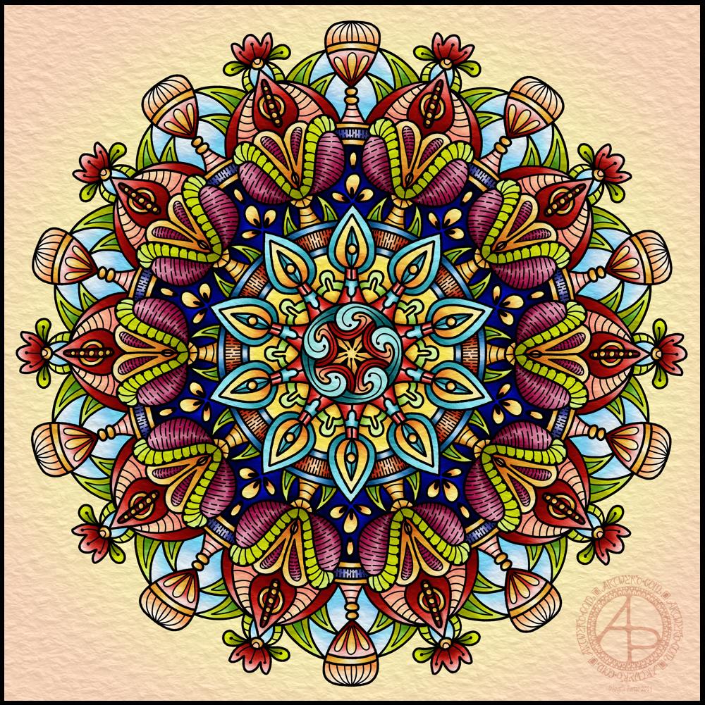
This took me a bit longer than I expected this morning. I did, however, enjoy creating this card.

First, I drew the design out on a piece of paper that is 10cm x 14cm using various sizes of Uniball Unipin pens.

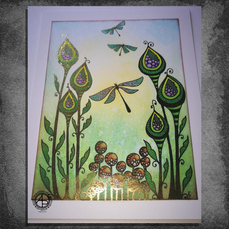
I copied the image using my Brother Laser printer. I didn’t scan it in at this time, but will do later on. All I needed was a copy to play around with.

The next step involved the use of Chameleon Duo Tone and Color Top markers to colour the design elements in. Even though some areas were quite small, I still managed to get bits of shading there.

Once the colouring with the Chameleon markers was done it was time to hot foil the design, and you can see where the gold foil catches the light in places as I took the photo. A friend of mine saw some of my foiling yesterday in person and she was said she was wowed by it. She thought it was good in the photos, but the photos really don’t do it justice at all.

After foiling, it was time to colour the background. I used a selection of Distress Inks, starting with mustard seed in the centre to give a subtle glow, then tumbled glass, crushed olive, peeled paint, pine needles and evergreen bough. I used a piece of cut and dry foam and a very light touch to add the colour.

I was worried that the Distress Inks may muddy up the colouring done with the Chameleon markers. Yes, they subtly changed the colours in some places, but I was careful to choose colours that wouldn’t make mud. Also, so little Distress Ink is added it barely alters the colours.

I can tell you I was well relieved by that!

Distress Inks are water reactive, so I gave the image a light spray of water knowing that only the Distress Inks would be affected. After a short while I dabbed the water off with a piece of paper towel. This lifted some of the colour leaving a subtle background texture.

As this point, after letting the paper dry completely, I could’ve added more Distress ink. Instead, I decided to use aged mahogany, again on a small piece of cut and dry foam, to edge the paper, to give it a border, and also to add a darker layer at the bottom of the design to ‘ground’ the image.

When I can find my Wink of Stella pen from Kuretake I’ll add some very subtle shimmer to the dragonflies, maybe to the seeds in the seedpods too. I also think some gold dots in small clusters would enhance the background.

I also need to think about adding a bit more shading to the bottoms of the laves to give a more dimensional look to them I think. I could definitely do the same to the dragonflies’ wings too.

Those are simple and quite minor changes that will make a difference I think. It’s only as I’m looking at the finished image now that I can see how those things would help. I often don’t think to step back and give myself time to look at the image with fresh and kindly critical eyes, seeing what I could do to improve my work.

In hindsight, the dragonflies may have worked well as black silhouettes in the design, which would then become totally covered in foil. Or just outlines that would be foiled. That’s something for me to try another time and see if I like that idea more.

I think you can tell I’m really enjoying this branch of my artistic journey. I’ve concentrated a lot on digital art of late. I’m not going to abandon my digital art journey at all; I can do things digitally that I can’t with traditional media.

However, it is showing me that working with traditional media is also a pleasurable and successful activity for me to do.

What am I going to do with this? I don’t know. Part of me wants to add it to my BuJo. Another part wants to mount it on a blank greeting card to send to a friend. Another part of me wants to put it into a reference sketchbook or folder for inspiration in the future.

More Foiling experiments

More foiling experiments ©Angela Porter 2019

The death of a laminator…

Another useless photograph, but I think you get some idea of how the foiling appears.

I’ve had a bit of a nightmare with the laminator. This morning it decided to terminally ‘eat’ a ‘foiling sandwich’ and there is no way I can get it out. I tried to put an A4 sheet through the laminator which meant that the folded ‘carrier’ paper had the fold to the side, not going through the laminator first. I think that’s what caused it all to get caught and stuck.

Lesson learned? Hopefully. I think I’m going to have to work on images that are A5 (UK) in size or less. Which is fine now I’m sure about that. However, I really was hoping to foil one of my A4 monogram images.

Ho hum. I shall purchase another laminator later today so I can continue working on it. The instructions with the foil say any home laminating machine will work with this particular foil.

About the foiled works…

Here’s what I’ve discovered so far.

Foiling works best on smooth paper, such as the heavyweight ‘premium’ paper I use in my printer. I do want to try Bristol Board as that is smooth and a bit more weighty again and stands up well to quite a few media.

Coloured cardstock, such as the dark blue example to the bottom left, doesn’t work quite so well as it’s not all that smooth. The foiling ends up a bit uneven and has a kind of ‘brushed’ look to it.

The copper foil I’ve used is amazing! It is like an interference ink or paint in that it’s colour changes from coppery-red to gold as it catches the light in different ways. I’m in love with this one for sure. It looks fab with turquoise blues and greens, a lot like the colours of verdigris.

I tried colouring the top left, top middle and bottom right images with Distress Inks after foiling. This worked brilliantly! It needs to be added after foiling; a little wipe with a dry paper towel removes any excess ink from the foil.

I’m not sure if you can see it, but the centre of the two mandalas at the top left and middle have some colour added to them. I used Staedtler Fineliners for the blue one and Zig Clean Colour Real Brush pens for the orange one.

The mandala at the top right I coloured using Chameleon markers and pencils after I’d foiled it. Not my best choice of colours, in my opinion, but it was an experiment. The alcohol inks stained the foil where I couldn’t keep the nib in the tiny spaces. The mandala was designed to be printed on A4 paper so the gaps weren’t quite so tiny, but I printed them at 4″ x 4″ just to try the foiling out.

I need to draw at sizes that it’s possible to foil successfully without killing a laminator off quickly in the future, and that means A5 or less in size. Unless I decide to ’tile’ the image in some way.

Future experiments in foiling…

There are some different papers I want to try. Bristol Board from either Frisk, Daler-Rowney or Winsor and Newton in particular. Strathmore is textured and I suspect it won’t work well, it’ll be more like the coloured card stock.

Coloured, heavyweight paper is a definite, particularly black I think. Just for the line art in foiling.

Hot-pressed, smooth watercolour paper may be worth a try, along with the smoother side of Claire-Fontaine or Daler-Rowney mixed media paper.

Different papers mean I can used different coloring media in different ways.

What else I have learned and what else I need to think about.

I really, really like digital colouring and I’m rather rusty with different traditional media.

I also need to think about what I can do with foiling and any market that I can create for myself with my art.

I’m really not at all good at promoting myself or my art and pricing work is so very difficult for me to do. It really is. I have a bit of a break in contracts at the moment (apart from editing some templates this week) and it’s something I really do need to turn my attention to. I create so much, but do so little with it.

Experiments in foiling

Foiling experiments © Angela Porter 2019

Hot foiling

I’ve had some fun today with thermal foiling. I’ve been waiting for an Amazon Basics laminator to arrive, which was the one that seemed to be the most recommended out of simple laminators. I’ve had the foil for quite a while.

For thermal foiling, the images need to be printed with a laser printer. The laminator then heats up the laser toner which becomes sticky and the foil sticks to it as you run the layers through the laminator. A quick cool down, peel the foil away and the black lines are left with foil covering them!

I played around with adding the foil first then adding colour, and coloring first before foiling. I also tried out alcohol markers, coloured pencils and Tombow Dual Brush markers both before and after foiling. They all worked well either way, though the alcohol markers do colour the foil, so for alcohol markers it may be best to colour first.

I then had to try them out on images and I chose to use two of my cute kittie designs. I coloured them with Copic markers before foiling. The one of the left has been foiled with gold, the one on the right with silver.

I mounted the designs on 4″ x 4″ square kraft card card blanks. To be honest, I could’ve done with printing these out a bit bigger as the lines were very bitty as they were so thin. Something I have to keep in mind when printing out future work. I think I’m going to have to design them to the size they’ll be printed at to make sure the lines are as thick as I’d like them.

I’m not a photographer. No matter what advice I’m given and follow I still don’t manage to get a good image. The gold shows up well and there are hints of silver visible on the right hand one, but I think you’ll get the idea.

I’m rather pleased with them and the sparkly, shininess keeps my inner raven quite happy.

I also now have a new tool in my creative tool box, one that I will use fairly often I think.

Emotional and mental wellbeing…

For the first time in ages it seems I feel awake and not needing to go back to bed for a nap in the afternoon. The emotional exhaustion of the recent EMDR, therapy sessions and Time to Change Wales anti-stigma talks is beginning to wear off. Mind you, that may change tomorrow as I have EMDR then rather than today just for this week. All the same, it’s nice to feel content and quite creative.

I’ve started a little book that I’ve titled ‘When it’s dark, look for stars’. It’s an A6 (UK size) sketchbook, and inside I am going to use Distress inks and other media to colour the pages and then add all shiny, metallic hand lettering and images and patterns with quotes and helpful words of advice, reminders for me on my darker days that I am not what the inner critic wants me to believe I am. Of course, my cute, foiled kitty and raven with rainbow and stars is definitely going to make it into the book.

I’m open to suggestions of what I could add to my little book, be it quotes, or kind words, or ideas for self-care. I’d also like to know if you’d like to see glimpses of it from time to time.

New coloring template in the facebook group

A new month means a new coloring template is available for members of the Angela Porter’s Coloring Book Fans facebook group.

This month, I’ve designed a mandala with some of the motifs I’ve been using in my more abstract works lately.

If you fancy printing and coloring a mandala designed by myself, pop over to the group, join and you’ll find the new template and quite a few others there available exclusively to members. Terms and conditions apply.

If you do join in, I’d love to see your finished coloration!

Mandala

Mandala © Angela Porter 2019

All done! It’s taken a couple of days work on this mandala, but I got there. For some reason the colours are darker and duller here on WordPress than they are in the file…still, the colours are rather rich and vibrant.

My usual tools of Microsoft Surface Pen, Microsoft Surface Studio and Autodesk Sketchbook Pro were used.

Mandala wip

©Angela Porter 2019
©Angela Porter 2019

Some self-soothing drawing and coloring is being done and this mandala is the work in progress. Digital art using Microsoft Surface Pen and Studio along with Autodesk Sketchbook Pro.

I’m exhausted. Emotionally fragile. Feeling very sad too. Instead of EMDR yesterday, the session was talking about and around the emotionally fragile week I’d had after the previous session. I came home absolutely shattered and soon crawled into bed.

Today, I had a Time to Change Wales anti-stigma talk to do at the Princess of Wales Hospital in Bridgend to a group of well-being champions.

For the first time I can remember I’ve had trouble putting a smiley, happy face on in public. Even my neighbour Anne asked if I was ok as I was looking sad. And I do feel sad.

I feel so sad about a life I never had. About the fact that it took 50 years of life and a serious burnout/breakdown/episode of deep anxiety/depression to learn about what mental and emotional wellbeing isn’t. About the desire to change the life I have in terms of what I’m able to do. And other things too.

After the chat in therapy yesterday I do know this is part of the healing process. Stored trauma/emotions are being released. Yes, it’s painful, but it’s necessary. I want to heal. I want to feel safe in this world. I want to feel that I belong. I want to feel comfortable in my own skin. I want the inner critic to be silenced. There’s more than this, so much more.

I will get there. I’ve come a fair distance on this journey to heal the damage my past has done to my emotional and mental wellbeing. I will continue with it.

Even when I’m emotionally exhausted, I still can create and creating and arting soothes the fragile emotions and mind. My go-to self-care activity.

When it rains look for …

When it rains by Angela Porter Artwyrd.com 2019

Another cute and whimsical drawing with some hand lettering this day before I start on work for the book and then off to EMDR.

Line art drawn with a Lamy Fountain pen, coloring done digitally with Autodesk Sketchbook Pro, Microsoft Surface Pen and Microsoft Surface Studio.

My mood is back to being fairly content. However, the past week has been quite tough and emotional. It’s on days where I struggle to push the inner critic that tells me I’m stupid, horrible, unloveable, useless, a failure it can be hard to look for rainbows or stars. Yet, it’s on these days that it’s important to try to find just one spark of colour in the rainbow or just one teeny, tiny star that is barely visible to the inner eye.

I think I may need to make a list of things in my BuJo about myself that are small stars and little rainbows on my good days. A list that may bring little glimmers of light in the darkness that descends on my soul on the bad days.

Little reminders of the good things about me, the positive things I have done and do do, the kind words people have said to me. Little reminders that this dark time will pass. Little reminders that the inner critic hasn’t won, even though it’s trying to break me. Little reminders that I’ve survived time and time again. Little reminders of the progress I am making.

Little sparks to help ignite the light once again.

Sunday Morning Art

Abstract wip 24 March 2019 Copyright Angela Porter Artwyrd.com

Spending a lazy Sunday morning (and early afternoon) digitally colouring this drawing and using it as an exercise in learning more about different kinds of brushes in Autodesk Sketchbook Pro.

Microsoft Surface Pen and Microsoft Surface Studio are my other tools for this, though the image was drawn with a Lamy Fountain pen on Rhodia dot grid paper.

I’m finally feeling more settled than I have been all week. Just in time for EMDR tomorrow! Typical. Still, it’s nice to feel settled for sure.

Friends, always

Friends, always © Angela Porter 2019

Two pals sitting in a galaxy of bright yellow celandine stars. Two pals that happen to be my two favourite animals – cat and raven.

Drawn with a Lamy fountain pen on Rhodia dot grid paper then edited and coloured digitally using my trifecta of Microsoft Surface Pen, Microsoft Surface Studio and Autodesk Sketchbook Pro.

Simple colouring for a simple but sweet, cute and whimsical image.

Self Care Kitty #2

Self Care Kitty #2 © Angela Porter - Artwyrd.com
Self Care Kitty #2 © Angela Porter – Artwyrd.com

I don’t know about you, but watching a beautiful sunrise or sunset lifts my spirits somewhat. Sometimes the experience makes me cry, sometimes with the beauty of it, sometimes releasing some of the stuff going on inside of me. Either way, I find myself relaxing and breathing more easily as I watch the sun set or rise.

It’s something I don’t do often enough. Not just watch the sun rise or set, but spend time in nature. Walking where I can hear birds sing. Paddling in the surf where sea meets land. Feeling the wind in my hair.

When I need to do it most is when I’m least likely to do any of these things. People scare me. Being on my own with people around when I’m emotionally and mentally vulnerable scares me. Being on my own where there’s no people around scares me. Growing up I was always scared and anxious. I always tried to get away from family to somewhere where there was no one who could pick on me. Yet when I got somewhere I’d be so nervous and anxious and scared that I’d end up returning home and then usually hiding away in my bedroom.

If I think about going out to watch a sunset, walk along a beach, sit in nature and draw/write when I most need it to soothe my emotions and mind, the inner critic pipes up in my mother’s voice saying ‘why do you want to bother to do that? what’s the point of it?’ That voice still has power at these times, the times when I really do need to ignore it but don’t have the strength to do so.

I need to fight back. I’ve never fought back, well rarely. I have rarely had ‘no’ in my vocabulary. After over fifty years of life, that voice still has power over me, still robs me of what strength I have.

It’s on notice though – I’ve just recognised you and have worked out what you are doing and your time in my head and heart is now limited.

It’s Friday, so today is both furbaby friday and dangle day, so it’s quite fitting that I have, once again, combined a furbaby and a dangle in one design. I drew the design on Rhodia Dot Grid paper using Uniball Unipin pens and then digitally coloured it using the usual Microsoft Surface Pen and Studio along with Autodesk Sketchbook Pro.

Looking at it now, I think I missed an opportunity to attach the dangle to the cat’s tail. I also didn’t add shadows, and I’m not too sure about the circles on the cat’s coat. Also, the cat looks rather ‘flat’.

‘A Dangle A Day’ is a tutorial book I wrote and illustrated to show how you too can create dangle designs and was published earlier this year.

Mandala 21 March 2019

Mandala 21 March 2019 © Angela Porter

I’ve had a day. My mood is quite low still – sad and teary – and not feeling that I’d be able to do work for the book at a good enough standard. Also, my quick errand this morning turned into a 3 hour marathon!

After cooking a veggie-rich pasta I tried to settle to work, but ended up creating this mandala.

Part way through the process, Autodesk Sketchbook Pro encountered unspecified problems and had to shut down. I managed to recover the image, but it saved it at a resolution of 100dpi. So any chance of me uploading this to RedBubble or Society6 has gone unless I choose to re-draw and re-colour it.

That’s frustrating and a little disheartening. I’m too tired now to think about it.

I’m not sure I’ve chosen the right background colour. I’ve also realised I’ve not added highlights and shadows either. Maybe I’ll return to do that another time.

I used the usual trio of Microsoft Surface Pen and Studio along with Autodesk Sketchbook Pro.

Now, it’s time to put the recycling out for collection tomorrow and then watch The Crimes of Grindlewald. I missed it in the cinema so … time to watch a DVD of it.