Finished! The addition of coppery tones was a bit of a surprise, even to me. But it seemed the right thing to do. I do like the combination of copper and the verdigris tones of teals, greens and blues.
I spent some time darkening the shadows in the inner rings of the mandala, as well as adding some depth of colour. They looked so washed out against today’s additions.
Also, I changed the colour of the background. Everything was so lost against the teal background.
Digital art – Autodesk Sketchbook Pro – Microsoft Surface Studio and Surface Slim Pen.
Monday dawns and along with it is the desire to create a mandala.
This one is a work in progress for sure. I’m still playing around with various brush settings to get the depth of contrast I desire. It’s working out fairly well so far, especially as I’ve chosen a limited palette of blue, teal and green. Also, my favourite seedpod, leaf and arch shapes are very much in evidence here. There’s also lots of little orbs. It never ceases to amaze me how such a simple collection of shapes can result in a fairly complex design.
What is unusual for me, like last week’s mandala, is the lack of black lines in the design. I think that’s a bit of a rebellion by me to all the pen drawing I’ve been doing of late. Also, I love colour, but find it so frustrating to add to my pen drawings.
When I work digitally, colour seems to work differently for me. I think it may be the ability to work and rework the colour endlessly until I get something that suits me. Maybe it’s the ability to get the depth of contrast I like. Or maybe it’s something else entirely, I really don’t know.
This part of the mandala, about a quarter to a third, has taken me around three hours to do so far, thanks to the symmetry tools available to me in Autodesk Sketchbook Pro.
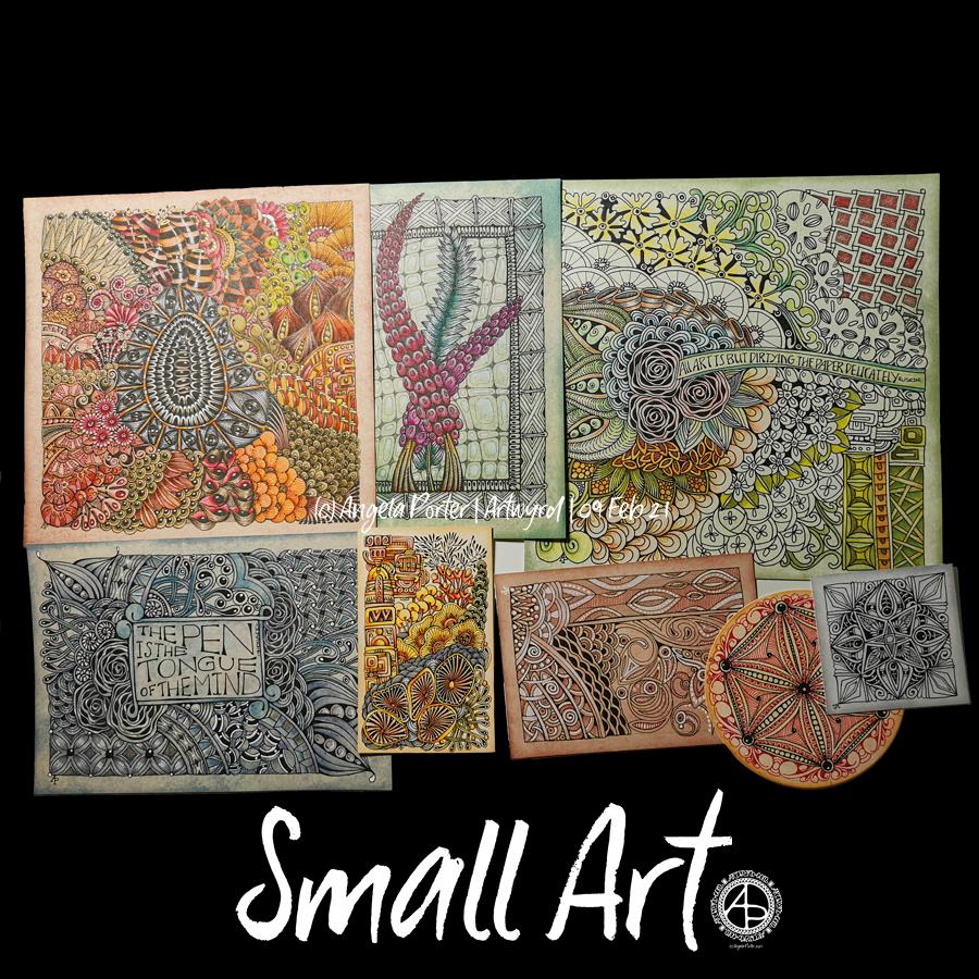
More small pieces of artwork today. These are perfect for when I’m feeling overwhelmed by a large sheet of paper. Also, they are sources of ideas for patterns and motifs for future work. I do need to spend some time with all this art and add some of the newer motifs and patterns to my visual dictionary/zibladone. Or, just stick them all into a sketchbook. At least then I’d know where they are!
It’s snowing outside. It’s cold outside, and warming up inside as I put the heating on a couple of hours ago. I think I may curl up in bed today with Din Djarin and Grogu. I still have three episodes of Season 2 to watch, and that sounds like a good plan to me!
I’ve enjoyed doing these! The squares are 3.25″ x 3.25, 3.5″ x 3.5″ or 4″ x 4″ in size. The circles are almost 3.5″ in diameter.
The tiles were cut from a variety of papers – watercolour, bristol vellum and heavyweight smooth cartridge paper. I used Distress Inks to colour the paper tiles before drawing on them.
I’ve used Sakura Pigma Micron pens (05 and 01), along with some brown and one blue-green Stabilio fineliner pens.
I like them all, But my favourites are the ones that are much more geometric in nature – my initials and the A in particular. My least favourite is the E; the background to the letter just feels disjointed. I think that’s why I like the more symmetrical, geometrical designs more.
I’ve enjoyed using one or two tones of colour to add variety, interest and ‘dimension’ to the tiles. I’ve not added any shadow or highlight to these. That’s when things tend to go wrong for me as far as traditional media is concerned!
It also occurred to me that if I were to draw these on a different shaped paper, I could add dangle designs to them. (My book “A Dangle A Day” is still available). Maybe I’ll try that out in a while. Of course, I’d like to get a full set of monograms done too.
I had a wee bit of trouble doing this week’s template for the Angela Porter’s Coloring Book Fans facebook group. This is either the third or fourth I drew, and the only one I think is just about good enough. I think that’s a reflection of the stress-comedown I’m experiencing after a week of trying to make a decision, which is actually more like months. I finally did it, and now I have to find that sense of inner balance and peace again.
Anyway. I drew this design on Bristol board with a 05 Sakura Pigma Micron pen. The colours have been added digitally. And after my messing around with Chameleon markers yesterday, I really enjoyed adding colour digitally.
I think it may be more or less time for me to abandon traditional coloring media! I always get so frustrated in using them very quickly.
Pen and paper is still something I love to use for drawing, so that’s not going to change!
I was potching around last night with how to add colour to a drawing with traditional media. You’d think I’d’ve learned not to do this by now, wouldn’t you? I was getting nowhere except to the land of frustration and feeling useless.
This morning, as I tried wrangling still further, I thought to myself, “let’s break out the Chameleon markers”. I did, and I also dug out some marker paper and started to draw. And I was happy with the design.
And then I started to add colour … and that’s where it all went to pot.
Oh the colours are lovely, individually. Just not when put together.
I’d also forgotten how much I like to use Chameleon markers. However, I really need to stick to monochrome! And, I think the Chameleons will work well in a monochrome manner. But not just yet. First I need a nap.
Lack of sleep was the usual overly hot at night stuff and also the early morning Wednesday wake-up for my Abel & Cole groceries delivery. What energy I had has now gone. I’m starting to go cross-eyed with tiredness, so I think I’ll need to nap very, very soon.
Here’s just some of the smaller pieces of art I’ve done over the past week or so. They’re all entangled, zentangle, zentangle inspired. The biggest is 9″x9″, the smallest around 3.5″x3.5″ in size.
All have been fun to created, but I’m really not sure about colour choices, the backgrounds colours of the papers I used and so on.
I have yet more in the pile created over the past two or three weeks! They’ve been comforting to do, even if I’ve doubted myself with them and what I was doing. That’s often the case when my emotions are all over the place, as they still are to some extent.
All I know is that though it is bitterly cold outside, the sun is shining and I really do need to go for a walk, take in some fresh air, and blow some cobwebs from my mind. Well, that’s my plan. It may change once I’ve showered and so on!
What a couple of days, weeks, months it’s been while I wrangled with a difficult decision I needed to make. Actually, it wasn’t making the decision, it was acting on it by overcoming the uncomfortable feelings of guilt and giving up that were the hardest things to do. But yesterday, I acted. Decisively for me.
A weight was lifted off my shoulders, but there was also the stress-comedown ‘hangover’ of extreme fatigue, spaced-outness, but no headache (thankgoodness!).
I’m still tired today, but that’s to be expected as the stress has been growing and growing. I think that’s been reflected in my dark, dingy, incohesive art of late.
So, when I woke this morning, I really wanted to create a mandala. And this is a mandala that is so different for me. But perhaps it represents what is happening inside me. Carl Jung believed mandalas, when created intuitively, reveal what is going on in our subconscious mind, things we’re not yet aware of, changes that are occuring, emotions we’re suppressing or ignoring.
It has been an enjoyable way to spend a couple of hours this morning. It’s just the art I needed to do after days, a couple of weeks even, pottering around with pen on paper doing zentangle-style drawings. Comfort art in the extreme.
Mandalas are comfort art for me, they do soothe my soul, but sometimes I do ones that break the ‘comfort’ mould a bit. This may be one of them. I’m fairly happy with it for sure, especially using a limited colour palette.
Waking at stupid o’clock meant drawing until I could go back to sleep. I got all the inking done for this particular drawing. Now, the colouring needs to be completed.
Materials: 21cm x 21 cm (8.25″ x 8.25″) piece of Claire Fontaine Paint-on mixed media paper – natural colour Aged Mahogany Distress Ink and a piece of cut and dry foam to distress/grungify the paper 03 and brush Uniball Unipin fineliner pens 01 Sakura Pigma Micron pen Staedtler Triplus fineliners Chameleon fineliners Water brush White Sakura Gelly Roll pen