Kintsugi art therapy

My artistic method today

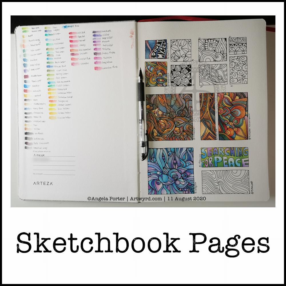
I do apologise for the poor photos. These were the best of many that I took of my arty pursuits this morning. I’m not sure if I’m finished with it or not.

This was an unusual excursion into the realms of art for me. I was feeling totally emotionally overwhelmed – scared, anxious, sad and confused.

So, I thought I’d try to express my emotions artistically, with watercolours.

I used masking tape to edge an area approx. 6″ x 2.75″ (15.5 cm x 7cm) in my Arteza Watercolor Sketchbook. I used a new page for this, and it was the smooth side of the paper.

Next, I applied a wet wash of indigo watercolour, and then dropped in greys and rusty oranges, reds and browns into it.

The paper warped with the quantity of water. No biggie though, as this is a sketchbook. Once I’d finished adding colour and letting the watercolour do it’s magic, I used a heat tool to dry the paper. When I removed the masking tape, which was low tack, it lifted some of the paper with it, which was a bit of a disappointment. However, it is a sketchbook, so no biggie.

I then wanted to add some gold patterns and lines. I dug out a Cosmic Shimmer iridescent/metallic watercolour palette and a size 1 brush.

Finally, I thought I’d add some details in black pen (Uniball Signo DX 0.38), but I’m not sure about them at the moment.

Reflections

My emotions were, and still are to a degree, all over the place. I tried to meditate to find some peace and calm; my mind was just racing faster and faster and I just couldn’t sit with the emotions.

So, I decided to try to paint my feelings, to put into colour and pattern what I couldn’t put in words, or make sense of. I thought I’d try a totally intuitive block of colour where I asked my feelings what colour they wanted to use, where to put it and when it was done.

I chose dark, gloomy inky indigo for the background, and rusty yellows and browns. Indigo for both the sadness and upset I was feeling, but also the deep calm I was seeking. The rusty colours perhaps represent the blood, sweat and tears I’ve been expending for a while now. Or maybe the stains on my soul and emotions that have resulted in my struggle today. Either way, the colours just seemed the right ones to use.

There’s also a lot of depth in the way the colours sit on the paper.

Oddly, this is a colour palette I’ve been using for a while now, but never quite so dark. Perhaps my unconscious has been trying to tell me what was likely to come if I didn’t take care of myself.

Once I’d got the block of colour done, I knew I needed to add lines and patterns of gold, a kind of artistic kintsugi. I hoped that the gold would help to heal the shattered pieces of my emotions and mind in the way gold infused resin is used to repair much loved pieces of porcelain. I hoped that the gold would remind me that my healed trauma-wounds that have been filled with gold would remain healed and I could be reassured that I wasn’t going to break.

I won’t, but I could feel myself unravelling.

For some reason, once I’d calmed a little, I felt the need to put the pattern of black at the bottom. Piles of tiny little stones. What springs to mind is they represent the touchstones that are the foundation of my emotional wellbeing. There’s quite a few of them there! That surprises me, as my usual one is the one of contentment, a gentle smile in my heart. I may have to explore what these other touchstones are at some point.

As I look at the panel now, I can see there are lighter areas, where a storm seems to be breaking. Light is shining through, clarity perhaps. The photo doesn’t show the colours at all well. I really do need to learn how to use the camera on my phone or my DSLR much better I think.

A successful experiment

I know art always is a source of peace and calm for me. What surprised me was that I felt I was expressing my feelings in this little, very personal artwork.

I’ve never really used art as a way to work through difficult (or not so difficult) emotions before. I think it’s something I’ll be doing again in the future.

Hand-drawn typographic quote

Today, I’ve been practising my hand-drawn typography (hand lettering). I seem to have Aneurin Bevan on the brain at the moment, probably because I’m working on a typographic portrait of him. So, I chose a quote by him.

To create this, I started off with squared paper, a ruler and a pencil. I marked out an area that was 24 cm x 12 cm. Before doing any lettering, I drew in some wavy guidelines. Then, I added the lettering. It took three attempts before I ended up with a design I was happy with.

Next, I scanned the sketch into Autodesk Sketchbook Pro and re-drew and inked in the letters.

Black on white was very stark, very graphic. However, I had a hankering for some colour. So, I chose reds. I used some digital wizardry to invert the black letters and white background. I created the coloured and textures background, and then used some layer options to get the effect I wanted.

Final steps were to ad my little copyright notice and watermark. As well as resizing the image for social media.

Taking a break

It’s always nice to have a change of pace and intensity in art work. I spent a couple of hours this morning getting my mind around how I could change the shape of letters to give a feeling of volume to a portrait. The fist in my portrait of Aneurin Bevan was looking a tad too flat.

I didn’t want to do any more work on the portrait today, wanting to give myself a break from the changes I’ve made so I can go back to it with fresh eyes and fresh mind.

Thoughts ticking around my mind

I do have an idea for creating a more abstract kind of typographic art from quotes and descriptive words now I’ve completed this mini typographic art quote. Not today, though I will note my idea down in my journal.

I often wake up in the morning, with ideas for art projects, as well as suggestions for solutions of problems I’m having with a current artwork, such as the flatness of Nye’s fist in his portrait.

It seems my subconscious mind works on these issues while I rest and sleep.

Perseverence

I really am persevering with the typographic portrait. That’s a surprise to me. Not all that long ago, I would’ve easily given up on it and decided that it wasn’t for me.

But not this time.

This time, I’m sticking with it, as well as the use of typography in my other styles of art.

This one isn’t coming as easily to me as other forms of art have, but it’s one that I seem to want to really succeed at.

What is making the difference is being able to work digitally. That makes editing, altering, trying things out a breeze. I don’t have to completely start all over again, I can keep what I like, and then rework what I don’t like. I can even keep what I don’t like in case it turns out that it is actually what I do like!

Remembering to work in layers really does help this process. That’s something I don’t always remember to do. However, I will get there. Just not today.

Template Thursday

It’s that time of the week once again – Template Thursday!

Each week during the pandemic, I’ve created a colouring template for members of the Angela Porter’s Coloring Book Fans facebook group.

This week, I’ve harked back to my Doodleworlds book with cute monsters and critters. I’ve included some family portraits which hang above a background of more monsters and critters and my signature entangled style drawing for coloring books.

I got lost in colouring this template this morning. It was fun to use different styles of digital brushes and colour combinations in this one. Sometimes it’s just nice to do art with no expectations other than enjoyment, relaxation and comfort.

I drew the template with a Pentel 07 Energel pen on Rhodia dot grid paper. I scanned it in to the Surface Studio and cleaned the image up digitally. Then, I partially coloured it digitally in Autodesk Sketchbook Pro, adding a background texture that isn’t present in the downloadable image.

Lightning storm

Last night, there was the most amazing lightning storm I think I’ve ever seen. It lasted for more than an hour and there were multiple flashes of lighting most minutes. I really need to learn how to use my camera to take photos of lightning – natures very own fireworks.

Sadly, I haven’t been able to see the Perseid meteor shower this year, and I missed the Neowise comet too. I have seen amazing photos of both, though, and of course the lightning storms of the past few days that have coruscated over the UK.

Heatwave

It’s a little cooler in the house today thanks to the clouds shrouding the sun. It’s humid though as the couple of brief showers last night have been evaporating slowly.

The heat meant I didn’t sleep well again last night. But, waking early meant I had plenty of time to edit the coloring template and add colour to a section of it.

I’m not sure if it’s cool enough to take a walk this afternoon. There seems to be a bit of a breeze picking up from time to time. I really don’t do well in the heat; I wilt very quickly. But I’ll see once I shower what it’s like outside.

Sketchbook Pages

Today, I share a glimpse into my current sketchbook. It’s an Arteza watercolour A4 sketchbook.

I’ve completed all the drawings in boxes now, and am adding colour to them using watercolours, graphitint watercolours, graphitint pencils and/or inktense pencils.

The paper is rather nice to draw on with Faber-Castell Pitt artist pens or a Uniball Signo DX 0.38 pen.

On the cover page I swatched my collection of Inktense pencils, using a damp brush to bring their true colours out.

Inktense pencils are intense in colour when activated with water. Also, once activated with water and dry they are permanent.

I like all the media I’ve used so far on this page. Which I use does depend on my mood. Today, I wanted to choose an inktense palette of colours that is like the rusty colours I’ve been using with watercolours.

I really am drawn to this colour palette in my work at the moment. The dark blues, rich red-browns, blue-greys, earthy-dark greens and the vibrant mustards. One day I’ll look up the psychology of these colours and see how they relate to my mood/life at this time. But not today.

Today, I need to focus on adding colour to some templates for the Entangled Gardens colouring book that will be released early next year.

Hello August!

The calendar page turns over and we’re into a new month.

August always heralds the end of summer and start of autumn, my favourite season. It is the last full month of summer here in the Valleys of South Wales. The evenings come noticeably earlier, always a sign that the year is continuing on its endless cycle of seasons.

We have a grey, damp and blustery start to the first day of the month. There are shafts of sunlight finding their way through gaps in the clouds, but there’s a deliciously refreshing snap to the cool and fresh air after the night-time rain.

I thought I’d create a really simple mandala design for the start of this month, one that is full of warm colours, but that hint of autumnal tones in the background.

I kept things simply stylised in the design. If nothing else, working on it made me smile, inwardly as well as on my lips.

I woke early-ish today and did some work on one of the typographic portraits I’ve been doing. Then, in my rush to get to the shower, I clicked the wrong button and lost my work. Thankfully, it’ll be easy enough to do it again. I also think that with the version I’m working on, I’m finding my way with the process. I have a lot of the portrait left to do, but I feel less frustrated with it and have a clearer idea of what I’d like to achieve now I’ve taken a few days break from this kind of work.

Before I settle back to the typography, I am going to take a walk in the fresh air of the morning. Well, after I’ve done my social media posts!

Template Thursday

It’s Thursday again, so that means it’s time for a new coloring template for the members of the Angela Porter’s Coloring Book Fans facebook group. I said that during the pandemic, I’d create a template a week for group, free of charge, to help people relax, calm and take their mind off all the awful things that are happening in the world for a short time.

This week, I’ve combined some typography my familiar entangled style of drawing. Botanicals, crystals and stars along with some repeated ‘zentangle’ style patterns. Some of my favourite things to draw.

To draw this template, I used Faber-Castell Pitt Artist pens (F and S), Copic Fineliner SP pens (05 and 025) and a Uniball Signo DX 0.38 pen with Rhodia dot grid paper.

Although lockdown has largely lifted in the UK, we still need to practice social distancing and wear face coverings when it’s not possible to do that, or in enclosed spaces. The Covid-19 virus has not gone away, and though the number of cases are falling, as are deaths, that’s due to people being sensible and following the guidelines for limiting the spread of the virus.

I’m very, very anxious about going out and about, and I know I am far from the only one. I mostly stay safe at home. Mind you, that’s not unusual for me. Even before the pandemic I wasn’t someone who was out and about all the time. I did pop out and about more often than I realised, however. But I’m still usually quite happy to stay at home and focus on my arty, creative activities. But, I know that’s not the case for everyone, and not everyone is able to work from home either, nor wants to.

Wednesday Wisdom

This was a perfect, small and quick project to do this morning as I was waiting for my weekly delivery from Able & Cole.

Some practice of hand-lettering /hand-drawn typography practice, starting with roughing the design out in pencil on dot grid paper. Then, inking it in digitally in Autodesk Sketchbook Pro.

The addition of a rainbow background was the perfect way to bring a smile to my face this morning. When don’t rainbow colours cheer a person up? The bold, black letters on top of it really make the colours glow bright.

The quote is a perfect bit of wisdom for Wednesday, not that it’s a bad day for me at all. Apart from me suffering from a lack of sleep once again. The morning sunshine has lifted my mood, and the cool air flowing in through the open window is both beautifully fresh and wonderfully refreshing. I have bright and happy music on as I work, just to add to the upbeat start to the day.

Hand-drawn typography practice

This morning, I decided to leave portraits alone for a little while. I woke with the idea of using typography to fill some typography!

So, I drew the outlines of ‘Nye’, for Aneurin Bevan. I then used wavy lines to split the outlines into interesting sections. Then, I pencilled in some quotes by Aneurin Bevan. This let me adjust size/ spacing so that the quotes fit and made sense. In some places I’ve stretched the letters as there wasn’t enough space for the next word. I could’ve made all the letters in the line wider, but thought the wider letters would add some interest and flow. Of course, I now realise I could’ve stretched some letters at the start of the lines too, but I can always do that as I ink in the lettering.

Anyway, my next step was to scan the sketch into Autodesk Sketchbook Pro so I could do the inking digitally, and you can see what I’ve done so far. I do need to adjust some letters, like the B at the start of the line I’ve started to ink. I will also need to go back and clean up some of the edges of letters.

It’s a nice project for me to do today. I didn’t sleep at all well last night; I was up and down to the loo. I had a sudden attack of anxiety yesterday, a really intense one. The pilot light on my boiler had gone out and I couldn’t light it, so I had to arrange for a breakdown visit. There was the stress of ‘what if they can’t fix it’ as well as a stranger in my home for the first time since most probably February.

Panic mode! And it didn’t abate all day, no matter what I tried to do. This kind of anxiety/stress always hits me in my digestive system, so it was an unpleasant night for me.

All needless of course. The gas engineer arrived this morning and he lit the pilot light first go. And it’s stayed lit. I felt like a right numpty. However, all is well, as I have now booked it for a service too.

I’m still feeling on edge, as well as really tired. So, working on a portrait wouldn’t be the best idea for me as at the moment they are frustrating and overwhelming me.

So, I thought I’d go for some hand-lettering or hand-drawn typography practice. Just practice. No pressure. However, the idea I had may turn out to be a fairly good one. Maybe.

Typographic Portraits WIP

I’ve been working on another portrait of Nye Bevan while I take a break from the first one. I really think I’ve gone over the top with detail in this one. I wanted to do one of him in one of his typical oration-giving stances, but I really do feel I’m messing it all up. I really think that’s because I am trying to get too much in the way of quotes into the portrait.

So, I’ll be going back to the drawing board (or in my case, the Surface Studio screen) to try this one again.

Having said that, I’ve had a lot of hand lettering /hand drawn typography practice and have played around with the brush settings to find one that will work for me!

I also have just noticed that there’s not much differentiation between the different weights of text in the second version, and that adds, I think, to the more confusing appearance of it.

I was struggling with the values of the gesturing fist in the second image. So, I put the photo into Affinity Photo and used the Posterise tool to simplify the areas of shade for me. There’s still a personal interpretation to be done on how I translate these areas into spaces of text.

Hands, feet and faces. These were always the parts of humans I struggled with when doing life drawing.

Drawing typographic portraits is a new endeavour for me. I’m learning, experimenting. One of the main lessons I have to take away today is to not over complicate such a portrait! But there is a fine balance betwixt having enough detail to capture the essence of the person, and having too much so that the essence of who they are is lost.

The first portrait I did, on the left, does look better, but I do think it lacks a bit of detail in the face.

The second one, on the right, is way too busy!

So, my task is to find that point where less really is more.

So, I’ll take a break from them, again, and regroup and try once more!

Watercolour Practice

Yesterday, after taking a walk and getting a few bits and bobs done, I settled down to spend some time with watercolours.

Each piece of paper is approx 4″ square. The top ones were just playing around with foliage, wet into wet, and adding some details with metallic ink, a gold glitter gel pen and a white Souffle pen. I just wanted to see how the different details could add to, or mess up, the watercolours.

I do like the one on the top left. It satisfies my inner need to not leave much in the way of white space.

The bottom image was me trying out painting plants in pots – the top row with very faint pencil guidelines and the middle with Pitt Artist pen outlines in black. The bottom two were comparing like ot like with black outline and pencil outline.

I had trouble with the details in the first two plants in pots on the top row. That was when I thought I’d try the black outlines.

I’m really not sure which I like most, or if either of them really work out.

I’m rather tired and headachy, again, today. I think that I’ll soon be going out for a walk. It’s another overcast and cooler day with a breeze. I love to walk on days like this.