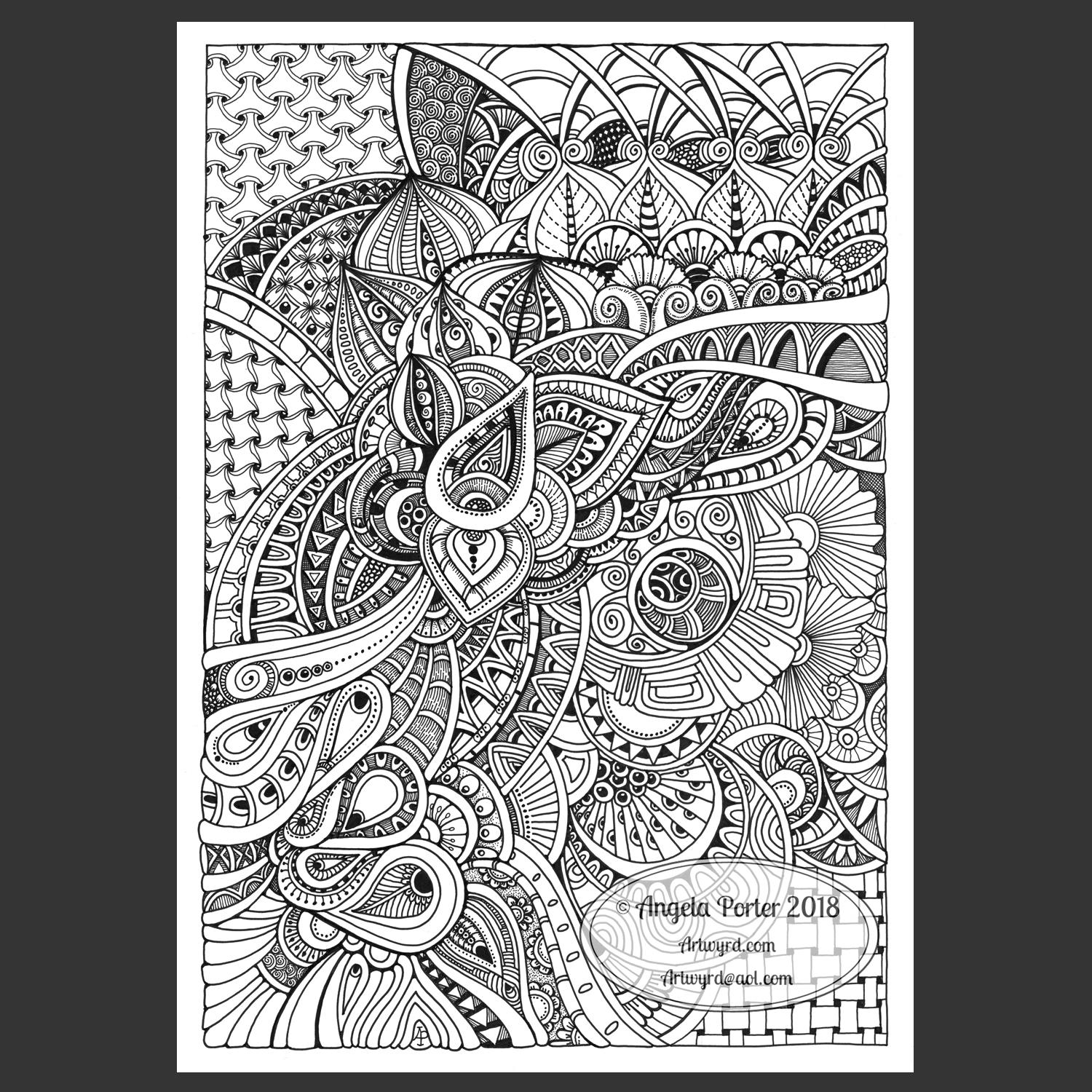
Yesterday, I just felt the need to do a bit of an entangled drawing. So, I started with the lower case b and added designs around it.
Not at all sure this works. The letter just looks ‘plonked’ on top of the design rather than part of it.
I do like the entangled stuff though.
Always something to learn – that’s my piece of Wednesday Wisdom. If you don’t try something, you never know if you can either do it or if it’ll work out. This one isn’t one of my better lettering adventures, but, I can reflect on what I like and what I don’t like and then try again another time.
I’m not at all sure I can ‘fix’ this one, but I can try again.
For this one I used Daler Rowney Bristol Board along with 08 Unipin Uniball and 04 Sakura Pigma Sensei pens.
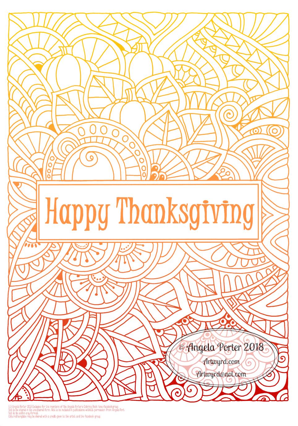
I’d like to wish all my American friends, and all others too, a very happy Thanksgiving celebration today.
I’ve made the black and white template an exclusive ‘freebie’ for members of the Angela Porter’s Coloring Book Fans facebook group. So, if you’d like to download and colour it, please wander over there. You’d be made very welcome indeed.
This template was had drawn using a Uniball Unipin pen on white paper.
I think all the line work is done on this design. I say ‘think’ because I’ll leave it to one side for a little while and come back to it with fresh eyes later on today to decide if I need to add details anywhere.
I also need to decide whether I just add shading/shadow in greys or whether I colour the design, or create a coloured background, or re-colour the lines, or any combination of these possibilities!
Shadows really help with increasing the sense of dimensionality of the design, as can colour. That’s the one thing I do like to do with my art once I’ve drawn it -create dimensionality, especially if I can manage to make it look like different elements are not just layered but are on different planes.
I have other decisions to make too. Whether to add shadow/colour digitally or whether to do this with traditional media. I do tend to favour digital colouring because of the wide range of colours and vibrancies available, and also it’s easy on my achy joints. The same applies to markers such as Chameleons or Copics; they require a lot less pressure than pencils and the wider barrels make it easy for me to grip them when my joints hurt, as they are today with the colder weather.
So, I need to have a bit of a break and come back to this image with a clearer idea of what to do. I also need some breakfast – it’s getting on for 11am here in the UK and I got so engrossed in completing the artwork after showering that I’ve not had tea or any thing to eat yet. That could help me with making those decisions about this drawing.
It’s WIPWednesday over on the Angela Porter’s Coloring Book Fans facebook group today. #wipwednesday
It’s also #wednesdaywisdom or #wisdomwednesday, so my wisdom for the day is if you’re not sure what to do with a drawing, colouring or anything else, just take a break from it and come back with fresh eyes and a fresh mind.
Do this especially if you think it’s not working out for you. Come back to it and push through that doubt. There’s always a point part-way through any art I create where I think what I’ve done is awful and I just want to destroy it and throw it away, but I’ve learned to either push through those doubts or to take a break and come back to it later with the intention of completing it.
Even if you don’t like the end result, learn from the process and work out what hasn’t worked for you. Focus on which parts you like and why you like them.
Even then, don’t throw it away or destroy it. Leave it aside for days or weeks and then come back to it. Your mood will have changed. You’ll really have fresh eyes and you’ll notice different things about it. It may be that the bits you didn’t like are actually the ones you now really, really like.
Make use of those bits in future work. I think that’s how we learn and grow as creatives. if we’re outside what we usually do or make choices of colour or pattern or shape etc that we’d not usually do we’re usually uncomfortable with that change. Once we’ve taken a break from that uncomfortable feeling and are able to look back on the artwork we can appreciate it far more.
Even if we still end up disliking it, we can learn from that as to what is ‘right’ for us and what doesn’t work for us and use those lessons in future works.
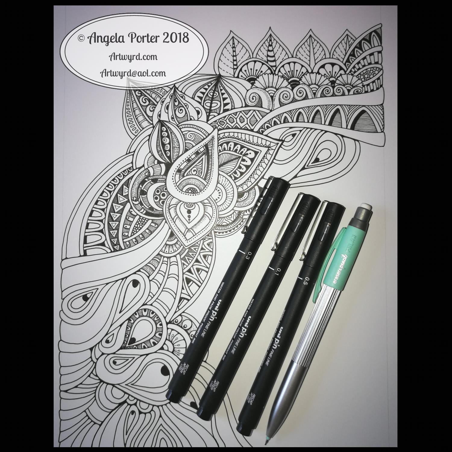
Today I thought you’d like to see my current work in progress, including the tools I’m using for it – Unipin Pens from Uniball and a mechanical pencil.
The pencil was only used for drawing the margins delineating the space within which I’m working. This helps stop me run off the page as well as keeping my mind’s desire for straight-ish edges happy.
This has already taken some hours to complete; I’m not sure how many as I don’t really keep track of my time. I know that I may get it finished at some point this evening (I’m writing this mid-morning UK time) if I manage to get all my errands and other tasks done in a timely fashion.
My process is quite simple really. I start with a motif somewhere on the page, a simple outline shape. I then add detail to this shape. I then let shapes flow out from this point, first drawing the foundation lines, then adding the detail.
Finally, I’ll decide if I’m going to add shadows/shading and with what medium I’ll do that. Sometimes I may decide to colour the image, or digitally alter the colours of the lines or background.
If I decided to draw digitally, my steps are the same, though I may start with a sketch on paper of the main lines in the design so I can make sure I have some reference to the actual scale of the design.
Oh, and I rarely draw in pencil first when I work directly on paper. The only times I do is when I may use circle stencils or french curves to add a large curve/shape. Mostly, it’s pen without any pencil guides.
I work very intuitively; I just let the lines and patterns flow in a way that is pleasing to my eye and mind at the time I draw designs such as these.
I drew this triangular design a couple of days ago and I knew I wanted to add some words around it, but I just didn’t know what I wanted to add.
Well, today was counselling/therapy day for me. A fair number of issues came up in the past week, connections/realisations being made, awareness of my negative self-talk, and awareness of me talking care of myself a little more than I have done.
So it seemed appropriate that I should add words related to today’s session :
Nurture myself
Believe and trust myself
Have compassion for myself
Maybe not the best worded, but relevant to myself.
I drew the design and hand-lettered the words with Uniball Unipin pens on white acid-free paper. Shading was added to the design with a soft drawing pencil and a paper tortillon.
Another abstract entangled drawing for today. The original art is black and white line art with grey shadows and shading. It’s been drawn on A4 acid-free paper. I used various sizes of OHTO Graphic liner pens for the line work and Chamaeleon Color Tones cool grey marker pens for the shading.
However, I’ve altered the colour from black and grey pen and ink to a gradient of blue, purple and magenta digitally, just as an experiment. I’m really surprised with how the grey shadows/shading has turned out – pleasantly surprised and really pleased.
A nice start to my Sunday, a day to be filled with art and completing the transfer of information into my new bullet journal.
I’ve worked on this image over the past three days or so. Adding the shading took a surprisingly large amount of time.
I really enjoyed creating this one. I say that about all my art though, but this one was particularly enjoyable as it helped me to calm and relax after the crazyily emotionally exhausting week I’d had.
It reminds me very much of work I used to do before I had so much work to do for colouring books, not that I’m complaining about that, not one bit. I love doing the drawings for them as much, but I can’t work in this kind of detail for them. I can’t put in all the fine line shading and shadow for them, nor the teeny-tiny details in the patterns as they’d be nigh on impossible to colour the gaps individually.
In my past couple of drawings like this, I haven’t added any shadow to them in the way I have in this particular design. The shadow really helps with that sense of ‘dimension’, though I do think I could have added some deeper shadows in some places.
Though it reminds me of the kind of drawings i used to do a lot pre-coloring books, it’s also shows a change in perhaps sophistication of line but also in the variety of patterns and design elements I like to include in my designs. I’ve even left some ares not heavily patterned so they give the eye spaces to rest without being overwhelmed with pattern and design.
Now to the nitty gritty of how I drew this.
After yesterdays discussion about digital vs traditional art I’d like to say I did this digitally, but I didn’t. I used Unipin Uniball and Sakura Pigma Micron pens on an A4 sheet of Bristol Board from Daler-Rowney. Pencil lines were sometimes used, especially for the circles, which I used stencils to draw them in lightly before inking them in free-hand. I’ve noticed I’ve not erased the pencil lines before scanning the artwork in.
To add the shading I used Chameleon Color Tones and Color Tops in shades of cool grey and neutral grey.
Today, I plan to do some more drawing similar to this before my new bullet journal arrives to replace the one I wrecked by spilling mocha over it and my lovely flowery bag. Thankfully, the notes I need to keep from the media training and events this week are still readable so I can transfer them across, as well as edit them in the process.
Just a quick post today; I have a busy day with media training for Time to Change Wales at the Mind offices in Cardiff.
Feeling a bit panicked about parking somewhere I’m not familiar with and then walking to another place I’m not familiar with and doing something with people I don’t know.
It will be fine I’m sure.
Yesterday was very much a day of being kind to myself and taking care of myself. Therapy on Monday really caused some fall out and I was emotionally exhausted yesterday (and I think that is lingering today).
So, one way I take care of myself is to draw. This time, however, I lost myself in drawing detailed, abstract entangled art, like this one above. I do have another on the go which I’ll be hoping to complete tonight as part of my self-care after the training today.
I drew this using Sakura micron pens on dotgrid paper. After scanning into the ‘puter I used GiMP to remove the dot grid. Autodesk Sketchbook Pro was used for the finals steps of adding the background and watermarks, as well as placing the artwork on a black square so the image fits nicely in Instagram posts.
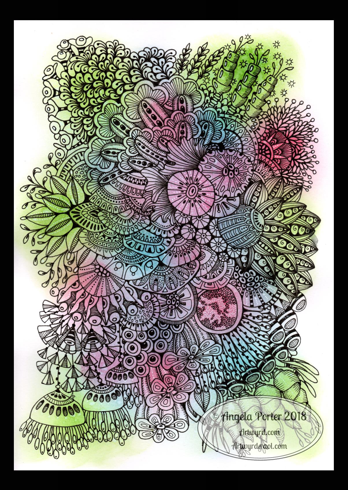
Started yesterday, finished this morning. Another intricate, abstract botanical
I coloured the paper first and worked with the patterns made, mostly. Intuitive drawing with detail and intricacy and black lines is my favourite to do. Botanical things, abstract motifs, from my imagination are also some of my favourite things to draw.
My colour choices are a bit different for me, the way I blended the colours resulted in some unusual, subdued, almost grungy tones. I think I like it.