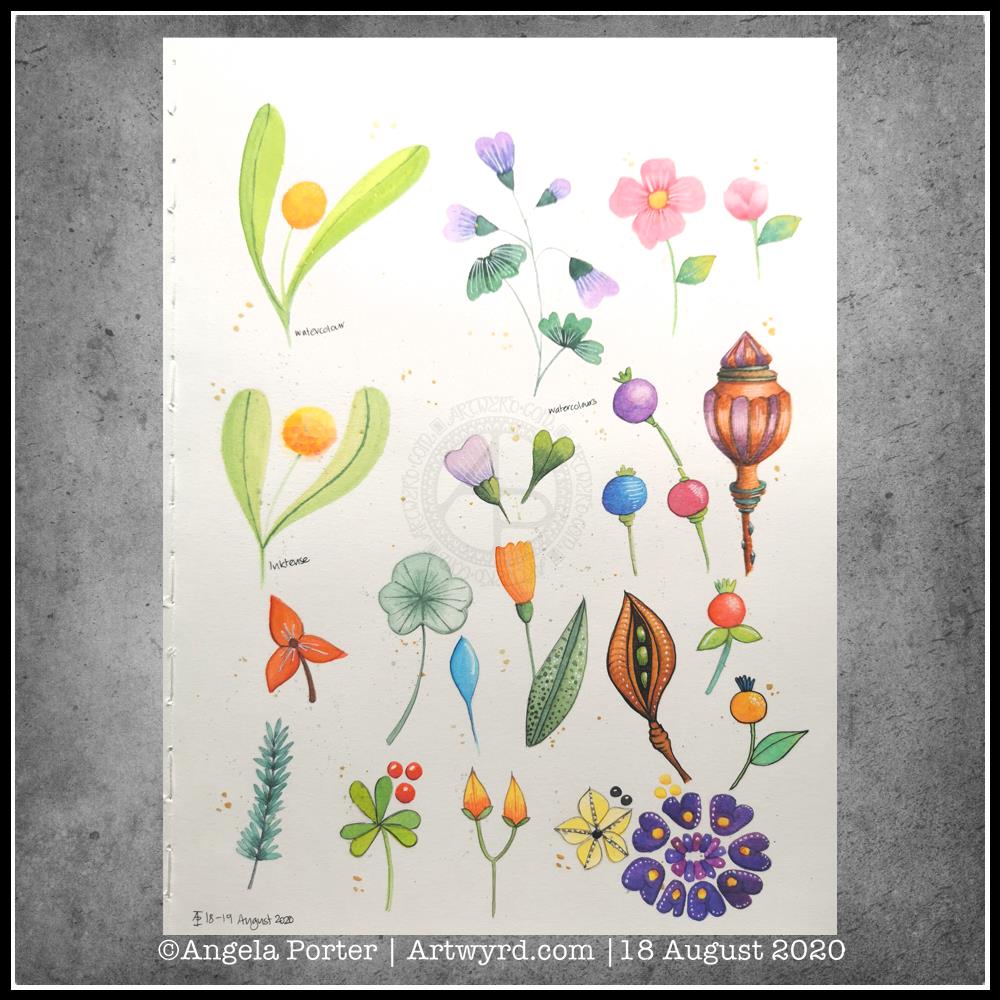
Working with the ‘aha moment’

Sketchbook page

After a walk and lunch yesterday, I eventually settled to working with my aha moment. This sketchbook page is the result, though I have work left to do with it.

The designs are inked in with Pitt Artist Pens and I’ve used watercolours and Inktense paint pans and pencils to colour the motifs. Well, most of them. I’ve left some parts in black and white to show the difference that colour makes.

I used a Daler-Rowney artist’s sketchbook. The paper is acid free, but is not specifically for watercolours. It held up surprisingly well to multiple layers and glazes of colour, though it does grab the colour and it’s difficult to move it around as on watercolour paper.

I also found the wet brush lifted some of the pigment from the Pitt Artist Pens. That surprised me as they were totally waterproof on watercolour paper.

Reflections

Having an ‘aha moment’ and working with that realisation can be quite different. It’s nice to try different ways of using line and stippling to add shadow and volume to the drawings.

The half-beetle was an interesting one to work with. On the lower wing I could’ve used lines to add the illusion of curves, but for some sections I just used colour. I also used the beetle to practice adding lines and stippling.

I tried drawing the beetle digitally, but it just didn’t feel ‘right’. I didn’t get the same satisfaction as I did drawing it with pens on paper. I’m sure that’s due to me having my brushes set up incorrectly. That’s something I’m going to have to work on. I ended up with a drawing that was too perfect. That surprised me too, as I love to work digitally. Perhaps that was a function of my current mood and energy levels.

I do tend to switch between digital and traditional media, sometimes mixing the two. That is certainly an option moving forward – drawing the line art on paper, then colouring digitally.

I do like the earthy tones I’ve used to add colour to many of the design elements on this page. That still continues to surprise me, as much of my work has been brightly coloured, often with ‘in your face’ colour palettes used.

The smaller designs I’ve drawn here also have their own sense of satisfaction and enjoyment for me. Usually, I draw full page designs for colouring books. But here, I’ve drawn small compositions, and that is not so overwhelming for me at this time.

The ‘Aha!’ moment

Finding inspiration

Yesterday evening, I found a little oompf to play with colour in my watercolour sketchbook. The little blocks of colour on the right hand side are the result.

I dropped wet into wet, both watercolours and metallic watercolours, and just let the watercolour do their thing. I also tried similar with Inktense ‘watercolours’ too.

Just doing something simple like this, playing with colour for the sake of playing with colour, led me to want to try something different.

I had got frustrated and not all that happy with the designs on the left page over the past couple of days. Browsing through Pinterest, my attention was caught by illustrations that use black line drawings with a wash of colour. So, I thought I’d try those out.

I also wanted to try different pens to see how waterproof they are on watercolour paper. Unipin pens in grey and black, Pitt artist pens and a Signo DX pen were what I had to hand.

I used the pens to draw some of my favourite kinds of motifs, but rather than leaving just the outline, I used the pens to add shadow and the illusion of shape to the motifs. Once I was happy, I added watercolours. I did go back and add more lines where needed once the watercolours had dried. I also used a white gel pen to add highlights.

Reflections

Firstly, all of the pens were waterproof. The grey Unipin pen did bleed more as I was drawing with it initially than the others, which showed little bleeding at all. Anyway, I’m happy that I now know for sure they are waterproof.

I have used colours that are different for me. They have more of a vintage vibe to them. I actually like the colours, a lot.

Still developing my artistic voice(s)

I keep trying to move away from black line drawings with colour, to paintings made solely of colour. Each time I do this, I’m never really happy with what I produce, it never seems to feel it is ‘me’. I love to see how others use just pure colour to create art, it just never seems to work out quite right for me, not unless I work digitally. Even then, the digital artworks make me smile, but they still don’t feel right.

I like to draw colouring templates that help others express their creativity and to use for relaxing, meditative, calming activities. These are lovely in their own right and for the purpose they’ve been created for. However, they lack the details that I find satisfying.

That ‘Aha!’ moment

And there it is, I’ve worked out why things don’t feel ‘right’. Detailed line work. Using line and pattern to create shadow and volume in a drawing. There’s also a need for me to use line to define and structure artwork.

That was something I always used to love to do in my earlier artsy years, and something that has gone by the wayside as I’ve used my skills at stylising motifs for my work as a colouring book artist/illustrator.

Those skills will never be lost and will always be used. However, I have a need to find ways to express myself in ways that satisfy my artsy heart, and this revelation is one answer to that.

It’s obvious when I look back at my blog, that I’m constantly trying out new things, going back to old things.

Sometimes I return to old crafts and styles I’ve tried in the past as they are familiar to me and that familiarity comforts me when I need time to just create and feel some level of satisfaction in what I do. Comfort art I’ve described this in past, and it’s just as true for me now as then. There are times when I’m not up to challenging myself as I try or develop a new style to me. Then, I go to art and craft styles that I know I can do fairly easily.

At other times, I’m seeking for the new, different and to stretch myself artistically. Out of a lack of inspiration over the past day or so has come a style that will stretch me, and perhaps will sit easily with me so it becomes one of my ‘voices.

Oh, I’ve not abandoned my new-found passion for typographic portraits/art. In fact, my mind is ticking over how I can incorporate that along with this coloured detailed drawings. Before I try the idea, I need to get some drawings done! I’d like to try the idea out digitally to see if it will work. That way, any drawings I’m really pleased with won’t be messed up.

Template Thursday

Another week of the pandemic

How are you all doing and coping with the continuing pandemic and the public health restrictions in place?

Here in Wales, our Senedd (Welsh Parliament) has been slowly easing the restrictions, pausing after each one to see how it affects the rate of transmission before easing more restrictions.

I, like many others, don’t leave my home often. I did go out for a walk in the fresh, sunshiny and windy morning. It was so nice out and moving my body around. I am still very nervous of being around people, so I go to a big cemetery near me where I know I will encounter few people. It’s a very quiet, serene space too, and nature flourishes quite wonderfully there as well.

Template Thursday

Each Thursday marks another week of the continuing Covid19 crisis, and so I make a new freebie colouring template available in the Angela Porter’s Coloring Book Fans facebook group. There are some terms and conditions relating to the use of the template.

This week, I have a typically ‘entangled’ style of template for people to colour. As well as some cute winged stars, botanicals, arches, spirals, feathers, crystals and clouds, I’ve also included some hand drawn typography. Let me know what you think of using typography as a way of adding pattern to the arches.

If you download the template and colour it, don’t forget to tag me in your coloured version if you share it on social media! I always love to see how people colour my templates and bring them to life.

Above all else, take care of yourselves.

Watercolour Art Therapy

Art to calm and soothe

More art therapy was required yesterday and today. This time I messed around with watercolours and botanical motifs.

Some I like, some are hideous, but all resulted in me finding some calm amidst a maelstrom of emotional and mental pressures being exerted against me.

Although I’ve not yet tried to express my emotions via colour and pattern today, working with motifs from nature is soothing in it’s own way.

Perhaps there’s more of me expressing my needs in creating botanical art. I do feel the need to be out walking where there is nature. With Covid19 still doing the rounds, my places of choice are cemeteries; so few people visit them and I feel safe there in a way I don’t feel safe in nature when I’m by myself.

So, as it’s fairly overcast and there’s a good breeze, I’ll head out as soon as I’ve completed my social media stuff for the day.

Materials and method

I used mostly watercolours, but I did try out the Inktense paint palette I received yesterday for one motif. For some of the motifs I used a faint pencil outline. On others I darkened that outline once I’d painted the motif. And I tried black outlines using a Signo DX 0.38 pen on some others. I also used white Signo gel pens to add highlights. Finally, I splattered some gold watercolour over the page, and added some bigger dots of gold.

Oh, I worked on one of the smooth textured pages in my A4 Arteza watercolour journal.

Template Thursday

It’s that time of the week once again – Template Thursday!

Each week during the pandemic, I’ve created a colouring template for members of the Angela Porter’s Coloring Book Fans facebook group.

This week, I’ve harked back to my Doodleworlds book with cute monsters and critters. I’ve included some family portraits which hang above a background of more monsters and critters and my signature entangled style drawing for coloring books.

I got lost in colouring this template this morning. It was fun to use different styles of digital brushes and colour combinations in this one. Sometimes it’s just nice to do art with no expectations other than enjoyment, relaxation and comfort.

I drew the template with a Pentel 07 Energel pen on Rhodia dot grid paper. I scanned it in to the Surface Studio and cleaned the image up digitally. Then, I partially coloured it digitally in Autodesk Sketchbook Pro, adding a background texture that isn’t present in the downloadable image.

Lightning storm

Last night, there was the most amazing lightning storm I think I’ve ever seen. It lasted for more than an hour and there were multiple flashes of lighting most minutes. I really need to learn how to use my camera to take photos of lightning – natures very own fireworks.

Sadly, I haven’t been able to see the Perseid meteor shower this year, and I missed the Neowise comet too. I have seen amazing photos of both, though, and of course the lightning storms of the past few days that have coruscated over the UK.

Heatwave

It’s a little cooler in the house today thanks to the clouds shrouding the sun. It’s humid though as the couple of brief showers last night have been evaporating slowly.

The heat meant I didn’t sleep well again last night. But, waking early meant I had plenty of time to edit the coloring template and add colour to a section of it.

I’m not sure if it’s cool enough to take a walk this afternoon. There seems to be a bit of a breeze picking up from time to time. I really don’t do well in the heat; I wilt very quickly. But I’ll see once I shower what it’s like outside.

Monday Morning Mandala

I actually started this mandala yesterday morning, but I did most of the work on it this morning.

Black, white and craft paper, with some warm grey shading to help to bring out a sense of volume to areas of pattern.

The number five.

I chose, to start with, five-fold symmetry.

The number five symbolises balance and harmony. It also can represent freedom, independence, adventure, curiosity, intelligence, individualism, courage, and important life lessons to be learned from your experiences.

Five can also be symbolic of a problem, but there are solutions to the problem. As five also symbolises inner wisdom, the solution comes from our own inner wisdom. Once a solution is identified, then a plan of action needs to be developed through passion, emotions, ideas or work. Then it needs to be followed through.

Star symbolism

The central motif of the mandala is reminiscent of a five-pointed star.

Stars are symbols of guidance and are often considered protective symbols. They are also associated with wishes, mysteries and magic. Most often, they represent something that is good, beautiful or positive. They are symbols of hope, truth and spirit.

The colour brown

Brown is a natural colour that evokes a sense of strength, approachabilityapproachability and reliability. It is often associated with resilience, dependability, security and safety.

Feelings of loneliness, sadness and isolation can also arise with brown, especially when used in large amounts, like a vast, expansive rocky landscape or desert. But it also can bring to mind feelings of warmth, comfort and security as brown also represents a hearth, the heart of a home, and so it represents a deep connection to one’s home.

Of course, brown also represents connections with the earth and so nature. It is a wholesome colour.

Symbolism and my art

I’m finding looking into the symbolism of numbers, colours and motifs quite interesting. I don’t often think overly hard about the colours I use when I create art, especially my daily ‘warm up’ art practice.

However, it is interesting to look at the meanings of colours, motifs I choose and how they relate to what I am currently experiencing on a personal level.

Dragonfly Mandala

I woke this morning knowing I needed to draw a mandala and dragonflies. Sometimes I have no idea why, but this is what flowed from my pen.

Soft teals and lavenders colour the dragonflies and mandala. Calming, restful, meditative. The bodies of the dragonflies are ornate, but the wings are not so, which is unusual for me. Perhaps because I feel I’ve lost my ability to fly at this time, I’m doubting myself an awful lot.

Carl Jung used mandala drawing to help inform him, and his clients, about what was going on in the unconscious and needed to be brought into the conscious mind to be processed. The unconscious mind works through symbols and metaphors. So, what do dragonflies (four in number), teal and lavender symbolise?

Dragonflies are said to symbolise wisdom, change, transformation, light and adaptability in life. They are also a symbol of the realm of emotions and so invite you to dive deeper into your feelings. They also symbolise a change in perspective of oneself by removing the doubts that we cast on our own sense of identity in order to reveal our authentic self.

When they appear to you, they are a reminder that there is a need for lightness and joy in your life.

As I’m delving into the realms of symbolism, what about the colours?

Teals are calming and emotionally healing. They also represent self-awareness. This colour promotes an open communication between the heart and spoken word, in both directions.

Lavender represents gracefulness, calmness and creativity. There is also a sense of fragility, sensitivity and vulnerability connected to this colour. It is also considered a grown-up pink.

The teals and lavenders I’ve used in this artwork are both quite subdued, which actually does describe how I am feeling at this time.

And what about my choice of four dragonflies? What does the number four symbolise?

Four symbolises what is solid, what can be touched and felt. It also represents the justice and stability that you need in your life. It also resonates with loyalty, trust, wisdom, determination and patience. It is a reminder not to give up on your goals and to reflect on your passions and aspirations. Believe in yourself, your abilities, your talents and show them to the world. It is also a number that symbolises the protection and guidance of angels.

It seems my mandala has drawn concerns from my unconscious mind into the light of day. I find it interesting how the symbols and colours I used relate to what I am working with on a personal level at this time.

It is said that all artists reveal a lot about themselves in their artwork. I think I do that a lot more than I realise.

Template Thursday

Another week of the Coronavirus Pandemic has passed us by, so it’s time for another colouring template/page for members of the Angela Porter’s Coloring Book Fans facebook group.

This week it’s a mandala. A more traditional kind of mandala at that.

Mandala’s are incredibly calming and soothing to draw and to colour.

Monday Mood

Drawing done with Faber-Castell Pitt Artist Pens.
Arteza Mixed Media Paper coloured with Distress Oxide Inks (Stormy Skies, Chipped Sapphire, Dusty Concord, edged with Hickory Smoke).
Paper measures 3″ x 8.25″ (8.3cm x 21cm).

“I make art to show my soul I am listening.”
“This, too, shall pass.”

Art is my solace, my form of expressing my soul, my inner self.

Typographic Portraits WIP

I’ve been working on another portrait of Nye Bevan while I take a break from the first one. I really think I’ve gone over the top with detail in this one. I wanted to do one of him in one of his typical oration-giving stances, but I really do feel I’m messing it all up. I really think that’s because I am trying to get too much in the way of quotes into the portrait.

So, I’ll be going back to the drawing board (or in my case, the Surface Studio screen) to try this one again.

Having said that, I’ve had a lot of hand lettering /hand drawn typography practice and have played around with the brush settings to find one that will work for me!

I also have just noticed that there’s not much differentiation between the different weights of text in the second version, and that adds, I think, to the more confusing appearance of it.

I was struggling with the values of the gesturing fist in the second image. So, I put the photo into Affinity Photo and used the Posterise tool to simplify the areas of shade for me. There’s still a personal interpretation to be done on how I translate these areas into spaces of text.

Hands, feet and faces. These were always the parts of humans I struggled with when doing life drawing.

Drawing typographic portraits is a new endeavour for me. I’m learning, experimenting. One of the main lessons I have to take away today is to not over complicate such a portrait! But there is a fine balance betwixt having enough detail to capture the essence of the person, and having too much so that the essence of who they are is lost.

The first portrait I did, on the left, does look better, but I do think it lacks a bit of detail in the face.

The second one, on the right, is way too busy!

So, my task is to find that point where less really is more.

So, I’ll take a break from them, again, and regroup and try once more!