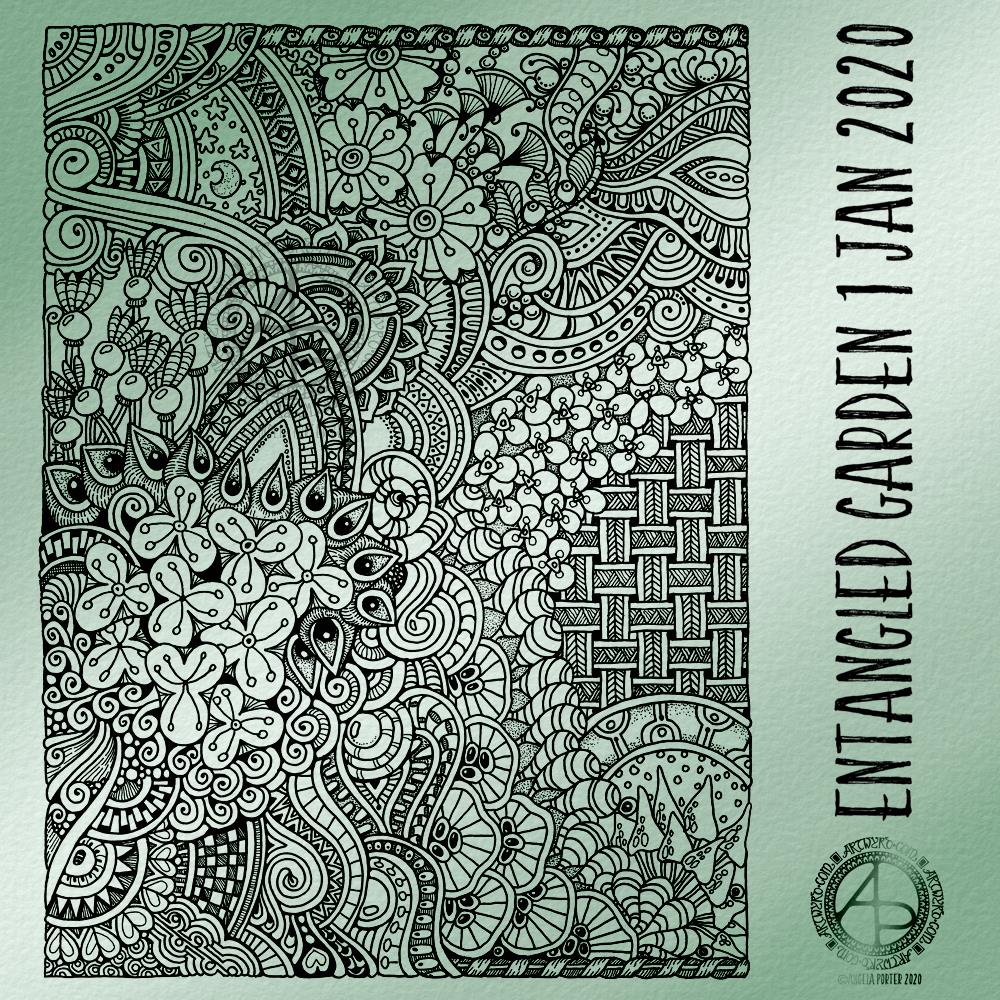
Today, I have another entangled drawing for you to enjoy. I worked on it over the past couple of days. I think it’s taken me around six or seven hours to complete.
Because of all the floral and botanical motifs I’ve called it an Entangled Garden. A garden that has grown from my intuition and imagination.
I’m enjoying drawing these kind of illustrations at the moment. I really do have a fondness for botanical motifs, but also for arches and patterns inspired by Romanesque and Gothic architecture. There’s also some influence from Zentangle patterns too.
I’ve not added any shading to increase depth and dimension. There are places in the design that could benefit from a hint of shadow. However, I’m happy with it as it is.
As a drawing, it is a bit too fussy with intricate details to work as a coloring page as far as traditional media are concerned. However, I do know some colourists who would love the challenge of colouring a design like this!
Having said that, this kind of design, with less details, would be perfect for my next coloring book which I do need to start work on soon. I need the cover done for the publishers by the end of this month. So, I can take inspiration from the drawings I’ve been doing recently, though I do have some other ideas rattling around my brainbox too.
I used Uniball Unipin pens, along with ClaireFontaine dot grid paper. The size of the drawing is approx. 7.5″ x 10″.
I added the background colour and texture digitally, after removing the dots from the dot grid paper.
One of the nice things about being between contracts is being able to indulge myself in art. It’s also a chance for me to do ‘comfort art’, art that is in a familiar style that I don’t often do.
This is an example of ‘comfort art’. Art that is soothing to do, is intuitive and surprising in how it turns out. I start with pen and paper (dot grid in this case), and just start with a single motif. I then let the design grow from that point, organically and intuitively.
There are always sticking points where I want to give up as it doesn’t look right, or I’m not happy with what I’ve just drawn. However, I’ve learned to persevere past these points and the end design is usually one I’m happy enough with.
There were many sticking points in this one, some of which I thought were going to be shatter points.
Although I’ve deemed this illustration ‘done’, as I reflect on it now, I can see places where some added line texture would help the design be less homogeneous in places and would add some contrast.
Also, some shadows would help add dimension to the illustration. Having said that, colour would really bring the drawing to life too.
For now, though, this design is finished. Whether I work some more on it remains to be seen.
I used Uniball Unipin pens to draw this design, along with ClaireFontaine Sketch dotgrid paper. The only things I did digitally were to scan the design in, remove the dots of the dot grid, and add the background colour and texture and watermarks.
Art really does wash the dust of everyday life from my soul. That’s why it’s something I do nearly every day. Creating art soothes my soul, my emotions, my mind. It helps me find balance when life has me all topsy-turvy. It helps me find the touchstone of contentment that now resides inside my chest, within my heart. I know that if I can’t settle to doing something artsy, then I’m seriously out of kilter.
I finished this drawing this morning. I think it’s taken me around 6 hours to do, give or take an hour or so. It’s a little smaller than A4 in size (6.75″ x 10.25″). The design was drawn with Faber-Castell Pitt Artist pens (F and S). I added shadows with grey Pitt Artist Brush pens.
I was rather clumsy with the shading in some places, so I took advantage of digital tools to smooth and blend the grey out.
My final digital task was to add a background texture to the artwork, which also added some colour. I do have a bit of a thing for grungy, distressed backgrounds.
On the whole, I’m pleased with this, though I must admit I didn’t think I was going to be so, especially with the heavy-handed shading really bothering me.
On Saturday, I recorded a video of me drawing this design on 6″ x 6″ Strathmore Vellum Bristol Paper coloured with Distress Inks.
This is an example of intuitive, entangled drawing; I started in the red area and worked my way out from that point. I had no idea what kind of design I wanted to create, I just wanted to draw and lose myself in that process.
The only guides I had at the start were some pencil lines to give me a border to work within, leaving a clear, plain border around the design. However, my mind seemed to do a bit of a flip when I came to drawing the bottom left of the design; I completely ignored the pencil lines for some reason totally unknown to myself. When I realised what I was doing, it was too late to change it as I was working in pen without any sketch to guide me.
It took me over 55 minutes to do, and I’m still trying to figure out in my head how to edit the video and post it, as well as making intro and outro pages.
I know that I’m busy for the rest of today, so I’m not likely to sort the video out today. I’m hoping I’ll have a bit more time tomorrow.
I was really surprised by the kind comments people left about my first, trial video, so I will do more. I do need to work out a realistic schedule for that for myself to work to amongst other projects I want to get going when I’ve finished Spectacular Sea-Life.
Talking of which, I’ve nearly completed the third out of four coloured templates, so I’ll soon have them all done. I will post some sneak previews of them as I go.
For the past six or so hours I’ve been busy with various social media video creation for something I’m involved in. I needed a break from it, and that meant some arty stuff.
I had this coloured ’tile’ in my stash. It’s a 4″ x 4″ piece of ClaireFontaine mixed media paper coloured with various green Distress Inks.
I used Faber-Castell Pitt Artist Pens to draw the design to create a border. To add some contrast to the background, I used water, Distress Ink and a brush to add darker shades to the design. I also thought some shimmer and shine was needed on the berries and flowers. So, I used some Perfect Pearls gold spray as well as some gold and silver Cosmic Shimmer Iridescent watercolour paints.
Finally, I added some spatters of the pearlescent colour to distress the background a bit more.
One thing I didn’t do was to add some shadows to lift the border from the background. I often say that I forgot to add shadows. One day I may remember!
All the same, I’m happy with this little design. The space is perfect for a quote or sentiment I think.
I’ve had a nice couple of hours this morning playing around with drawing and paper coloured (and not coloured) with Distress Ink.
I started with drawing the border with the flower straight onto the coloured square of mixed media paper (top right).
For the middle design, I cut a rectangular panel of Distress Ink coloured mixed media paper and glued it to another piece of coloured paper. Then, I decorated the panel along with some simple patterns spilling onto the background.
The bottom right design uses a square piece of plain paper with a small rectangle cut from some Distress Inked paper. I used a die with a stitched detail to cut this panel out along with a Sizzix Big Shot die cutting machine.
I’m not at all fussed on the stitched detail in this case. However, I do like the contrast of the coloured panel against the white background.
I do have a fair few pieces of paper coloured with Distress Inks, so I think some fairly quick, simple and soothing designs will be done over the next day or several.
Not sure what I’ll do with them yet. If you have any helpful suggestions, leave a comment! Also, leave a comment to let me know which design is your favourite.
I started by colouring a 6″ x 6″ piece of Strathmore Bristol paper with various shades of green Distress Ink (Peeled Paint, Shabby Shutters, Crushed Olive, Bundled Sage and Iced Spruce) and edged it with some Aged Mahogany.
Then, I drew the design using a metallic bronze Uniball Signo gel pen. Finally,I added some shading and depth with an olive green Chameleon Fineliner pen.
My photography skills aren’t good, which is why there’s two photos. The top one is a bit truer to and you can see the design more clearly on it. The bottom one shows the shiny bronze ink I used.
I think you’ll get the idea of what I’ve created.
It’s been a busy day here in the Angela studio/office. I’ve been focused on social media stuff for something I’m involved with at the moment. I had to get things done this morning and afternoon, so it wasn’t until quite late in the day I could turn my attention to art.
By then, I just wanted to draw something that was comforting, familiar, soothing. Which is why I ended up with another entangled design.
It did it’s job in soothing and calming me somewhat. Now, I can settle down, after I finish off a couple of things. I think time away from technology is required this evening.
This morning I thought it would be nice to use some Distress Inks to colour a 6″ x 6″ piece of Strathmore Vellum Bristol Paper and then draw a more traditional kind of zentangle design.
Before drawing on the coloured paper I scanned it in to use as a background for digital art at some point.
Anyway, I used Tattered Rose, Victorian Velvet and Rich Mahogany Distress inks with a foam blender to colour the paper.
Then, I used Pitt artist pens to draw the design. To help parts of the design stand out a bit more, I used some Chameleon coloured pencils to gently shade in the floral elements.
Finally, I couldn’t resist adding a little sparkle to the stamen of the flowers in the top right!
It’s always nice to relax with some familiar styles of art, and this morning I needed a bit of a relaxing time as I have a busy day ahead of me, which I must now go and sort myself out for!
This morning, I needed the calming and soothing process of drawing a mandala.
The last few days have been manic, tiring and emotional. I’ve also had to use a lot of mental concentration on a project that involves me. All this has resulted in evenings filled with headaches and emotional vulnerability.
I’m aware of what’s happening to me, and I do take steps to make sure that I practice self-care and self-soothing.
Drawing mandalas is always self-soothing for me. The abstract nature of them means anything goes, within the foundation of rings and angles. Drawing repeating patterns and shapes is also a soothing activity.
Today, I chose to draw in black and white and add a grey, textured background. Some subtle shading in greys helps to add the illusion of dimension to the mandala.
I drew this mandala digitally, using my favourite tool triad of Autodesk Sketchbook Pro, Microsoft Surface Pen and Microsoft Surface Studio. This made it easy to alter what I wasn’t happy with as I worked on the mandala. This removed a source of potential stress and upset and allowed the perfectionist in me to smile.
That doesn’t mean there aren’t any imperfections in the design; there are plenty of them! It just means I can fix the big mistakes quickly. I wish it were as easy to do that in life, for myself but also for others.
I enjoyed drawing the mandala. It has helped to soothe my fragile head and heart and has set me up for the rest of my arty, creative day.
So, Angela, how are you feeling today?
I’ve not written much about my mental and emotional health lately. It’s mostly been good. However, I’ve had some challenges with it and have had some weepy, teary times.
Previously, I’ve mentioned that I was looking at leaving therapy soon. I still think that will be the case, but these challenges have caused some flotsam and jetsam from my past to surface. They need to be processed and released before I consider leaving therapy.
I have so much to do in terms of work and other commitments that I really do need to schedule in that self-care time. Also, I’m aware that the challenges I’m currently facing could, potentially, harm my mental and emotional health. All the work of the past five years in therapy could, possibly, be undone. I can’t allow that to happen.
During the recent difficulties, I’ve found my emotions and thoughts harking back to the dark days of my poor mental and emotional health. I managed to stop myself falling into the bottomless, dark pit of despair and anguish. I recognised it was happening. Also, I recognised the trigger for this. It was strong enough to breathe some life into the pale ghosts of my past. Those ghosts have now been dispelled, but I know they can rise to haunt me at my vulnerable moments.
What scared me most was that I lost that awareness of inner contentment that has been present for many months now. It’s now back, once the ghosts had been returned to their realm – the past.
I’ve said it before, and no doubt I’ll say it again – emotions are the weather of my inner being. Things happen or are said that can stir up a storm. The storm opens a portal to the past and ghosts can find their way to trouble my mind and feelings. I’m now more aware of myself, my emotions, and how to cope with this weather. I’m back to a calm sea where the contentment isn’t shrouded by the shades of the past.
Being able to banish these ghosts myself shows how far I’ve come since my darkest days.
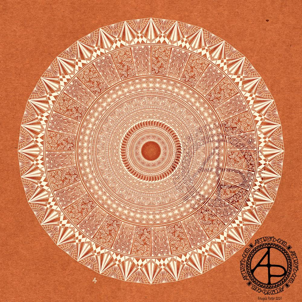
This morning I awoke with a pounding headache, an introvert’s hangover from a therapy session and a busy meeting in the evening with lots of people and noise. A big mug of tea, a couple of Anadin Extra and the head has cleared somewhat, though I still feel quite fuzzy-headed and tired.
Despite the headache, or perhaps because of it, I slipped into mandala mode to start my day. I had wanted to include some wise words in it, but my mind just wasn’t functioning clearly enough.
Unusually for me, I chose a terracotta-coloured kraft paper background to draw with a creamy coloured ink. I added some shading behind the design in places, just to try to increase the depth and dimension. I’m not sure I’ve achieved it well this time, however. Once my head fully clears, I may do the shading afresh.
The resulting mandala is far more geometric and structured than is often the case with me, especially the outside ring. However, I’m quite pleased with it, especially given the state of my head!
I do like the warm, earthy tones of paper and ink in this design. The colours have been quite comforting and soothing to work with.
I drew this digitally, using my favourite combination of Autodesk Sketchbook Pro along with my Microsoft Surface Pen and Microsoft Surface Studio (which are the digital analogues of pen and paper).