Entangled Drawing WIP

Link to Time Lapse Video of Pen drawing (not adding colour though)

This morning, I spent over an hour starting work on this entangled pen drawing. I did film the process, but it’s recycling day, and the bin lorries and bin men were really noisy this morning. So, I turned the video into a timelapse with music. It lasts about 14 minutes, and the link to it is above this paragraph.

I remember chatting about my influences for this drawing, and they started with me watching a video from the “Journey to the Microcosmos” YouTube channel.

I’ve always loved microscopic images, being able to see things that are invisible to our naked eyes. There’s always a sense of wonder about it, amazement at the different shapes of the various organisms that become visible. That wonder must be the same as Antonie van Leeuwenhoek, a Dutch scientist of the 17th and 18th Centuries must have seen.

I loved drawing what I could see with the aid of a microscope from the first science lessons when I was 11 years of age, right through my degree and PhD and on through my teaching career too. And of course it was bound to creep into my art!

My memories of drawing diagrams of flowers and rock sections, minerals and scientific apparatus and diagrams are very fond indeed. This has certainly influenced my style of art – observing the tiny, abstracting the interesting (important) patterns and forms. Scientifically, the focus is on the features, structures, the important parts that allow identification or communicate the important features of what was seen. After all, photographs and videos can be made of all the glorious detail and colour.

The diagram is a simplified version, a map, that can help others to navigate their way around. A kind of scientific version of the map of the London Underground system. The map helps in navigating the system, but it bears no relationship to the physical layout of the rail lines and the geography of the city above.

Now, however, I take those observations and turn them into my own arty, entangled worlds of wonder. It is still the small parts that catch my attention, fill me with wonder and awe, are the ones I record, rarely the whole thing. If I visit an old church or abbey, I rarely, draw the building as a whole. I spend time looking and drawing the elements of it that capture my arty attention.

My sketchbook page often ends up of a collage of my visit, the various observations fitting together in a pleasing way. Often, I may join the elements together with imaginary lines or patterns. I may end up not with a drawing of the whole building; instead, I record my experience of the building at the day, time, season and weather I visited it.

The same is true for visits in nature, or to museums. My sketchbooks record what catches my attention, and that may not be the ‘whole’ of something, but just a part.

I’m still a scientist in my approach to art – what are the important forms, patterns, shapes, etc. that are the distillation of my experience, that I’d like to record and, maybe, share with others?

Of course, these observations find their way into my more Entangled art, like this one. The round orbs separated into three lobes were inspired by something I saw when watching one of the Journey to the Microcosmos videos. The flat leaves, by seaweed. The triangular pods are imaginary, though there may be real-world analogues of them from which inspiration was unknowingly gained. Curled, baby fiddlehead ferns are the inspiration for another motif in the drawing.

Inspiration indeed – based on observation, but interpreted and altered in a way that is personal to me.

I’m forever wondering what my artistic voice is, and here it is. At least one of the harmonic notes or chords anyway.

Inky Insects! A sketchbook page

Yesterday was a bit of an odd day. Between a couple of mediation meetings in the day and me still not feeling quite right – fatigued, headachy, tummy still not right – I just didn’t feel up to doing much when I was awake. Except for drawing. Drawing insects.

I started with pencil drawings and then decided to ink them in. I know from bitter experience how pencil drawings can quickly smudge and fade in a well used and referenced sketchbook.

I loved the delicate nature of the pencil drawings, but I know I can always draw in pencil again for future work involving bugs.

If you’d like to see some of the pencil drawings before they were inked in, then have a look at the time lapse video.

I started off with bugs that were quite true, in a simplified and stylised way, to the images I was looking at, Gradually, I found myself being more imaginative.

I now have a fair collection of insects in my sketchbook, and I am quite keen to add more! However, I really do need to turn my attention to the colouring book I’m working on for much of the rest of today.

Template Thursday

Coloring Template and Timelapse Video

It’s that day of the week once again – the day I create a new coloring template / coloring page for the Angela Porter’s Coloring Book Fans facebook group.

This week, the design is botanical, entangled and a tad on the abstract ‘mechanical’. As is my want, I’ve partly coloured the template to start to breathe life into it.

Drawn with Unipin pens on Claire Fontaine Paint On mixed media paper. Digitally coloured in Clip Studio Paint Pro.

I’ve also created a video. The drawing and colouring took me over 3 hours this morning, so I’ve sped the video up so it takes just a few seconds over 20 minutes.

Still not too well…

I’m feeling better today, but I’m still not right. My stomach/digestive system is still delicate and I have a headache on and off. I did get a bit more sleep last night, but not enough really.

Still, I’m on the mend and taking it easy again today.

Having said that, while this video was processing and then uploading and processing again in YouTube, I managed to edit two templates I drew on Tuesday and then ink in the one I wanted to use a symmetry tool to draw it. So, I’ve got some more templates done for the book I’m working on. The total is now 13 out of 31.

I don’t know if I’ll get any more done today. I’m flagging badly now and feel the need to sleep. I may have another mug of tea before I take a nap and see if that perks me up a tad.

Entangled Art WIP

Today, I finished drawing this entangled, zentangle inspired kind of floral/botanical design. I did start this yesterday afternoon, but continued it this morning before I settled back to sleep. I’ve had a poor night’s sleep thanks to yet another upset stomach, so after my Wednesday delivery from Abel & Cole, I drew and then settled back to sleep.

I’m still feeling very tired, my digestive system is still uncomfortable, delicate, upset. But I have to run an errand today. I’ll get to that soon enough and then I’ll see how I feel and how that dictates how I look after myself for the rest of the day. I suspect more sleep will be needed.

Anyways, this drawing is on an A5 piece of Canson Imagine mixed media paper. I used a 0.3 Unipin pen to draw the design, and I’m now adding colour using a fairly limited palette of Zig Clean Colour Real Brush pens:
*green gray
*pale dawn gray
*olive green
*deep green
*ochre
*bright yellow
*pale rose
*lilac
*english lavender

I’m considering adding a couple of browns to this palette, as well as using some olive green over the grays.

These pens do move easily with a barely damp brush on this paper making it so easy to get a colour gradient. It’s also easy to add more colour to intensify the dark area.

I have recorded my morning art session as vlog.

In the vlog I talk about how the pressures of being constantly productive turned me into a workaholic when I was a teacher, and then fed negatively into my self-image which ultimately led to my burn-outs/breakdowns. I have learned that taking time for myself, to just be, to relax, to do things I enjoy, to look at ‘goals’ in a realistic kind of way to limit the pressure I put on myself.

I no longer have the external pressures of my career as a teacher, and one of the many hard lessons I’ve had to learn as part of my healing is how to value self-care time, and how that time can change from day to day. It’s so important for me, otherwise life’s own stresses and strains can take their toll on me and leads to physical, emotional and/or mental exhaustion or even ill-health.

Taking time to rest, to relax, is being ‘productive’, but in an important way. The productivity is investing time in one’s self and one’s own well being. And that is so very important.

This is why I take time nearly every day to create art just for myself, for the pleasure of creating, of exploring and experimenting, with no pressure on myself to create a completed work of art or for commercial gain. Just for the simple joy it brings.

Admittedly, I can fixate on art and forget about doing other things I enjoy, such as playing my flute, or learning to play my harp or tongue drum, or reading, or journalling, or even getting out for a walk, or combining my walk with sketching.

I know this is something I do need to work on for sure. But, like everything else, it comes together in it’s own way, in it’s own time, when I am ready to do so.

Watercolour Experiments

Two watercolour experiments in the photo.

The leaves I did yesterday afternoon, just playing with colour, wet into wet, and then adding patterns to the leaves with metallic watercolours. It was relaxing, soothing, and the way the colours flow into each other is just … magical!

The watercolour process was helped by the paper I used – 100% cotton rag Khadi paper, which I just tore into a squarish shape.

The bottom one was this morning’s play around with watercolour in a Doodleworlds kind of way.

I started off with a pencil drawing – you can faintly see the pencil lines of the rest of the design. I wanted to try adding watercolour to the pencil drawing, no black line.

But, as I’d completed add colour as far as I had, I wasn’t sure I liked it. So, I used a Signo DX .38 pen to add some fine, waterproof, lines.

The black lines do help to define the elements of the design, but the drawing ends up a bit cartoonish, which is fine as it’s Doodleworlds.

Of course, I did video this morning’s session with watercolour. When I was looking back on it, the colours looked a lot more vibrant than I thought they were to my eyes, and also the painting looked better at such a distance.

So, I’m torn between whether to add line or not! I think I need to add some more colour to this drawing, without adding black lines, to see which I prefer for sure.

New Watercolours, & arty lessons learned

New Watercolours

Late yesterday evening, my new set of watercolours arrived. I’m now the proud owner of a set of 36 tubes of Mijello Mission Gold Class watercolour paints, and a pretty neat palette too.

It was too late last night for me to think about adding the paints to the palette and setting up some colour swatches,. So I set to that this morning with a big mug of tea and a headache.

I used them to continue adding colour to this drawing, and I can easily tell the difference between the Mission Gold and Cotman Watercolours, not just because I know where I added each colour, but from the intensity and vibrance of the colours.

I know I got more vibrance from the Cotman colours when I was adding colour to this by adding water to the pans and letting them sit for a while to soften the pigments. But, it was so much easier with the Mission Gold to do this. Indeed, I had to be careful that I didn’t use colour that was too intense!

Some insight into watercolour and me

It was, and will continue to be, an absolute joy and pleasure to use watercolour paint tubes. I’m so glad I splurged out on them after I had a memory of using tube watercolours years and years ago.

They were such a pleasure to use, both to create the swatches and in adding colour to this drawing. Bear in mind that this drawing wasn’t done on watercolour paper, but on creamy coloured Arteza mixed media paper! Also, I created the swatches on SeaWhite all media cartridge paper, which is a lovely bright white colour.

Now, I realise that a lot of my frustration with pan watercolours is with getting colours intense enough for my taste. That won’t be a problem with the Mission Gold set I’m sure.

I also feel that exploring and learning more about watercolour and colour mixing is something that I’d like to do now, and that I may not be quite so frustrated as I have in the past.

Coloring Template doubts and frustrations

Yesterday, I got a couple more templates drawn and edited, so I now have ten out of the thirty-one I need completed, editorial team’s feedback allowing that is.

However, I was really doubting whether what I’d done would work, was good enough. So, I thought I’d try colouring the template I was least happy with to see if that made a difference to how I viewed it, and hopefully the others.

That really did the trick! Just by adding a background colour/texture first, I started to feel better about it. Once I’d added colour and the line-art started to come to life, I started to feel even more confident.

This is something I need to remember going forward, when I doubt my ability to create colouring templates. All I need to do is see if they work with colour!

A bonus was that I really enjoyed adding colour.

Vlogging along …

I touch on all these things in today’s vlog, as well as showing the swatches and adding colour to the drawing.

I’ve also decided that I’m going to mostly keep my vlogs to no more than around 20 minutes, whether that’s real time or a time lapse version. I think they may work the best, though I may still record longer ones if there’s a need to do so.

Template Thursday and Good News!

This week’s coloring template

Here’s a partly coloured version of this week’s coloring template for the Angela Porter’s Coloring Book Fans facebook group.

This one contains some zentangle patterns, some of my typically entangled designs, and some cute and whimsical elements that are reminiscent of Doodleworlds.

I posted some videos yesterday showing me drawing this coloring template, or colouring page.

Good News!

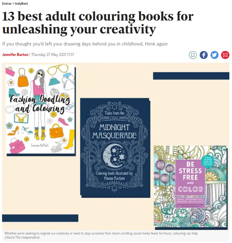
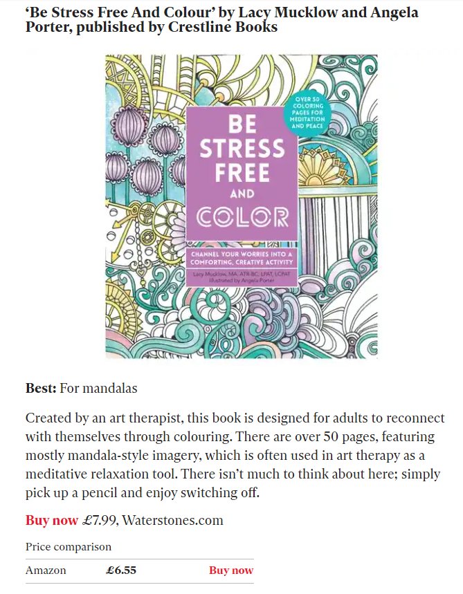
The good news bit is that Lacy Mucklow, the art therapist I worked with for the Color Me books, alerted me to the fact that our “Be Stress Free and Color” book is one of the best adult colouring books listed by The Independent, a UK newspaper. The book contains illustrations and text from the original books in the Color Me series.

Image
Image

Template Thursday…On a Wednesday?

It’s Wednesday, so one of my main tasks is to create a colouring template for the Angela Porter’s Coloring Book Fans facebook group. And as I drew this for my morning warm up art, I recorded it.

It took me over 1 hour and 20 minutes to draw the template and the full length video is here.

The time lapse version, which is about 15 minutes or so long, can be found via this link.

Yesterday, I wasn’t at all well. The usual upset stomach followed by a headache that needed sleeping off. The upset tummy had kept me up most of Monday night. What had caused it this time, I dunno. All I know is I slept a bit better last night, though I’ve been awake since 4:15 am and I’m beginning to feel rather tired again and my digestive system is still a bit tender. I’m sure I’ll be tickettyboo once again tomorrow.

It was lovely to spend some time this morning drawing just for pleasure. Don’t get me wrong, I do enjoy drawing for my publishers, but it’s different as there’s a lot more pressure on me to create templates that fit into a particular theme and their guidelines.

My weekly templates have no of those limits on them, so it’s a different kind of enjoyment.

There’s a lot of whimsical and cute elements to this weeks design, and I think that’s something I need to lift me up as I’m feeling a bit under the weather.

It was also a great pleasure to draw with pen on paper, and I think I’m going to have to do that with the templates for the book I’m working on. I get a much better sense of scale and overview of the design. Even when I scan a sketch in, I’m not all that happy with the digitally drawn version of it, usually.

So, that’s what I’m going to settle down to do for the rest of the day, once all my social media posts are done. Pen on paper, without the frustration I can feel when drawing digitally. Simple tools to focus on drawing ‘life size’ coloring templates.

And lots of tea is called for today, I think. Lots of good tea.

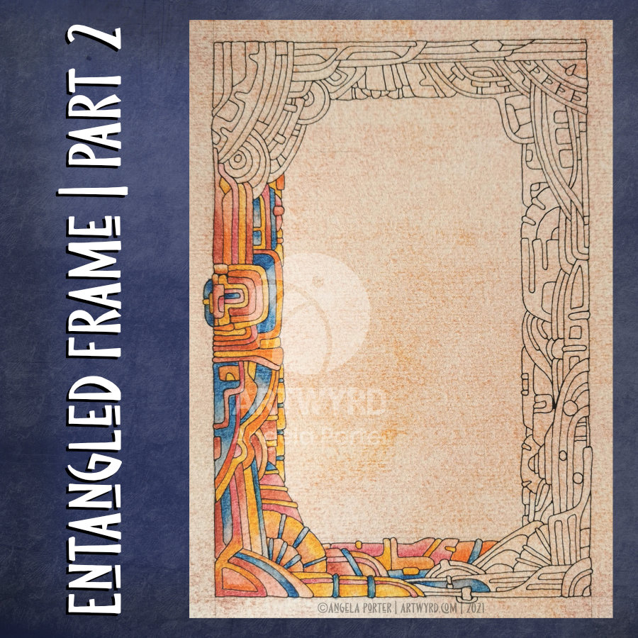
Entangled Frame | Part 2

My morning warm up drawing was to do some more work on the entangled, abstract frame I started yesterday.

With fresh eyes, I could see I wanted to make the width of the design more consistent around the frame. So, my first job was to do a little bit more pen drawing.

Then, I could carry on with adding colour with Inktense pencils, the same colour palette as I used yesterday.

As is becoming my daily…habit? practice?…I also filmed the process and chattered away as I did so. And my chattering, rather, my thinking out loud actually helped me make some connections between my experiences of art from childhood through to the present day. And that helped me understand my perceived problems with using colour in drawings from real life.

I will need to spend some time with these memories and insights and journal later on. I can then work with them to help, hopefully, to overcome some blocks and difficulties in how I feel about my artistic expression. And then, hopefully I can become accepting of and comfortable with the way that I work.

I’ve been following a few courses on Domestika, and one of the common themes in the introduction by each artist is what has influenced them. Many go back to their childhood passions and how they have influenced their artistic voices.

That, I have discovered today, is so true!

Perhaps I’ll condense my words from today’s video at some point, once I’ve processed them myself. However, if you’d like to hear my thinking out loud while drawing/colouring today, then here’s the link to the video.

Entangled Frame WIP

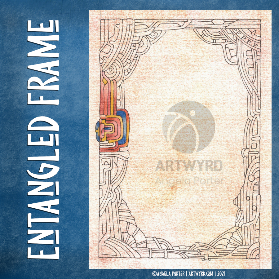
Having a bit of a break from the weird fish today. Instead, I drew this abstract, entangled frame and started to add some colour to it.

I’m working on A5 Arteza mixed media paper which has been coloured with Aged Mahogany and Rusty Hinge Distress Inks. The pen drawing was completed with a 0.38 Uniball Signo DX pen, which is both a consistent, fine line and is waterproof. I’m adding colour with Inktense pencils ( Red Oxide, Baked Earth, Crimson, Deep Blue and Sienna Gold).

I may add some more pen work as I work out if I’m happy with the inner space; I hope to add quotes to that space once the design is finished.

As far as the weird fish go, I have scanned them in and re-drawn them digitally using the vector drawing option in Clip Studio Paint. I’ve been experimenting with adding the shadows and highlights first then using different layer to add colour to the sections. I’m bumbling around with this at the moment, but I expect I work out how to get it to work in a way I like.

Yes, I know there are going to be tutorials out there that will show me how it can be done, and lots of ways of doing the same thing. However, by me bumbling and bimbling around the software, I’m learning more about it on my own terms.

Oh, I also filmed my drawing and adding colour this morning and the video is below. If you do choose to watch the video, then please choose to view it in YouTube as your view then counts to the channel stats, along with thumbs-ups! Cheers!