Comparing paper for watercolour

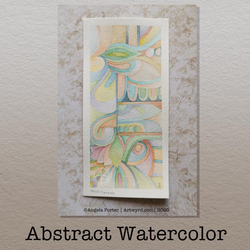
I was getting vexed, again, about the paper I was using for the watercolour I was working on yesterday (1). It still wasn’t behaving like the one I used at the start of the week (3).

So, after another comparision ‘twixt these two, I realised that the paper was too lightweight to be any of my watercolour papers. It the dawned on me it was a fugitive piece of Arteza mixed media paper in my store of pieces of watercolour paper.

So, I had to try a piece of Arteza mixed media paper to confirm (2), and it was the same paper as (3) with similar effects.

The Arteza mixed media paper is off-white, just like the Canson Moulin Du Roy (5) and St Cuthbert’s Mill Bockingford (1).

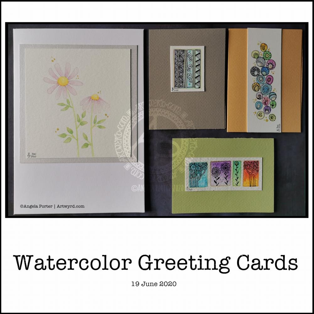
As I liked the way the mixed media paper worked, I thought I’d try a piece of ClaireFontaine mixed media paper (4). It’s bright white, in comparison, and the colours are much more vibrant. The watercolour laid down in a similar way to the Arteza paper, but the paper is so much smoother as well.

So, which do I prefer. Although I’ve not done an abstract piece on the 100% cotton rag paper yet, I’m sure that will be top of the list. What surprises me is how much I like working on the Arteza and ClaireFontaine mixed media papers. I do think the Arteza has the edge on the ClaireFontaine, though I wish it was a little less on the creamy-yellow side.

Perhaps I like these papers as I’m not working wet into wet, nor am I doing much in the way of glazes. I find they let me apply the watercolour with a finish that pleases me.

I also know I don’t like working with Daler-Rowney Aquafine paper with the White Knights paints. It works better, for me, with watercolour pencils.

I know I will continue to experiment with different papers and watercolour; I have Daler-Rowney mixed media paper to try, along with the Khadi 100% cotton rag paper too. I don’t know if I have any others hidden away in my stores, but if I find them, I will use them.

Abstract Watercolour WIP

What a grey, cool, windy and showery/rainy, changeable day it is here in the Valleys of South Wales, UK. Such a huge contrast to the three days of a heatwave earlier this week. Mind you, I’m one of those people who prefers to be cool rather than too hot, and on Wednesday and Thursday it really was too hot for me!

I’m still not quite right in terms of mental focus and emotional balance. After the rollercoaster rides I’ve had over the past month, it takes a while for the stress hormones to leach from my system. Each time they had started to lower, I found myself on that rollercoaster once more.

This is nothing that is affecting me directly, other than emotionally. However, it’s the emotional stuff that makes it difficult to deal with, despite me meditating and self-soothing and losing myself as much as I can in creativitity. That’s hard when I can’t settle to anything.

I do find I can settle somewhat more today, but I am still tired and my mind still feels fuzzy and unfocused. So, I won’t be chancing doing any work that requires my absolute focus, not today.

I was up early-ish this morning for a delivery. While waiting for it, I cut up a sheet of St Cuthbert’s Mill Bockingford watercolour paper and washi taped a 5½” x 4″ piece of it to an old cutting plate. I then took a 3mm mechanical pencil and sketched out an abstract design based on clouds, believe it or not.

I’m now part way through adding colour to it with White Knight’s watercolours and a size 2 Graduate round brush by Daler-Rowney.

Yesterday, I thought that this Bockingford paper was the one I’d used for the first of these abstract watercolours. It turns out it isn’t. I’m begininng to wonder if it was some mixed media paper as it is a brighter white than either Bockingford or Canson Moulin du Roy. It definitely wasn’t Daler-Rowney aquafine paper nor Tim Holtz’s watercolour paper. Nor was it the 100% cotton paper either. How curious.

I have enjoyed the process of drawing the design and starting to add colour. The colours are softer than yesterday’s watercolour, but more vibrant than the one I did earlier this week. Perhaps the change in colours is a sign I’m continuing to settle back to my usual chilled out, calm and content state.

So, I’m going to take a break from arty stuff for a little while. My concentration is wavering and I’m tempted to go back go sleep. However, I know that will prevent me from sleeping well tonight.

Abstract Watercolor

This morning, it was lovely to settle down to some watercolor work with the air much cooler and after a good night’s sleep.

I used a 5½” x 3″ piece of Canson Moulin du Roy watercolour paper for this one. I have to say, I’m not at all fussed on this paper. I much prefer the Bockingford paper from St Cuthbert’s Mill that I used for the last watercolour abstract I did. My favourite, though, is the 100% cotton rag Khadi paper, but as I’ve been feeling my way through this, I thought I’d use paper from my stash that is OK but not my favourite.

Oh, I used White Knights watercolour paints, which are usually much smoother and cleaner in colour. The off-white Moulin du Roy paper mutes them down. Also, the colours easily re-wet and move when adding glazes. Definitely not my favourite for this kind of work.

I’ve had heck of a couple of days, again, that have been emotionally draining and mentally exhausting. I think that shows in my choices of colours, which are not as harmonious as the previous version. I was also frustrated with how the colours didn’t appear as I expected them to.

I’ve also made the colours a lot more saturated. I’m not sure if I prefer this, but it could be a reflection of how I’m feeling and what I need at this time.

Nonetheless, there are parts of this piece that I am pleased with, the pointy teardrops as an example.

Still, I really think the colours I used feel really uneasy, which is a reflection of the lingering remains of the emotions of the past couple of days in particular.

Even though I slept really well last night, I’m still exhausted and feel the need to sleep again. That tells me it’s another self-care day. I hope that will recharge my batteries so I can focus on the editing and work I need to do by the end of the month. I fear not focusing well at the moment would result in me not saving edited images correctly so I lose some of the art I’ve done. It’s a necessary, but tedious, task and I need to be able to focus and think clearly. Today is not that day.

Abstract Watercolor

Last night, I was tired and emotionally drained, again. So, some self-soothing activities were in order. I thought I’d try to create an abstract watercolour painting in the same kind of style as the abstract digital art I’m working on.

Before bed, I got a small part of this done. I finished it this morning. I woke around 4am, with a headache. The usual kind of stress-comedown headache I’m prone too. Migraine-y in nature. I also was due to get up early for my weekly delivery of organic vittles from Able & Cole; they deliver to me just after 6am.

Oddly, the headache lifted as I started to work on the watercolour, which was a huge relief to me. A couple of hours later, and the watercolour was finished.

The paper is Bockingford cold pressed and it measures approx 5¾” x 2¾”, the artwork being approx. 5¼” x 2¼” in size. I used my set of White Knights watercolours and a Daler Rowney Aquafine brush (size 0, round). I did lightly pencil in the design before painting.

I love working digitally, but I also love to work with traditional media, watercolours becoming one of my favourites as I work out how I can get them to work for me.

I’ve said before that I love to create small works of art – precious little treasures that need to be the centre of attention in a huge frame.
The precision of this abstract watercolour painting really pleased my artistic heart. I worked with watercolours on paper in a way that is analogous to how I work with colour and shape digitally.

The realisation of this has been a ‘ta-da’ moment for me. As much as I love to see the way watercolour does magic when it’s worked wet in wet, my sensibilities tend towards having much greater control over the way the colours mix and blend. I even break the rules; I’m happy to mix colours on paper, while the watercolour paint is still wet or damp. I’m also happy to use glazes to intensify the colour or alter the tone.

What is a change for me, in terms of traditional art, is the lack of black line-art. In the past, that would have been something that really troubled me; the work didn’t look right without black lines.

Working digitally, with pure colour and no black outlines has certainly made me more confident in working traditionally this way.

In this painting, you can see influences from nature and architecture. Shapes that I love appear – rounded and pointy arches, curves, leafy and petal forms, circles, but no spirals this time.

Straight lines and rectangles add a counterpoint to the curvilinear forms, giving a sense of sections and also support in various places in the design.
The colours I chose are a lot more muted than is typical of me in the past, and I actually really like them.

Yet another piece of artwork that marks a development in my artistic voice. Actually, I think it’s more like a note in my artistic song. I seem to have a number of notes (styles) that are characteristically ‘Angela’ and this is very likely to become another of them.

Watercolor Greeting Cards

About the artwork

I needed a quiet morning, again, today. So, I thought I’d dig out my Caran D’Ache Supracolor Soft watercolour pencils and try some stuff with them.

I wanted to use them to draw a flower, or two, and then use water to create a watercolour effect. The result you can see on the left-hand side card. I’ve left loads of white space on this card, which is unusual for me. I couldn’t resist, however, adding some gold dots around the flowers. The colour of the petals was so delicate that I used a 2H 3mm pencil to outline them and the leaves. Just for info, the piece of watercolour paper measures 4″ x 4″.

For the other cards, I just wanted to work with the pencils to create gradients and abstract patterns in colour. I drew on the little panels using a 0.25 Copic Multiliner SP pen and added some lines and details with metallic gold watercolour. These cards are approx 3″ x 4″ in size.

Watercolor pencils are nice to use when it comes to drawing in colour with them, then activiating the colour with water. They really glow on 100% cotton rag paper (bottom right) compared to the other cellulose papers.

Cute and whimsical cards, some very detailed, one not quite so. But a nice way to spend my morning.

Self-care time, again.

There’s a situation going on around me that is draining my emotions greatly at this time. I’m doing my best to not become overly emotionally involved in it, but it’s difficult when it’s to do with people you care about.

It all has a knock on effect with me. I’m anxious, tired verging on exhausted, really grumpy, irritable, and lacking patience at this time. I’m also not able to concentrate too well. These are all behaviours I could do without in dealing with this situation. Yet I’m exhausted by it.

I have been meditating, making sure I take time to do self-calming and self-soothing activities, such as my morning art, Though I have work to do for contracts, I need to take a day away from everything, if I can.

I know there are lessons for me to learn about myself in how I’m reacting ot the situation, stuff from my past that wasn’t processed during my EMDR therapy. If I can work out what it is, I can work through it myself now. Organising EMDR therapy isn’t possible at this time, with lockdown still very much in operation and me being very nervous of going out into the world as well.

So, I’m going to make time today to drink tea, meditate, journal and try to get to the bottom of my own issues and start doing what I can to work through them and heal the past traumas that are causing my reactions at this time.

I think I’ll also take time to crochet (I started a mosaic blanket earlier this week) and watch films or crafting shows on the TV. Eat healthily – I have a yearning for brussel sprouts, of all things! And take time away from social media and news. I may even pick up my flute and play it, for the first time in months and months.

Digital watercolours?

Another morning, another play around with watercolours, this time digitally.

Soft balls of watercolour, fuzzy edges, with white ink details added on top. Layers of transparent colour.

I overlaid a watercolour paper texture, which helps give the right ‘feel’.

This is my favourite attempt at digital ‘watercolours’ so far. I definitely like using white ink in this instance; black ink was just too harsh, hard and jarred uncomfortably with the softness of the watercolours.

I tried lots of ways of adding colour; not just brushes, but different brush effects. In the end I was happiest with white ink.

A nice way to spend a couple of hours as I wake up.

Flower?

I’ve spent several hours exploring and trying ideas out in the realms of both digital and abstract art, and this is the result.

I’m really not at all sure about it in any shape or form. I think I was influenced by watching a few YouTube videos about mixed media and abstract art.

It’s been an “interesting” time, as well as a frustrating time in some ways. I also have a bit issue with choice of colours.

I’m pleased to say that I’ve calmed down an awful lot from the stresses of the last week or so. I actually slept for nearly 12 hours last night, which happens once all the adrenaline/cortisol have left my body. It’s nice to be back to my ‘normal’ state of contentment.

Seeking Calm

Another morning, another migraine-y headache. Yet again caused by stress and worry. Painkillers taken, just waiting for the pain to go so I can sleep the remains off.

I also completed this peace of art which I started last night. I painted circles of watercolour on a 5.5″ x 6.5″ piece of Canson Moulin Du Roy watercolour paper and left it to dry overnight.

This morning, I wanted to add pattern to the circles. I tried using a white gel pen, but it wasn’t quite opaque enough. So, I used a fine brush and white gouache. That worked really well. It was also good practice using a brush like a pen or pencil. Is it still drawing if you draw with a brush, or is it painting? I don’t know!

The circles have ended up looking like diatoms, formanifera, microscopic bits and bobs, seeds, sea urchins…

Once the gouache dried, I added some more watercolour to add shadows and details to help bring some sense of dimension or volume. The white gouache works really nicely with the watercolour. Black pen can often feel too harsh to me with delicate colours. The white lines of gouache seems a lot more sympathetic with the delicate colours. It adds a lightness, airiness, delicateness to the design. The opacity gives a sense of more solid support, architecture.

While I like the transparency of watercolour, the way I’ve added the lines and shadows doesn’t quite work being able to see the lower layers, and my head doesn’t quite work right at the moment to work out how to add details from the lower layers that could be seen. Mind you, it does give me something to think about (when ny head will let me think) in doing similar kinds of work in the future. I definitely want to explore using gouache with watercolours.

I did think of adding some metallic dots, but haven’t done so at this time. I can always revisit this painting in the future.

It’s also giving me something to think about in working digitally, though I’m not sure what those thoughts are at the moment.

While I was doing this, I felt calm, content, at peace, and the headache wasn’t so noticeable. Hence the title – “Seeking Calm”. That’s exactly what I was hoping to find while finishing this artwork off.

Detailed drawing is something I love to do. Creating abstracts based on patterns/shapes that I’ve observed in the world around me and in nature is also something I love to do.

Exploring different ways of working with different media to see how I can get it to work for me (or not work for me) is also important. Watercolour is something I do struggle with and would like to work with. This little work of art is something that is a stepping stone on my way to finding a way of working that works for me.

#DYICAD 2020 #ICAD2020 Day 03 “Album”

This index card #ICAD2020 #DYICAD2020 was a bit of fun to create.

I used a mixture of Distress Oxide inks to colour the 6″ x 4″ index card. The colours I used were Old Paper, Bundlesd Sage, Dried Marigold and Chipped Sapphire. I built the background up in two layers, with chipped sapphire lightly dragged across the texture that the spray of water from the first background created. A final spray of water, a dab with some paper towel to leave some bleached areas and the background was done.

I decided I’d go with the typography theme today, so hand-lettered monograms for each letter. I used pieces of Canson XL Bristol paper coloured either with Distress Inks or Distress Oxide inks. After spraying the paper with water, I squished some cling film onto the surface to create abstract patterns in the colour.

Anyway, I used 06 and 03 Sakura Pigma Sensei pens to draw the monograms. Once I was happy with the designs, I edged the monograms with Ground Espresso Distress Ink. Then, I glued them to some brown-ish card, and cut them out with a border. I edged the brown paper mat with Ground Espresso Distress ink.

I then set to adding pattern and colour with Paul Rubens metallic watercolour set. Tiny dots and highlights were sparingly added to the monograms. Then, I used the same 01 brush to draw patterns around each monogram in colours that picked up the background colours of the monograms.

My final step was to edge the index card with Ground Espresso Distress Ink.

This was a perfect little project to practice my hand lettering as well as trying out the Paul Rubens paints. It was also good practice at using a fine brush to draw patterns. I do think a finer brush would’ve worked better.

The scan hasn’t picked up the sparkly, shimmery gorgeousness of the metallic paints.

This was a really nice way to come round after I’d slept off yesterday’s migraine-y stress-come-down headache. It was a small project that I didn’t feel overwhelmed by and there was no pressure on me for it to be perfect, as would be the case for my contracts for coloring books. So, it helped me calm and settle and find that sense of contentment, for a while at least.

ICAD2020 Day 02 Marigold

#DYICAD2020 #ICAD2020 – Day 02 – Marigold

I took an index card and used Dried Marigold and Bundled Sage Distress Oxide inks to colour it. I spattered on water to create some bleached spots. Then, I edged the card with Ground Espresso Distress Ink.

I knew I wanted to draw a marigold, which is what I did. In fact, I drew a few. The large one is a French Marigold (Tagetes sp.). The others are pot marigolds (Calendula sp.)

All the drawings are quick, loose, sketchy ones using an 04 Sakura Pigma Sensei pen. I did use a pencil to roughly sketch out the flowers.

As the theme for week one of the ICAD2020 challenge is typography, I added some hand lettering. I also looked for a couple of quotes about marigolds, which I hand lettered.

Finally, I added a wash of iridescent orange and yellow watercolours to the flowers, sage-y green to the leaves. I also added some graphic lines in iridescent orange to the letters. And I couldn’t resist spattering some of the iridescent paint on the card itself.

I think I may add the ICAD2020 creations into my journal, or maybe make one from them as time goes along. No need to make a decision today, I’m not really thinking straight at the moment.

Experimenting with watercolours

I woke with another raging headache this morning. So, some art was in order until the pills kick in and I can sleep the dregs of it off.

I thought I’d try some ways of adding texture and interest to watercolour backgrounds.

Putting some clingfilm (saran wrap I think it’s called in the US) onto wet watercolour creates a lovely texture. It’s not easy to see but I used it on the pieces at the top middle and top right. This is something I will definitely be experimenting with going forward.

I also tried salt again, on fairly damp, less damp and almost dry. The darker pink tile under the Marigold ICAD was where I added salt to rather damp watercolour and the blooms are just beautiful.

I also tried using white gouache. I spattered it onto a couple of tiles, but I also used it mixed with water to paint into wet watercolour. It adds a really interesting effect, the opacity of gouache looking intriguing against the transparent watercolour.

Finally, I used a straw to blow drops of watercolour around. That was a lot of fun and really created random, abstract patterns.

I added these to my journal with notes on how I achieved the effects so I can reference them in future. Today, I may not remember much about what I’ve done, all thanks to the dratted headache. All due to stress/anxiety/worry yet again.