Abstract Botanical 28 August 2018

Angela Porter 28 August 2018

Another abstract botanical. This one has gold dot highlights as well as white dots. Fun to do!

I dug out my old Ohto Graphic Liner pens to draw this one. I’d forgotten all about them until I was looking for some new Uniball Unipin pens in my pen stash.

The Ohtos are roller ball pens with pigment ink which is waterproof and fadeproof. The beauty of a roller ball, unlike fibre-tips like the unipins or Sakura Microns, is that the roller ball tip is practically indestructible, even for one with a heavy hand like me.

They work well on the lightly textured hot pressed watercolour paper I used (which is 10″ x 14″ in size).

I applied the colour first, then worked with the way the colours spread and mixed to draw the patterns generally, though I do work rather intuitively.

Abstract Botanical 27 August 2018

Angela Porter 27 August 2018 small

Started yesterday, finished this morning. Another intricate, abstract botanical

I coloured the paper first and worked with the patterns made, mostly. Intuitive drawing with detail and intricacy and black lines is my favourite to do. Botanical things, abstract motifs, from my imagination are also some of my favourite things to draw.

My colour choices are a bit different for me, the way I blended the colours resulted in some unusual, subdued, almost grungy tones. I think I like it.


Abstract Botanical 22 August 2018

Angela Porter 22 August 2018

Another day, another drawing/artwork/illustration/design. This one is only a little one; it’s approximately A5 in size.

I used some new watercolour paper from Canson – Moulin du Roy. It’s smooth, slightly off-white, pure cotton mould made and seems to work nicely with Intense pencils and a waterbrush.

I’m waiting for some metallic paints to arrive so I can add some highlights to this – there are places where a dot of gold will really work nicely, but not too many places methinks.

Also, I chose just seven colours to be my palette – sherbert lemon, apple green, iron green, lagoon, violet, red-violet and sienna gold. I thought that a smaller number of colours could result in a more cohesive feel to the design, and I think that it may have done so!

For this one, I drew the design first in pen then added colour.

When I draw first I do tend to fill the space with drawings. When I add colour shapes first I end up with more white space and a more random ‘edge’ to the design.

Why that is, I don’t know, other than it may have something to do with me filling spaces in with pen and ink habitually.

A habit I need to modify I think.

All the same, it’s nice to do little designs. I already have another drawn out waiting for colour!

Entangled Art 18 August 2018

Angela Porter 18 August 2018

Planning a relaxing arty day, no digital art planned at the moment.

In the last couple of days, in between work for my next Entangled coloring book in the Creative Haven series from Dover Publications Inc, I tried something a bit different for me.

I tried drawing shapes for the design in colour first, then adding the black ink details over them.

For the completed design I used a Kuretake Zig Brush Pen and Tombow dual tip markers. I say completed, but I may return to it and add dome metallic/pearlescent/iridescent embellishments.

For the coloured design, without details, I used the same brush pen and Winsor & Newton Water Colour Markers.

I’m trying to decide if I’m going to add the details using a Uniball Unipin pen or whether I’m going to use a fine brush and watercolour.

Perhaps with this one I’ll stick with my Unipin pen(s) while creating a smaller, test piece for the use of watercolour with a fine brush.

I must admit, I do like the more graphic, high-contrast black lines, but I do think I have to give lines in colour a try.

Weekend relaxing with art, my #weekendvibes.

WIP Wednesday – 15 August 2018

Angela Porter 15 August 2018 WIP 02

Another bit of hand lettering or hand writing along with my particular style of entangled design.

This is very much a work in progress. I’m just laying down the ‘skeleton’ of the design before I add colour and pattern. you can see the dotgrid ‘paper’ I use as a guide for the size of the elements of the design.

Not sure I’m at all happy with the writing, but I do like the bit of wisdom for a Wednesday.

All drawn using a Surface Pen on my Surface Studio in Autodesk Sketchbook.

Love – 14 August 2018

Angela Porter Love 14 August 2018

Another day, another word in the same kind of style as yesterdays. It’s fun doing these for sure! And it’s giving my hand-lettering and writing skills on a digital platform a bit of a workout.

That’s appropriate as it’s World Calligraphy Day today!

There is a difference between hand-lettering and calligraphy.

  • Hand lettering is about drawing the letters, which are often decorative.
  • Calligraphy is about writing the letters.

Both require discipline and control. However, there is a little less control over the letters formed when writing calligraphically than there is in deliberately drawing letters.

To create my word ‘love’, I first wrote the word using a digital brush. Yes, that’s right, I wrote the word! I didn’t pencil out the letters first. Then, I got to doing the colour and pattern ‘thing’.

Not sure if it counts as calligraphy, but I still think it’s a fairly pretty example of a nicely written word. I hope any calligraphers will forgive me and recognise that I’ve entered into the spirit of the day!

Bookmarks – #makeitmonday

Angela Porter Bookmarks 30 July 2018

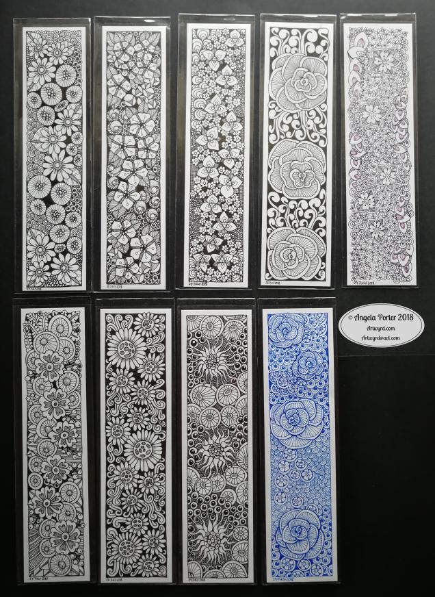
Amongst other things, I’ve had a lovely crafty time over the weekend drawing tall and think designs that make lovely bookmarks, and here they are!

I love black and white line art, but I thought I’d try working in colour too with a mid-blue and a dusky kind of purple. Not too sure about the coloured drawings; I think that’s because I do like high contrast.

The first task was to cut paper (Winsor and Newton Bristol board and Claire Fontaine Paint On mixed media paper) into strips that are 30.1cm x 5cm or 30.1cm x 5.5cm in size. For each, I drew a pencil border around them that is approx 3mm wide.

Then, came the inky drawing. Usually, I start with one motif and let the design grow out from that one. However, with these I scattered large motifs across the space, then slightly smaller ones. Finally I used small patterns and even plain colour, to fill in the gaps.

I tried to keep to just three or four patterns in each design (a self-imposed challenge); some have just two patterns, others have 4 or so.

I really enjoyed doing these!

Now, I have to decide what to do with the originals. Do I scan them and then gift/sell the originals? Do I use them as the focal points for some mixed-media work? Do I use them to created some printable pages for people to make their own book marks? Do I scan and re-colour them in the way I have my recent quotes? Do I scan, print and set small parts into bezels to create my own custom jewellery? Do I turn them into greetings cards? Do I add shadows/shading to them?

So many possibilities and I feel quite overwhelmed.

I do know I need to turn my attention to my next coloring book for the Creative Haven series from Dover Publications Inc; I need to get a few templates done in the next couple of weeks, with one to be coloured as the cover illustration.

All #makeitmonday projects!

Talking of #makeitmonday; I uploaded a bonus colouring template to the Angela Porter’s Coloring Book Fans facebook group yesterday. It is a group exclusive, so if you’d like to print and colour it and share it with the group, pop along and join in with the lovely group of people over there.

Another Terry Pratchett Quote…

Angela Porter 25 July 2018

I am enjoying doing these quotes, as I’ve said before.

I enjoy the intricacy of the drawing/design/illustration.

I quite like taking a black and white line drawing and turning into a rainbow line drawing too.

Today is WIP over on the Angela Porter’s Coloring Book Fans facebook group – you’d be made very welcome if you pop over and join in!

Decorated Terry Pratchett Quote and Chameleon Pencils first impressions

Angela Porter 23 July 2018

Another quote from Terry Pratchett. This one from one of my favourite characters – Death. Death tries so hard to understand humanity, yet he gets it both very wrong and quite right at the same time.

I like the way I’ve added colour to my black and white line art in this example, but one day I hope to get around to colouring in the black and white version.

Maybe I’ll print the art out and then colour it in using Chamelon Pen’s ColorTone Pencils, which arrived yesterday.

I have spent some time  colouring with them and so far I quite like them.

They are softer than Polychromos and others, but not quite as soft as Prismacolours. They blend quite nicely, and a little help from a blending pencil results in really nice blends.

I like the colour palette; the colours are nice and bright and just the colours I love to use in my art, which is a huge, huge bonus! As I often struggle to choose and use colours in a sensible manner when I have a huge choice, the limited palette of 50 colours is really useful for me, as are the double ended pencils. Being able to flip to add shadow or light is a nice touch, though I would like a bit more contrast between some of the colours as some are a bit too similar.

The leads are a bit thicker than other pencils, such as Prismacolours. However, this makes the barrels of the pencils a bit too thick for a standard pencil sharpener. My Staedtler pencil sharpener – the ones with the handles that you turn around – should cope well with them though.

At a price point of £45 on Amazon.co.uk with free prime delivery I think they’re good value for money, even though you essentially have 50 half-sized pencils. However, the thicker colour leads make up for that to some degree.

I’ve not been able to find out if you can buy individual pencils when some wear down. However, I can’t see that being a big issue as I suspect that I’ll use most of the pencils fairly equally.


#Weekendvibes

Angela Porter 21 July 2018As you  may have guessed, I love Terry Pratchett’s Discworld books. I’ve used a few quotes from them of late, and there’s more to come.

After printing out the quote, I drew the designs around it with Uniball Unipin pens. After scanning and printing again I added colour with Chameleon marker pens.

Drawing and colouring is definitely something that brings me #weekendvibes, which means I have those all week! I am so grateful that my job is doing something that doesn’t feel like work.