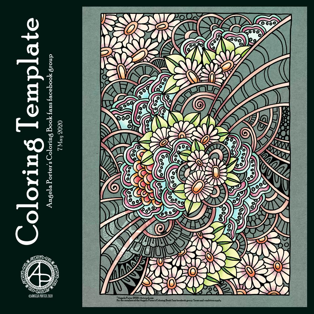
It’s a lovely sunshiny day, so a sunshiny mandala seemed an appropriate design to create today.
The background is one of my Distress Oxides ones, though I’ve recoloured it to reflect the sunshiny nature of my mandala.
I drew the mandala digitally using Autodesk Sketchbook Pro.
This was a really nice exercise for me. It’s been a few days since I’ve done much in the way of digital art. I’ve been so focused on stuff for my art journal that I’ve had an unplanned break from it.
I must say that I rather like not having a bit of a mess around me, albeit a bit of a pretty mess. Digital art is very clean, tidy, and that suits my creative inclinations quite a bit.
Talking of my art journal, my A5 mixed media sketchbook arrived yesterday. Actually, a pack of three from Arteza did. So, I started by colouring three of the pages last night. I also drew some patterns on the first page to try some ideas out. I’ll show these another time.
This morning, I affixed some tags to the first page. I hinged them so I could have some tuck-spots on the back of them. I also drew some designs and painted/coloured them. And, I finished off some more inchies!
I’ve had quite a busy arty morning!
So far, the A5 sized journal seems to be working out so much better for me than the A4 one. The smaller sized pages means I can’t put so many items on a page, not without layers anyway. That seems to make it easier for me to achieve a pleasing arrangement of elements. Only time will show if it actually does work out well for me.
The mixed media paper in the Artezea sketchbook is rather rough and very different in texture to the ClaireFontaine one I usually use. However, as it’s likely to be covered with tags, pockets, envelopes and so on then it won’t be too much of an issue.
I’ve become a bit obsessed with making art journal bits and bobs over the last couple of days. This morning has been no exception, other than the more I do and watch, the more ideas that come to me.
Inchies
Yesterday, I created some blank, printable, templates for inchies, twinches and tea cards. I printed them out on plain paper so I could draw in them. I also made a list of themes I could tackle for them too.
I spent an hour or two filling in a sheet of inches with various designs. Then, I printed them on plain paper and also vellum for calligraphy. The vellum has a rough texture, interesting colours and subtle patterns in them. I have a laser printer, so wasn’t sure if it would print on the vellum; it did, however the print does come off if I’m a bit rough with it.
Nevertheless, I coloured some of the inches with Distress Inks and then adhered them to some 1″ tiles of thick chipboard card. I edged them with tresure gold wax from Imagination Crafts. Then, I gently applied a thin layer of Ranger’s gloss multi-media medium, to see if it would seal the laser printing; it did! It also brought out the colours of the Distress Inks.
Seed packets/envelopes
These are simple enough to make. There are plenty of tutorials online for them. I made them from ordinary printer paper, then coloured them with Distress Inks.
Next, I added some dot embellishments using a small ball tool with Imagination Crafts’ Starlights metallic paint in rich gold. This is a beautiful, glittery, shiny paint that leaves some dimension when applied this way.
Finally, I adhered the inchies I’d made, along with some vintage book paper, to the envelopes.
I’m not sure if these envelopes are finished. I do want to use them to store either journaling notes in, or little pieces of art or mementos in them.
Tags
I haven’t been at all sure about tags and using them. However, I thought I’d see what I could do with them after yesterday’s mucking about with a tri-fold tag that turned into one single tag.
I wanted to make some templates for cutting the corners at the top of the tags, so I did that, using various widths of paper and slopes to remove the top corners.
I then realised I needed something to store them in, so I made an envelope for them.
The envelope has a more rectangular top flap and a plain front, perfect for embellishments.
Backgrounds
Something occurred to me this morning while watching someone make tags using background paper. I thought that I could use my colouring sheets and entangled designs as my own background paper. So, I thought I’d try to use some.
I found some old designs on my computer and printed a couple of them both as the black line originals and with a grey line.
I made a tag and cut out a piece of one of the designs. I coloured the design with Distress Inks and used them to subtly colour the tag.
I didn’t like the way the neatly cut out background pattern looked when I placed it on the tag. So, I tore the edges. I still wasn’t happy, so I tried tearing it into strips. That looked better, but I still wasn’t happy with it, but I stuck the pieces down.
I used a gold glitter gel pen to add lines and patterns between the torn pieces, which created some pattern and interest.
Finally, I added a distress ink coloured belly band along with a word, “creativity” to the tag. For now, I tucked one of the seed packets behind the belly band.
The background drawing may be just too busy, detailed, and varied to work well. I need to bear this in mind going forward.
Notebook
I am keeping notes of how I make tags, pockets, and other bits and bobs in an A5 dot grid notebook, along with ideas for other things to do or try. It’s turning out to be rather useful as a reference.
Acceptance
I’m struggling with accepting that what I’m creating for my art journal is “good enough”, “attractive enough”, “pretty”. It’s not like others I’ve seen, which is part of my problem.
I seem to like, mostly, neat edges, borders on work, very organised, neat, and carefully, geometrically arranged elements in my designs. I know I want to use my own artwork to create a journal, but I’m not sure it’s going to be successful in any kind of way. I have no idea if I’m on a wild goose chase.
I know I enjoy making these bits and bobs, I just don’t know if the overall end products actually work, so I’m doubting myself. I’m not sure I like what I’m creating. I mean, I really like individual elements such as the inchies and little panels on the envelopes. It’s when I start to actually combine them or put them into a journal that it all seems to go more than a bit skew-iffy.
I’m at that uncomfortable place I often find myself in when I’m creating a mandala or drawing or digital painting; partway through I want to give up as I think that what I’m creating is awful and not working. With the mandalas, drawings and digital art, I’ve learned to work through that point and, mostly, to complete the work. I’ve learned by experience and perseverance that I can produce art I’m happy with.
I’m not at all sure of that with this art journal type stuff. I’m not sure at all if I can find my own creative ‘voice’ with this, or whether I have to accept that as much as I’d like it to be one of my ‘things’ it’s not meant to be and that I can continue to watch and admire others for what they create.
Maybe, I’ll end up making digital elements for journals for others to use in their creations. Maybe, I’ll find that collections of inchies are my thing (along with twinchies and tea cards and other little designs).
For now, I’ll take a bit of a break from it all, and come back to it with fresh eyes and a fresh mind.
Flowers always cheer me up, and I thought they’d make a nice motif in the design. I kept to the same kind of flowers. In fact, although this drawing is still quite detailed and complex, there’s far fewer motifs and patterns in it than I’d usually use.
I also like to partly colour the template – it helps to bring it partly to life to show on social media. Today, I’ve chosen a fairly pastel color palette. I think that reflects how I’m feeling today.
I drew the design on quadrille (squared) paper with a 06 Sakura Pigma Sensei pen. This is an unusual choice for me; the nib is broad and a bit more flexible than I’d usually use. The result is a bold design with bold lines.
I scanned the design in and used some digital wizardry to remove the quadrille grid. I also corrected an error and removed some smudges. All this was done in Autodesk Sketchbook Pro, which I continued to use to colour the design in.
So, Angela, how are you doing?
I’m so tired today. I couldn’t sleep past 4:30 am, and after a long while waiting to go to sleep I got up an started doing some arty stuff.
As well as feeling tired, my digestive system is uncomfortable still and I’m feeling a bit icky-sicky too. No headache today, thank goodness.
I am feeling a bit fed up today – fed up of feeling under the weather and tired. Hopefully I’ll have a nap later on today, and that may help my mood a little.
Until then, I’m going to do some arty stuff, most probably in my art journal, or maybe some work for the Mattias Adolphsson Domestika course, “The Art of Sketching: Transform your doodles into art.”
I thought I’d try it out to kick start my imagination and perhaps discover new ways of working, stretching myself somewhat. So far, I’m enjoying it. I work at my own pace.
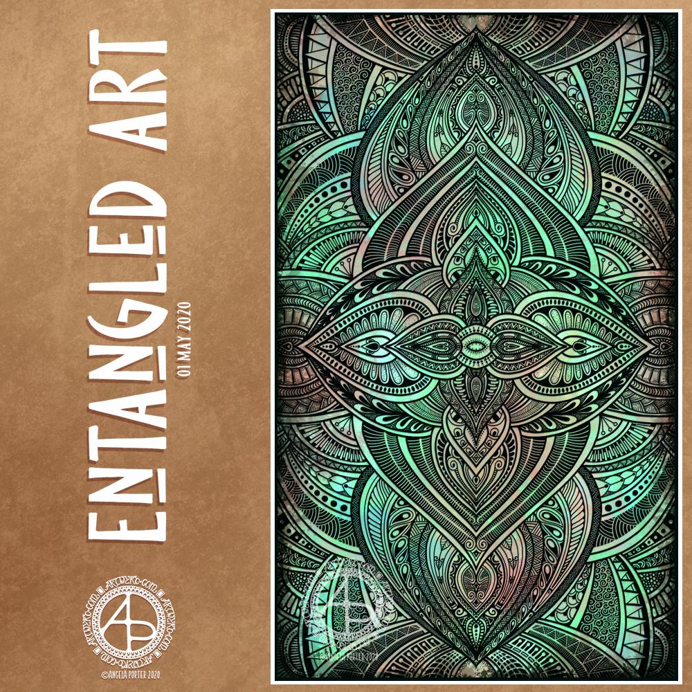
This morning, I finished this Entangled Art drawing.
The background was created using Distress Oxide inks and sprays of water on mixed media paper then scanned in.
The drawing was done digitally using Autodesk Sketchbook Pro.
A very intricate, detailed drawing in my signature ‘Entangled’ art style, that includes inspiration from nature, architecture, geometrical and repeating patterns, and overlaps a little with zentangle.
A new month!
While we may all be in lock-down, the days still pass us by and go into the past.
I sit here, at my desk and looking out of my window as I work. Sunshine, blue sky with some heavy grey clouds cover the world. Fluffy dandelion seeds are dancing around in the air, thanks to a fairly swift breeze. The trees that cover the valley sides are all cloaked in their spring green finery. It’s a fitting view for Beltane, May Day.
The world is now fully awakened from it’s winter sleep. The long, dark days of winter are now behind me and the days have been rapidly lengthening towards the longest days around the summer solstice in June.
In years past I’d be looking forward to days out, enjoying evening activities and meetings in daylight. I was looking forward this year to going out with my DSLR to take photos of flowers and plants, architecture, and anything else that grabbed my attention. That’s not to be. However, I will be looking forward to doing this in the future.
As much as I would like to be wandering around with my camera, I know it’s more important to be at home, to avoid contact with others, and to help slow down, if not halt, the spread of the Covid-19 virus.
The most difficult thing is not knowing when the current restrictions will safely be lifted. And when they are, the number of cases is likely to increase once again and we’ll return to lock-down.
I am so grateful that I am able to work at home, am happy to stay at home, for as long as it takes. The longer this goes on, the easier I find it to remain at home. I do worry that when the lock-down is released I may find I’m filled with fear and anxiety about leaving my home. I struggle with that anyway, but I do wonder what effect this will have on me.
Still, I can still think of things I’d like to do, places I’d like to visit, once it is safe to do so once again, even though that particular point in time is, as of yet, not in the calendar.
It’s Thursday again, and one more week of quarantine is behind us. That means one week of lockdown ahead of us. Feeling sad about all those who are sick or who have died as as a result of the sanctions, but the sanctions have kept others safe from Covid-19, thus reducing serious illness from the virus, or death.
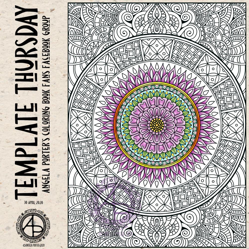
As always, the template is available free to members of the group, which is also free to join. So, if you would like to colour it, meet some like-minded people, and share your colourings with us, pop over the the group and join in!
I drew and partially coloured today’s template digitally using Autodesk Sketchbook Pro. I needed to draw a mandala to soothe me. I’m tired today and feeling ‘meh’. That is reflected in my colour choices.
Yesterday, I said I’d like to make simple pockets for my sketchbook-journal to hold my artwork rather than gluing it to the pages. So, this morning, I started my day looking on YouTube for some ideas and this video by joie de fi was the top of the list.
While I was watching it, I thought I’d make an instruction sheet to go in my sketchbook (or my virtual one I’m making in One Note).
I picked up some quadrille paper and wrote and drew as I watched the method for the first pocket. I worked in ink without pencil sketches and I made quite a few mistakes. A Tipp-Ex mini pocket mouse was my friend.
When I’d finished the instruction sheet, I scanned it in and used Autodesk Sketchbook Pro to remove the square grid from the paper, clean up some smudges, and correct minor errors.
Then, I added some colour to help bring out the drawings, but also to help with the instructions.
I’ve yet to make this kind of pocket, but I’m sure I’ll be able to do so quite easily now.
Reflecting on the artwork/illustration
This was a lot of fun for me to do. It’s something I’ve not done much since my days as a science teacher, or a learner in school and university myself. I’d forgotten how much I enjoy creating instruction sheets with my own drawings on them.
Back in those days, I would’ve used a ruler to draw straight lines, pencil for the diagrams, pen for the words, and little or no colour. Here, I free-handed the drawings, wobbly lines and all. The colour also adds life and dimension to the diagrams/drawings/illustrations.
The layout of the instructions may not be the best and easiest to follow through. That’s because I did this as I was watching the first part of the video. I think that for the next one, I need to sketch out the steps and notes first, and then work on organising them more clearly.
Yes, I’m going to do some more instruction sheets like this!
I also really need to do more hand lettering! I’ve lapsed in my writing practice, that’s for sure.
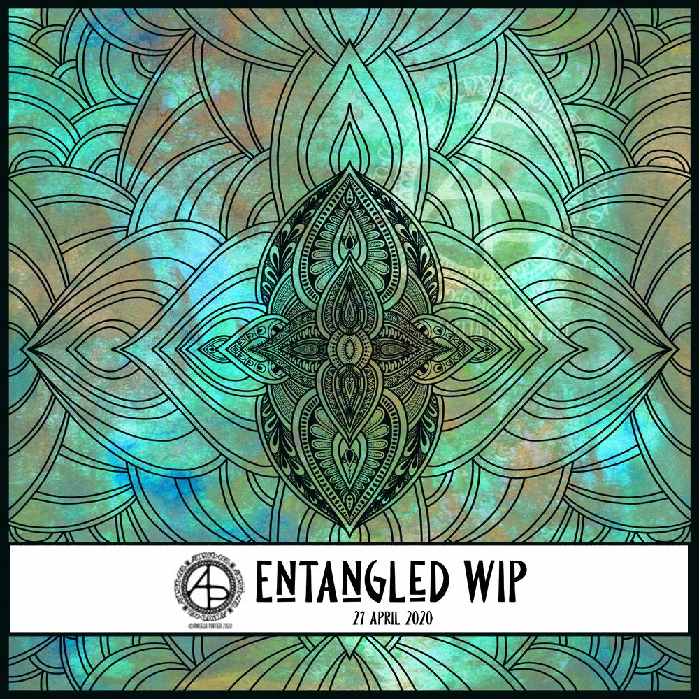
This morning started early and I played around with metallic paints along with Distress Oxide inks in my sketchbook / art journal. I have some interesting backgrounds as a result.
I also created a background for today’s artwork. I have tweaked the colours a little, digitally. I don’t know what WordPress does to the colours, but they look different in Autodesk Sketchbook Pro. I used Distress Oxide inks and have ended up with a rusted, weathered, kind of distressed/grungy texture.
Of course, I can always alter the background later on, if I wish.
I used the symmetry tool to reflect my drawing. You can see I’ve laid out the bare bones of the design and have started to fill the sections in with texture and pattern. I have a lot more work to do to complete the drawing. Then, I’ll think about shadow and highlight to help to bring the design to life some more. Or perhaps I’ll make it look like a stencilled design on the background, one that has some dimension to it.
Over the week I’ve been adding to my sketchbook- notes and images, ideas and reflections.
Each page has been coloured with combinations of Distress Inks, applied using the black side of a piece of Cut and Dry foam, followed with a spritz of water to bring out some water-staining grungy loveliness.
All the little drawings have been done on either Daler-Rowney Smooth watercolour paper (300gsm) or mixed media paper, either from Claire Fontaine or Daler-Rowney. The papers have been coloured with Distress Oxide Inks, Distress Inks, or a combination of them. Most of the pieces have had the inks applied with the foam, but some were made by brayering Distress Oxide inks onto a gelli plate and taking a print of them.
The reflection about what I like, what I don’t like, and ideas that arise is important to me in my sketchbook/journal. I do reflect on my art, a bit too much in my head. When I write it down, it forces my sometimes abstract and swirling thoughts into some kind of order. When I make these thoughts a material manifestation by writing them down, it helps me to recognise the thoughts, sift through that which is useful, and still record those that are not particularly useful at this moment but may be in the future.
I think I need to find a way to do this with my digital art. My mind goes to using One Note to do this. I shall think on this one, and make a note of it in my physical sketchbook/journal.
I wonder how many are trying to keep busy, busy, busy during the lockdown? And how many are learning how to just ‘be’, relaxing and taking time for self-care?
Self-care has been a long, difficult series of lessons for me. It’s a practice and not a perfect situation. However, self-care is important.
I don’t mean personal grooming, which is important, but it means taking care of your emotional and mental needs as much as your physical needs.
Today is a day where I’ll need to practice a lot of self-care. Migraine-style headache woke me up way too early and although the pain has gone it has left me exhausted, unfocused, and needing sleep. So, I’ll soon be returning to bed to sleep the lingering effects of the migraine away.
To help me cope with the migraine, I spend a few hours working on my mosaic crochet blanket/throw, and then created the above. Both very self-soothing activities for me.