Entangled Art – 1 May 2020

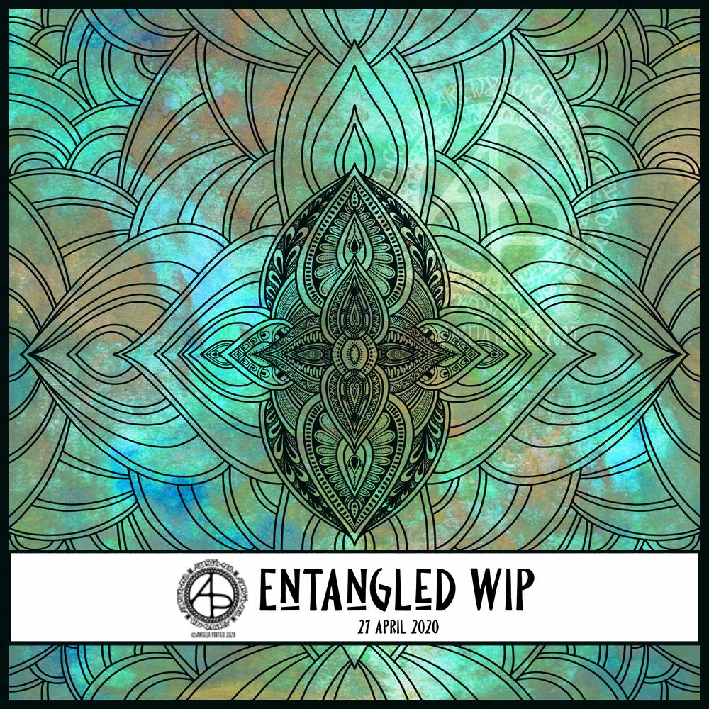
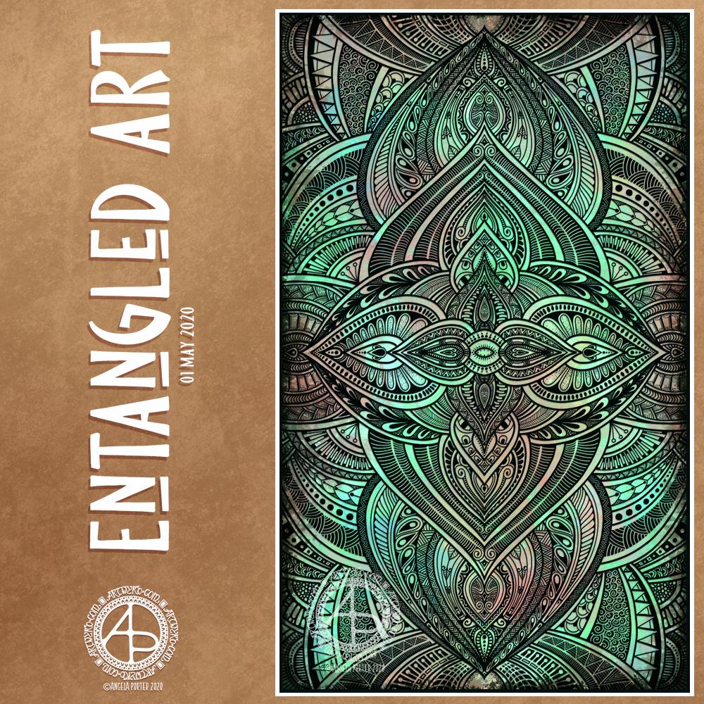
This morning, I finished this Entangled Art drawing.

The background was created using Distress Oxide inks and sprays of water on mixed media paper then scanned in.

The drawing was done digitally using Autodesk Sketchbook Pro.

A very intricate, detailed drawing in my signature ‘Entangled’ art style, that includes inspiration from nature, architecture, geometrical and repeating patterns, and overlaps a little with zentangle.

A new month!

While we may all be in lock-down, the days still pass us by and go into the past.

I sit here, at my desk and looking out of my window as I work. Sunshine, blue sky with some heavy grey clouds cover the world. Fluffy dandelion seeds are dancing around in the air, thanks to a fairly swift breeze. The trees that cover the valley sides are all cloaked in their spring green finery. It’s a fitting view for Beltane, May Day.

The world is now fully awakened from it’s winter sleep. The long, dark days of winter are now behind me and the days have been rapidly lengthening towards the longest days around the summer solstice in June.

In years past I’d be looking forward to days out, enjoying evening activities and meetings in daylight. I was looking forward this year to going out with my DSLR to take photos of flowers and plants, architecture, and anything else that grabbed my attention. That’s not to be. However, I will be looking forward to doing this in the future.

As much as I would like to be wandering around with my camera, I know it’s more important to be at home, to avoid contact with others, and to help slow down, if not halt, the spread of the Covid-19 virus.

The most difficult thing is not knowing when the current restrictions will safely be lifted. And when they are, the number of cases is likely to increase once again and we’ll return to lock-down.

I am so grateful that I am able to work at home, am happy to stay at home, for as long as it takes. The longer this goes on, the easier I find it to remain at home. I do worry that when the lock-down is released I may find I’m filled with fear and anxiety about leaving my home. I struggle with that anyway, but I do wonder what effect this will have on me.

Still, I can still think of things I’d like to do, places I’d like to visit, once it is safe to do so once again, even though that particular point in time is, as of yet, not in the calendar.

Template Thursday

Coloring Template ©Angela Porter | Artwyrd.com

It’s Thursday again, and one more week of quarantine is behind us. That means one week of lockdown ahead of us. Feeling sad about all those who are sick or who have died as as a result of the sanctions, but the sanctions have kept others safe from Covid-19, thus reducing serious illness from the virus, or death.

As another week has gone by, it’s time for another template for the members of the Angela Porter’s Coloring Book Fans facebook group.

As always, the template is available free to members of the group, which is also free to join. So, if you would like to colour it, meet some like-minded people, and share your colourings with us, pop over the the group and join in!

I drew and partially coloured today’s template digitally using Autodesk Sketchbook Pro. I needed to draw a mandala to soothe me. I’m tired today and feeling ‘meh’. That is reflected in my colour choices.

Entangled WIP

Entangled WIP 27 April 2020 ©Angela Porter | Artwyrd.com

This morning started early and I played around with metallic paints along with Distress Oxide inks in my sketchbook / art journal. I have some interesting backgrounds as a result.

I also created a background for today’s artwork. I have tweaked the colours a little, digitally. I don’t know what WordPress does to the colours, but they look different in Autodesk Sketchbook Pro. I used Distress Oxide inks and have ended up with a rusted, weathered, kind of distressed/grungy texture.

Of course, I can always alter the background later on, if I wish.

I used the symmetry tool to reflect my drawing. You can see I’ve laid out the bare bones of the design and have started to fill the sections in with texture and pattern. I have a lot more work to do to complete the drawing. Then, I’ll think about shadow and highlight to help to bring the design to life some more. Or perhaps I’ll make it look like a stencilled design on the background, one that has some dimension to it.

Tranquility

Tranquility ©Angela Porter | Artwyrd.com

Not sure I’ve captured the sensation of tranquility all that well. All I can say is that I gained a sense of tranquility whilst drawing the mandala.

I’m tired today. Again, I woke way too early and couldn’t get back to sleep. So, I thought I’d try to do some art to soothe and relax me.

Background texture – Distress Oxide inks on Daler-Rowney mixed media paper.

Mandala – Digital art using Autodesk Sketchbook Pro and Microsoft’s Surface Studio and Surface Slim Pen.

Zen

What is Zen? Quote – anon. Artwork ©Angela Porter | Artwyrd.com

I wonder how many are trying to keep busy, busy, busy during the lockdown? And how many are learning how to just ‘be’, relaxing and taking time for self-care?

Self-care has been a long, difficult series of lessons for me. It’s a practice and not a perfect situation. However, self-care is important.

I don’t mean personal grooming, which is important, but it means taking care of your emotional and mental needs as much as your physical needs.

Today is a day where I’ll need to practice a lot of self-care. Migraine-style headache woke me up way too early and although the pain has gone it has left me exhausted, unfocused, and needing sleep. So, I’ll soon be returning to bed to sleep the lingering effects of the migraine away.

To help me cope with the migraine, I spend a few hours working on my mosaic crochet blanket/throw, and then created the above. Both very self-soothing activities for me.

What do you do for self-care?

Truth

This quote by Buddha has kept popping up in my life over the past couple of days. So, this morning I really thought I could use it in some artwork.

The background is one I created using Distress Oxide inks on A4 Daler-Rowney Smooth watercolour paper.

The typography I created in Affinity Publisher.

The rest of the artwork was completed in Autodesk Sketchbook Pro.

I like the raggedy edge of the quote banner, as well as the subtle, patterning of the mandala.

A nice way to spend a morning when I’m feeling headachy, fuzzy-headed and tired.

Wanderlust

Wanderlust ©Angela Porter | Artwyrd.com

Wanderlust

As I’m pretty much an introvert, I’m usually happy in my own company and happy at home. There are times when even I get and a huge desire to visit somewhere else, where the feeling of wanderlust becomes so strong I have to act on it, even if it’s just a drive in my car.

I, like us all, have no idea when I’ll be able to do this again, just like us all. The Covid19 crisis has changed everything and liberties I took for granted are not not available now and shows how much I enjoyed them even if I didn’t use them all the time. I had the choice.

Yesterday was one of those days where wanderlust overwhelmed me. With it came a huge dose of frustration and sadness, as well as a loneliness I rarely feel.

Also, I was over-tired. I know that when I’m over-tired, my emotional resilience is low. So, all of these things bubbled up and I ended up in bed in the afternoon. I felt a bit better on waking, and my attention went to creating some art.

As I couldn’t indulge my wanderlust physically, I thought I’d try to find a way to express it artistically, and the above is the result.

Words always interest me, and their meanings and origins too. So, I wanted to include the definition of wanderlust in my art. I wanted to make it look like torn paper, or a rip in the background, so I created a messy edge for the typography panel. I actually like how this turned out; I felt like I was being torn apart, emotionally, by the feeling of wanderlust, and a darkness was welling up from that tear.

I used one of my Distress Oxide background textures and drew an entangled art design on a layer above it.

Once I was happy with the design, I coloured the line art, created a copy of it, and applied various effects to these two layers.

I’m really happy with this artwork. It made me smile inwardly and helped to lift my mood some more.

ATC Card backgrounds

ATC Card Backgrounds ©Angela Porter | Artwyrd.com

I’m still tired today, over-tired, exhausted. I woke up, however, with the idea of creating some ATC card backgrounds using Distress Oxide inks, and these are the results.

Except for the middle and right cards in the bottom row. I wanted to try out using Distress Microglaze to see if it brings out the colours and layers of colour and texture. It does, though it’s not easy to see on the scan. I do need to do before and after scans. I also need to see if I can draw on the panels treated this way too.

So, ATC cards are 2½” x 3½” in size and were started as a collaborative art project where artists and crafters could swap the cards with others, sharing inspiration and creativity in the process.

I just think they could be a lovely size to work on and mount on greeting cards.

All of these cards were cut from 300gsm watercolour paper, which is very thick and sturdy.

I’m still playing around with Distress Oxide Inks to get a feel of how I can get them to work for me as well as creating backgrounds for my traditional and digital art.

My mind is ticking over various things I’d like to do with these, both traditionally and digitally.

If you have any suggestions what I could do, leave a comment!

Flowery

Background – Distress Oxide inks and water spray on Daler-Rowney mixed media paper.

Flowers and background foliage – digital art using Autodesk Sketchbook Pro.

I had a lovely time creating this artwork. Flowers are something I love and find in my art an awful lot. It took a few iterations to get the drawing of the flowers and leaves as I wanted them. A lot more iterations were needed to get the colour and texture of the flowers and leaves so that I was happy with them.

I wanted a bit more interest in the background, so I drew a leafy, simple mandala that was coloured with shades of green. I then replicated it, resized it, and applied different layer effects to each copy of the mandala.

As I was doing this, it was reminding me of the mixed media work I did a few years ago, particularly using stencils to add interest to a background.

Digital mixed-media … without the mess! I’ve said it before – I’m averse to creating a mess!

Anyway, this has been an interesting experiment in the realms of digital art and my brain is now ticking over with ideas for the future. All I have to do is make a note of them!

World Art Day 2020

Poppy Mandala ©Angela Porter | Artwyrd.com

The aim of art is to represent not the outward appearance of things, but their inward significance.

-Aristotle

Today is World Art Day.  It is meant to be an international celebration of the fine arts which was declared by the International Association of Art (IAA) in order to promote awareness of creative activity worldwide.

Each year, on 15 April (Leonardo da Vinci’s birthday), World Art Day celebrations help reinforce the links between artistic creations and society, encourage greater awareness of the diversity of artistic expressions and highlight the contribution of artists to sustainable development. (UNESCO)

“Our Organization would thus like to pay tribute to the solidarity shown by artists and institutions at a time when art is suffering the full force of the effects of a global health, economic and social crisis.”

— Audrey Azoulay, Director General of UNESCO

About today’s art

I started by choosing one of my Distress Oxide backgrounds to use for today’s art.

I woke knowing I wanted to do an arrangement of stylised poppies with a mandala for a background, and this is the result.

Poppies symbolise, among other things, a lively imagination, messages delivered in dreams, beauty and success, as well as remembrance. They, along with their seed heads, often appear in my art.

It took me many iterations of colour, shadow and highlight to get the mandala appearing as I wanted it to – lacy, light, in the background but still standing out. I think I’ve managed to achieve that fairly well.

Overall, I’m pleased with the finished artwork. I do think the poppies and mandala could be moved towards the top of the background, something that is easy enough to do as I have the layers saved. However, the artwork is good enough for now.

I suspect I’ll be creating more art using a couple of the backgrounds I’ve created through the day. It’s a satisfying process to use backgrounds I’ve created myself rather than using ones that I have purchased.

Truth

“Truth” ©Angela Porter | Artwyrd.com

I like to use a word in my artwork from time to time. Truth was the word I knew I had to use as the central point for some artwork, and that’s where I started, along with one of the Distress Oxide backgrounds I made yesterday (in the middle of the image).

After I’d decided on the typography and placed it centrally, I then started to draw digitally. I made use of the symmetry tools in Autodesk Sketchbook Pro, along with a flexible nib and fineliner brushes.

I had no idea what kind of design would result, I just went with the flow and intuition and thoroughly enjoyed doing so and losing myself in the art.

I added shadows and highlights once the drawing was finished for that sense of dimension and ‘life’.

I am really pleased with the finished artwork. There’s something about symmetry, spirals, repeating patterns, and intricate, abstract designs like this that just makes my arty heart smile and sing. I always return to this style, it seems to be at the core of my being.

I also love to draw on coloured and textured backgrounds. I also think I’ve found a way to combine more traditional media (making the backgrounds) with digital art (drawing and adding shadows and highlights) in a way that really works for me.

My only problem is that I do tend to try to branch out into other kinds of art and never seem quite so satisfied with them. This doesn’t mean I’m going to abandon them; they need a lot more work and thought and maybe structure.

Perhaps that’s why I like this particular piece of art so much – it has clearly defined structure. The colour palette is defined by the background and so I’m not struggling with what colours to use. Having the black line structure defines clearly where shadows and highlights need to go.