Exploring Mark Making and Pattern #DrawWithMe

Click on this link to view today’s video on YouTube.

I had a lot of fun with this sketchbook page. It’s well out of my ‘comfort-zone’ as there are absolutely no black lines, not even the lines that define the basic shapes.

This is inspired by illustrator Kate Sutton, whose Domestika course I started watching yesterday. And there’s another project I have on the go that is inspiring me to explore this kind of drawing.

I’ve tried this before, but felt so uncomfortable with it that I gave up very quickly. Today, I was determined not to use any black lines at all. Instead, I picked a colour palette of just four colours of Arteza EverBlend markers. For each colour, I chose a similar one from my set of Zig Writer pens.

I started by creating the collage of simple shapes using the markers, overlapping them so that the colours mixed. I was careful not to mix the pink and green; I didn’t want to make mud!

Once I was happy with the basic design, I used the Zig writers to add patterns made from simple marks. To begin with, this felt really awkward, uncomfortable, and just plain wrong. However, the more I did, the easier it became, and the more I liked what was happening. I’m so glad that I persevered!

I dug out a white gel pen to add some brighter, lighter marks and to play with the ‘stitching’ to the top right. The idea that I was using pen ‘stitching’ to connect shapes and patterns amused me.

Using the white gel pen reminded me I had other gel pens to use, and use them I did.

I love the translucency of the marker pens and the way that the patterned shapes seem to float. The use of monochrome colours in these shapes, along with white, just gives an airy, delicate feel to them. I can now see the value of this way of using no black line. I have a lot more exploring and experimenting to do. My mind is ticking over how I can make use of this in a project I’m developing at the moment.

As eager as I am to continue my explorations, I have an errand to do first. But when I return home, well, I’m going to try out some of my ideas both on paper and digitally and see where this takes me.

Draw With Me | A Sketchbook Page of Oyster Shells – Part 1

Click on this link to watch the video tutorial showing how to draw this motif over on YouTube.

I’ve been having a lot of fun filling sketchbook pages with variations on a basic motif/pattern. It’s time, I think, to fill a sketchbook page (A5-ish) with variations of just one motif. Variations that include filler patterns, colours, shading and media used. I’m not sure that makes sense, but sometimes it’s easier to show rather than tell. Or perhaps tell while showing what I’m doing/thinking.

The video is much shorter than usual, at less than 30 minutes. I think that looking at drawing just one motif is a bite-sized activity, whereas a whole sketchbook page in one go can be a bit overwhelming.

There, I’ve got to a clear explanation of my intention behind this video!

So, I’ve decided to start with a page of variations of oyster shells. I start with line art in an Oysteroid style. Oysteroid is a tangle pattern by Eni Oken. I make sure that I use thicker lines to give the illusion of depth.

Next, add colour. I used two pale warm grey marker pens to add shadows. (Ohuhu WG1 and WG3). Then I used two peachy pinks to add colour (Ohuhu R18 and R21).

Using an 01 fineliner, I added the textural patterns. I decided to use a different one in each layer of the motif. Perhaps a bit too much pattern.

Finally, I added dots of white gel pen for the highlights.

I completely forgot to add a drop shadow beneath the motif to lift it off the paper a little. I’ll add that at a later point in time I’m sure.

The patterns added complexity to the simple colour/shadow. They also masked where my impatience meant the black pen hadn’t dried fully and the ink smudged a bit with the alcohol marker.

I do hope you’ll take a look at the video, get out pen, paper and some coloring medium and draw along with me.

Doodleworlds – A5 Illustration WIP

Adding colour digitally lets me try things

I’ve learned a new ‘trick’! New to me that is. I’ve finally worked out how I can use grey shadow underpainting to increase contrast in my artwork! It’s new to me, but not new to the art world I’m sure.

I’m really happy with the result. Digital art makes it so easy to try things out in layers. So, this is the way for me to go.

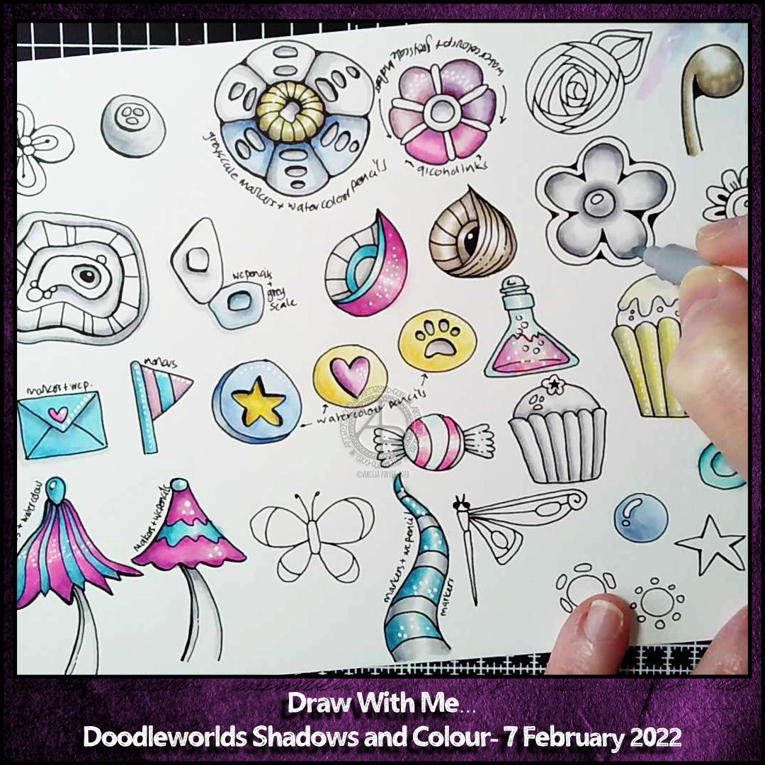
Yesterday morning, I started adding shadows to some pen drawn motifs with marker pens. I wanted to see what that would look like. I prefer these shadows to those done with graphite or chalk pastel pencils.

Then, I added colour using watercolour pencils and a damp brush, just to see what would happen. I liked the result! Lots!

I filmed part of this process today, and here’s the video on YouTube