One of the members suggested a Christmas in July template, so that’s what I did. A page full of iconic Christmas motifs, admittedly not all of them, but a fair selection.
If you fancy printing this template off, all you need to do is join the group! It’s completely free, as are all the templates I design for the group. All I ask is that you follow the terms and condtions of use.
I drew these little designs on Rhodia dot grid paper with a Tombow Fudenosuke (hard) pen. I cleaned the drawing up in Autodesk Sketchbook Pro, then digitally added colour. Some are in the more traditional Christmas colours, others are less so. No rules for colouring! Whatever makes you happy or peaceful is fine! The most important thing is to have fun and enjoy what you do.
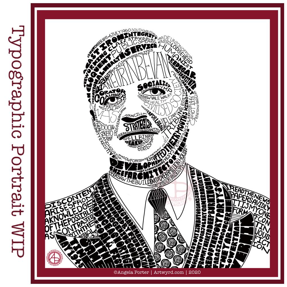
As for me, today I’m taking a break from the typographic portrait of Nye Bevan that I shared yesterday. My artistic intuition needs some time to work out what to do with it, both to complete the blank areas and to edit places that aren’t working.
I need to pop out for a walk too. I’ve been sat down, focused on art too much over the past couple of days. It’s overcast and there’s a stiff breeze, so it’s perfect for me!
I’m not entirely sure that I’ve fully succeeded. I seem to have a lot of white space, and that is all to do with the photograph I used. I thought it had enough detail in terms of tones of light and dark. I guess not! Or maybe this is just part of my style.
There are areas on his jacket to the bottom left and right that need pattern or image put there. I have yet to work out what to do about the shirt. Also, I need to try removing the lines around the jacket and collar too.
Aneurin “Nye” Bevan was the main architect of the UK’s National Health Service after WWII. He’s also considered one of the best political orators of all time. There’s an Aneurin Bevan website if you’d like to know more.
While this is hand-drawn, I chose to work digitally. My Surface Studio allows me to work with a digital pen directly on the screen as if I was drawing on paper. This makes it easy to edit as I work.
I now need a break from this particular artwork, so I can look at it with fresh eyes (and any feedback people offer on it) and then return to it another day.
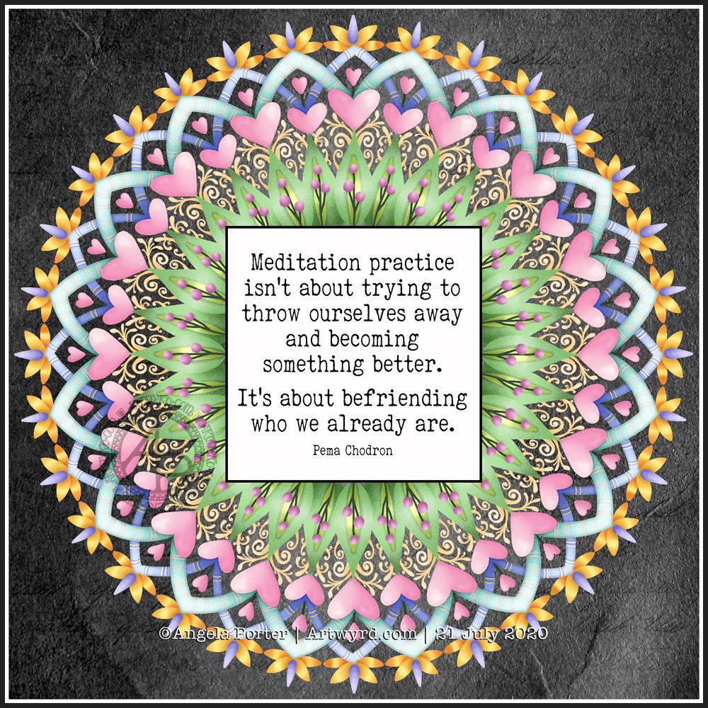
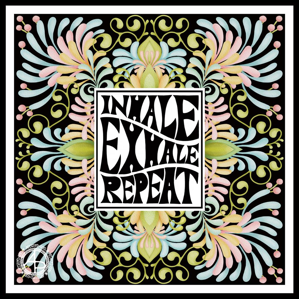
Today’s artistic offering is a mandala with a quote about meditation.
The simple typography was done in Affinity Publisher. I used Autodesk Sketchbook Pro to create the mandala.
I just needed some quiet time this morning. I spent quite a while meditating before breakfast. Then, my attention turned towards art.
I knew I wanted to include a quote in today’s art, and I found this quote about meditation that resonated with me.
Meditation and mandalas go together like bread and butter!
The mandala design is quite simple and bold, in quite subtle colours, for me.
It’s going to be a quiet day for me today. A self-care day. I may not get anymore work done on my typographical portrait, but I will be immersing myself in arty and/or creative activities for sure.
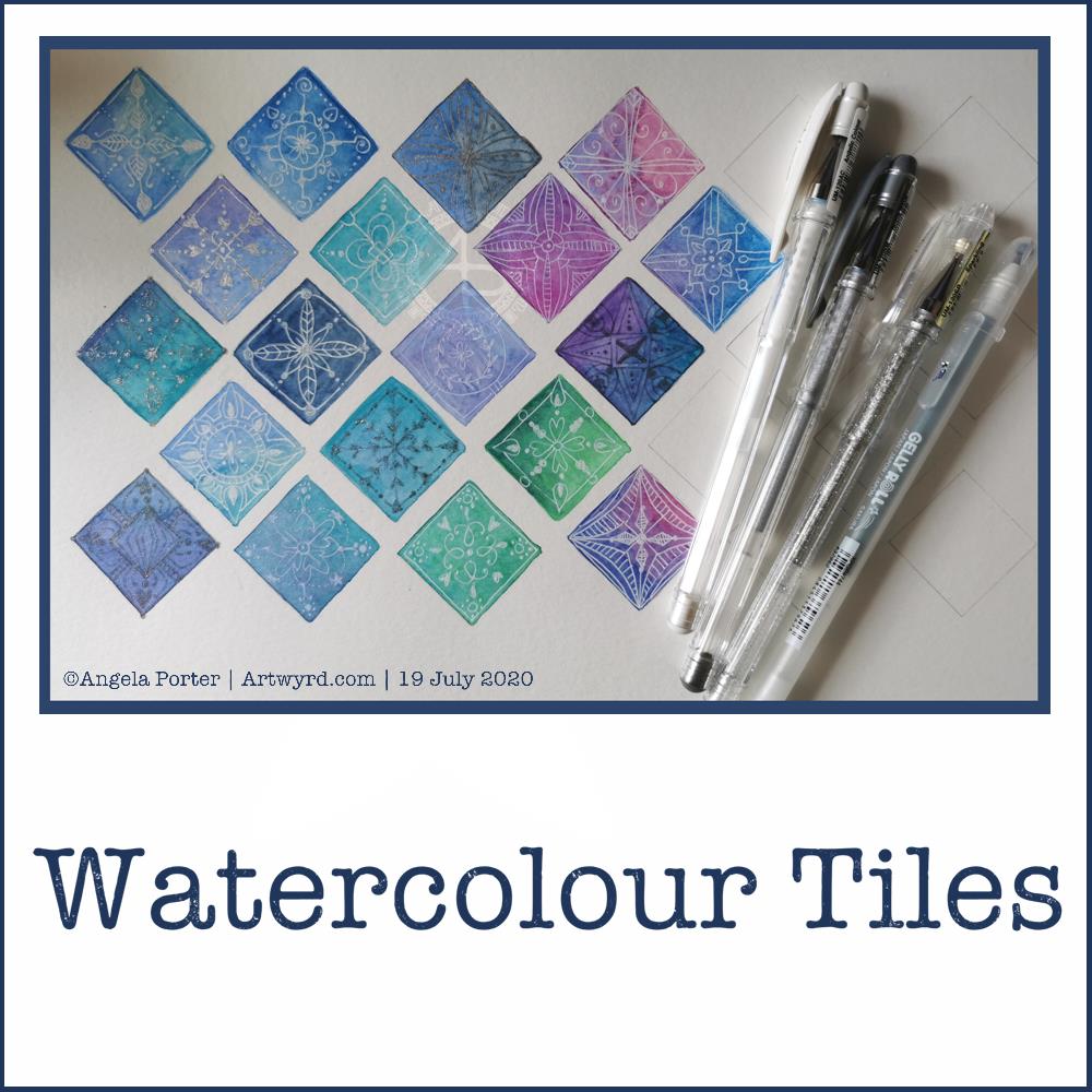
Good news – the headache has gone! Yay! The sun is shining, I have uplifting music playing, and I’ve spent some of the morning practicing watercolour skills and working out how to subtly draw/paint on top with white.
The little tiles at the bottom have designs painted on them with white gouache. There’s a lot more variability in line width with these.
The book marks have had the designs drawn using a white Soufflé pen by Sakura. The ink goes on clear but dries a matt and opaque white.
I used som Molin du Roy watercolour paper from Canson for these. The tiles are approx 2″ x 2″, the book marks are approx 2″ x 7″.
I may mount the tiles on greeting card blanks. The bookmarks need a hole punching in the top and then some string/ribbon threaded through.
I did try out the Sakura Quickie Glue pen and embossing powder yesterday, but really wasn’t happy with it. I also tried using a variety of Sakura pens to draw the outlines before watercolouring – black Glaze, metallic siver Gelly Roll and silver Stardust. They were waterproof, but just didn’t give me the borders for the patterns that I wanted. The black was very bold and gave a rather stained-glass feel to the tile. But, white turns out to be my favourite.
It’s been nice to spend quite a few hours working with watercolours and trying out ideas without any pressure to create anything that is finished. Sometimes making art for the fun of making art is enough and much needed to soothe some rather battered emotions.
Another day, another migraine type headache. Nothing helped yesterday, not even painkillers. I woke up with the same headache, though some painkillers did ease it somewhat, eventually. Enough that I could go out for a short walk around my local cemetery.
I needed to create in order to create a mindful space within me. So, I thought a collection of square tiles may be a nice thing to do. A way to practice with watercolours and to do a bit of pattern making on them.
I used a square template to mark the squares out, not very evenly it has to be said. Faint pencil lines that would, hopefully, become part of the watercolour.
I used Daler-Rowney Aquafine Smooth watercolour paper. That shows how little I was thinking clearly. I really don’t like working on this paper at all. The watercolours dried too quickly, and when they were just wet enough to drop more wet colour into them, they just didn’t flow and mix as I like them to.
I tried using watercolour pencils, with similar frustrating results. So much for this being a meditative, mindful, relaxing exercise!
Oddly, they all look fairly OK in the photo.
Once they’d dried, I used a mixture of metallic silver, silver glitter and white gel pens to add patterns to each tile. I could’ve used white gouache and/or pearlescent watercolours or pearlescent acrylic inks with a fine brush. However, by this point I was so frustrated with brush and wet media that I just wanted to draw. So I did.
It may not be a wonderful, finished, polished piece of art – it was never meant to be. It was practice.
What I may do, on a larger scale, is to heat emboss a design in white and then add watercolours. I can do this using a Sakura glue pen or a versamark embossing pen with embossing powders. Maybe not today, but another day. And I need to use a different paper to the Aquafine to avoid frustration.
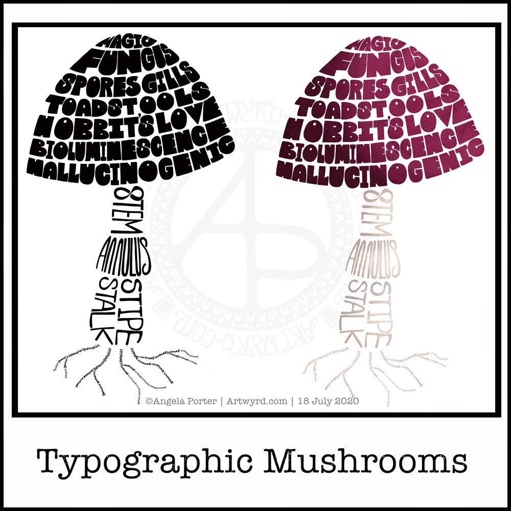
Just a little something I wanted to try out – using hand-drawn typography to create illustrations. I chose a mushroom, for no other reason than I like mushrooms.
It’s more about practising the hand-drawn typography or hand lettering than anything else.
What I realised, when I completed the black and white version, is that I could’ve varied the weight of the letters to produce highlights. That’s for another day, I think.
I also had to try adding colour, and in that way adding highlight and shadow.
I like both versions, but I think I like the coloured one a bit more.
I mentioned I’m following the Sarah King Domestika course – Hand-Drawn Typographic Portraits. I have started work on my first portrait, but it’s going to take me a while to do. In the meantime, little projects, like the mushroom, will give me plenty of practice as well as a chance to work out my process and way of working, as well as how I’d like to use it so it adds a note of harmony to my artistic song.
I started with a pencil sketch of the mushroom. Then, I added the words in rough with pencil. I scanned the sketch into Autodesk Sketchbook Pro. I then used my Microsoft Surface Slim Pen, to hand-draw the typography. Even though I’m using digital media. Autodesk Sketchbook Pro is a lot like working on paper, but it streamlines the process and allows me to skip a lot of the tedious steps. It also lets me take a black and white drawing and add colour quite easily.
I’ve done this while I’m waiting for a migraine-type headache to subside enough that I can return to bed and sleep the dregs of it away. I’m nearly at that point now as I’m beginning to feel tired and sleepy. So, I’ll get the rest of the social media postings done, and then crawl back into bed to sleep.
I started with the hand-drawn typography. I’ve just started another Domestika course — Hand-Drawn Typographic Portrait by Sarah King. The first exercise is to letter words boxes divided by wavy lines. Then, creating letters in different weights. And of course, practice is something that needs to be done.
There was just something about her approach to this that grabbed me, and so, I now have many boxes with words and quotes in.
The first lesson shows how to use Photoshop to edit your lettering outlines and fill them with black. I found the process rather clunky and long-winded. Perhaps that’s because I’m used to working in Autodesk Sketchbook Pro with a pen on a screen as if they were pen and paper, that I could do this in my own way.
So that’s what I did. I used one of my pencilled samples to create the typography for the centre panel.
Then, it was adding the background. I just went with the flow on that one. I made use of the symmetry tools in Sketchbook Pro, and just had fun with a limited colour palette and my favourite kinds of shapes.
The course is about portraits. However, I have zero interest in drawing people. However, the techniques shared will spark ideas for how I can use them.
I’ve long been trying to incorporate words, quotes into my artwork and struggling to find my own style. I’m not sure if this will help, but I’m really quite happy with this particular artwork.
It’s #TemplateThursday when I create and post a colouring template to the Angela Porter’s Coloring Book Fans facebook group. The template is free to members, though there are a few terms and conditions associated with it’s use. It’s also free to join the group!
This week, I decided to draw some cute and whimsical bugs, each having their very own portrait. Lots of small, individual pictures that a perfect for quick, mindful colouring.
I know I often get overwhelmed by a huge artwork I’m working on and that is most likely to happen when I’m experiencing a lot of anxiety, and I seem to have waves of anxiety the like I haven’t seen for a long time, most related to the pandemic.
When I need to take time out, to do art that will soothe me, calm me, let me relax and find that mindful, content space within myself, I turn to creating small artworks.
I drew this template with a Faber-Castell Pitt Artist pen on ClaireFontaine dot grid paper. Colouring has been done digitally in Autodesk Sketchbook Pro.
7″ x 2″, St Cuthbert’s Mill Bockingford watercolour paper, White Nights watercolours and a Faber-Castell Pitt Artist pen.
Abstract patterns, bright, almost 1960s psychedelic colours and a small project that doesn’t overwhelm me are what I need today. I’m feeling under the weather, and bright cheery colours and a simple project are what I needed to do.
Yesterday, I spent some time adding colour to paper to add to my custom sketchbook. This is one of the papers that I created, with an abstract drawing on it, that is finished enough for the sketchbook.
The artwork measures approx 4″ x 6½”. I used a piece of ClaireFontaine Paint-on mixed media paper which I coloured with Distress Oxide Inks followed by some sprays and splatters of water to create a distressed look. The colours used were Seedless Preserves and Fossilised Amber.
I first drew the basic outline of the design with a M Pitt Artist pen from Faber-Castell. To add colour to the design, I used Distress Inks in Seedless Preserves, Fossilised Amber and Ripe Persimmon like watercolours.
Then, I started to add patterns, lines and stippling to the design to bring out the patterns and add depth, interest and dimension.
I think it’s worked out fairly well. I may well go back to yesterday’s ‘Blessings’ artwork and add colour and more patterns to it at a later date.
I went out!
My blog post is a little later as I decided to go out for a walk this morning. This was a big deal for me. Especially after the effects of the high anxiety/stress I experienced last week.
I went to my local cemetery, Glyntaff Crematorium. It’s fairly large, with lots of paths and roads sectioning the cemetery up. I wandered around the older section, which is full of fascinating funereal sculpture. I had my DSLR camera with me, and managed to take over 100 photos this morning, not just of gravestones, but textures too.
It was so nice to be out in fresh air, moving my body around more than I have done for nearly four months. I had nice music on earphones so that any loud sounds wouldn’t startle me. There was work going on around the crematorium as well as grounds work.
It was also nice to drive my car again. It’s been a week, and I really miss the freedom of just being able to take a drive. It’s important that we still stay home as much as possible and to limit our time where there are people. I think my choice to visit the cemetery was a good one. Very few people, alive or dead, haunt cemeteries!
I think I fall into the group of people known as tapophiles – people who are interested in cemeteries, gravestones and funerals. It’s not a morbid interest, just an interest about the changing styles of funerals, funerary sculpture , practices and how they change over time with society and culture.
I discovered the fascination with gravestones when I walked to and from school through this cemetery. It took me longer to get home than it did to get to school. On the way home I had the time to linger and explore and indulge my curiosity. I remember being too scared to look in the chapels there, but enjoyed popping into the columbarium, which has recently been renovated and reopened.
I think I’ll be looking for other cemeteries fairly local to me to visit in the weeks ahead, ones that offer me a good walk as well as interesting graves to look at.