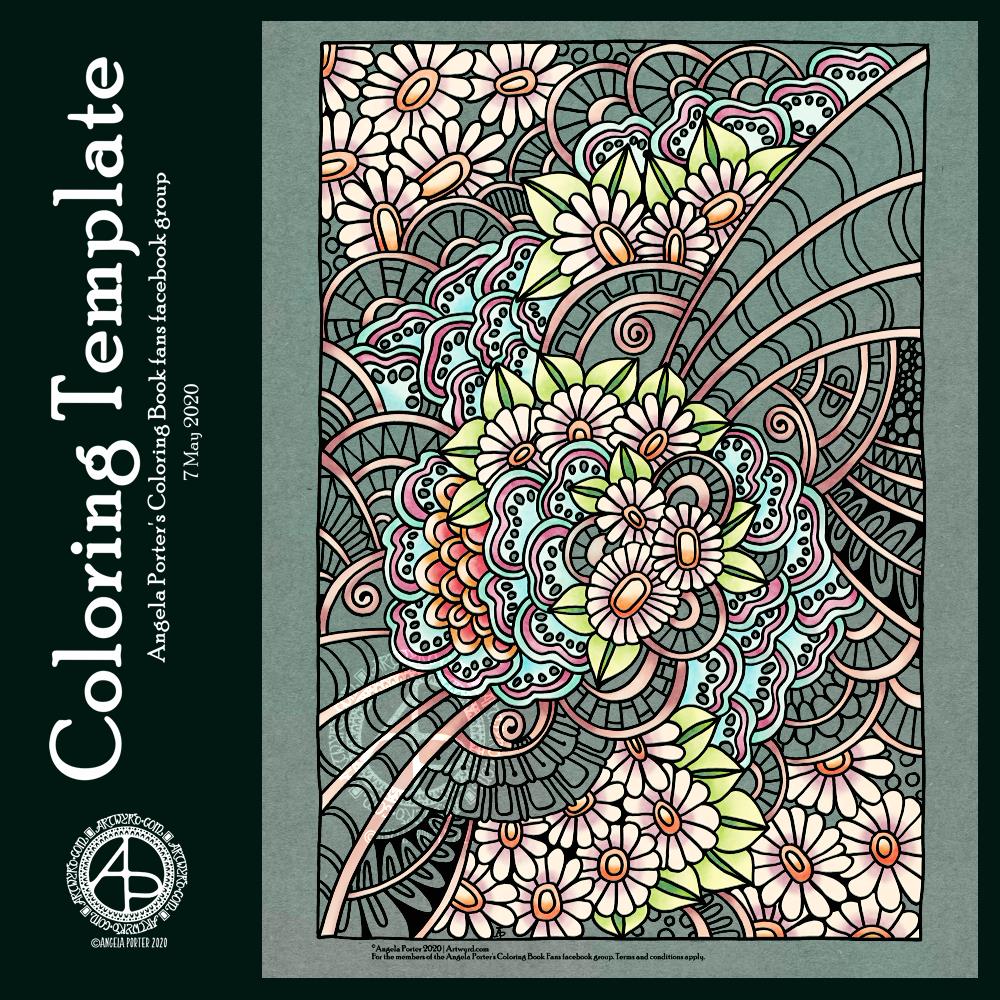
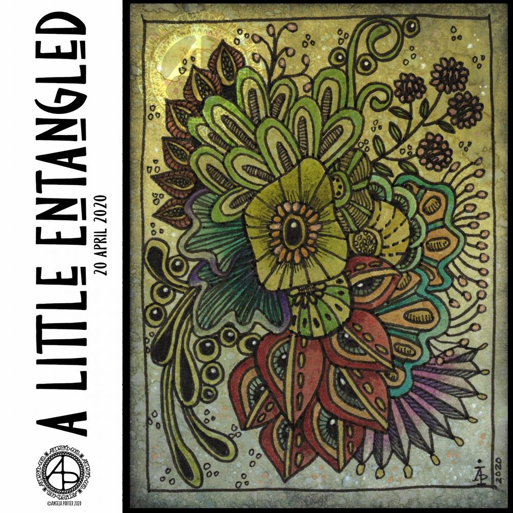
Flowers always cheer me up, and I thought they’d make a nice motif in the design. I kept to the same kind of flowers. In fact, although this drawing is still quite detailed and complex, there’s far fewer motifs and patterns in it than I’d usually use.
I also like to partly colour the template – it helps to bring it partly to life to show on social media. Today, I’ve chosen a fairly pastel color palette. I think that reflects how I’m feeling today.
I drew the design on quadrille (squared) paper with a 06 Sakura Pigma Sensei pen. This is an unusual choice for me; the nib is broad and a bit more flexible than I’d usually use. The result is a bold design with bold lines.
I scanned the design in and used some digital wizardry to remove the quadrille grid. I also corrected an error and removed some smudges. All this was done in Autodesk Sketchbook Pro, which I continued to use to colour the design in.
So, Angela, how are you doing?
I’m so tired today. I couldn’t sleep past 4:30 am, and after a long while waiting to go to sleep I got up an started doing some arty stuff.
As well as feeling tired, my digestive system is uncomfortable still and I’m feeling a bit icky-sicky too. No headache today, thank goodness.
I am feeling a bit fed up today – fed up of feeling under the weather and tired. Hopefully I’ll have a nap later on today, and that may help my mood a little.
Until then, I’m going to do some arty stuff, most probably in my art journal, or maybe some work for the Mattias Adolphsson Domestika course, “The Art of Sketching: Transform your doodles into art.”
I thought I’d try it out to kick start my imagination and perhaps discover new ways of working, stretching myself somewhat. So far, I’m enjoying it. I work at my own pace.
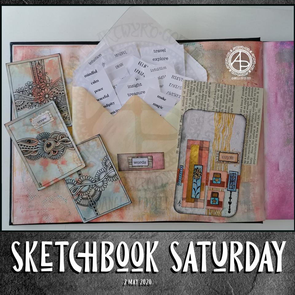
Teeny, tiny one inch square works of art are called inchies. Here are two sets of six inchies.
For each set, I cut an ATC sized (3.5″ x 2.5″) Distress Oxide coloured mixed media paper into one inch squares.
I took the chisel nib of a black Copic Ciao marker to the edges, and then drew on the squares using either Copic Multiliner SP or Faber Castell Pitt artist pens. When I was happy with the designs, I added metallic watercolours to bring out some highlights.
What to do with them? I don’t know…yet. All I know is they were fun to do and quite satisfying.
Under the weather
I’ve not been feeling too grand, hence the lack of a blog post yesterday. I had a stomach upset on Saturday night, along with headache, tiredness and loss of appetite.
I’m still not right today – tired, another headache and an uncomfortable digestive system still. I think it’ll be another quiet day for me.
I am enjoying working a little either on my sketchbook-journal or preparing bits and bobs for it each day.
The main thing I wanted to do this morning was to get some little word tags prepared and in use.
I created a list of words I’d like to add to bits and bobs of art. I copied the list, using different fonts, then printed out an A4 sheet of the words. I made a second sheet using different words and different fonts. Then, I cut the sheets up into smaller pieces for storage.
Then, I realised I’d need to create a storage space for them in my sketchbook and thought an envelope would be the easiest way. I do have some commercially produced envelopes, but I thought it was time to use my We’R’Memory Keepers envelope punch board for a more custom size.
I cut an 8″ x 8″ piece of ordinary printer paper. I coloured the paper with distress oxide inks (old paper, tea dye and dried marigold) and then made an envelope that measures 3.5″ x 6″.
I then realised I needed a way to keep the envelope closed. I could tuck the flap inside the envelope, but as I used copy paper I didn’t know how durable it would be. So, I came up with the idea of having a little pocket to tuck the corner of the flap into. And that meant I could cut out “words” from one of the lists and add it to the little pocket.
Before I did that, I aged the edges of the label with Distress Ink. Next, I glued it to a an old book page and cut it out with a border of text. That layer was also edged with Distress Ink, then it was added to the pocket. I used a metallic Gelly Roll pen to draw around the label.
On the page, you can see some small drawings I’ve done over the past couple of days.
On the left of the page are three ATC cards (2.5″ x 3.5″) made from a piece of mixed media paper coloured with the same Distress Oxide Inks.
On the right, is a larger artwork, an experiment and exploration of what I could do. I collaged some Distress Oxide coloured pieces of paper on to the background. I added metallic gold and copper paint to some of the pieces, and also to create patterns behind them. I drew little designs too, including a Dangle Design from one.
I’m not all that happy with the ‘explore’ card. There are bits I like, and other bits where I think I messed up. I think if I’d left it with the gold patterning on the background and just some simple patterns on some of the collaged rectangles, maybe some gold paint on the smaller ones, then it would’ve worked out better.
I think I’m going to make a vellum envelope or pocket to store the ATC cards in. Vellum in translucent and so will provide a tantalising glimpse of the card(s) safely stored within.
The ‘explore’ card will be placed into the sketchbook, with notes and reflections about it. It’s one that will be a learning experience more than anything else.
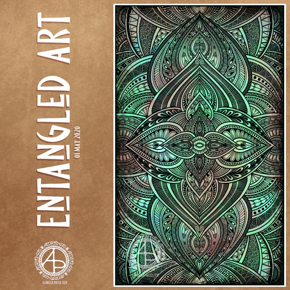
This morning, I finished this Entangled Art drawing.
The background was created using Distress Oxide inks and sprays of water on mixed media paper then scanned in.
The drawing was done digitally using Autodesk Sketchbook Pro.
A very intricate, detailed drawing in my signature ‘Entangled’ art style, that includes inspiration from nature, architecture, geometrical and repeating patterns, and overlaps a little with zentangle.
A new month!
While we may all be in lock-down, the days still pass us by and go into the past.
I sit here, at my desk and looking out of my window as I work. Sunshine, blue sky with some heavy grey clouds cover the world. Fluffy dandelion seeds are dancing around in the air, thanks to a fairly swift breeze. The trees that cover the valley sides are all cloaked in their spring green finery. It’s a fitting view for Beltane, May Day.
The world is now fully awakened from it’s winter sleep. The long, dark days of winter are now behind me and the days have been rapidly lengthening towards the longest days around the summer solstice in June.
In years past I’d be looking forward to days out, enjoying evening activities and meetings in daylight. I was looking forward this year to going out with my DSLR to take photos of flowers and plants, architecture, and anything else that grabbed my attention. That’s not to be. However, I will be looking forward to doing this in the future.
As much as I would like to be wandering around with my camera, I know it’s more important to be at home, to avoid contact with others, and to help slow down, if not halt, the spread of the Covid-19 virus.
The most difficult thing is not knowing when the current restrictions will safely be lifted. And when they are, the number of cases is likely to increase once again and we’ll return to lock-down.
I am so grateful that I am able to work at home, am happy to stay at home, for as long as it takes. The longer this goes on, the easier I find it to remain at home. I do worry that when the lock-down is released I may find I’m filled with fear and anxiety about leaving my home. I struggle with that anyway, but I do wonder what effect this will have on me.
Still, I can still think of things I’d like to do, places I’d like to visit, once it is safe to do so once again, even though that particular point in time is, as of yet, not in the calendar.
I’ve been awake since stupid o’clock, which roughly translates to 3:30am BST. While I was trying to get back to sleep I watched a youtube video about making pockets and tuck-ins for an altered book journal.
I thought that could be something good for my sketchbook-journal. I have worried a little about gluing my little artworks into it, but pockets, tuck-ins, see-through envelopes could be a good way to both show the work and store it in a non-permanent way.
So, with my mind now working and sleep eluding me, I decided to have a go at making my own pockets. You can see the result at the top right, with a journalling card popped in one of them for now.
How I made the pockets
I used some ordinary white card, cut it into what I thought would be good sizes to make a set of stacked pockets for the ATC sized cards I’ve been working on.
I then coloured the cards with Distress Oxide Inks. For one of them, I used a brayer to add ink to a gelli plate. Before pulling a print, I spritzed the gelli plate with water that had some white perfect pearls added to it.
For another panel, I used the brayer to add ink directly to the paper. It did that unevenly. So, I used a ball-tool to carve some texture into the black side of a piece of cut and try foam and used that to add colour. That worked really well! Dabbing the foam added a lovely textured layer of colour. A spritz of water activated the dusty, chalky, soft nature of the Distress Oxides.
I enjoyed the look I achieved with the distressed foam that I coloured the remaining pair of paper panels in the same way.
I then tore the top edge of each panel, for added interest, then used a piece of foam and Rich Mahogany Distress Ink to add grunginess to the edges of each panel.
I wanted to add some embellishments to each panel, so I used a copper sparkle Gelli pen to draw patterns on them.
Finally, I used Tombow Mono adhesive to stick the panels together.
When I put the panels on the page in my sketchbook-journal, I thought a panel behind them. So, I coloured a panel of the same card with Distress Oxide inks and the distressed piece of foam and used the same gelly roll pen to add some sparkly patterns. Then, I adhered the back panel and pockets to my sketchbook.
When I tested some ATC cards in the pockets, I realised I need to work out a way for some more ‘give’ in the pockets as they’re too tightly put together to slip more than one ATC card in them. Also, I placed them just low enough down the page so the ATC card doesn’t stick out of the sides of my sketchbook.
I’m not well known for my fore-planning projects like this, though I do try to learn as I go along.
Inchies and Twinchies
My mind was working in weird ways this morning. As I was making the pockets, my mind strayed to inchies and twinchies. I’ve not made any of these for a long, long time. I thought it could be fun to do so and add them to my sketchbook-journal.
I cut two 1″ wide, and one 2″ wide strips of card. I used the distressed foam to apply Distress Oxide inks to them, spritzing with water to add to the distressed look. Then, after drying with a heat tool, I cut them into squares – 1″ x 1″ inches and 2″ x 2″ twinchies.
I decided to use metallic watercolours from Cosmic Shimmer to add a sparkly, shimmery border to each tile. I used rich gold, pale gold or copper on each tile.
Then, I got to draw on the tiles. Teeny, tiny zentangle-style drawings. That was fun to do!
After adding some dots using a white Sakura Soufflé pen, I adhered the inchies into my sketchbook-journal. I’ve left the twinchies for decoration later.
Journaling cards
I realised that I could stored journalling cards in the pockets. All I needed to do was to colour the back of one of the ATC cards I coloured a few days ago. I also just realised that I could have added a layer of squared, dot grid or lined paper to write on too. That’s an idea for another time, maybe.
After drying the ink, I used a rollerball pen to add what notes I wanted to about this mornings creative sessions.
In fact, I’ve just created another journaling card to jot down ideas and notes to self as a result of reflecting on my pre-dawn arty activities!
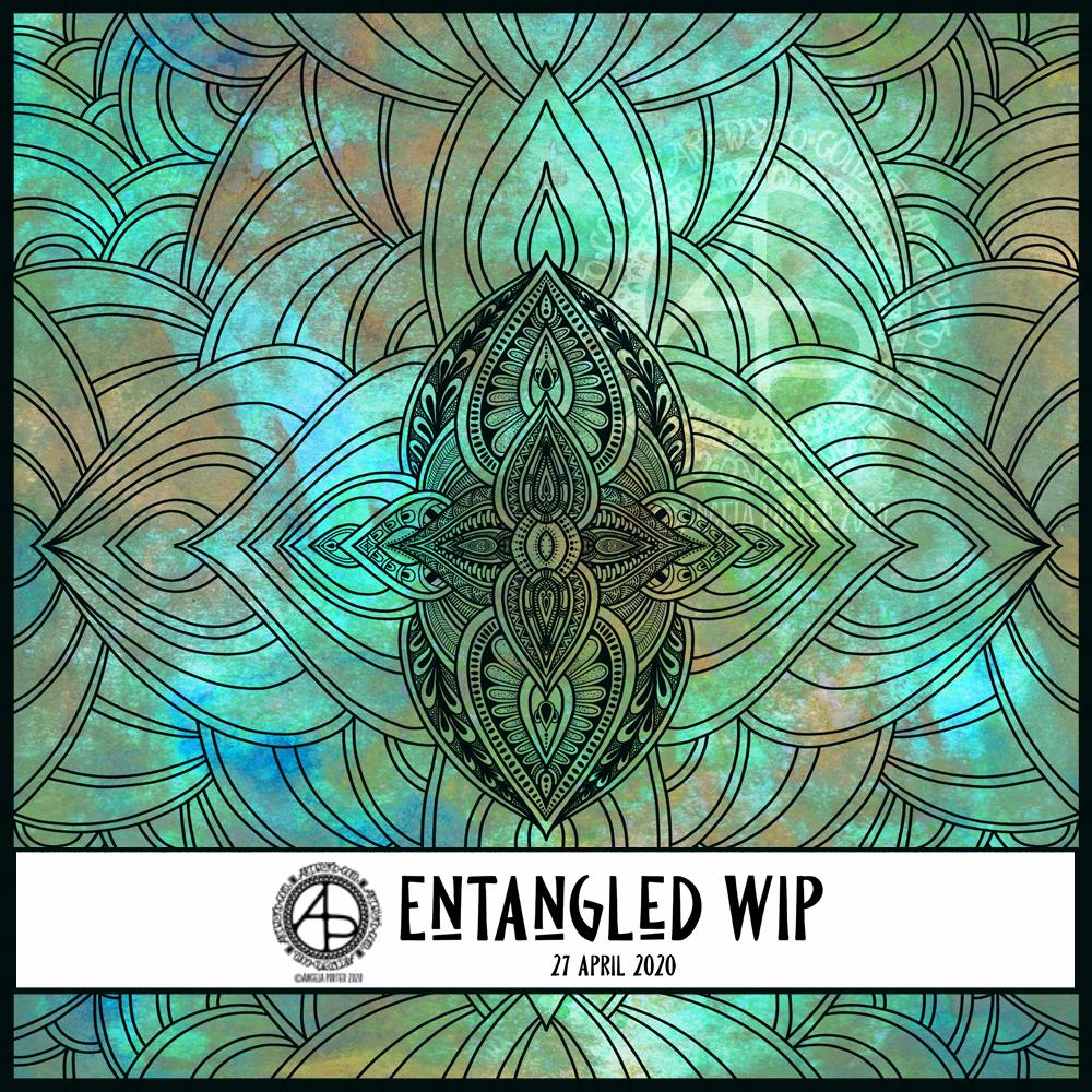
This morning started early and I played around with metallic paints along with Distress Oxide inks in my sketchbook / art journal. I have some interesting backgrounds as a result.
I also created a background for today’s artwork. I have tweaked the colours a little, digitally. I don’t know what WordPress does to the colours, but they look different in Autodesk Sketchbook Pro. I used Distress Oxide inks and have ended up with a rusted, weathered, kind of distressed/grungy texture.
Of course, I can always alter the background later on, if I wish.
I used the symmetry tool to reflect my drawing. You can see I’ve laid out the bare bones of the design and have started to fill the sections in with texture and pattern. I have a lot more work to do to complete the drawing. Then, I’ll think about shadow and highlight to help to bring the design to life some more. Or perhaps I’ll make it look like a stencilled design on the background, one that has some dimension to it.
Floral designs, an entangled garden was my fancy this morning and this is the result, not fully coloured though.
Coloring is a great way to find some calm and peace during troubled times, such as the times we find ourselves in. Scientific studies have shown it has a similar effect on the brain as meditation.
I have a number of templates available for free in the facebook group, including this one.
Today’s arty offering is this little bit of entangled art. It measures 4″ x 3″, so is small in size, but big in detail, I think.
Distress Oxide inks were used to colour a 4″ x 3″ piece of Claire Fontaine mixed media paper, with water to add extra texture to it.
I drew the design using 08 and 02 Unipin pens. To bring the design out of the background, I used Faber-Castell Pitt Artist Brush pens. Dots of gold and white finished the embellishment.
My final step was to apply some Distress Microglaze to add a subtle sheen that brings out the colours and layers of texture, not just to the Distress Oxide ink, but to the Pitt Artist Pens too.
I thought I’d try the Pitt Artist pens with this background as it seemed more dull and dusty, and that’s how I find the colours in the Pitt Artist Pens. Initially, I was going to keep it monochrome. However, I liked the nature of the colours in the pens, so experimented with them.
I enjoyed creating this little work of art. Now, it’ll find its way into my sketchbook-journal, with reflective notes for future reference.
Gosh, Thursdays seem to come around so quickly these days! Thursday is the day I post a new colouring template for the members of the Angela Porter’s Coloring Book Fans facebook group, and above is this weeks offering.
I drew the line art on mixed media paper from Claire Fontaine with Tombow Fudenosuke flexible nib brush pens. I like to use variable line widths in my art from time to time. They give instant depth to the drawing and increase the graphic nature of the design.
I’ve used some really weird colours, for me, in my sample coloration. They’re really quite muted. That’s a hint to me that something is awry with my emotions/mood. I feel quite subdued and ‘meh’ at the moment, which is reflected in my colour choices.
Anyway, if you’d like to colour this, or any of many others in the archives, please pop along and join the Angela Porter’s Coloring Book Fans facebook group. I create these exclusive templates as a way of saying thank you to those who like my coloring books.