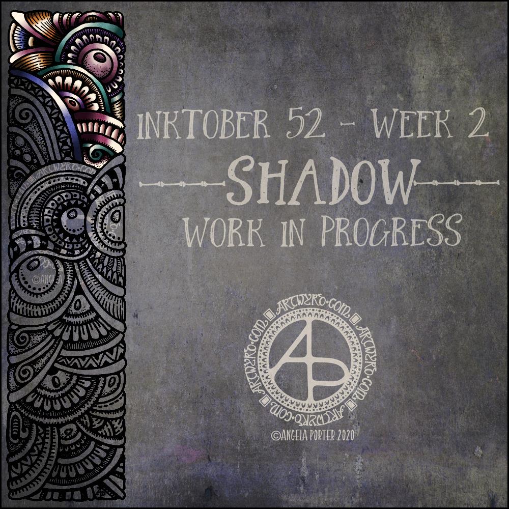
I like this week’s prompt for #Inktober52 – Shadow. I like to work with quite high contrast colours/shades to give the illusion of dimension. So, I thought I’d take one of my borders, add it to a very shadowy background, add colour, light and shadow, and finally I’ll put a quote about shadow on to it. My only problem with adding a quote is which one to choose! There are so many fine quotes about shadow and light.
It’s nice to have a whole week to work on the prompt. I’ve already spent over two hours adding colour to that little section of the border design, just to give you an idea of how long it takes me to work in colour.
What this means is that I can use my Inktober52 project as ‘warm up’ or ‘comfort’ art over the next few days if I wish.
The colours I’m choosing are quite ‘dull’ for me – they are hues that have a lot of black/ in them and they do give a quite vintage or grungy feel. However, against the dark background they glow.
They’re not my usual choice of bright, pure colour. I think that’s simply because it’s taken me a long time to work with them and become comfortable with them too. That’s another reason why Inktober52, and Inktober, are so good – I end up trying things out that I wouldn’t necessarily do for my publishers.
I love Star Wars. It’s one of my go-to self-soothing, self-care kinds of series of films to watch. I’m also steadily working my way through the books related to the films, that fill in the gaps and build a rich galaxy of tales, myths, and great deeds. I can lose myself in them, and escape from everyday life into realms where good eventually overcomes evil.
The same is true for Lord of the Rings and Harry Potter for me too, amongst others. Worlds where there seems so little hope of overthrowing evil, yet hope remains kindled and the underdogs overcome an overbearing, cruel order.
There are so many wonderful quotes from these books and films.
Of course, I’m on the side of the rebels, the underdogs. The Jedi, wizards and witches, the fellowship and all the free peoples of Middle Earth.
I can apply the metaphor to my own journey to recovery from cPTSD. I’m rebelling against all the programming I had from a young age that made me believe I was stupid, useless, weak, a failure, unlovable, ugly, friendless, worthless and more.
For a long time, I held on to the hope that EMDR would help me overthrow the dominion of my past. Now, that hope has turned int a trust that I have done that and will overthrow the last vestiges of the erroneous and harmful views and beliefs I have of myself.
I’ve been a rebellion of my own, rebelling against my past and becoming the person I was always meant to be and not limited by the self-serving beliefs of others who sought to control and manipulate me.
About the art
I used one of the borders from yesterday’s collection to decorate the background for the quote, which I typeset in Affinity Publisher.
I do like a dark, grungy background, and this one just felt ‘right’ to use. I chose colours from the background to add colour to the border design. I used Autodesk Sketchbook Pro to add the colour and highlights/shadows to the text and border. The border was drawn with Uniball Unipin pens on ClaireFontaine dot grid paper.
I made sure I had plenty of places where light was being gathered and reflected, representing the hope that is always there if we look for it, even when everything is covered in shadow.
I’m actually quite pleased with the border and the depth and dimension I’ve achieved. I could’ve made the highlights even brighter, but I wanted it to look like hope was being kindled, gently gathering in the shadow.
I do have to say I also like the limited colour palette I used for the border. I used white and four other colours (dark shades of green, raspberry, blue and purple). This isn’t something I do easily, but I think it’s really worked out well here.
One of the nice things about being between contracts is being able to indulge myself in art. It’s also a chance for me to do ‘comfort art’, art that is in a familiar style that I don’t often do.
This is an example of ‘comfort art’. Art that is soothing to do, is intuitive and surprising in how it turns out. I start with pen and paper (dot grid in this case), and just start with a single motif. I then let the design grow from that point, organically and intuitively.
There are always sticking points where I want to give up as it doesn’t look right, or I’m not happy with what I’ve just drawn. However, I’ve learned to persevere past these points and the end design is usually one I’m happy enough with.
There were many sticking points in this one, some of which I thought were going to be shatter points.
Although I’ve deemed this illustration ‘done’, as I reflect on it now, I can see places where some added line texture would help the design be less homogeneous in places and would add some contrast.
Also, some shadows would help add dimension to the illustration. Having said that, colour would really bring the drawing to life too.
For now, though, this design is finished. Whether I work some more on it remains to be seen.
I used Uniball Unipin pens to draw this design, along with ClaireFontaine Sketch dotgrid paper. The only things I did digitally were to scan the design in, remove the dots of the dot grid, and add the background colour and texture and watermarks.
Here’s my video of my entangled design I showed yesterday. I really do have a lot to learn about making and editing videos. Still, I hope you enjoy having a look at it.
The drawing took over 55 minutes, though I’ve sped it up so it lasts around 17 minutes.
I used Faber-Castell Pitt Artist pens to draw the design on a 6″ x 6″ piece of Strathmore Vellum Bristol Paper that I had previously coloured with Tim Holtz’s Distress Inks by Ranger.
I wanted to try out an idea I had, and it’s worked out fine, I think. Mind you, I’m not thinking well today – I’m experiencing an ‘introvert hangover’ from being in a large group of people last night. I come across as quite an extrovert to people, but that is a well practiced mask and to keep it up is rather exhausting. It’s also tiring to be around people with all the noise, various emotions, and just the number of people there.
I have a couple of things that I need to get done this afternoon, and I also need to take care of myself and this ‘hangover’ of a headache and tiredness. I really need a good amount of alone and self-caring time. Maybe when I get home this evening I’ll manage to do that.
Anyways, the arty idea I had has ended up as a rather ghostly, faded design, which actually describes how I feel at the moment.
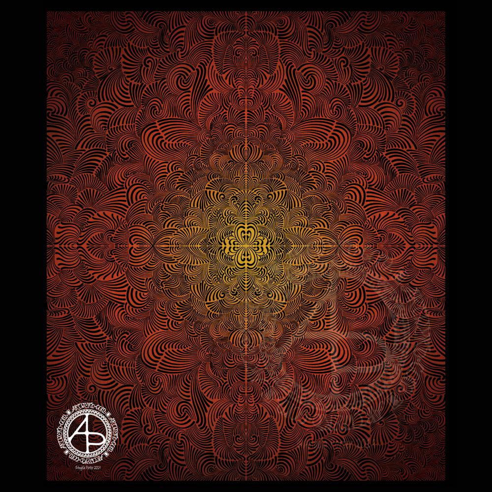
I like the softness of both the contrast but also of the lines that form the mandala. I do have a bit of a thing for grungy backgrounds at the moment. The texture really appeals to me and I like the contrast between the more orderly mandala designs and the chaotic grungy-ness.
I’ve had a busy day learning new things to do with video and so on. The concentration has taxed my brain just a bit, and I needed some time in an arty happy place.
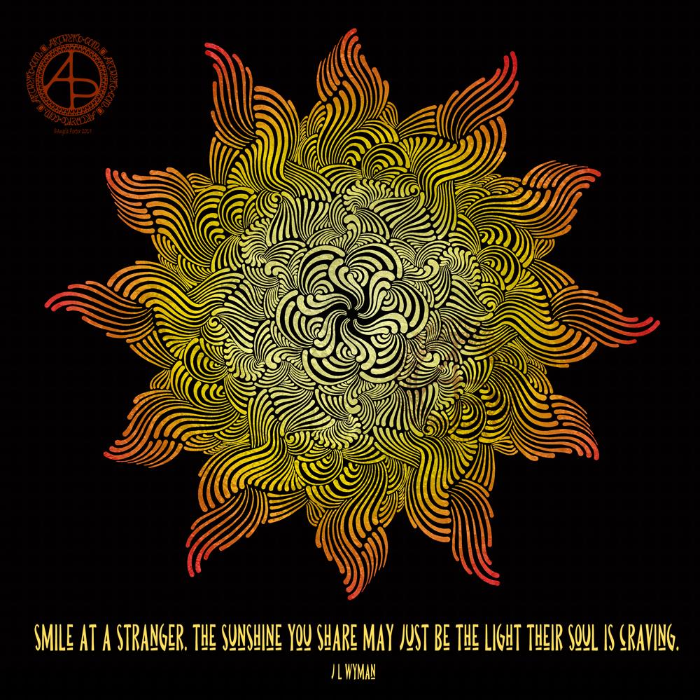
My first task was to find a quote that appealed to me today. This one is quite apt I think, for many reasons. I’m not entirely sure my typography is right for the quote, but it will do for now.
I then knew I wanted to do a mandala as a background. I find this style of mandala very soothing to draw, and soothing was just what I needed today.
Once I’d finished the mandala, I added colour in greens and teal. Calming, soothing, balancing colours for today. Colours of calm contentment, which is just how I feel at the moment. Also hopeful colours. That green reminds me a lot like the first leaves showing themselves at the tail end of winter, spreading hope that the warmer, lighter days will soon be here.
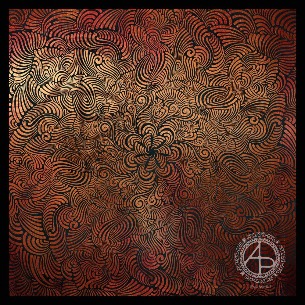
Seven plane symmetry, using a flexible nib pen to carve through black to reveal the design in copper. Done digitally using Autodesk Sketchbook Pro, Microsoft Surface Pen and Surface Studio.
I really have been enjoying creating this kind of design lately and I make no apologies for showing so many that seem to be similar. I find creating these so soothing and calming.
Here, I wanted to see how a metallic background texture would work, and it does really well, just not on WordPress and how the website shows images. The colours never seem to be as vibrant as they do elsewhere.
What I love about this process is that I have no idea of what the end product will be. It’s all about being in the flow, working intuitively, and trusting my skills and creativity.
Often, I’m so zoomed in to the section I’m drawing I’m not aware of how the overall design is looking and working. That means I really do have to trust my instincts, and trust that it will all fit together to create a satisfying end result, and I am happy with it.