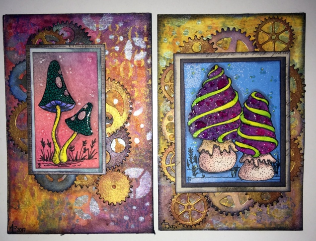
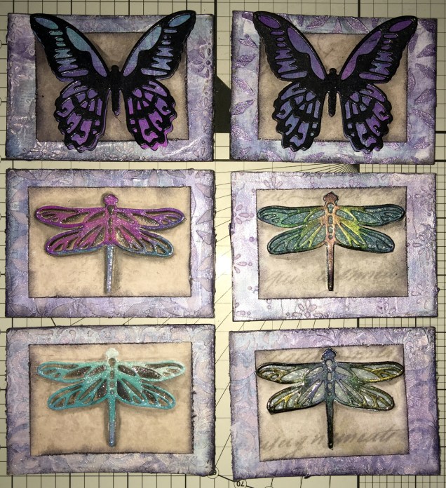
Mixed Media ACEOs/ATCs
I’ve spent the last four or five hours creating this set of four ACEO/ATC cards. It’s been a while since I did any mixed media work, but I felt the need to get a bit messy.
Each card measures 2½” x 3½” (approx. 6.5 cm x 9 cm) with the substrate being some fairly thick Kraft card.
I started by using some yellow Frog Tape to hold the cards together so I could make the background at the same time.
I started by applying PaperArtsy Fresco Paints to the kraft card until I had a finish I liked. The colours I used were Cheesecake, Rose and Sherbet.
The next step was to add some Windsor and Newton Modelling Paste through a couple of stencils (one was the dot fade stencil by Tim Holtz, the other a mini dragonfly stencil by Creative Expressions).
Once the modelling paste was dried, which I hurried along using a Tim Holtz Heat Tool from Ranger, I watered down some Alchemy Waxes from Imagination Crafts (white gold, tulip and apple green)and used a paintbrush to colour the dragonflies. I then used the wax and a piece of Cut and Dry Foam from Ranger to apply some of the waxes over the dot patterns.
Once I’d finished applying the wax, I wasn’t happy with the result on the dragonflies, so I used Daler Rowney System 3 acrylic paint in Rich Gold to re-colour them. I was much happer with the results, especially the dragonflies that I’d coloured pink/red.
The next step was to have a furtle through various coloured diecuts I have in my stash. Every now and again, I spend a day cutting out various die cuts (mainly cogs, flowers and foliage, but sometimes other things too) and then colouring them to add to my stash. It saves on time when I have the urge to do some mixed media work. It also makes use of my rare urges to do die cutting, which I find a very tedious process.
After a good furtle, I found some cogs that would work on two ACEOs that had just the dots on the background. I couldn’t find anything I’d want to add to the dragonflies; I was just happy with them as they were.
The die cuts were applied with Cosmic Shimmer Acrylic Glue from Creative Expressions, then some Vintage Photo Distress Oxide Ink with a wet brush was used to add shadows.
I used a Quickie Glue pen from Sakura and Gold Superfine Embossing Powder from WOW to add some gold dots and to areas where there was no embossing paste. Following this, I edged the cards using a piece of Cut and Dry foam and black Archival Ink from Ranger.
I then chose some words from the Tim Holtz Chit Chat stickers and glued them down with the Cosmic Shimmer Acrylic glue, and used a damp brush and a China Black Inktense pencil from Derwent to add shadows around the stickers.
The very final step was to add some sparkly gems, and they were done! Once all is dry, I can add my information to the back and so on, and I have some ACEO cards to use on other mixed media projects or in my art journal.
Other arty news
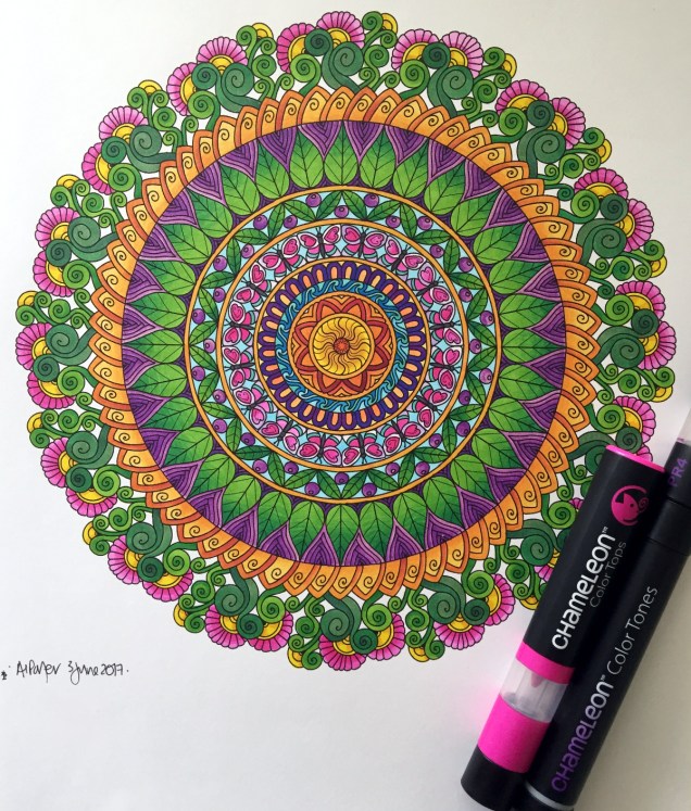
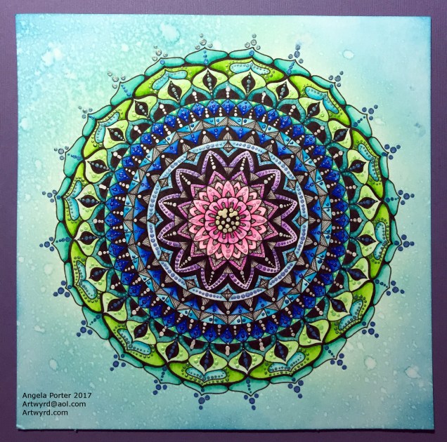
Over the past week I’ve been keeping myself artfully busy learning a bit more about Autodesk Sketchbook Pro and how it works for me; you could say I’m building up a relationship with it.
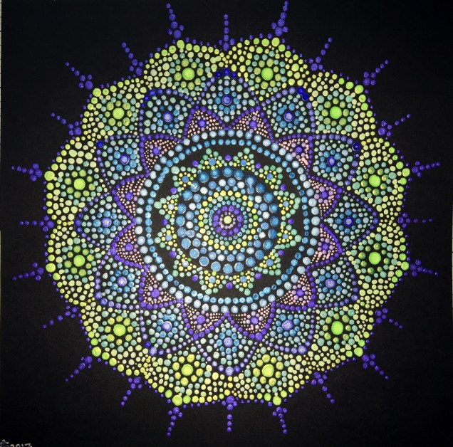
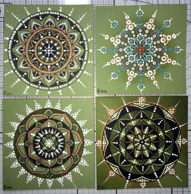
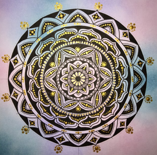
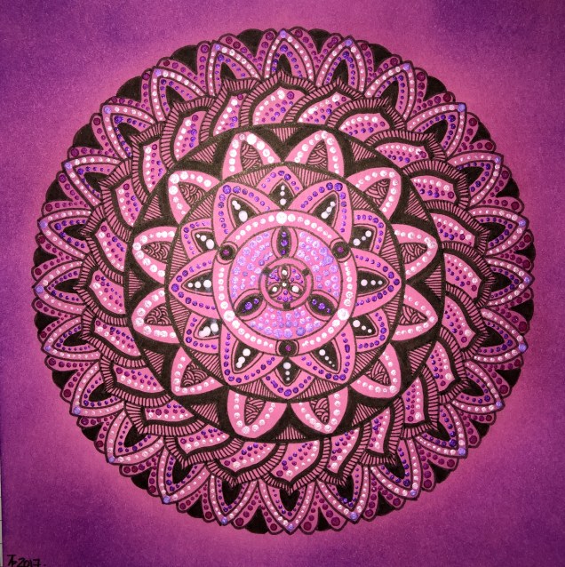
For now, I’ve been drawing LOTS of mandalas! I’m keeping them back from t’internet as I hope to publish them (some are already spoken for by the Colorist app), and other people asked if I was going to make some available for purchase. So, I’m building up a collection of them for that purpose – either with a publisher, or I’ll self-publish if necessary. I’ve also done a couple more small mandalas that work nicely as designs to be coloured and made into greetings cards, kind of like digital stamps.
Talking of digital stamps (digi stamps), there are some ideas rattling around my noggin that I’d like to try out, so there’ll be more news on this later on no doubt.
It looks like I’m going to be doing a colouring book of spooky templates in the near future, so if anyone has any ideas for ‘spooky’ or ‘eerie’ then feel free to share!
I also have a few ideas for written books rumbling around my noggin; however, it’s really hard for me to do something with them as I doubt myself so much, think they’re silly ideas, and so on. The ideas aren’t wholly in my noggin, I do have notes on them on the ‘puter which need tidying up…but I’m finding it difficult to do this because of all my self-doubt and self-criticism. I just need to keep saying to myself, ‘But you have recorded these ideas so they are there for you, so you have made progress).
Other things going on in my life
A week ago, I finally had the hedge at the front of the house removed, as well as the back garden completely cleared. My garden is tiny, but it’s amazing how much space was hidden by the cotoneaster and forsythia! I do have some clean up to do, but there’s no great rush on that. I also need to consider what to do with the back garden.
The process of getting this done has caused me great anxiety, but there was an ah-ha moment when I realised that some voile panels in the windows in my front room would help me to feel ‘safer’ and more ‘private’ while letting in daylight. For a long time I’ve hid behind curtains; well, I still am, but at least I can see out through the voiles even if people outside can’t see in! Why I didn’t think of this a long while ago, I don’t know, but thank goodness I did!
I’ve done a couple of anti-stigma talks for Time to Change Wales, and I’m seriously wondering if I’m really making any difference as my story is so bland and ordinary … after all it’s not a dramatic tale to tell, and I really don’t think it’s anything people haven’t heard/seen on TV on the soaps and so on…so I’m really feeling quite downhearted about that at the moment.
I know it may very well pass, but at the moment … it’s difficult….my therapy? Art of course!