Hand-drawn typographic quote

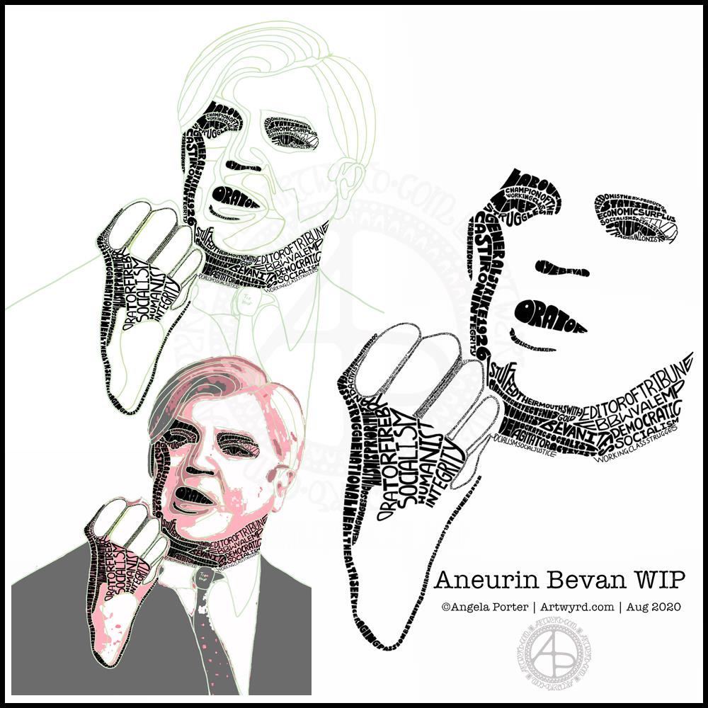
Today, I’ve been practising my hand-drawn typography (hand lettering). I seem to have Aneurin Bevan on the brain at the moment, probably because I’m working on a typographic portrait of him. So, I chose a quote by him.

To create this, I started off with squared paper, a ruler and a pencil. I marked out an area that was 24 cm x 12 cm. Before doing any lettering, I drew in some wavy guidelines. Then, I added the lettering. It took three attempts before I ended up with a design I was happy with.

Next, I scanned the sketch into Autodesk Sketchbook Pro and re-drew and inked in the letters.

Black on white was very stark, very graphic. However, I had a hankering for some colour. So, I chose reds. I used some digital wizardry to invert the black letters and white background. I created the coloured and textures background, and then used some layer options to get the effect I wanted.

Final steps were to ad my little copyright notice and watermark. As well as resizing the image for social media.

Taking a break

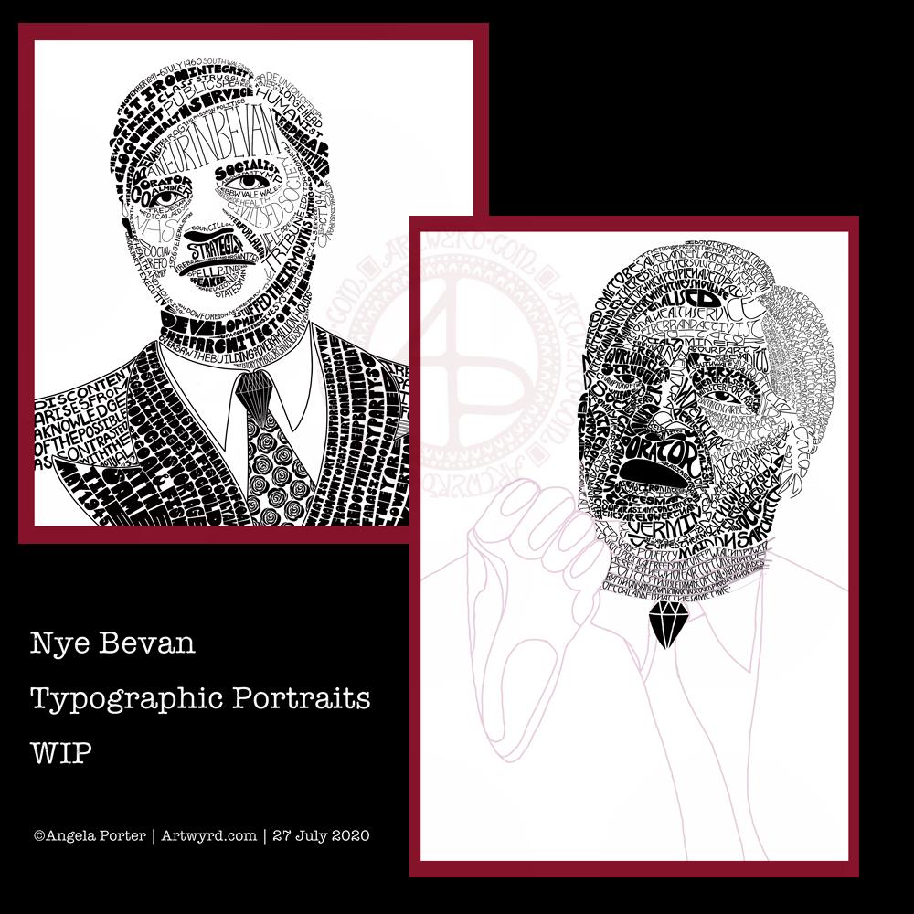
It’s always nice to have a change of pace and intensity in art work. I spent a couple of hours this morning getting my mind around how I could change the shape of letters to give a feeling of volume to a portrait. The fist in my portrait of Aneurin Bevan was looking a tad too flat.

I didn’t want to do any more work on the portrait today, wanting to give myself a break from the changes I’ve made so I can go back to it with fresh eyes and fresh mind.

Thoughts ticking around my mind

I do have an idea for creating a more abstract kind of typographic art from quotes and descriptive words now I’ve completed this mini typographic art quote. Not today, though I will note my idea down in my journal.

I often wake up in the morning, with ideas for art projects, as well as suggestions for solutions of problems I’m having with a current artwork, such as the flatness of Nye’s fist in his portrait.

It seems my subconscious mind works on these issues while I rest and sleep.

Perseverence

I really am persevering with the typographic portrait. That’s a surprise to me. Not all that long ago, I would’ve easily given up on it and decided that it wasn’t for me.

But not this time.

This time, I’m sticking with it, as well as the use of typography in my other styles of art.

This one isn’t coming as easily to me as other forms of art have, but it’s one that I seem to want to really succeed at.

What is making the difference is being able to work digitally. That makes editing, altering, trying things out a breeze. I don’t have to completely start all over again, I can keep what I like, and then rework what I don’t like. I can even keep what I don’t like in case it turns out that it is actually what I do like!

Remembering to work in layers really does help this process. That’s something I don’t always remember to do. However, I will get there. Just not today.

Typographic Portrait WIP

This morning I’ve been working on my typographic portrait of Aneurin Bevan. This portrait is the third iteration. I’m learning as I go along, trying out ideas as they occur to me.

I started with the photograph Nye Bevan and used the posterise tool in Affinity Photo to create areas of contrast. Then, I added colour to these areas to help me differentiate ‘twixt them. I completed this task in Autodesk Sketchbook Pro.

The next stage was to draw lines around these areas of colour, smoothing them out somewhat, and using artistic interpretation where necessary. These are the green lines that delineate the areas for different weights of text. I’ve decided to leave the white areas blank.

The green guidelines have been changed and edited as I work the portrait.

The area that was vexing me most were the fingers. However, I had an idea to use tiny lettering to add some deep shadow. I’m sure I’ll work out how to add some lighter shadow areas later on (my mind is already ticking over that issue) to give more volume to the fingers.

They typography is hand drawn and I’m having to come to terms with the struggle I’m having with my perfectionist side. This isn’t to do with the shapes of the letters, but the weight of them and making sure that they are consistent. As I’m hand-drawing the letters, then they are going to be imperfect, and I need to learn to accept when they are good enough.

Also, those imperfections and style of lettering are personal to me, and that is what will differentiate my work from others.

I’m also struggling with letting go of the desire to be as photographically accurate with the portrait as I can be. This is where learning to simplify the shapes of the different areas of contrast comes in, and recognising they don’t have to be a perfect copy of the photo in order for the resulting portrait to be recognisable as Aneurin Bevan.

One other thing I’ve done is to let go of trying to use full quotes in the portrait. I’m using repetitions of words and short phrases that represent Nye – personally, politically and in terms of achievements. I’ve realised the portrait doesn’t have to be a grammatically correct biography! I will, however, be using quotes to fill in his jacket.

I’m not sure what to do with his shirt and tie yet. It will fall into place soon enough I’m sure.

Working digitally helps me in so many ways. It takes away the frustration of starting over again if I make a mistake, and also minor frustrations. I gain a confidence to try things out, knowing that if they don’t work out I’ve not screwed up the rest of the work I’m happy with.

Working digitally, for me, is like working with pen and pencil on paper. I use a digital pen on the screen of my Surface Studio, just as I would pen on paper. It’s easy to undo and edit changes made. It removes from me the pressure to be perfect first time and helps me to persevere when things aren’t working as I’d like them to.

All the skills I’m learning digitally, in terms of the hand-drawn typography and being more patient with myself and allowing my work to be ‘perfectly imperfect’ is transferable to the work I do with traditional media too.

Sketchbook Pages

Today, I share a glimpse into my current sketchbook. It’s an Arteza watercolour A4 sketchbook.

I’ve completed all the drawings in boxes now, and am adding colour to them using watercolours, graphitint watercolours, graphitint pencils and/or inktense pencils.

The paper is rather nice to draw on with Faber-Castell Pitt artist pens or a Uniball Signo DX 0.38 pen.

On the cover page I swatched my collection of Inktense pencils, using a damp brush to bring their true colours out.

Inktense pencils are intense in colour when activated with water. Also, once activated with water and dry they are permanent.

I like all the media I’ve used so far on this page. Which I use does depend on my mood. Today, I wanted to choose an inktense palette of colours that is like the rusty colours I’ve been using with watercolours.

I really am drawn to this colour palette in my work at the moment. The dark blues, rich red-browns, blue-greys, earthy-dark greens and the vibrant mustards. One day I’ll look up the psychology of these colours and see how they relate to my mood/life at this time. But not today.

Today, I need to focus on adding colour to some templates for the Entangled Gardens colouring book that will be released early next year.

Inhale. Exhale. Repeat.

Monday Mood

Drawing done with Faber-Castell Pitt Artist Pens.
Arteza Mixed Media Paper coloured with Distress Oxide Inks (Stormy Skies, Chipped Sapphire, Dusty Concord, edged with Hickory Smoke).
Paper measures 3″ x 8.25″ (8.3cm x 21cm).

“I make art to show my soul I am listening.”
“This, too, shall pass.”

Art is my solace, my form of expressing my soul, my inner self.

Sunday mornings…

This morning I created some tall, thin (or short and wide) backgrounds using Distress Oxides on some Arteza Mixed media paper. The paper is 8.25″ x 2.87″ (21cm x 7.2 cm) in size.

I chose this one to draw on for no other reason that it was the one that appealed to me at this time.
I started with the seed pods and foliage at the bottom, and worked my way through some hand lettering / hand-drawn typography to more abstract line-art.

I drew with a M Pitt Artist Pen from Faber-Castell, though I added the stippling with an XS Pitt Artist pen.

No glitter or glitz on this one, nor any highlights. Not yet. I’m not in the mood for any, not today.

Template Thursday

It’s Thursday again, so that means it’s time for a new coloring template for the members of the Angela Porter’s Coloring Book Fans facebook group. I said that during the pandemic, I’d create a template a week for group, free of charge, to help people relax, calm and take their mind off all the awful things that are happening in the world for a short time.

This week, I’ve combined some typography my familiar entangled style of drawing. Botanicals, crystals and stars along with some repeated ‘zentangle’ style patterns. Some of my favourite things to draw.

To draw this template, I used Faber-Castell Pitt Artist pens (F and S), Copic Fineliner SP pens (05 and 025) and a Uniball Signo DX 0.38 pen with Rhodia dot grid paper.

Although lockdown has largely lifted in the UK, we still need to practice social distancing and wear face coverings when it’s not possible to do that, or in enclosed spaces. The Covid-19 virus has not gone away, and though the number of cases are falling, as are deaths, that’s due to people being sensible and following the guidelines for limiting the spread of the virus.

I’m very, very anxious about going out and about, and I know I am far from the only one. I mostly stay safe at home. Mind you, that’s not unusual for me. Even before the pandemic I wasn’t someone who was out and about all the time. I did pop out and about more often than I realised, however. But I’m still usually quite happy to stay at home and focus on my arty, creative activities. But, I know that’s not the case for everyone, and not everyone is able to work from home either, nor wants to.

Wednesday Wisdom

This was a perfect, small and quick project to do this morning as I was waiting for my weekly delivery from Able & Cole.

Some practice of hand-lettering /hand-drawn typography practice, starting with roughing the design out in pencil on dot grid paper. Then, inking it in digitally in Autodesk Sketchbook Pro.

The addition of a rainbow background was the perfect way to bring a smile to my face this morning. When don’t rainbow colours cheer a person up? The bold, black letters on top of it really make the colours glow bright.

The quote is a perfect bit of wisdom for Wednesday, not that it’s a bad day for me at all. Apart from me suffering from a lack of sleep once again. The morning sunshine has lifted my mood, and the cool air flowing in through the open window is both beautifully fresh and wonderfully refreshing. I have bright and happy music on as I work, just to add to the upbeat start to the day.

Hand-drawn typography practice

This morning, I decided to leave portraits alone for a little while. I woke with the idea of using typography to fill some typography!

So, I drew the outlines of ‘Nye’, for Aneurin Bevan. I then used wavy lines to split the outlines into interesting sections. Then, I pencilled in some quotes by Aneurin Bevan. This let me adjust size/ spacing so that the quotes fit and made sense. In some places I’ve stretched the letters as there wasn’t enough space for the next word. I could’ve made all the letters in the line wider, but thought the wider letters would add some interest and flow. Of course, I now realise I could’ve stretched some letters at the start of the lines too, but I can always do that as I ink in the lettering.

Anyway, my next step was to scan the sketch into Autodesk Sketchbook Pro so I could do the inking digitally, and you can see what I’ve done so far. I do need to adjust some letters, like the B at the start of the line I’ve started to ink. I will also need to go back and clean up some of the edges of letters.

It’s a nice project for me to do today. I didn’t sleep at all well last night; I was up and down to the loo. I had a sudden attack of anxiety yesterday, a really intense one. The pilot light on my boiler had gone out and I couldn’t light it, so I had to arrange for a breakdown visit. There was the stress of ‘what if they can’t fix it’ as well as a stranger in my home for the first time since most probably February.

Panic mode! And it didn’t abate all day, no matter what I tried to do. This kind of anxiety/stress always hits me in my digestive system, so it was an unpleasant night for me.

All needless of course. The gas engineer arrived this morning and he lit the pilot light first go. And it’s stayed lit. I felt like a right numpty. However, all is well, as I have now booked it for a service too.

I’m still feeling on edge, as well as really tired. So, working on a portrait wouldn’t be the best idea for me as at the moment they are frustrating and overwhelming me.

So, I thought I’d go for some hand-lettering or hand-drawn typography practice. Just practice. No pressure. However, the idea I had may turn out to be a fairly good one. Maybe.

Typographic Portraits WIP

I’ve been working on another portrait of Nye Bevan while I take a break from the first one. I really think I’ve gone over the top with detail in this one. I wanted to do one of him in one of his typical oration-giving stances, but I really do feel I’m messing it all up. I really think that’s because I am trying to get too much in the way of quotes into the portrait.

So, I’ll be going back to the drawing board (or in my case, the Surface Studio screen) to try this one again.

Having said that, I’ve had a lot of hand lettering /hand drawn typography practice and have played around with the brush settings to find one that will work for me!

I also have just noticed that there’s not much differentiation between the different weights of text in the second version, and that adds, I think, to the more confusing appearance of it.

I was struggling with the values of the gesturing fist in the second image. So, I put the photo into Affinity Photo and used the Posterise tool to simplify the areas of shade for me. There’s still a personal interpretation to be done on how I translate these areas into spaces of text.

Hands, feet and faces. These were always the parts of humans I struggled with when doing life drawing.

Drawing typographic portraits is a new endeavour for me. I’m learning, experimenting. One of the main lessons I have to take away today is to not over complicate such a portrait! But there is a fine balance betwixt having enough detail to capture the essence of the person, and having too much so that the essence of who they are is lost.

The first portrait I did, on the left, does look better, but I do think it lacks a bit of detail in the face.

The second one, on the right, is way too busy!

So, my task is to find that point where less really is more.

So, I’ll take a break from them, again, and regroup and try once more!