Entangled flora

©Angela Porter | Artwyrd.com

One of the nice things about being between contracts is being able to indulge myself in art. It’s also a chance for me to do ‘comfort art’, art that is in a familiar style that I don’t often do.

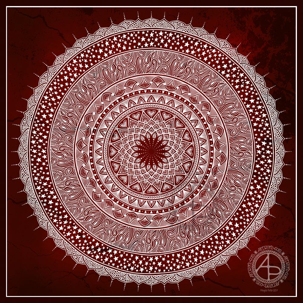
This is an example of ‘comfort art’. Art that is soothing to do, is intuitive and surprising in how it turns out. I start with pen and paper (dot grid in this case), and just start with a single motif. I then let the design grow from that point, organically and intuitively.

There are always sticking points where I want to give up as it doesn’t look right, or I’m not happy with what I’ve just drawn. However, I’ve learned to persevere past these points and the end design is usually one I’m happy enough with.

There were many sticking points in this one, some of which I thought were going to be shatter points.

Although I’ve deemed this illustration ‘done’, as I reflect on it now, I can see places where some added line texture would help the design be less homogeneous in places and would add some contrast.

Also, some shadows would help add dimension to the illustration. Having said that, colour would really bring the drawing to life too.

For now, though, this design is finished. Whether I work some more on it remains to be seen.

I used Uniball Unipin pens to draw this design, along with ClaireFontaine Sketch dotgrid paper. The only things I did digitally were to scan the design in, remove the dots of the dot grid, and add the background colour and texture and watermarks.

Art washes…

©Angela Porter | Artwyrd.com

Art really does wash the dust of everyday life from my soul. That’s why it’s something I do nearly every day. Creating art soothes my soul, my emotions, my mind. It helps me find balance when life has me all topsy-turvy. It helps me find the touchstone of contentment that now resides inside my chest, within my heart. I know that if I can’t settle to doing something artsy, then I’m seriously out of kilter.

I finished this drawing this morning. I think it’s taken me around 6 hours to do, give or take an hour or so. It’s a little smaller than A4 in size (6.75″ x 10.25″). The design was drawn with Faber-Castell Pitt Artist pens (F and S). I added shadows with grey Pitt Artist Brush pens.

I was rather clumsy with the shading in some places, so I took advantage of digital tools to smooth and blend the grey out.

My final digital task was to add a background texture to the artwork, which also added some colour. I do have a bit of a thing for grungy, distressed backgrounds.

On the whole, I’m pleased with this, though I must admit I didn’t think I was going to be so, especially with the heavy-handed shading really bothering me.

Art washes from the soul …WIP

©Angela Porter | Artwyrd.com

This is my current work in progress (WIP), where drawing is concerned anyway.

I’m sure I’ve used this quote before, but I stumbled upon it again and it seemed appropriate I should used it again.

I’ve often blogged about how one of my self-soothing, self-caring activities on days where life has overwhelmed me is art. And so it is the case at the moment as I recover from a tummy bug and from a busy time during November and into December too.

So, I printed out the quote, along with some framing lines, using Affinity Publisher to do the typography, on a piece of Bristol Paper from Frisk.

I’m using F and S Faber-Castell Pitt Artist Pens to draw the design and a grey Pitt Artist brush pen to add some shadow to the design.

I’ve added the coloured and textured background, along with my watermarks, digitally.

I’m almost half way through this drawing and it’s taken me around two and a half hours so far.

My other main WIP is the New Year coloring template for the Angela Porter’s Coloring Book Fans facebook group. These should keep me busy for the next day or so for sure.

New Year coloring template

New Year coloring template (c) Angela Porter – Artwyrd.com

Today, I seem to have a lot of my focus back. I’m still not 100%; my appetite and taste buds are still way off, but my mind seems to be a bit less fuzzy.

That means I’ve been working on a colouring template for the members of Angela Porter’s Coloring Book Fans facebook group to celebrate the incipient calendar changing celebration.

Here is a section of the template, which I’ve been working on colouring. The gold background is just a temporary thing.

I used Affinity Publisher for the typography in the centre of the design. I then used Autodesk Sketchbook Pro to draw the design and to start colouring it. The template is in my entangled signature art style.

I’m enjoying adding colour to this design; this is a good sign that I’m recovering from the tummy bug that has laid me low for the the best part of a week now.

If you’d like to download a copy of the colouring template, you do need to be a member of the facebook group – it’s free to join and the template is free to members!

Of course, I’ll be posting my coloured version of the template to welcome in the new year.

Flowers

Flowers (c) Angela Porter – Artwyrd.com

Yesterday, as today, I wasn’t feeling too grand still. The stomach bug has laid me rather low it seems. I tire all too easily. Still, I wanted to create some art, so I thought working with flowers would be a nice thing to do.

So, I started with some pen drawings of flowers with three petals – that’s the top row. I used a Faber-Castell Pitt Artist pen on dot grid paper (the dots of which you can still see!).

After scanning that drawing in, I re-drew the same designs digitally using a technical drawing pen style brush (second row) and a flexible nib ink pen brush (third row).

The fourth row of flowers is the same as the third (using digital magic to copy the drawings), but with colour gradients and some details added in the last flower of the line.

The last row was done using the drawings as a guide, but using colour so I could try a variety of brushes and techniques out on them. I used the Copic colour palette that is part of Autodesk Sketchbook Pro’s options.

Looking at the last row of flowers with fresh eyes, I can see how I could’ve added some stamens to some of the flowers, particularly the green one.

I just wanted to be arty for the sake of being arty. What I’ve ended up with is a sketchbook page that is a mixture of traditional and digital art! And there was me saying a few blogs ago that I find it hard to do art just for the sake of creating with no goal or purpose in mind.

Festive Dangle Designs

©Angela Porter | Artwyrd.com

Feeling in a festive mood? Fancy getting a little creative? Well, there’s no better way than creating some dangle designs to decorate your own Christmas and holiday projects. They’re also a great way to practice hand lettering and drawing cute, whimsical and simple designs.

Being creative is also a great way to relax and take some time out of the hustle and bustle that can overwhelm us at this time of year. I always find it relaxing to sit down with some pens, dot grid paper and a big mug of tea (or mocha as it’s the last days of autumn here in the UK) and just draw for enjoyment. Mind you, all my drawing work is enjoyment, but drawing for just the pleasure of drawing, with no specific brief to work to is a different kind of joy for me.

I’m finding that I need a focus, a project to be creative at the moment. I’m in between contracts and need some time out as I’ve had a crazy few weeks. However, settling to do anything not connected to a contract can cause me some issues. I still feel the need to create for a purpose, and sometimes that simple joy isn’t enough. I still have some issues to work through in therapy it seems. However, I am now aware of them and can work towards releasing these limiting attitudes and behaviours.

Anyway, today, I’ve created a sheet of some examples of design elements, hand lettering and examples of dangle designs to use as is or just to inspire you. There’s plenty more to inspire you in my book “A Dangle A Day”.

My drawings today are a bit rough, ready and wobbly, as is my hand lettering. I coloured them in very loosely, not worrying about keeping inside the lines or perfect coverage or blending. Colour really does make a difference, doesn’t it? It brings the designs alive!

However, this is a page of sketches, ideas. Maybe I’ll use some of them another time, or maybe I’ll leave it as a page of drawing and hand lettering practice, a page that I enjoyed doing with no real reason other than enjoying the process of creating.

I had thought about doing a video of this page – if you’d like to see videos of me drawing pages like this, then leave me a comment.

I used a mixture of Tombow Fudenosuke brush pens and Faber-Castell Pitt Artist pens to draw the designs on ClaireFontaine dot grid paper. I coloured the images digitally.

Mandala 19 Dec 19

©Angela Porter | Artwyrd.com

Purple is my favourite colour and I thought it would make a lovely colour to go behind this delicate, lacy mandala.

I did enjoy drawing this one, late last night. I have been out of sorts or almost a week, and I can’t seem to settle or feel enthused about anything much. However, this mandala was a pleasure to draw. It’s a familiar process, using, mostly, familiar patterns and motifs.

The familiarity in creating this mandala was soothing to me, and soothing is just what my emotions and mind need at the moment.

The colour scheme is simple: white on purple, though it did start off a pale, creamy yellow on brown kraft paper. When I’d finished drawing, those colours just didn’t seem right to me, so I played around with them until I found a combination which, at the time, pleased me.

This is the fun of working digitally. What seems a good idea at the start may not pan out upon completion. It’s easy to alter the colours or the background texture, and so many other things.

This colourway will do … for now. I may change it again as I work out what to do with all these designs I’ve created that just lurk in the depths of my hard drive.

Saturday Morning Mandala

Mandala 14 Dec 19 ©Angela Porter | Artwyrd.com

It’s another day, another new dawn, and I needed to do some art to self-soothe. When I’m like this I nearly always draw mandalas.

Carl Jung, the psychotherapist, asserted that by drawing mandalas, we get a view of what is going on in the unconscious (subconscious) mind that we are unaware of. He also recognised that drawing a mandala gives a window into the current state of mind and emotions, it also allows ordering and healing to take place.

Yesterday’s mandala and today’s are quite different, but drawn for the same Yesterday’s mandala and today’s are quite different but drawn for the same purpose. To soothe my overwhelmed emotions, and it has helped in doing that..a bit, anyway.

I’m not entirely sure how I’d interpret my own mandala, however, but I’m sure that plenty of people will read a lot more into than I will.

A little video of a little drawing!

Eeek! I’ve finally gone and done it – recorded a video of me drawing. It’s a little video of a little drawing. And that means I now have a YouTube channel – Angela Porter, oddly enough.

I used my mobile phone with a swan neck holder, stand, thingy. That was stable, but my desk was a little wobbly.

The drawing itself took me around 11m30s to do, but I’ve sped the video up somewhat and added some music too.

I’ve had to do some work with social media for an organisation over the past few weeks, and being thrown in the deep end of editing videos, subtitling, turning stills into videos and so on, meant I really couldn’t put off trying this myself.

I have a lot to learn it seems. However, my toes have been dipped in the waters of videoing me ‘arting’, and they haven’t been burned too badly, yet.

I hope you find it interesting to watch me draw (with or without the music). I have no idea where this will take me – only time will tell.

Entangled tile

Entangled Tile

For the past six or so hours I’ve been busy with various social media video creation for something I’m involved in. I needed a break from it, and that meant some arty stuff.

I had this coloured ’tile’ in my stash. It’s a 4″ x 4″ piece of ClaireFontaine mixed media paper coloured with various green Distress Inks.

I used Faber-Castell Pitt Artist Pens to draw the design to create a border. To add some contrast to the background, I used water, Distress Ink and a brush to add darker shades to the design. I also thought some shimmer and shine was needed on the berries and flowers. So, I used some Perfect Pearls gold spray as well as some gold and silver Cosmic Shimmer Iridescent watercolour paints.

Finally, I added some spatters of the pearlescent colour to distress the background a bit more.

One thing I didn’t do was to add some shadows to lift the border from the background. I often say that I forgot to add shadows. One day I may remember!

All the same, I’m happy with this little design. The space is perfect for a quote or sentiment I think.