Sketchbook Saturday

Sketchbook Saturday 2 May 2020 ©Angela Porter | Artwyrd.com

I am enjoying working a little either on my sketchbook-journal or preparing bits and bobs for it each day.

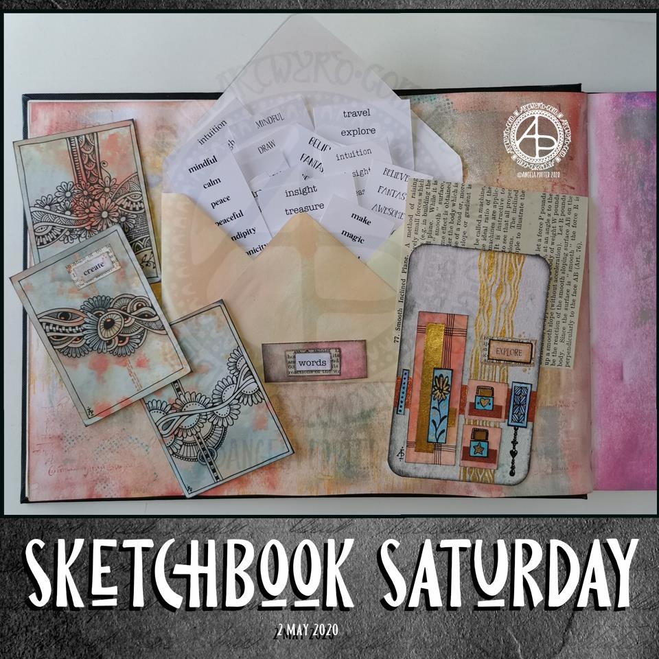
The main thing I wanted to do this morning was to get some little word tags prepared and in use.

I created a list of words I’d like to add to bits and bobs of art. I copied the list, using different fonts, then printed out an A4 sheet of the words. I made a second sheet using different words and different fonts. Then, I cut the sheets up into smaller pieces for storage.

Then, I realised I’d need to create a storage space for them in my sketchbook and thought an envelope would be the easiest way. I do have some commercially produced envelopes, but I thought it was time to use my We’R’Memory Keepers envelope punch board for a more custom size.

I cut an 8″ x 8″ piece of ordinary printer paper. I coloured the paper with distress oxide inks (old paper, tea dye and dried marigold) and then made an envelope that measures 3.5″ x 6″.

I then realised I needed a way to keep the envelope closed. I could tuck the flap inside the envelope, but as I used copy paper I didn’t know how durable it would be. So, I came up with the idea of having a little pocket to tuck the corner of the flap into. And that meant I could cut out “words” from one of the lists and add it to the little pocket.

Before I did that, I aged the edges of the label with Distress Ink. Next, I glued it to a an old book page and cut it out with a border of text. That layer was also edged with Distress Ink, then it was added to the pocket. I used a metallic Gelly Roll pen to draw around the label.

On the page, you can see some small drawings I’ve done over the past couple of days.

On the left of the page are three ATC cards (2.5″ x 3.5″) made from a piece of mixed media paper coloured with the same Distress Oxide Inks.

On the right, is a larger artwork, an experiment and exploration of what I could do. I collaged some Distress Oxide coloured pieces of paper on to the background. I added metallic gold and copper paint to some of the pieces, and also to create patterns behind them. I drew little designs too, including a Dangle Design from one.

I’m not all that happy with the ‘explore’ card. There are bits I like, and other bits where I think I messed up. I think if I’d left it with the gold patterning on the background and just some simple patterns on some of the collaged rectangles, maybe some gold paint on the smaller ones, then it would’ve worked out better.

I think I’m going to make a vellum envelope or pocket to store the ATC cards in. Vellum in translucent and so will provide a tantalising glimpse of the card(s) safely stored within.

The ‘explore’ card will be placed into the sketchbook, with notes and reflections about it. It’s one that will be a learning experience more than anything else.

Sketchbook Page

Sketchbook Page © Angela Porter | Artwyrd.com

I’ve been awake since stupid o’clock, which roughly translates to 3:30am BST. While I was trying to get back to sleep I watched a youtube video about making pockets and tuck-ins for an altered book journal.

I thought that could be something good for my sketchbook-journal. I have worried a little about gluing my little artworks into it, but pockets, tuck-ins, see-through envelopes could be a good way to both show the work and store it in a non-permanent way.

So, with my mind now working and sleep eluding me, I decided to have a go at making my own pockets. You can see the result at the top right, with a journalling card popped in one of them for now.

How I made the pockets

I used some ordinary white card, cut it into what I thought would be good sizes to make a set of stacked pockets for the ATC sized cards I’ve been working on.

I then coloured the cards with Distress Oxide Inks. For one of them, I used a brayer to add ink to a gelli plate. Before pulling a print, I spritzed the gelli plate with water that had some white perfect pearls added to it.

For another panel, I used the brayer to add ink directly to the paper. It did that unevenly. So, I used a ball-tool to carve some texture into the black side of a piece of cut and try foam and used that to add colour. That worked really well! Dabbing the foam added a lovely textured layer of colour. A spritz of water activated the dusty, chalky, soft nature of the Distress Oxides.

I enjoyed the look I achieved with the distressed foam that I coloured the remaining pair of paper panels in the same way.

I then tore the top edge of each panel, for added interest, then used a piece of foam and Rich Mahogany Distress Ink to add grunginess to the edges of each panel.

I wanted to add some embellishments to each panel, so I used a copper sparkle Gelli pen to draw patterns on them.

Finally, I used Tombow Mono adhesive to stick the panels together.

When I put the panels on the page in my sketchbook-journal, I thought a panel behind them. So, I coloured a panel of the same card with Distress Oxide inks and the distressed piece of foam and used the same gelly roll pen to add some sparkly patterns. Then, I adhered the back panel and pockets to my sketchbook.

When I tested some ATC cards in the pockets, I realised I need to work out a way for some more ‘give’ in the pockets as they’re too tightly put together to slip more than one ATC card in them. Also, I placed them just low enough down the page so the ATC card doesn’t stick out of the sides of my sketchbook.

I’m not well known for my fore-planning projects like this, though I do try to learn as I go along.

Inchies and Twinchies

My mind was working in weird ways this morning. As I was making the pockets, my mind strayed to inchies and twinchies. I’ve not made any of these for a long, long time. I thought it could be fun to do so and add them to my sketchbook-journal.

I cut two 1″ wide, and one 2″ wide strips of card. I used the distressed foam to apply Distress Oxide inks to them, spritzing with water to add to the distressed look. Then, after drying with a heat tool, I cut them into squares – 1″ x 1″ inches and 2″ x 2″ twinchies.

I decided to use metallic watercolours from Cosmic Shimmer to add a sparkly, shimmery border to each tile. I used rich gold, pale gold or copper on each tile.

Then, I got to draw on the tiles. Teeny, tiny zentangle-style drawings. That was fun to do!

After adding some dots using a white Sakura Soufflé pen, I adhered the inchies into my sketchbook-journal. I’ve left the twinchies for decoration later.

Journaling cards

I realised that I could stored journalling cards in the pockets. All I needed to do was to colour the back of one of the ATC cards I coloured a few days ago. I also just realised that I could have added a layer of squared, dot grid or lined paper to write on too. That’s an idea for another time, maybe.

After drying the ink, I used a rollerball pen to add what notes I wanted to about this mornings creative sessions.

In fact, I’ve just created another journaling card to jot down ideas and notes to self as a result of reflecting on my pre-dawn arty activities!

Sketchbook Sunday

Sketchbook Pages – 26 April 2020 ©Angela Porter | Artwyrd.com

Over the week I’ve been adding to my sketchbook- notes and images, ideas and reflections.

Each page has been coloured with combinations of Distress Inks, applied using the black side of a piece of Cut and Dry foam, followed with a spritz of water to bring out some water-staining grungy loveliness.

All the little drawings have been done on either Daler-Rowney Smooth watercolour paper (300gsm) or mixed media paper, either from Claire Fontaine or Daler-Rowney. The papers have been coloured with Distress Oxide Inks, Distress Inks, or a combination of them. Most of the pieces have had the inks applied with the foam, but some were made by brayering Distress Oxide inks onto a gelli plate and taking a print of them.

The reflection about what I like, what I don’t like, and ideas that arise is important to me in my sketchbook/journal. I do reflect on my art, a bit too much in my head. When I write it down, it forces my sometimes abstract and swirling thoughts into some kind of order. When I make these thoughts a material manifestation by writing them down, it helps me to recognise the thoughts, sift through that which is useful, and still record those that are not particularly useful at this moment but may be in the future.

I think I need to find a way to do this with my digital art. My mind goes to using One Note to do this. I shall think on this one, and make a note of it in my physical sketchbook/journal.

Microbial

Microbial © Angela Porter | Artwyrd.com

I started this yesterday before I hurt my back. I started with a Distress Ink background. Next, I used water and a brush with Tombow Dual Brush pen ink to create the circles and splashes. Finally, I added some line and pattern to the ‘blobs’. As I was finishing it up this morning, they reminded me of microbes, so that’s why I’ve named it ‘Microbial’. A classic bit of abstract, intuitive Angela art, and a bit of a blast to the past as well, but fun.

My back is a bit better today, but as well as painful I’m now stiff and with pain down my thighs. Hot gel pads really work with the pain/stiffness and I’ll be sorting that out very soon, as soon as I’ve finished posting this in fact!

Poppies

© Angela Porter | Artwyrd.com

I’ve had a play around with Distress Ink backgrounds, painting on the basic shapes of flowers, leaves and stems, and then adding black line art to it.

And, as I got up to put this on the scanner, I hurt my back. So, today I’ll be finding somewhere to sit/lie where my back doesn’t hurt and most probably crocheting and hoping the pain/stiffness eases off soonest. My back was a bit niggly as I woke up – I’d slept in a different position to usual and I wonder if that’s what had started it off.

Ho hum, so no arty stuff today, it’s too painful to sit at my studio desk and work.

Mail Art

Mail Art ©Angela Porter | Artwyrd.com

Yet again I woke with my mind swimming with an idea I wanted to try out. I’d had a problem when I was trying to add colour to drawings I’d done on distress ink backgrounds. Whether I used water and a brush or a Tombow Blender pen, the pigment from the Sakura Micron and Uniball Unipin pens bled, and I really wasn’t happy with that.

I spent some time yesterday trying different pens out, with no luck in finding any that didn’t smear/bleed. So, I put this to one side until I had a chance to think about it.

I slept on it and woke with an idea to try.

Why not use the Tombow blender to draw the basic shapes of my design in colour and then add black lines afterwards. Seed pods seem to be my default design when I’m experimenting, but I’m fine with that.

So that’s what I did. And this card is the result.

As I was starting to add the black lines to the design I thought I’d made a horrible mistake, had a bad idea. However, as I added more and more detail, I realised it would work out, and I think it did.

I added some gold to the seeds in the seed pod with a glitter gel pen. I also splattered some gold watercolour paint over the design.

The envelope is really simple; three seed pods, black line art with golden seeds.

Not a unique artistic approach, but it is something that has never worked for me before.

It’s not a dissimilar approach I take to my digital art, where I start with the basic shapes and then add shading and detail. I do use line art as a guide for my design, and that is an approach I can apply to traditional art in that I may need to pencil in the design, then colour, then add the line art.

Who would’ve thought it – working digitally is helping me develop my traditional art methods and skills.

Zentangle ‘toppers’ for cards

©Angela Porter | Artwyrd.com

I’ve been awake way too long already today. I just couldn’t settle to get back to sleep when I woke around 4am. I gave up trying just before 6am and thought I’d do some drawing to see if it would settle me.

The soothing style of choice at the moment is zentangle, so I made use of some of the coloured ’tiles’ I made yesterday, and these are the result. I’ve yet to decide whether I will actually turn them into cards, or whether I’ll just keep them as references for the future.

I thought plain black line looked a bit ‘flat’. That may be a consequence of me working digitally so much and the way I achieve dimensionality in my art.

So, in the top design, I used brush, water and some colour from Zig Clean Colour Real Brush Pens by Kuretake. I enjoyed adding shading with colour, though it was hard work with the fine brush I’d chosen, especially when I turned my attention to the one on the bottom left. So, I used a Tombow Blender pen with the colour for the third card on the bottom right. I’m much happier with the smoothness of the gradients here, compared to the other two.

What I’m not happy with is the way the pigment from the black lines seems to move, particularly when I used the brush. I’m not sure whether this is a result of me drawing on top of the distress ink coloured paper, or whether it’s to do with the friction of brush on the lines. I did get a little bit of movement of the pigment with the Tombow blender pen, but not so much it seems.

As I’m digging into my stash of media from past times, I remembered I had some Nuvo Drops from Tonic. So, instead of using a metallic gel pen to add some embellishments, I added some of these drops.

I’m not entirely sure they work. I think I’ll have to look at these cards again after I’ve had a good sleep and a break from them

I am glad I tried adding more saturated colour to the designs to give that illusion of dimension, even though I had to rediscover the joys of using a blender pen. I do find pens so much easier to work with than brushes, that’s for sure. That may be a knock on effect of me using pen ‘brushes’ so much in digital art.

I’m exhausted now, but I won’t go back to bed until my grocery deliveries have arrived.

Monday morning

©Angela Porter | Artwyrd.com

On Saturday, I recorded a video of me drawing this design on 6″ x 6″ Strathmore Vellum Bristol Paper coloured with Distress Inks.

This is an example of intuitive, entangled drawing; I started in the red area and worked my way out from that point. I had no idea what kind of design I wanted to create, I just wanted to draw and lose myself in that process.

The only guides I had at the start were some pencil lines to give me a border to work within, leaving a clear, plain border around the design. However, my mind seemed to do a bit of a flip when I came to drawing the bottom left of the design; I completely ignored the pencil lines for some reason totally unknown to myself. When I realised what I was doing, it was too late to change it as I was working in pen without any sketch to guide me.

It took me over 55 minutes to do, and I’m still trying to figure out in my head how to edit the video and post it, as well as making intro and outro pages.

I know that I’m busy for the rest of today, so I’m not likely to sort the video out today. I’m hoping I’ll have a bit more time tomorrow.

I was really surprised by the kind comments people left about my first, trial video, so I will do more. I do need to work out a realistic schedule for that for myself to work to amongst other projects I want to get going when I’ve finished Spectacular Sea-Life.

Talking of which, I’ve nearly completed the third out of four coloured templates, so I’ll soon have them all done. I will post some sneak previews of them as I go.

Never give up on hope

Artwork ©Angela Porter | Artwyrd.com

I woke earlier with the need for some self-caring, self-soothing art and a mandala is the only thing that does that at times.

I created a background using various shades of pink and red Distress Inks (Worn Lipstick, Abandoned Coral and Candied Apple). I scanned it in and then drew the mandala digitally.

I needed pink as a soothing colour, so I chose a monochrome (more or less) colour scheme for the mandala.

I knew I wanted a Star Wars quote, and I chose this one from The Clone Wars. I feel a Star Wars marathon coming on later today; something else that I find soothing.

First, though, I want to get some work done on colouring another illustration for the Spectacular Sea-life coloring book. This is yet more self-soothing.

Entangled designs

Entangled Designs ©Angela Porter | Artwyrd.com

I’ve had a nice couple of hours this morning playing around with drawing and paper coloured (and not coloured) with Distress Ink.

I started with drawing the border with the flower straight onto the coloured square of mixed media paper (top right).

For the middle design, I cut a rectangular panel of Distress Ink coloured mixed media paper and glued it to another piece of coloured paper. Then, I decorated the panel along with some simple patterns spilling onto the background.

The bottom right design uses a square piece of plain paper with a small rectangle cut from some Distress Inked paper. I used a die with a stitched detail to cut this panel out along with a Sizzix Big Shot die cutting machine.

I’m not at all fussed on the stitched detail in this case. However, I do like the contrast of the coloured panel against the white background.

I do have a fair few pieces of paper coloured with Distress Inks, so I think some fairly quick, simple and soothing designs will be done over the next day or several.

Not sure what I’ll do with them yet. If you have any helpful suggestions, leave a comment! Also, leave a comment to let me know which design is your favourite.