Peace

Angela Porter Peace 10 Sept 2018
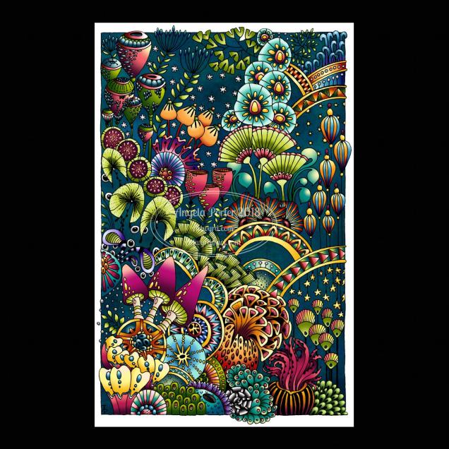
Drawn using a Microsoft Surface Pen on a Microsoft Surface Studio screen in Autodesk Sketchbook Pro.

It’s been a couple of weeks since I last hand-lettered and patterned a word, and this morning it seemed really appropriate to do so.

Yes, hand-lettered, in a digital environment. Working with the Surface Pen on the screen of a Surface Studio is just like working with pen on paper in terms of physically hand-lettering and drawing the patterns.

The ability to work in layers, add effects to layers and use gradients to colour the background is a bit different to working in traditional media.

I do like doing these words; they’re fun to do! Also, a nice way to spend a few hours of a Monday morning.

Abstract Botanical 9 September 2018

Angela Porter 9 September 2018

This one has taken many hours to do, and I’m not quite happy with the background colour/texture, but I need a break from it.

I drew the black and white line art on paper with Sakura Pigma Micron pens, scanned it in, created a transparent background and then coloured it digitally.

I used Autodesk Sketchbook Pro with a Microsoft Surface Pen on my Microsoft Surface Studio.

Fun to do. A nice way to spend time, jut playing. And it’s unusual for me to colour in one of my black and white pieces of line art.

Abstract Botanical 28 August 2018

Angela Porter 28 August 2018

Another abstract botanical. This one has gold dot highlights as well as white dots. Fun to do!

I dug out my old Ohto Graphic Liner pens to draw this one. I’d forgotten all about them until I was looking for some new Uniball Unipin pens in my pen stash.

The Ohtos are roller ball pens with pigment ink which is waterproof and fadeproof. The beauty of a roller ball, unlike fibre-tips like the unipins or Sakura Microns, is that the roller ball tip is practically indestructible, even for one with a heavy hand like me.

They work well on the lightly textured hot pressed watercolour paper I used (which is 10″ x 14″ in size).

I applied the colour first, then worked with the way the colours spread and mixed to draw the patterns generally, though I do work rather intuitively.

Abstract Botanical 27 August 2018

Angela Porter 27 August 2018 small

Started yesterday, finished this morning. Another intricate, abstract botanical

I coloured the paper first and worked with the patterns made, mostly. Intuitive drawing with detail and intricacy and black lines is my favourite to do. Botanical things, abstract motifs, from my imagination are also some of my favourite things to draw.

My colour choices are a bit different for me, the way I blended the colours resulted in some unusual, subdued, almost grungy tones. I think I like it.


Bookmarks

Angela Porter 25 August 2018

I’ve been playing around with a different kind of material and techniques and created these bookmarks. I’ve had a bit of fun doing them, something different, the same kind of drawings but different techniques.

I’ve used parchment paper and various ball tools to draw the images and Tombow Dual Brush markers to colour them.

I like the one on the left a lot. Surprisingly, the more muted, pastel tones really appeal to me.

I do have other bits and bobs of parchment here that I’ve tried things out on, and there’s some skills to develop for sure; but it’s a nice way of working, to draw in white on white then add texture and colour. I don’t think the textures show well on the photos though.

A nice way to spend a Bank Holiday Saturday – being quietly creative and learning new stuff at the same time.


Abstract Botanical 22 August 2018

Angela Porter 22 August 2018

Another day, another drawing/artwork/illustration/design. This one is only a little one; it’s approximately A5 in size.

I used some new watercolour paper from Canson – Moulin du Roy. It’s smooth, slightly off-white, pure cotton mould made and seems to work nicely with Intense pencils and a waterbrush.

I’m waiting for some metallic paints to arrive so I can add some highlights to this – there are places where a dot of gold will really work nicely, but not too many places methinks.

Also, I chose just seven colours to be my palette – sherbert lemon, apple green, iron green, lagoon, violet, red-violet and sienna gold. I thought that a smaller number of colours could result in a more cohesive feel to the design, and I think that it may have done so!

For this one, I drew the design first in pen then added colour.

When I draw first I do tend to fill the space with drawings. When I add colour shapes first I end up with more white space and a more random ‘edge’ to the design.

Why that is, I don’t know, other than it may have something to do with me filling spaces in with pen and ink habitually.

A habit I need to modify I think.

All the same, it’s nice to do little designs. I already have another drawn out waiting for colour!

A little cattitude

angela-porter-17-june-2018-watermarked.jpg

A couple of quick (ish) drawings of kitties, the first I’ve done since I said goodbye to my companion puss of 16 years a few weeks ago. So, they’re both white as he was pure white.

Often, all anyone would see of him was his backside while I was Skype-ing with them.  Sometimes his cute pink nose pressed up to the screen.

He sure left a lot of deep paw prints of love on my heart. He was one unique kittycat for sure.