Spectrum Noir Illustrator pens – Review

Today, I popped into my local craft shop – Dandie Crafts (Dandie Crafts Facebook Page)- in their new premises in Caerphilly.

The shop is larger, smells fresh and new, has more space for stock and much more space for classes and demos.  The warm welcome was very much the same.

I had gone there to stock up on paper for my printer; I like their own range of acid-free heavy-weight paper (usually 160g/m²) and found the Spectrum Noir Illustrator  twin-tip alcohol markers in stock.

I bought the six packs of pens, which cost £12.99, so the pens work out a little over £2 each, which is about half the price of a Copic Sketch marker, Promarkers you can get for a little over £1 each at the moment.

Debbie, the lovely lady in charge today, told me they’re supposed to be a new formulation of ink that blends more easily with quality Japanese nibs.  One of the nibs is a bullet nib, the other a brush nib.

On the Illustrator marker packaging it says:

For smooth, natural linework and detailed colouring.  Fully blendable, streak-free coverage.  Perfect for drawing and illustration.

So, I just had to buy and try them out!

I drew the design using the True Black marker and the bullet tip.

The bullet tip isn’t as fine as I thought it would be.  The tip is softer than the bullet tips found on the Promarker pens.  Personally, I’d prefer the bullet nibs to be firmer.

The pen drew nicely with plenty of ink in the new pen (something that hasn’t always happened with my experience of Spectrum Noir pens in the past).  Also, the ink seems jucier in a different way that I can’t describe.  It does seem to be a different formulation.

The black lines are thicker than I’d usually draw, but I’m hoping they’ll give a stained-glass kind of feel to the art.

Once I’d inked out the design on 160gsm smooth white card, I started to colour in the design using just two colour blending.  That was going to be a bit of a challenge as I have eight of the six pen sets which aren’t the full range of colours in the Illustrator pens.

What I did notice is that the colours do blend much more easily than the original Spectrum Noir markers, and also the Promarkers and the Copics!  The ink in the Illustrator pens is definitely different to the others.

Also, where I coloured fairly large areas with one colour, there was no streaking!  Admittedly I didn’t colour a huge area, but so far so good.  The lack of streaks was the case with both the bullet nib and the brush nib.

For the green leaves, I also used a tip-to-tip method to transfer a little of the darker colour on to the lighter colour to help blending with two quite different shades of green. That worked well.

The brush nib is made up of fibres that do spread out – more like the Chameleon pen nibs than Copics.  I don’t now how that will affect their ability to get into small nooks and crannies as they are used over time.

I also noticed that the inks are a lot more vibrant and ‘cleaner’ in colour than the original Spectrum Noir pens, which is a huge plus for them.

The only downside is that as I was colouring, the inks would blend out the black ink, so some of the lines have bled where I don’t want them to bleed.

I do need to test them out with the usual pens I use for drawing and also with the Epson Ultra-brite ink I favour, which hasn’t been affected by alcohol markers previously.

Overall, I’m happy with the pens.  I most probably will get the full set of 96 and will use them along with my other alcohol markers as I’m sure they’ll work well with them.

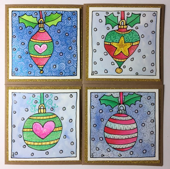


Christmas/Winter Greetings Cards

I’m a bit late getting myself organised this year as to making cards and getting some up on Etsy for sale!  However, there’s still time to buy or order some!

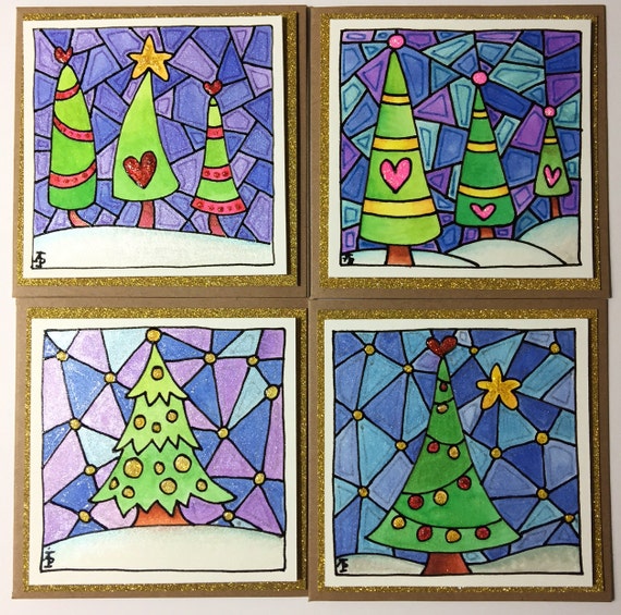
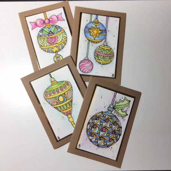
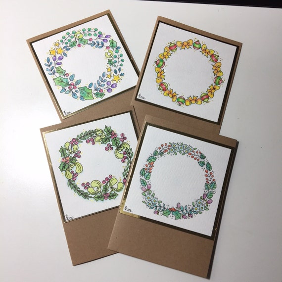
The photographs don’t do these cards justice.  They subtly shimmer with fine gold and silver mica powders.  They have glitter and glitz thanks to Tonic Studio’s Nuvo Crystal drops and Uniball Signo Sparkling pens.  The image panels are ‘popped up’ on foam so they have some dimension to them.

All are hand-drawn, coloured and embellished in my own unique, cutesy, wonky, whimsical style.  There’s no greeting on the the front inside so you can either add your own or ask for them to be customised for you.

They’re all rather whimsical, and each is unique.

Set of 4 whimsical Christmas/Winter Bauble Cards


Set of 4 Whimsical Christmas/Winter Tree Cards.


Set of 4 whimsical Christmas Bauble Cards

Set of 4 Whimsical Christmas Wreath Cards

Crimble card making time again!

I’ve been keeping myself a little busy at times in the past few days making this years crop of Christmas cards.

The materials I used:

  • Kraft cardstock and ready cut 4″x4″ Kraft card blanks
  • Watercolour paper
  • Spectrum Noir sparkle pens
  • Zig clean colour real brush pens
  • Perfect pearls
  • Cosmic shimmer metallic and iridescent paints
  • Nuvo crystal drops by Tonic
  • Sakura glaze pen in black
  • Inktense pencils by Derwent
  • Gold glitter cardstock, matte gold cardstock and mirror gold cardstock from Crafters Companion
  • UHU glue
  • Glue dots
  • White fun foam

And here are the resulting cards; they all shimmer and shine to one degree or another!

Peace in colour

All coloured, using Chameleon pens.

Color Me Stamps!

I have designed sets of clear stamps for Hampton Arts.  The range is called ‘Color Me by Angela Porter’.  It’s been a lovely challenge to do, and another string to my artistic bow too.

I’m being sent my own sets of the stamps and I can’t wait to play with them and embossing powder in particular to get the ‘stained glass’ kind of colours that I so love!

Of course I’ll post my versions here.  It’s all exciting for me!  Everything!

Notionsad_Jan2016OL

A little colouring break

I’ve been busy with black and white line art over the past few days.  Seeing so many people colouring artwork in with gay abandon had me hankering for my Polychromos coloured pencils, paper stumps and blending fluid for a while this evening.  I drew some designs just for my own personal fun over the weekend and decided to add colour to one of them.  Below is the result, the work in progress.

It could take a while to get finished as I have so much line art to do, which is great for me.  It is therapeutic, soothing, healing for me and that is just what I need at this point in life.

AngelaPorter_Artwyrd_Otherworldy_0001One thing I could do with an answer to is why do scanners always wash out the colours I have used?  I have a Brother A3 printer/scanner, which is great as I’m tending towards using larger paper these days, but try as I might I can’t seem to stop the color washout.

If anyone can give me any advice, help or instructions then that would be grand!

Two little books I made

TwoLittleBooks_AngelaPorter_Artwyrd_8March2015

I’ve spent much of the day so far making these two little books.  The smaller one is made out of one piece of 12″x12″ designer paper and some raspberry red cardstock with some strips of designer paper for the front.  The interior of the book has little pockets as well as places for words and pictures on the front and back of the pockets.  It’s not perfect, not by a long shot, but it’s a learning experience.

The bigger one is made from envelopes – I have blue and red ones that vibrate against each other.  I’ve decorated the front but am not too happy with it.  I’ve not done a brill job of putting the book together either.

However, in both cases I see it as a learning experience, and they are perfectly imperfect given that they are my first attempt at such projects.

This youtube video from split coast stampers shows how to make the small meander book.

This youtube video from papertreyinks shows how to make the envelope mini book.

It’s been a while…

Untitled 8 March 2014 by Angela Porter


It has been a while since I last made a post to my blog.

I have been struggling with vagueness and lack of focus with the medication I’m taking, and this one I’m on now doesn’t suit either. As well as the vagueness, I’m constantly on edge and fidgety, and the medication is supposed to treat that not cause it.  Have to give it a couple more weeks before it’ll be changed though.  I’m still away from work as a result.

In spite of all of this I’ve still been busy with art, though the focus for the projects I’m involved in has been lacking at times, but just ‘doodling’ with no constraints or requirements does help me settle a little and also is something I can do that doesn’t need that focus.

In the summer I signed contracts to do the artwork for two books linked to art therapy.  In the last week I was approached by another company to do one book for them in the first instance, and if it goes well then there could be a whole series of them.   My hope is that I’ll have enough contracts and work lined up that I can go kind of part time at work.  That won’t be for a while and I need to get myself better first, but the part time may be a way of helping me remain ‘better’ in the future.  Time will tell.

A different kind of mandala from me

August Mandala 9 © Angela Porter 2013

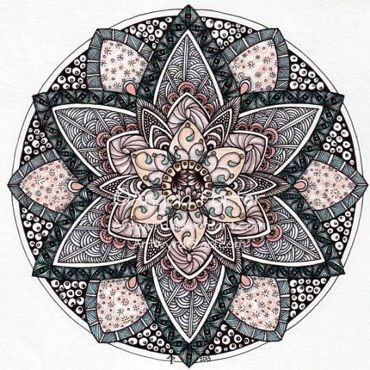
This one is a little different for me.  The colours are rather subdued for a start.  It shows the influence of my love of Romanesque architectural details, geometric patterns, natural patterns, doodly patterns, and, dare I say it, zentangles, though I do have to say the use of repeated patterns and doodly patterns has been around for thousands and thousands of years not just through the cleverly packaged and marketed brand of Zentangle!  I’ve used patterns like this in my art for a very long time, drawing on my own observations as well as those of others…

Anyway, this mandala has been created using Unipin pens, coloured pencils, a Pentel white hybrid gel pen, and gold and silver Sakura pens.  Yes, there are some very subtle metallic highlights on this one that don’t really show up in the scan.

Autumnal August Mandala 8

Yup, it’s the eighth one in the series this month.  I really have become hooked on mandalas this past week or two.  The repetition that’s necessary to complete them (well it is  the way I do them) is calming and meditative; that’s not just for drawing the outline, or for the colouring, but for all the texturing as well.

This one uses a rather unusual, for me any way, colour palette.  The background has been left white as I really don’t know what colour (or texture) to do it in.  Do I do earthy greys and black, rich earthy greens, blues the hues of autumnal day, twilight and night skies, or some other colour(s) that I’ve not considered yet?

It will come to me, and any suggestions are always welcome!

August Mandala 8 © Angela Porter 2013

And here it is with a background.  I’m ambivalent about the background; part of me likes it, part of methinks the colours are too similar to the mandala design, part of me wonders if I should have played around with colours more, and part of me thinks that the texture on the background should have been done in a copper metallic ink with dark inner shadows.

August Mandala 8 with background © Angela Porter 2013