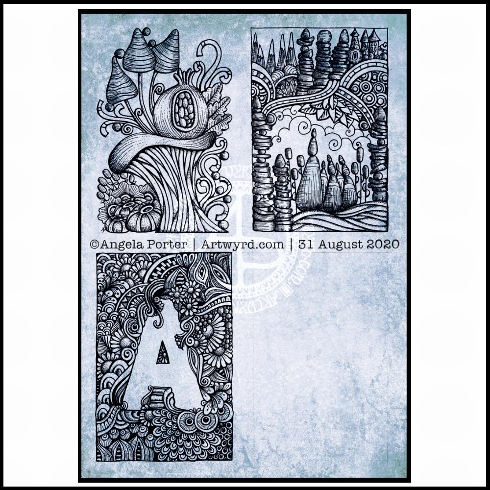
Wednesday is WIP day! WIP is work in progress, and this is one of my current one.
I’m working on A4 (29.7 cm x 21 cm) Claire Fontaine Paint-On mixed media paper with 05 and 01 Uniball Unipin pens.
It’s taken several hours so far, and there’s several yet to go! I’m enjoying creating such detailed drawing in just black and white. Lots of botanical elements, but there’s also arches and spirals and geometric patterns in there too.
I never have much of a plan in mind when I tackle a drawing like this. I know what patterns I like, and if I lack inspiration I can always refer to my visual dictionary or design motifs and patterns. It’s all about intuition. It’s not entirely mindless. I do make conscious decisions about what design element to use, how to use line and pattern to add volume and contrast.
I sometimes wonder, when I see my work like this, why I try to work with colour. I always feel I struggle with colour, but black and white, with or without grey, always seems to work so well for me.
I love to play with the illusion of volume in a drawing, and whether that is done with density and shape of line/pattern, or with colour (even though I really do feel I struggle with colour).
I will persevere with this illustration, drawing, artwork over the coming days. In fact, I may spend time on it today. I’ve completed my morning errands, so I can remain at home, which is where I need to be. I’m tired today; I didn’t sleep at all well last night, or for the past few nights and my mood and ability to concentrate is suffering as a result.
I finished the top right design, and have completed the ‘A’ illustration on the bottom left. That leaves one space to be filled, no doubt later today.
I’ve used either Faber-Castell Pitt Artist pens or Uniball Unipin pens to complete the drawings on ClaireFontaine’s Paint-On mixed media paper. This paper is fairly weighty (250g/m²) and has a lovely velvety feel to it.
The only pencil lines I’ve used have been to delineate the ‘boxes’ to draw in, and for a couple of the design elements in the top left image as well as the A.
Reflecting on the designs
The white space in the top left design works really well I think, and is quite an accomplishment for me. The same is true, to a lesser extent for the top right design. In both cases, the white space brings attention to the design.
In contrast, the densely pattered area helps to bring out the monogram A, making the white space the focus of the design.
I think I’m going to work on some more monograms in this style. They are fun to do, and dense, entangled patterns are one of my signature artistic voices. It’s been a long time since I’ve completed art like this, with a lot of detail to bring out dimension/volume in the design.
In fact, I’ve enjoyed using line and stipple to add volume in all the designs, exploring how I like to do this as I go. All the work I do with colouring books means I have put this to one side. It’s interesting how I’ve circled back to this style. It’s even more interesting to look at how my drawing skills have developed and evolved over time as well.
I found some peace, contentment and joy while drawing these, and feel a sense of accomplishment, particularly with the two on the left.
Do I prefer digital or traditonal drawing?
A difficult question to answer. I think it depends on what I’m creating.
I really do enjoy using pen on paper. I get a better sense of the overall design. Paper and pen is very portable too – whether I’m sketching when out and about, or drawing in different places at home.
Drawing on the screen of my Surface Studio with a pen is a lot like drawing on paper. The smoothness of the screen makes it a very different tactile experience. It also is great for inking in sketches. It also makes correcting mistakes or re-working areas a lot easier, and there are techniques I can use that are near impossible or very time consuming when working traditionally.
Sometimes, the lines produced digitally are too perfect. I’m still working on developing the brush styles that will mimic the unevenness of an inked line. I do have to use some element of line-smoothing as I draw; without it the lines are really wobbly, but with it they can be too perfect and I lose, to a degree, that personal and unique way that my pen moves on paper.
I also find it difficult to have a sense of proportion or detail when working digitally, even though I can look at the design at the same size as it will be printed. The ability to zoom in and work on a small area means I lose all sense of relative size and complexity/detail of a design. So, if I’m going to work on a drawing digitally, I prefer to start with a sketch to give me that sense of scale.
I rarely sketch out my design when I work on paper, except if I need the outlines of a design element as I’m drawing. I do tend to work very intuitively.
So the answer is, I prefer each for different purposes, and also to suit my different moods and purposes.
Of course, once I’ve drawn a design, I then have to decide if I want to add colour, and then what media I will use – traditional or digital!
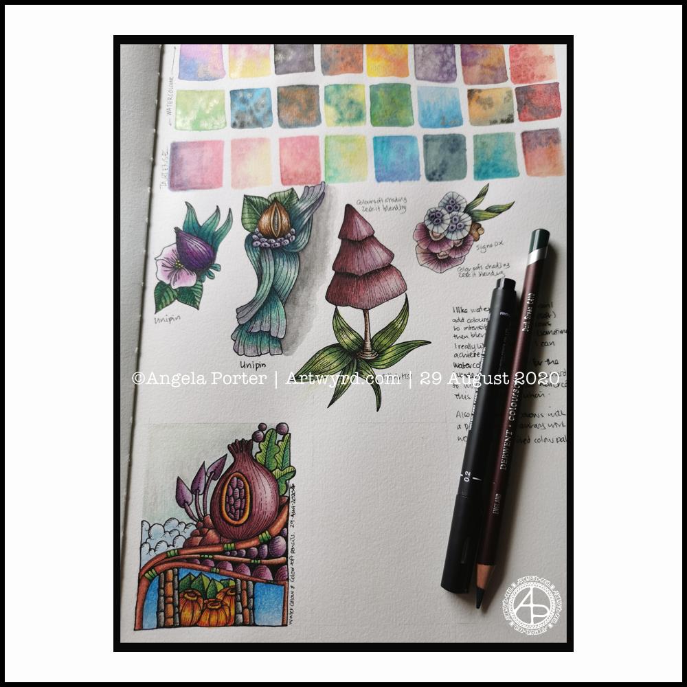
I know, it’s that page in my Arteza watercolour sketchbook again! However, there are some changes, most noticeably the bottom left design.
I have added some depth and contrast in colour using coloured pencils to parts of the designs, and left other parts as just watercolour. I have used a blending solution and paper torchon to blend the pencils in most instances, but not all. Sometimes the blending just isn’t needed.
The bottom design was done today. It took around three hours to complete. Drawing the design with Pitt Artist pens, followed by the background washes of watercolour, finally the coloured pencils.
What I’ve learned
I like using coloured pencils on watercolour paper, and over a watercolour wash.
I find it really difficult to get the intensity of contrast with watercolours alone. Using coloured pencils makes that a cinch, especially on paper with a good ‘tooth’ to it, like watercolour paper.
I got a good sense of satisfaction as I completed the bottom design. I’m not all that happy with some of my colour choices, but that wasn’t my main consideration today; that was trying coloured pencils on watercolours on watercolour paper.
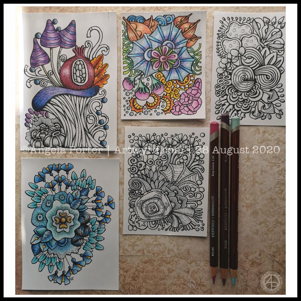
Over the past couple of days I’ve been drawing small designs in pen, including plenty of line detail to add volume and shadow.
Today, I scanned the drawings in and printed them out (after cleaning them up a tad digitally) so I could try colouring them.
I wanted to print them on mixed media paper, which I know my printer will take. However, even with clean scans, the prints were really messy. However, when printed on ordinary paper, the prints were pristine.
I wasn’t happy as I wanted to use a paper with a bit more ‘tooth’ so I could make use of the Derwent Colorsoft pencils. But, I persevered and the results are above.
The first I coloured is in the top middle. My colour sense isn’t always wonderful. Lots of colours, but it just doesn’t feel coherent in any kind of way.
So, I moved on to the next design. This time, I thought I’d use analogous colours (colours next to each other on the colour wheel), with a touch of a complementary colour to add brightness. Complementary colours are opposite each other on the colour wheel.
I like this second one much more. It feels cohesive, like everything belongs together. And the little bursts of yellow/orange just lift it all.
The third design I’ve been colouring is only partly done. I’ve veered away from entirely analogous colours, but I am trying to keep the colour palette simple and with, perhaps, an autumnal feel to it.
As I was working on printer paper, I needed to use some way to blend the colours. I remembered I had some ‘Zest-It’ blending solution and some paper torchons. They worked well. The big frustration was that I couldn’t lay down intense colour. However, as these are prints, I’m not too worried. I do need to find some toothy paper which will go in the main paper drawer of my printer. I do have some cartridge paper here somewhere which should go through it.
Of course, scanning the drawings in means I can also work on adding colour digitally. It means I can try things out until I’m happy with the results.
Pesky printers
I never have much luck with printers. Inkjet printers die on my quickly, even the more expensive professional ones. I thought I’d try a laser printer, but I seem to have problems with this one now not giving clean prints when I use the sheet feeder for specialist papers.
I don’t print much out, to be honest, but it’s frustrating when I want to print artwork out on specialist paper.
A note to self about colour.
What I have learned is that I like to watercolour the designs, but then the addition of coloured pencils to intensify the colours and add shadows works really well for me. I like the intense contrasts that I can get with coloured pencils that I just can’t seem to achieve with watercolours.
Of course, I can always colour digitally, which lets me play with colours, change them, until I get something I really like.
Today, I’ve had a reminder that limited palettes, particularly of analogous colours, seem to be working rather well for me, especially with those accents of complementary colours.
I really do need to put a big ‘note to self’ where I can see it to remind me of this. I can get carried away with colours
This week, I have an entangled mandala design, with a zentangle-style background. It always seems a shame to waste the space around a mandala when it’s a page for breathing life into a design with colour.
I drew this design in Autodesk Sketchbook Pro using a brush that changed width with pressure. That allowed me to add some dimension to the lineart. But it is colour and shading that really brings a sense of volume to the design.
After trying out watercolours with my line art, I thought I’d try using coloured pencils.
I dug out some Derwent Professional coloured pencils, and found their leads very hard; my finger joints don’t like working with media that need a lot of pressure.
I then remembered the Derwent Coloursoft pencils that I had somewhere. Their leads are softer and more easily laid down. So, I dug them out and rediscovered how lovely they are to use!
That means I went to town adding colour to the uncoloured motifs, and also to some that had been finished to add contrast and depth.
And it’s another ‘aha!’ moment. I love the Coloursoft pencils, and they work well when combined with watercolour it seems.
I panicked a little when I wondered if Derwent still made them. They do! So phew! So, I get to use coloured pencils again, coloured pencils that my finger joints like.
I went on to draw some more designs, working out how to add depth and dimension with line work. They are drawn in my sketchbook – colour gradient and texture added to try to protect my artwork. These are much more my ‘entangled’ style of art.
Once that page is complete, I will scan the drawings in so that I can, if I wish, add colour digitally, or print them out to try out different colour palettes or different media.
After a walk and lunch yesterday, I eventually settled to working with my aha moment. This sketchbook page is the result, though I have work left to do with it.
The designs are inked in with Pitt Artist Pens and I’ve used watercolours and Inktense paint pans and pencils to colour the motifs. Well, most of them. I’ve left some parts in black and white to show the difference that colour makes.
I used a Daler-Rowney artist’s sketchbook. The paper is acid free, but is not specifically for watercolours. It held up surprisingly well to multiple layers and glazes of colour, though it does grab the colour and it’s difficult to move it around as on watercolour paper.
I also found the wet brush lifted some of the pigment from the Pitt Artist Pens. That surprised me as they were totally waterproof on watercolour paper.
Reflections
Having an ‘aha moment’ and working with that realisation can be quite different. It’s nice to try different ways of using line and stippling to add shadow and volume to the drawings.
The half-beetle was an interesting one to work with. On the lower wing I could’ve used lines to add the illusion of curves, but for some sections I just used colour. I also used the beetle to practice adding lines and stippling.
I tried drawing the beetle digitally, but it just didn’t feel ‘right’. I didn’t get the same satisfaction as I did drawing it with pens on paper. I’m sure that’s due to me having my brushes set up incorrectly. That’s something I’m going to have to work on. I ended up with a drawing that was too perfect. That surprised me too, as I love to work digitally. Perhaps that was a function of my current mood and energy levels.
I do tend to switch between digital and traditional media, sometimes mixing the two. That is certainly an option moving forward – drawing the line art on paper, then colouring digitally.
I do like the earthy tones I’ve used to add colour to many of the design elements on this page. That still continues to surprise me, as much of my work has been brightly coloured, often with ‘in your face’ colour palettes used.
The smaller designs I’ve drawn here also have their own sense of satisfaction and enjoyment for me. Usually, I draw full page designs for colouring books. But here, I’ve drawn small compositions, and that is not so overwhelming for me at this time.
Yesterday evening, I found a little oompf to play with colour in my watercolour sketchbook. The little blocks of colour on the right hand side are the result.
I dropped wet into wet, both watercolours and metallic watercolours, and just let the watercolour do their thing. I also tried similar with Inktense ‘watercolours’ too.
Just doing something simple like this, playing with colour for the sake of playing with colour, led me to want to try something different.
I had got frustrated and not all that happy with the designs on the left page over the past couple of days. Browsing through Pinterest, my attention was caught by illustrations that use black line drawings with a wash of colour. So, I thought I’d try those out.
I also wanted to try different pens to see how waterproof they are on watercolour paper. Unipin pens in grey and black, Pitt artist pens and a Signo DX pen were what I had to hand.
I used the pens to draw some of my favourite kinds of motifs, but rather than leaving just the outline, I used the pens to add shadow and the illusion of shape to the motifs. Once I was happy, I added watercolours. I did go back and add more lines where needed once the watercolours had dried. I also used a white gel pen to add highlights.
Reflections
Firstly, all of the pens were waterproof. The grey Unipin pen did bleed more as I was drawing with it initially than the others, which showed little bleeding at all. Anyway, I’m happy that I now know for sure they are waterproof.
I have used colours that are different for me. They have more of a vintage vibe to them. I actually like the colours, a lot.
Still developing my artistic voice(s)
I keep trying to move away from black line drawings with colour, to paintings made solely of colour. Each time I do this, I’m never really happy with what I produce, it never seems to feel it is ‘me’. I love to see how others use just pure colour to create art, it just never seems to work out quite right for me, not unless I work digitally. Even then, the digital artworks make me smile, but they still don’t feel right.
I like to draw colouring templates that help others express their creativity and to use for relaxing, meditative, calming activities. These are lovely in their own right and for the purpose they’ve been created for. However, they lack the details that I find satisfying.
That ‘Aha!’ moment
And there it is, I’ve worked out why things don’t feel ‘right’. Detailed line work. Using line and pattern to create shadow and volume in a drawing. There’s also a need for me to use line to define and structure artwork.
That was something I always used to love to do in my earlier artsy years, and something that has gone by the wayside as I’ve used my skills at stylising motifs for my work as a colouring book artist/illustrator.
Those skills will never be lost and will always be used. However, I have a need to find ways to express myself in ways that satisfy my artsy heart, and this revelation is one answer to that.
It’s obvious when I look back at my blog, that I’m constantly trying out new things, going back to old things.
Sometimes I return to old crafts and styles I’ve tried in the past as they are familiar to me and that familiarity comforts me when I need time to just create and feel some level of satisfaction in what I do. Comfort art I’ve described this in past, and it’s just as true for me now as then. There are times when I’m not up to challenging myself as I try or develop a new style to me. Then, I go to art and craft styles that I know I can do fairly easily.
At other times, I’m seeking for the new, different and to stretch myself artistically. Out of a lack of inspiration over the past day or so has come a style that will stretch me, and perhaps will sit easily with me so it becomes one of my ‘voices.
Oh, I’ve not abandoned my new-found passion for typographic portraits/art. In fact, my mind is ticking over how I can incorporate that along with this coloured detailed drawings. Before I try the idea, I need to get some drawings done! I’d like to try the idea out digitally to see if it will work. That way, any drawings I’m really pleased with won’t be messed up.
How are you all doing and coping with the continuing pandemic and the public health restrictions in place?
Here in Wales, our Senedd (Welsh Parliament) has been slowly easing the restrictions, pausing after each one to see how it affects the rate of transmission before easing more restrictions.
I, like many others, don’t leave my home often. I did go out for a walk in the fresh, sunshiny and windy morning. It was so nice out and moving my body around. I am still very nervous of being around people, so I go to a big cemetery near me where I know I will encounter few people. It’s a very quiet, serene space too, and nature flourishes quite wonderfully there as well.
Template Thursday
Each Thursday marks another week of the continuing Covid19 crisis, and so I make a new freebie colouring template available in the Angela Porter’s Coloring Book Fans facebook group. There are some terms and conditions relating to the use of the template.
This week, I have a typically ‘entangled’ style of template for people to colour. As well as some cute winged stars, botanicals, arches, spirals, feathers, crystals and clouds, I’ve also included some hand drawn typography. Let me know what you think of using typography as a way of adding pattern to the arches.
If you download the template and colour it, don’t forget to tag me in your coloured version if you share it on social media! I always love to see how people colour my templates and bring them to life.
I woke this morning knowing I needed to draw a mandala and dragonflies. Sometimes I have no idea why, but this is what flowed from my pen.
Soft teals and lavenders colour the dragonflies and mandala. Calming, restful, meditative. The bodies of the dragonflies are ornate, but the wings are not so, which is unusual for me. Perhaps because I feel I’ve lost my ability to fly at this time, I’m doubting myself an awful lot.
Carl Jung used mandala drawing to help inform him, and his clients, about what was going on in the unconscious and needed to be brought into the conscious mind to be processed. The unconscious mind works through symbols and metaphors. So, what do dragonflies (four in number), teal and lavender symbolise?
Dragonflies are said to symbolise wisdom, change, transformation, light and adaptability in life. They are also a symbol of the realm of emotions and so invite you to dive deeper into your feelings. They also symbolise a change in perspective of oneself by removing the doubts that we cast on our own sense of identity in order to reveal our authentic self.
When they appear to you, they are a reminder that there is a need for lightness and joy in your life.
As I’m delving into the realms of symbolism, what about the colours?
Teals are calming and emotionally healing. They also represent self-awareness. This colour promotes an open communication between the heart and spoken word, in both directions.
Lavender represents gracefulness, calmness and creativity. There is also a sense of fragility, sensitivity and vulnerability connected to this colour. It is also considered a grown-up pink.
The teals and lavenders I’ve used in this artwork are both quite subdued, which actually does describe how I am feeling at this time.
And what about my choice of four dragonflies? What does the number four symbolise?
Four symbolises what is solid, what can be touched and felt. It also represents the justice and stability that you need in your life. It also resonates with loyalty, trust, wisdom, determination and patience. It is a reminder not to give up on your goals and to reflect on your passions and aspirations. Believe in yourself, your abilities, your talents and show them to the world. It is also a number that symbolises the protection and guidance of angels.
It seems my mandala has drawn concerns from my unconscious mind into the light of day. I find it interesting how the symbols and colours I used relate to what I am working with on a personal level at this time.
It is said that all artists reveal a lot about themselves in their artwork. I think I do that a lot more than I realise.