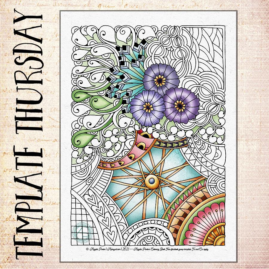
If you’d like to print and colour this template, then pop along to the Angela Porter’s Coloring Book Fans facebook group. It’s free to join and the template is free to members, with just a few sensible Terms and Conditions of use to follow.
This week, it’s a rather typically Angela Entangled style template. There’s lots of larger spaces that are perfect for you to add patterns or textures.
Template drawn with Unipin pens on A4 cartridge paper. Colour and texture added digitally.
Two drawings today, both done over the night as I couldn’t sleep as I really wasn’t at all well.
The larger one is a Zentangle ‘cartouche’. The central floral image is from one of Tim Holtz’s Ephemera packs. The paper is natural coloured mixed media paper by ClaireFontaine. I used a mixture of black, gold and rusty-red pens to draw the frame around the image. To add colour and shadow I used a mixture of pastel and graphite pencils, along with some tortillons. The design is approx. 12.5cm x 16cm (approx 3″ x 5″).
The smaller design is approx. 13cm x 8.5cm (3.3″ x 5.2″) in size. The paper is a piece of Medioevalis paper by Fabriano. This is lovely soft, gently textured paper that has a high cotton content. It’s easily damaged by the use of tortillons, however. So, I did add some shadows with a graphite pencil, but then added colour with Inktense pencils, brush and water. The paper really works well with wet media it seems. To draw the design I used a black fineliner, a brush pen and white and gold gelly roll pens.
I saw the ideas of cartouches, as a decorative frame around writing or image, and Zentangle designs on a youtube video and wanted to try it out. I decided to do that in the dark depths of the night when I wasn’t able to sleep. I may very well experiment with this idea as time goes on – particularly using drawings of my own as the focal point. I’ll see how it goes.
Yes, another WIP (work in progress). I’m fairly happy with the drawing, and I may re-draw it with less detail for this week’s coloring template. I’ll see how I get along.
This one is vexing me in terms of adding colour. I think that because elements of this are far less abstract my brain kicks into making things like life. I think I need to find a way to kick my brain into using shadow and light to bring dimension rather than focusing on colour.
This frustration may be because I’m feeling more than a little anxious and a bit like a startled rabbit. I have an appointment in a short while, and that means going into the world where there are people.
Design drawn on A4 heavyweight cartridge paper with Unipin pens. Background and colour added digitally.
Monday is mandala day! I never tire of creating mandalas, Angela style. It’s always a really lovely way to spend Monday morning and some of the afternoon.
This weeks is a combination of some organic patterns with quite geometric designs. There’s some Zentangle patterns in the design for sure.I’ve used a vintage colour palette once again.
I haven’t used any black outlines for this mandala. I’m not sure which way I prefer – black line drawing or not. Drop me a comment to let me know which you prefer.
A little more colour added to this drawing, including some shadows and highlights to the areas of background colour. I always have a lot of fun and fascination adding shadows and highlights and the illusion of dimensionality the add to the design.
I’m still really enjoying the vintage-y, steampunkish colour palette.
As it’s sunny here, if a tad blowy and cool, I’m going to call it a day working on this art. Instead, I’m going to try to muster the courage to go out into the world and take a walk, and if not a walk, a drive long enough to top up the battery on Binky, my SmartCar.
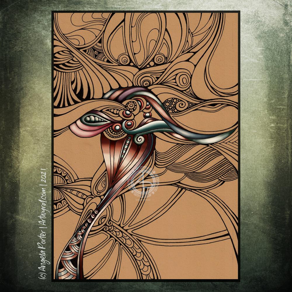
Another abstract drawing that is a work in progress. This time, the drawing is done, but I’m working on adding colour to it.
To draw this one, I used a hard Tombow fudenosuke pen with natural coloured mixed media paper. I enjoyed working with the broader lines in contrast to the fine line work of the previous abstract entanglement drawing.
I have made the background darker than the original paper, and I do intend to leave areas in this colour. For now, I’m working with colour to develop a sense of dimension. Of course, I’m adding colour digitally. Every now and then, I circle back to traditional media, and I think that diversion serves to remind me of how much I prefer to add colour digitally.
I keep circling around this. I like to draw designs with pen on paper. I get a much better sense of the flow of the design that way. But I like to add colour digitally. And so, it’s time for me to do what I can to accept this is how it is meant to be for me. I may dabble with traditional media from time to time, but digital art, at least as far as adding colour is concerned, is where I love to bring my drawings to life.
So it seems to be that from time to time I need that diversion to remind me of what really makes my artsy heart happy. A diversion or a break from the usual? Either, neither, both I suppose.
I do love the richness of these rather vintage, steampunk-ish colours against the warm, tan background.
I always relax, feel my whole body let out a sigh of relief as I work on drawings like this one. Purely abstract, line and pattern being the focus, with healthy doses of black giving a very graphic feel to the design.
Playing with line width and pattern to bring layers and depth to the design is always something I’ve enjoyed.
I start with one single line, shape or motif and go from there instead of having an overall plan for the design all sketched out and ready to go. I like this organic, intuitive way of letting the design grow, developing it one pen stroke at a time.
I’m learning, slowly but surely, that areas of white space can be a powerful part of the overall design. It’s been a long journey to realise I don’t have to fill the whole sheet of paper with line and pattern.
I need to have a lot of trust in the whole of this process; that something pleasing will be created after hours of work with very fine nibbed pens.
What next when I’ve finished the pen-work? Do I add shadows, colour, highlights with traditional media or digitally? Do I just add a background coloured/textured paper? Do I leave it in it’s very graphic black and white?
Working digitally with a scan of the finished drawing allows me to experiment, though I’ve yet to work out how to add shadows in the way a blended graphite or pastel pencil would do. And I do have a tendency to use much brighter, saturated colours than I would with traditional media.
Perhaps it’s time I sorted out my own digital colour palettes from my traditional media. That is something for another day, however. For the rest of the day, I’m going to lose myself in completing this drawing.
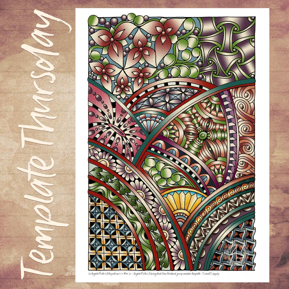
This week, my template for members of the Angela Porter’s Coloring Book Fans facebook group is a typically entangled one – full of Zentangle-style patterns, arches, a few flowers and organic motifs added, but mainly purely abstract. Great fun to add colour to!
This template was one I had doubts about whether it was ‘right’ or ‘good enough’. It wasn’t until I added colour to it that I realised it was just fine. I’ve chosen, yet again, quite a vintage colour palette, with a couple of brighter spots here and there.
This often happens to me. I’m really not happy with a drawing, but then I add colour and it magically transforms into something that I’m quite happy with. The colour is the flesh on the line-work skeleton. It’s quite magical!
The template is free to members of the facebook group, and you’d be made most welcome as a member should you wish to colour this template, or many others that are available there.
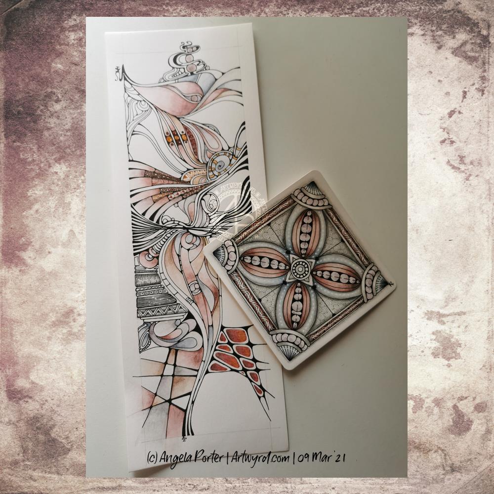
The tall, thin one is approx 10.5 cm x 29.7 cm in size – a piece of smooth, heavyweight cartridge paper. Colour has been added with a mixture of fineliner pens and graphitint pencils with a damp brush.
The smaller tile is 4″ x 4″ (10cm x 10cm) piece of the same paper. Again, I’ve used graphitint pencils and a damp brush to add colour. A white gelly roll pen has been used to add highlights to the image.
Both drawings have also had shadow added with a graphite pencil and paper tortillon.
I love the graphic nature of a pure black and white drawing. However, there is something almost magical in the way that colour and shadow/highlights can bring a drawing to a lucious 3-D appearing work of art.
I’m also loving the softer tones of the graphitint pencils with a damp brush. The water activates the colour a little and allows me to drag it out to create a gradation of colour, along with a darker, shadowed area.
The cartridge paper is not the best for using damp brushes on, but the texture that results actually isn’t all that bad.
My mind is wandering to the square tile, and wondering if I could create it in polymer clay … a thought to try out at a later time, maybe.
Mandalas are so much fun to do. In this one are lots of zentangle patterns – can you spot them?
Soft blues and greens play against the coppery tones used in the structure of the mandala. Soft, yet not washed out with plenty of contrast betwixt the highlights and shadows. I’m actually really happy with the color palette I’ve used here, as well as some subtle texture patterns that may not be visible on this smaller, lower resolution image.
What I do like is the light, almost lacy feel to the outermost ring.
A lovely way to spend a few hours on a Monday morning. Indeed, I got so engrossed in this that I’ve not had breakfast yet and it’s gone midday!