Mandalas are so much fun to do. In this one are lots of zentangle patterns – can you spot them?
Soft blues and greens play against the coppery tones used in the structure of the mandala. Soft, yet not washed out with plenty of contrast betwixt the highlights and shadows. I’m actually really happy with the color palette I’ve used here, as well as some subtle texture patterns that may not be visible on this smaller, lower resolution image.
What I do like is the light, almost lacy feel to the outermost ring.
A lovely way to spend a few hours on a Monday morning. Indeed, I got so engrossed in this that I’ve not had breakfast yet and it’s gone midday!
The challenge is a month long and I’ve asked the members to hold off posting their completed templates until 31st March so they can all be posted together. I thought it would be fun to do that way.
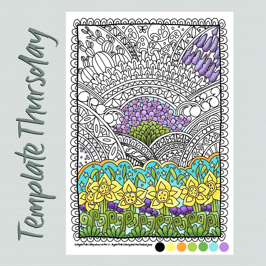
Anyway, the challenge is to use a limited colour palette plus black and white to colour this week’s template, or any other flowery template for the 31st March. I’ve chosen some springtime colours. It’s going to be interesting to see how different people use the colours to complete this challenge.
My artistic mood today was for another mandala. Again, I’ve used vintage colours to complete this one. I realised, once I’d collapsed all the layers and saved it, that the outer pattern ring is ‘off’ from vertical/horizontal. Blooming typical! Oh well.
Mind you, in my defence, I was also ‘adulting’ at the same time, so wasn’t quite paying the attention I usually would.
All the same I’m quite pleased with this one, though that central space may need something. I don’t know at the moment. I need tea and some lunch!
Yet again, a lovely way to start a Monday. Mandalas are always a pleasure to draw/paint/create. I particularly love creating them digitally for many reasons, not least is the opportunity to experiment and learn new skills. It removes the worry of making a ‘mistake’ on paper and either having to start again or try to make that ‘mistake’ a part of the work. Often, that ‘mistake’ will be worked into the drawing, but not always and if I know it’s there, it bothers me, even if no one else can see it. The perfectionist in me gets a tad upset at it.
Having said that, there are a couple of things I’m not happy with in this mandala, but I can live with them.
One thing I do like is the colour palette of copper/bronze colours and that steely blue-grey. Vintage colours seem to be my thing at the moment for sure.
Thursday seems to come around both quickly and as if it’s been an age since last Thursday. As it’s Thursday, that means it’s time for a new colouring template /coloring page for the members of Angela Porter’s Coloring Book Fans facebook group.
This week’s template is a typically ‘Angela’ entangled style drawing. A stylised dragonfly floats above an entangled background containing arches and seed pods, flowers and foliage, along with various patterns and an intricate border.
I’ve chosen to part colour the template in a monochrome scheme of greens. I don’t really pay attention to light source much. mostly I use light and shadow as part of the patterns and a way to introduce a sense of depth and dimension to my art. This is something I realised only recently.
It’s Monday, so it’s time for a mandala. This one includes lots of Zentangle tangle patterns, many quite organic in nature.
I, again, chose a monochrome colour scheme, and enjoyed playing with light and shadow to add dimension to this artwork. Perhaps not quite as contrasting as I’d like, but still interesting.
Digital art – Autodesk Sketchbook Pro, Surface Slim Pen and Surface Studio.
Finished! The addition of coppery tones was a bit of a surprise, even to me. But it seemed the right thing to do. I do like the combination of copper and the verdigris tones of teals, greens and blues.
I spent some time darkening the shadows in the inner rings of the mandala, as well as adding some depth of colour. They looked so washed out against today’s additions.
Also, I changed the colour of the background. Everything was so lost against the teal background.
Digital art – Autodesk Sketchbook Pro – Microsoft Surface Studio and Surface Slim Pen.
Monday dawns and along with it is the desire to create a mandala.
This one is a work in progress for sure. I’m still playing around with various brush settings to get the depth of contrast I desire. It’s working out fairly well so far, especially as I’ve chosen a limited palette of blue, teal and green. Also, my favourite seedpod, leaf and arch shapes are very much in evidence here. There’s also lots of little orbs. It never ceases to amaze me how such a simple collection of shapes can result in a fairly complex design.
What is unusual for me, like last week’s mandala, is the lack of black lines in the design. I think that’s a bit of a rebellion by me to all the pen drawing I’ve been doing of late. Also, I love colour, but find it so frustrating to add to my pen drawings.
When I work digitally, colour seems to work differently for me. I think it may be the ability to work and rework the colour endlessly until I get something that suits me. Maybe it’s the ability to get the depth of contrast I like. Or maybe it’s something else entirely, I really don’t know.
This part of the mandala, about a quarter to a third, has taken me around three hours to do so far, thanks to the symmetry tools available to me in Autodesk Sketchbook Pro.
I had a wee bit of trouble doing this week’s template for the Angela Porter’s Coloring Book Fans facebook group. This is either the third or fourth I drew, and the only one I think is just about good enough. I think that’s a reflection of the stress-comedown I’m experiencing after a week of trying to make a decision, which is actually more like months. I finally did it, and now I have to find that sense of inner balance and peace again.
Anyway. I drew this design on Bristol board with a 05 Sakura Pigma Micron pen. The colours have been added digitally. And after my messing around with Chameleon markers yesterday, I really enjoyed adding colour digitally.
I think it may be more or less time for me to abandon traditional coloring media! I always get so frustrated in using them very quickly.
Pen and paper is still something I love to use for drawing, so that’s not going to change!
What a couple of days, weeks, months it’s been while I wrangled with a difficult decision I needed to make. Actually, it wasn’t making the decision, it was acting on it by overcoming the uncomfortable feelings of guilt and giving up that were the hardest things to do. But yesterday, I acted. Decisively for me.
A weight was lifted off my shoulders, but there was also the stress-comedown ‘hangover’ of extreme fatigue, spaced-outness, but no headache (thankgoodness!).
I’m still tired today, but that’s to be expected as the stress has been growing and growing. I think that’s been reflected in my dark, dingy, incohesive art of late.
So, when I woke this morning, I really wanted to create a mandala. And this is a mandala that is so different for me. But perhaps it represents what is happening inside me. Carl Jung believed mandalas, when created intuitively, reveal what is going on in our subconscious mind, things we’re not yet aware of, changes that are occuring, emotions we’re suppressing or ignoring.
It has been an enjoyable way to spend a couple of hours this morning. It’s just the art I needed to do after days, a couple of weeks even, pottering around with pen on paper doing zentangle-style drawings. Comfort art in the extreme.
Mandalas are comfort art for me, they do soothe my soul, but sometimes I do ones that break the ‘comfort’ mould a bit. This may be one of them. I’m fairly happy with it for sure, especially using a limited colour palette.