This morning, I needed to create something that wasn’t too taxing, that was meditative, that could be completed relatively quickly in a process that was familiar to me. So, I chose to create a Zentangle tile. Perfect for when I’ve woken with a stinking headache.
I cut a 4″ x 4″ square of Fabriano Sand Toned Paper and added a few pencil lines to act as the ‘string’ for the design. Next, I had a look on TanglePatterns.com for a pattern to place in the diagonal area. The latest one posted is called TIWA, designed by Ria Mattheussen, one I’ve not drawn before. So, I used that, and let the design grow from there.
To create the tile I used the following: 0.3 Unipin pen, various Stabilo Carbothello pastel pencils and a paper stump, a white Sakura Soufflé pen, and a BR3 Chameleon fineliner for the spiral pattern (Printemps in Zentangle-speak!).
I need a quiet, restful, and possibly nap-filled rest of the day. As the headache is beginning to fade, it’s leaving me feeling exhausted in it’s turbulent wake. I do think I may do a little more drawing first.
As autumn has arrived, at least astronomically, As we’ve passed the astronomical point of season’s change, from summer to autumn here in the northern hemisphere, I continue to long for the fiery costume of nature. Warm memories to sustain us as the cold, architectural skeletons of nature are all that remain. A reminder burned in our minds that nature will once again blossom and bloom once the days begin to lengthen once again.
To complete the line art, I used a Tombow Fudenosuke pen. Colour was added with Stabilo Carbothello pencils and a paper tortillon.
Today’s vlog is a sketchbook flip-through showing my week in art.
I’m still exhausted after a stressful couple of days organising routine appointments, then having the first yesterday. The rest of them are tomorrow afternoon.
As the stress hormones leach from my body, as I start to come down from the intense stress/anxiety I’ve experienced around the appointments, I’m left exhausted, with brain fog. Today, I’m not so brain foggy, but I am still really tired. I had a poor night’s sleep which didn’t help.
So, today is going to be a quiet one. I want to get this drawing finished, maybe my drawings for Sketchtember – Day 15 done too. But I’ll see. I think I need some more tea first!
I woke with a stinking headache this morning. So, spending some time adding colour to an entangled drawing, along with a couple of headache pills, was just what was needed. And listening to a podcast or three.
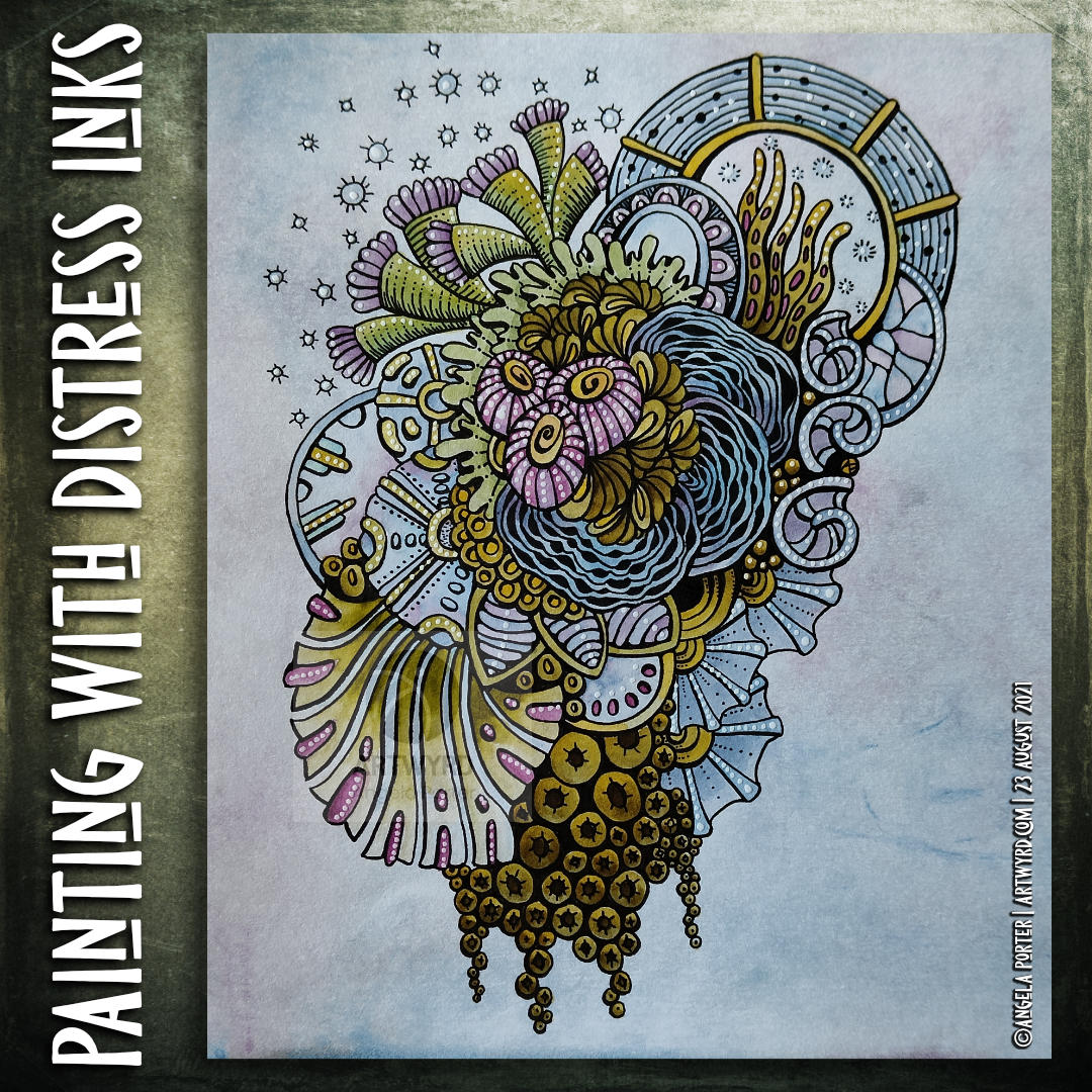
I decided to use Distress Inks as paints, along with a Caran d’Ache waterbrush. Here’s a list of the colours I used: Forest Moss, Fossilised Amber, Weathered Wood, Broken China, Dusty Concord and Seedless Preserves.
Hindsight is a wonderful thing, and I think I really should’ve stayed away from Dusty Concord and Seedless Preserves – the purple and pink colours. Either other analogous colours and/or browns/greys would’ve worked so much better.
I keep doing this with colour. I’m so used to choosing complementary colours that I still reach for them. In this case it’s understandable as I chose some of the colours that were in the background.
Note to self – monochrome-ish or analogous colours!
To help tone these brighter pink and purple colours down, a liberal use of dot highlights from a white Sakura Soufflé pen was needed! I’ve not finished adding embellishments yet.
Nor have I started intensifying shadows. I’m not sure whether to use biro or either a graphite pencil or a chalk pastel and a paper tortillon. My head isn’t clear enough to decide about that! As the headache is wearing off, my need to sleep the last of it off is increasing.
This morning, I spent nearly two hours adding colour to this drawing. It’s getting close to being completed. Well, the adding colour part. There’s embellishing to be done too!
I’ve used Inktense pencils through out, along with a damp brush to activate and blend the colours.
As well as colouring new areas of the design, colour was added to intensify various areas that were appearing too insipid. I still have some of this to do to bring out a sense of volume in various elements.
I’m fairly pleased with this, though in hindsight adding the shadows with a grey Faber Castell Pitt Artist pen first may not have been the best idea. Still, it’s a learning experience, again.
As I enjoyed my first mug of tea of the day, I continued to add colour to this entangled drawing.
The success of blending colours yesterday inspired me to do more of this. Little by little, I’m starting to get some sparkles of confidence in adding colour.
Inktense pencils do make this easy in a way. It’s a lot easier to control the application of colour.
Control – it’s that word again in respect to the addition of colour. Watercolour vexes me as I want to control a medium that isn’t easy to control it seems. Perhaps the exploration of watercolour and Ecoline watercolour inks are cul de sacs for me. They’re interesting to explore but lead nowhere except back to where I started, almost. I return with extra knowledge and experiences that can then be applied to other media.
Indeed, the way that I apply colour digitally has partly inspired me in this artwork. But remembering my dabbling with abstract art back in my A level days gave me a few insights into my relationship with colour.
As a scientist, all my observations – drawn or written – had to be accurate, representative of what I could see. Colours had to be correct, as I could see, so others could check what I had seen and confirm those observations are correct.
As an artist, I can put that requirement to one side; but it’s not easy to do so, especially when I’m drawing from observations.
I have little problem adding colour to my cute, whimsical, entangled coloring templates. They’re not meant to represent anything ‘real’. They’re abstract in their own way. Though, when the motifs are based on observations, then I get into trouble with colour.
Remembering the abstract oil paintings I did back in the days of A level exams, I used colour to convey the mood, feeling that went with the time, place, experiences I had when taking photographs to use to work from. The final paintings were in colours that represented these personal, emotional, and sometimes intellectual responses.
Going forward, I need to remember this in my work and to transfer it to artwork. The actual colour of something is not as important as I think it is, and to remove that pressure from myself. If I want a record of the ‘real’ colours, I can take a photograph. But to record my experience, I need to give myself permission to express my feelings, emotions and my response to it in whatever colours suit me at the time. I need to allow my intuition and imagination a greater role in my work with colour
Hopefully I’ll get there, and I probably am little by little. The value of the vlogs is that I have to start to give words to the thoughts that come as I create, and this blog allows me to expand on them.
To give words to the ephemeral, abstract, metaphoric thoughts that wander around my head is to manifest them. The words result in conscious awareness of the thoughts. The awareness is then something that can be learned from, acted upon and put into practice.
I’m learning to externalise what has usually been an internal and fleeting process of thought and analysis, and it’s an intriguing and interesting experience for sure.
This morning, I spent over an hour starting work on this entangled pen drawing. I did film the process, but it’s recycling day, and the bin lorries and bin men were really noisy this morning. So, I turned the video into a timelapse with music. It lasts about 14 minutes, and the link to it is above this paragraph.
I remember chatting about my influences for this drawing, and they started with me watching a video from the “Journey to the Microcosmos” YouTube channel.
I’ve always loved microscopic images, being able to see things that are invisible to our naked eyes. There’s always a sense of wonder about it, amazement at the different shapes of the various organisms that become visible. That wonder must be the same as Antonie van Leeuwenhoek, a Dutch scientist of the 17th and 18th Centuries must have seen.
I loved drawing what I could see with the aid of a microscope from the first science lessons when I was 11 years of age, right through my degree and PhD and on through my teaching career too. And of course it was bound to creep into my art!
My memories of drawing diagrams of flowers and rock sections, minerals and scientific apparatus and diagrams are very fond indeed. This has certainly influenced my style of art – observing the tiny, abstracting the interesting (important) patterns and forms. Scientifically, the focus is on the features, structures, the important parts that allow identification or communicate the important features of what was seen. After all, photographs and videos can be made of all the glorious detail and colour.
The diagram is a simplified version, a map, that can help others to navigate their way around. A kind of scientific version of the map of the London Underground system. The map helps in navigating the system, but it bears no relationship to the physical layout of the rail lines and the geography of the city above.
Now, however, I take those observations and turn them into my own arty, entangled worlds of wonder. It is still the small parts that catch my attention, fill me with wonder and awe, are the ones I record, rarely the whole thing. If I visit an old church or abbey, I rarely, draw the building as a whole. I spend time looking and drawing the elements of it that capture my arty attention.
My sketchbook page often ends up of a collage of my visit, the various observations fitting together in a pleasing way. Often, I may join the elements together with imaginary lines or patterns. I may end up not with a drawing of the whole building; instead, I record my experience of the building at the day, time, season and weather I visited it.
The same is true for visits in nature, or to museums. My sketchbooks record what catches my attention, and that may not be the ‘whole’ of something, but just a part.
I’m still a scientist in my approach to art – what are the important forms, patterns, shapes, etc. that are the distillation of my experience, that I’d like to record and, maybe, share with others?
Of course, these observations find their way into my more Entangled art, like this one. The round orbs separated into three lobes were inspired by something I saw when watching one of the Journey to the Microcosmos videos. The flat leaves, by seaweed. The triangular pods are imaginary, though there may be real-world analogues of them from which inspiration was unknowingly gained. Curled, baby fiddlehead ferns are the inspiration for another motif in the drawing.
Inspiration indeed – based on observation, but interpreted and altered in a way that is personal to me.
I’m forever wondering what my artistic voice is, and here it is. At least one of the harmonic notes or chords anyway.
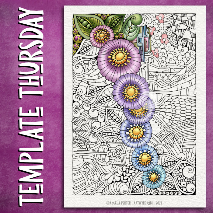
This week, the design is botanical, entangled and a tad on the abstract ‘mechanical’. As is my want, I’ve partly coloured the template to start to breathe life into it.
Drawn with Unipin pens on Claire Fontaine Paint On mixed media paper. Digitally coloured in Clip Studio Paint Pro.
I’ve also created a video. The drawing and colouring took me over 3 hours this morning, so I’ve sped the video up so it takes just a few seconds over 20 minutes.
Still not too well…
I’m feeling better today, but I’m still not right. My stomach/digestive system is still delicate and I have a headache on and off. I did get a bit more sleep last night, but not enough really.
Still, I’m on the mend and taking it easy again today.
Having said that, while this video was processing and then uploading and processing again in YouTube, I managed to edit two templates I drew on Tuesday and then ink in the one I wanted to use a symmetry tool to draw it. So, I’ve got some more templates done for the book I’m working on. The total is now 13 out of 31.
I don’t know if I’ll get any more done today. I’m flagging badly now and feel the need to sleep. I may have another mug of tea before I take a nap and see if that perks me up a tad.
Firstly, let me apologise for the poor photo. I’ve tried a couple of times to take a photo of the artwork, but I just can’t seem to get it in focus across the paper. I did video all but one of these experiments, and a timelapse video is available on my YouTube channel.
I had a delivery yesterday of Canson Imagine mixed media paper. I mistakenly ordered A4 instead of A4, but no problem, it can be used in my disc bound sketchbook.
I wanted to see how various media would work on the paper so, I used *Derwent Inktense Pencils *Mijello Mission Gold Class watercolours *Kuretake Zig Clean Colour brush pens *Tombow Dual Brush Pens
In each case I used a barely damp brush; I’d already found out that using rather wet colours left edges of colour rather than the smooth colour I like.
I didn’t draw the designs with pen, just an 0.3mm, 2H mechanical pencil.
The inktense are Ok. The colours spread a little patchily as the pigment/ink grabs onto the paper very strongly quite quickly. As they dry permanent, it’s easy to add a glaze of colour to adjust the patchiness. The colours aren’t as bright as I would’ve expected from Inktense. Maybe the off-white colour affected them, or maybe the pigments/dyes sank into the paper more as they dried.
A dry brush technique is needed for the Mijello paints, and they move too easily on the paper with water. The paper doesn’t really grab them, which is surprising as it’s not watercolour paper. I didn’t really enjoy working with them on this paper. Also, the colours are so dull… the colour of the paper, or perhaps the colours sink into it?
I loved using the Zig Clean Colour pens! The ink moved so easily with the barely damp brush. Getting a gradient was so easy. Also, adding a bit more colour to the still damp area helped with this too. I also tried blending one colour into another, and that worked really well. The colours are so vibrant, I loved working with them. My only regret is I forgot to press record for them! However, I’m sure you’ll see more of them in future videos.
The Tombows aren’t my favourite pens to work with. But, in this instance I really did enjoy working with them. The colour grabbed onto the paper more than the Zigs. This made both blending out to a gradient and blending colours more difficult. The colours though are really vibrant.
I did write notes next to each little experiment with a 0.3 Unipin pen. It was a pleasure to write on this paper, and I think I’ll enjoy drawing on the paper too, so it will definitely be a good addition to the disc bound sketchbook.