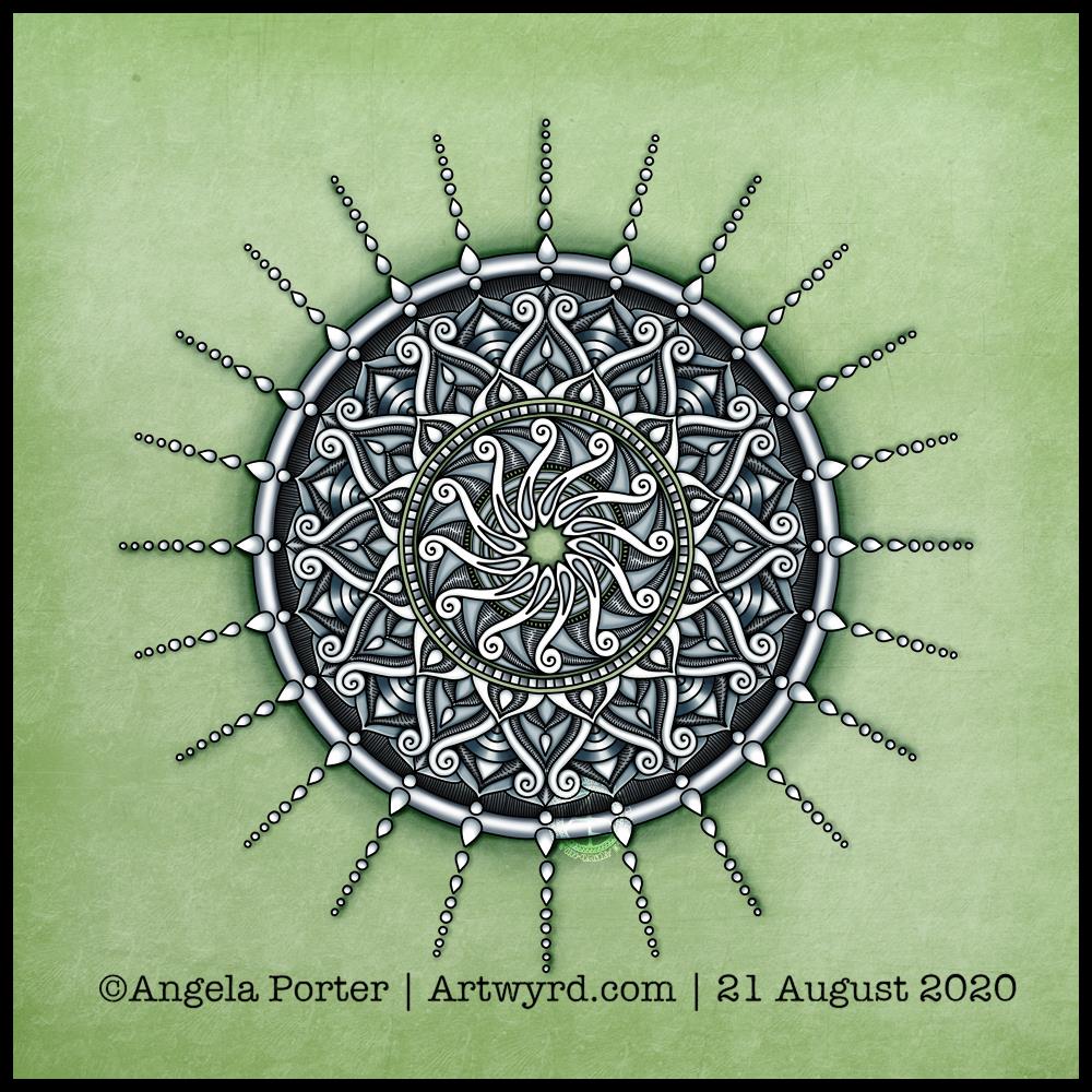
Today’s art is a simple mandala. A cool grey, black and white colour scheme on a soft, calming green background.
Drawn in Autodesk Sketchbook Pro using a Microsoft Surface Slim Pen and Microsoft Surface Studio.
Confusion
I am emotionally drained, confused and overwhelmed again today. I don’t have much in the way of focus. I was surprised I could complete even this quick and simple mandala.
I don’t have the focus or energy to reflect on the choices of colours and symbols in the mandala and how they relate to messages bubbling up from my unconscious mind.
I feel trapped, caught between a rock and a hard place. I’m damned if I do, damned if I don’t. The stress of it all is giving me a migraine, upset digestive system and is dragging my mood downwards.
Heck, even the mandala looks like it is either sinking down, pulling itself up or hanging on by the chains of teardrops. That is how I feel, and I had no idea that was how the mandala would appear when finished.
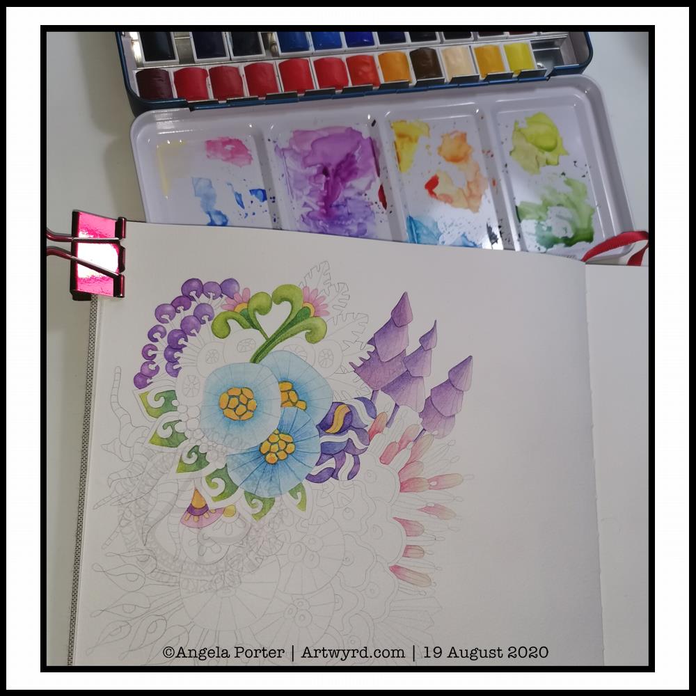
It’s WIP Wednesday, so here’s a work in progress I started this morning.
I woke thinking it was about time I tackled rendering one of my abstract, stylised, imaginary botanical designs in watercolour.
I think I’ve gained a bit of experience with watercolours, kind of have a feel for them and how I like to work with them. Or so I thought.
Anyways, I started by drawing the design lightly in pencil. I used a 0.5mm mechanical pencil by mistaked; I had intended to use a 0.3 mm one instead. No matter, this is an experiment, a trial in my Arteza watercolour sketchbook.
Once I was happy with the drawing, knowing I can always add more to it or alter it before painting it, I started to add colour.
I started with the bottom right blue seed-poddy/stylised flower motif. I thought I’d use two different shades of blue alternately around it, adding shadow and depth. That didn’t work out too well. I tried dry brushing on the ‘spokes’ of the motif. My reaction was ‘yeuch! Angela what were you thinking???’.
I didn’t give up at this point, though it would’ve been easy to do so. I continued on, reminding me this is an experiment, I’m trying something out that I’ve not had much success with in the past; just keep going.
So I did. And I know I have work to do to recognise when the wet paint has dried enough for a different wet colour to spread nicely, but not too much, when dotted into the first colour.
As time was going on, I was becoming more comfortable with how I was adding colour. I was working out that adding glazes was a way to darken areas, and that I could gently blend the edges out while the glaze layer was still damp so I didn’t get harsh lines.
Slowly but surely I coloured in different motifs, careful not to do wet next to wet.
All in all, I’ve worked on this painting for around three hours. There’s a lot more to do, but I can pick at it from time to time.
What I have noticed is, however, how much I want to add colour in the same way I do when working digitally. An interesting observation, the implications of which I have not even started to unpack yet.
Therapeutic art once again…
Once again, I turn to art to help me manage my unsettled emotions and thoughts. I am so tired, again. The stress of the past week or so has taken it’s toll. However, like the heavy rain and rather windy weather we’re experiencing here in the Valleys of South Wales, these will eventually blow over and I’ll be able to focus on my contracted work.
I’ve learned that when I’m all out of balance, it’s best for me to focus on art that is soothing, that no one expects anything from me, that I don’t have to worry about messing up. If I try to do art that others need to be happy with too, then I get frustrated and negative about myself, doubt myself.
So, for today at least, I will be creative in ways that will give me the time and space to heal my frazzled emotions and gradually work my way back to mental and emotional well-being once again.
After a life-time of putting everyone else’s needs and happiness first, I’m gradually learning to take care of my own needs first.
I felt guilty and selfish to say ‘my own needs first’. But it isn’t selfish to look after myself. It’s a recognition of being responsible for myself and my own needs and well-being.
And so, today I art, for art’s and heart’s sake.
I just wish it wasn’t so darned rainy and blowy. The rain alone I’d be happy to go and walk in, or the wind alone. But not both together. It is forecast to ease off in a couple of hours, so maybe I’ll get a walk this afternoon, with brolly and waterproof jacket. I’d like that. But for now, I’m going to go and drink tea, draw the design for Template Thursday, and have the quiet time I need to heal, recharge and refresh.
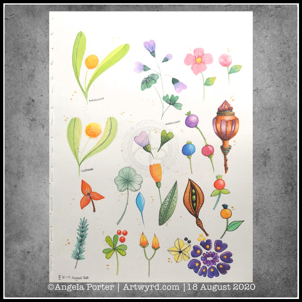
More art therapy was required yesterday and today. This time I messed around with watercolours and botanical motifs.
Some I like, some are hideous, but all resulted in me finding some calm amidst a maelstrom of emotional and mental pressures being exerted against me.
Although I’ve not yet tried to express my emotions via colour and pattern today, working with motifs from nature is soothing in it’s own way.
Perhaps there’s more of me expressing my needs in creating botanical art. I do feel the need to be out walking where there is nature. With Covid19 still doing the rounds, my places of choice are cemeteries; so few people visit them and I feel safe there in a way I don’t feel safe in nature when I’m by myself.
So, as it’s fairly overcast and there’s a good breeze, I’ll head out as soon as I’ve completed my social media stuff for the day.
Materials and method
I used mostly watercolours, but I did try out the Inktense paint palette I received yesterday for one motif. For some of the motifs I used a faint pencil outline. On others I darkened that outline once I’d painted the motif. And I tried black outlines using a Signo DX 0.38 pen on some others. I also used white Signo gel pens to add highlights. Finally, I splattered some gold watercolour over the page, and added some bigger dots of gold.
Oh, I worked on one of the smooth textured pages in my A4 Arteza watercolour journal.
I do apologise for the poor photos. These were the best of many that I took of my arty pursuits this morning. I’m not sure if I’m finished with it or not.
This was an unusual excursion into the realms of art for me. I was feeling totally emotionally overwhelmed – scared, anxious, sad and confused.
So, I thought I’d try to express my emotions artistically, with watercolours.
I used masking tape to edge an area approx. 6″ x 2.75″ (15.5 cm x 7cm) in my Arteza Watercolor Sketchbook. I used a new page for this, and it was the smooth side of the paper.
Next, I applied a wet wash of indigo watercolour, and then dropped in greys and rusty oranges, reds and browns into it.
The paper warped with the quantity of water. No biggie though, as this is a sketchbook. Once I’d finished adding colour and letting the watercolour do it’s magic, I used a heat tool to dry the paper. When I removed the masking tape, which was low tack, it lifted some of the paper with it, which was a bit of a disappointment. However, it is a sketchbook, so no biggie.
I then wanted to add some gold patterns and lines. I dug out a Cosmic Shimmer iridescent/metallic watercolour palette and a size 1 brush.
Finally, I thought I’d add some details in black pen (Uniball Signo DX 0.38), but I’m not sure about them at the moment.
Reflections
My emotions were, and still are to a degree, all over the place. I tried to meditate to find some peace and calm; my mind was just racing faster and faster and I just couldn’t sit with the emotions.
So, I decided to try to paint my feelings, to put into colour and pattern what I couldn’t put in words, or make sense of. I thought I’d try a totally intuitive block of colour where I asked my feelings what colour they wanted to use, where to put it and when it was done.
I chose dark, gloomy inky indigo for the background, and rusty yellows and browns. Indigo for both the sadness and upset I was feeling, but also the deep calm I was seeking. The rusty colours perhaps represent the blood, sweat and tears I’ve been expending for a while now. Or maybe the stains on my soul and emotions that have resulted in my struggle today. Either way, the colours just seemed the right ones to use.
There’s also a lot of depth in the way the colours sit on the paper.
Oddly, this is a colour palette I’ve been using for a while now, but never quite so dark. Perhaps my unconscious has been trying to tell me what was likely to come if I didn’t take care of myself.
Once I’d got the block of colour done, I knew I needed to add lines and patterns of gold, a kind of artistic kintsugi. I hoped that the gold would help to heal the shattered pieces of my emotions and mind in the way gold infused resin is used to repair much loved pieces of porcelain. I hoped that the gold would remind me that my healed trauma-wounds that have been filled with gold would remain healed and I could be reassured that I wasn’t going to break.
I won’t, but I could feel myself unravelling.
For some reason, once I’d calmed a little, I felt the need to put the pattern of black at the bottom. Piles of tiny little stones. What springs to mind is they represent the touchstones that are the foundation of my emotional wellbeing. There’s quite a few of them there! That surprises me, as my usual one is the one of contentment, a gentle smile in my heart. I may have to explore what these other touchstones are at some point.
As I look at the panel now, I can see there are lighter areas, where a storm seems to be breaking. Light is shining through, clarity perhaps. The photo doesn’t show the colours at all well. I really do need to learn how to use the camera on my phone or my DSLR much better I think.
A successful experiment
I know art always is a source of peace and calm for me. What surprised me was that I felt I was expressing my feelings in this little, very personal artwork.
I’ve never really used art as a way to work through difficult (or not so difficult) emotions before. I think it’s something I’ll be doing again in the future.
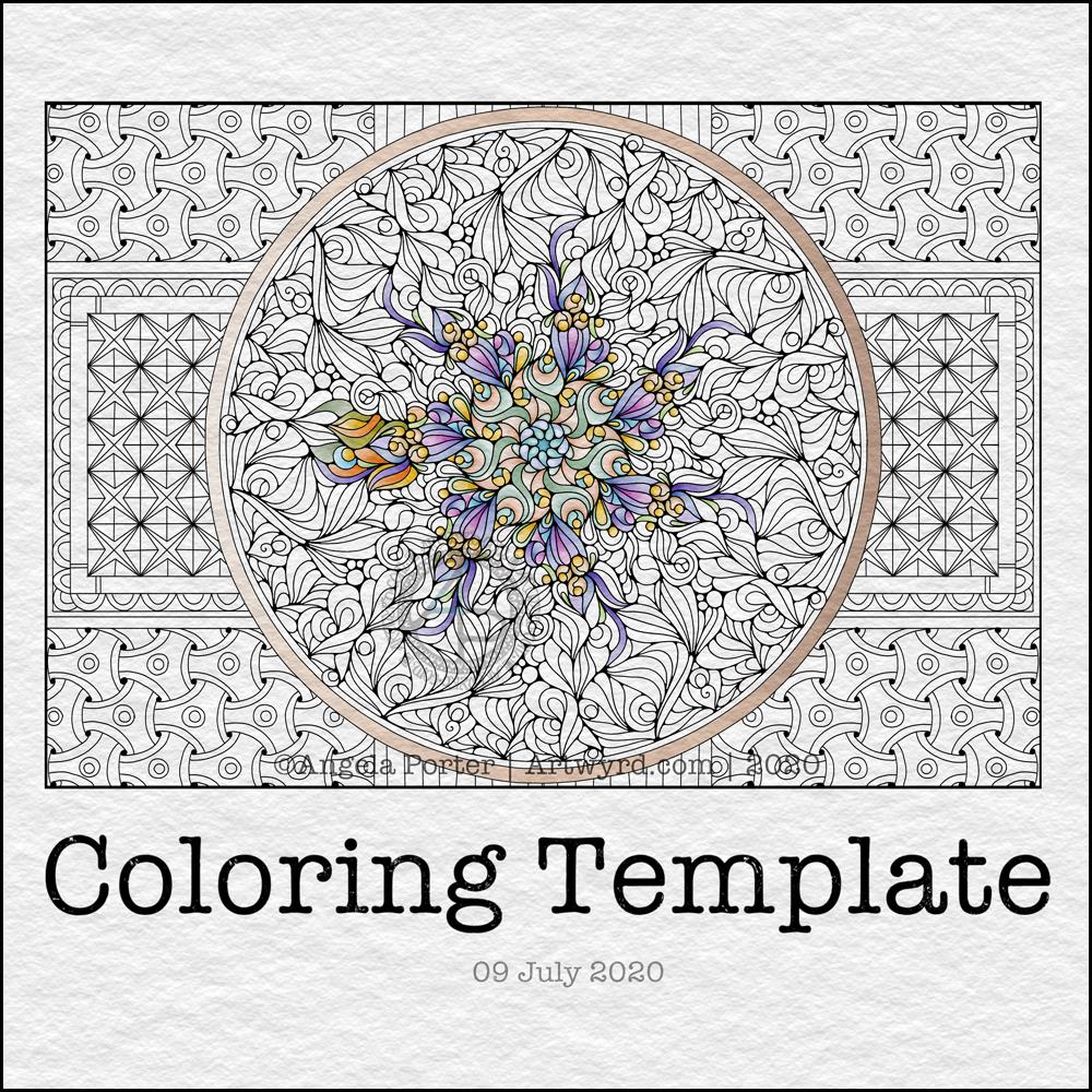
It’s #TemplateThursday when I create and post a colouring template to the Angela Porter’s Coloring Book Fans facebook group. The template is free to members, though there are a few terms and conditions associated with it’s use. It’s also free to join the group!
This week, I decided to draw some cute and whimsical bugs, each having their very own portrait. Lots of small, individual pictures that a perfect for quick, mindful colouring.
I know I often get overwhelmed by a huge artwork I’m working on and that is most likely to happen when I’m experiencing a lot of anxiety, and I seem to have waves of anxiety the like I haven’t seen for a long time, most related to the pandemic.
When I need to take time out, to do art that will soothe me, calm me, let me relax and find that mindful, content space within myself, I turn to creating small artworks.
I drew this template with a Faber-Castell Pitt Artist pen on ClaireFontaine dot grid paper. Colouring has been done digitally in Autodesk Sketchbook Pro.
It’s free to join the group, and the template is a freebie for members of the group.
This week, I created a mandala design with a background of geometric, repeating patterns.
I’m still recovering from the stress of my first trip out since March 2020. Drawing (and colouring) mandalas is an incredibly peaceful, relaxing and mindful activity. So, it was natural that I drew one.
The mandala design is based on some of the abstract art I’ve been doing of late. It’s a bit unusual for my mandalas, but I really do like the organic flow of the lines.
Even though the design is abstract, the repeating symmetry of a mandala bring some structure to the design. I am looking forward to seeing how members of the group add colour to the design.
The geometric patterns in the background also result in a soothing, repetitive rhythm for colouring; a rhythm that results in soothing and calming ones mind and emotions.
De-stressing
I have been totally shaken by the level of anxiety/stress that resulted from my trip out on Tuesday. I am beginning to feel more my contented and calm self. However, I find I’m still irritable and grumpy and have withdrawn from social media and the like for most of the day.
It was a sobering thought when I realised I’d lived most of my life constantly at elevated stress levels, often as higher than what I experienced in the past couple of days.
It’s also a wonderful realisation that I can recognise this now, and I also am able to allow myself self-care time to let all the stress hormones leach from my body. It’s been a long time since they peaked in this way.
It makes me extremely grateful to my therapist for her years of patient work with me. Experiences like the Tuesday Trip remind me of how I used to be and show me how far I have come in recovery from cPTSD.
Yesterday, after my social media post, I binged watched the Harry Potter films from The Order of the Phoenix. I found I was irritated by crochet. I tried cross-stitch, which irritated me too. Eventually, I settled on knitting, which, oddly, soothed me. I think it’s because I could knit and watch the film. Knitting allowed me to channel my irritability into something creative. As I can knit without looking at the knitting, I could also watch and immerse myself in the films at the same time.
My fingers are itching to knit again, now I’ve thought about it.
Even though I slept well last night, I’m still feeling really tired today. This happens as part of the post-stress come-down. It can last a few days. I’ll not be rushing to nap, however. Napping has a knock-on effect on my ability to sleep at night when I’m like this. My naps tend to end up as periods of deep sleep, so I try not to take them unless it’s absolutely necessary.
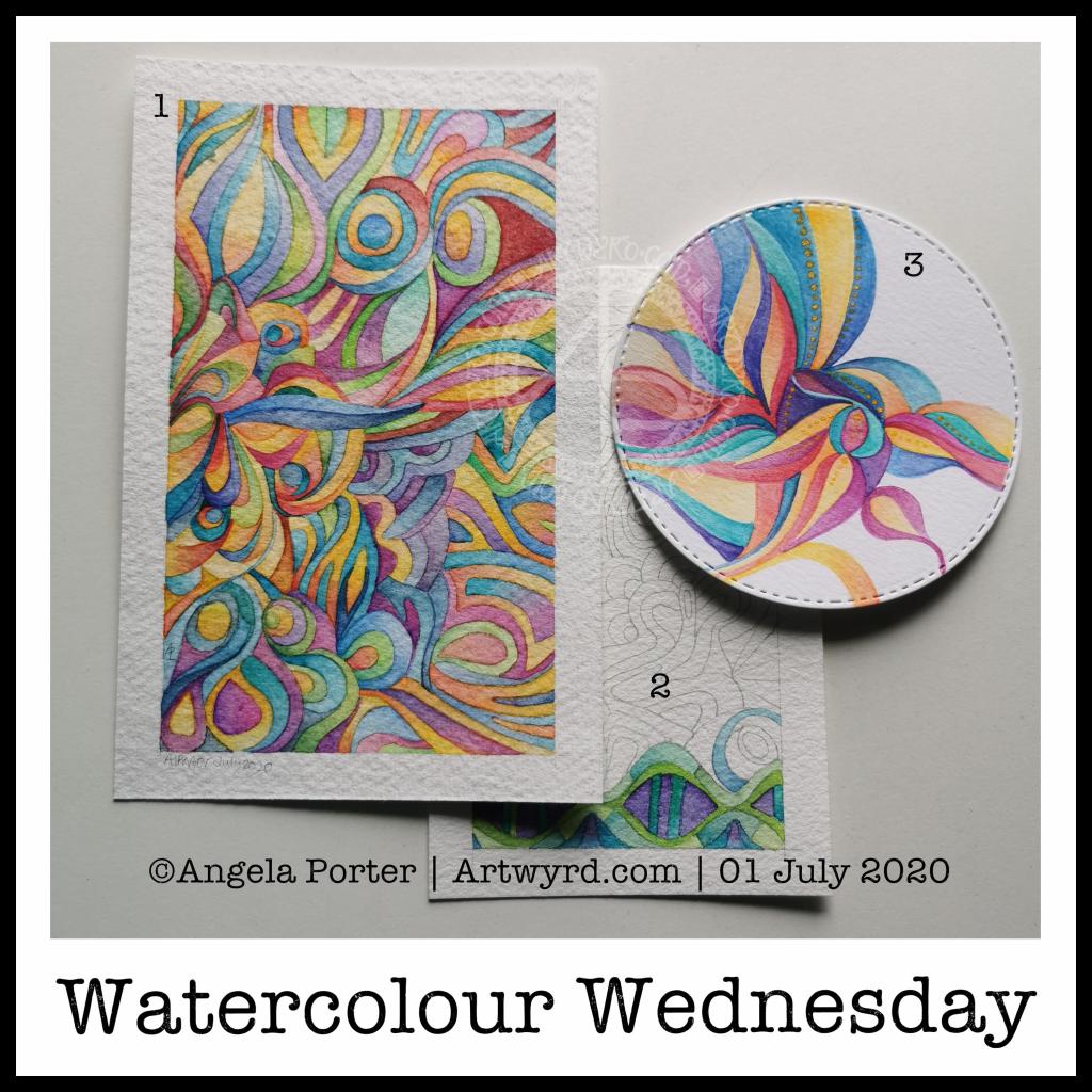
I know, it’s been a watercolour day nearly every day for the past week or so. However, I do like alliteration. As did the Anglo-Saxons, who used alliteration in their poetry rather than rhymes.
Anyway, a fair amount of watercolour being done here in the past day.
Painting (1) This one is now finished. It was an unusual one to do as I didn’t start with a sketch, but just added shapes as the painting grew. It’s colourful, for sure, which is my usual way of working with colour. I know I needed some colour to brighten my heart up yesterday.
Painting (2) A work in progress, this one is on a piece of Arteza Premium watercolour paper, which is 100% cotton. It works in much the same way as the other 100% cotton paper I have, but it’s slightly more offwhite, with a yellow-ish tone, than the Khadi paper. It also has a different texture that is finer and not quite so bumpy. I’ve yet to work out which I prefer.
I’ve decided to complete this painting in shades of blue, green and purple, mostly. I’m sure I’ll end up changing that idea, or sneaking in other colours here and there.
With the 100% cotton paper, I am starting to become comfortable with dropping wet into wet and letting the colours spread and blend with each other. Judging the quantity to get the depth of colour and a smooth gradient is still a tricky task for me.
Painting (3) I don’t know what got into my head this morning, but I felt the need to paint a mandala in much the same way that Carl Jung would to start his day with an idea of what is going on mentally and emotionally on a subconcious level.
I also had a kind of bright idea to use a diecutting machine to cut out circles of paper, in this case Daler-Rowney Mixed media paper.
With the first circles I tried watercolour and had really unsatisfactory results. This surprised me given the fairly pleasing experience I had with the ClaireFontaine mixed media paper.
So, rather than use watercolours, I thought I’d try Inktense pencils, using a damp brush to pick colour up from the pencil nib. I also used a solution of gum arabic to help keep the colour wet for longer. Gum arabic also increases the translucency of the pigments, and can add a glossiness to the colour too. This helped the Inktense colours to work more like watercolours.
I also added dots of gold Daler-Rowney FW Pearlescent acrylic inks to the design here and there. To finish the design off. I had thought of adding patterns in gold to the blank areas, but that just didn’t feel the right thing to do. It felt finished, white space and all.
The aim of this painting wasn’t to create a work of art, but to give an insight into what is going on within me at this time. I’ll keep my observations on this to myself. What I will say is I’m feeling out of sorts and rather sad and low today. I have a lot of confusion, anxiety, fear and despair surrounding various things going on and I’m just feeling a bit overwhelmed by it today. It’s all just emotional weather – just as the clouds cover the sun, they will move along by and the sun (or moon) will shine bright and clear once again, so it is with emotions.
What a grey, cool, windy and showery/rainy, changeable day it is here in the Valleys of South Wales, UK. Such a huge contrast to the three days of a heatwave earlier this week. Mind you, I’m one of those people who prefers to be cool rather than too hot, and on Wednesday and Thursday it really was too hot for me!
I’m still not quite right in terms of mental focus and emotional balance. After the rollercoaster rides I’ve had over the past month, it takes a while for the stress hormones to leach from my system. Each time they had started to lower, I found myself on that rollercoaster once more.
This is nothing that is affecting me directly, other than emotionally. However, it’s the emotional stuff that makes it difficult to deal with, despite me meditating and self-soothing and losing myself as much as I can in creativitity. That’s hard when I can’t settle to anything.
I do find I can settle somewhat more today, but I am still tired and my mind still feels fuzzy and unfocused. So, I won’t be chancing doing any work that requires my absolute focus, not today.
I was up early-ish this morning for a delivery. While waiting for it, I cut up a sheet of St Cuthbert’s Mill Bockingford watercolour paper and washi taped a 5½” x 4″ piece of it to an old cutting plate. I then took a 3mm mechanical pencil and sketched out an abstract design based on clouds, believe it or not.
I’m now part way through adding colour to it with White Knight’s watercolours and a size 2 Graduate round brush by Daler-Rowney.
Yesterday, I thought that this Bockingford paper was the one I’d used for the first of these abstract watercolours. It turns out it isn’t. I’m begininng to wonder if it was some mixed media paper as it is a brighter white than either Bockingford or Canson Moulin du Roy. It definitely wasn’t Daler-Rowney aquafine paper nor Tim Holtz’s watercolour paper. Nor was it the 100% cotton paper either. How curious.
I have enjoyed the process of drawing the design and starting to add colour. The colours are softer than yesterday’s watercolour, but more vibrant than the one I did earlier this week. Perhaps the change in colours is a sign I’m continuing to settle back to my usual chilled out, calm and content state.
So, I’m going to take a break from arty stuff for a little while. My concentration is wavering and I’m tempted to go back go sleep. However, I know that will prevent me from sleeping well tonight.
This morning, it was lovely to settle down to some watercolor work with the air much cooler and after a good night’s sleep.
I used a 5½” x 3″ piece of Canson Moulin du Roy watercolour paper for this one. I have to say, I’m not at all fussed on this paper. I much prefer the Bockingford paper from St Cuthbert’s Mill that I used for the last watercolour abstract I did. My favourite, though, is the 100% cotton rag Khadi paper, but as I’ve been feeling my way through this, I thought I’d use paper from my stash that is OK but not my favourite.
Oh, I used White Knights watercolour paints, which are usually much smoother and cleaner in colour. The off-white Moulin du Roy paper mutes them down. Also, the colours easily re-wet and move when adding glazes. Definitely not my favourite for this kind of work.
I’ve had heck of a couple of days, again, that have been emotionally draining and mentally exhausting. I think that shows in my choices of colours, which are not as harmonious as the previous version. I was also frustrated with how the colours didn’t appear as I expected them to.
I’ve also made the colours a lot more saturated. I’m not sure if I prefer this, but it could be a reflection of how I’m feeling and what I need at this time.
Nonetheless, there are parts of this piece that I am pleased with, the pointy teardrops as an example.
Still, I really think the colours I used feel really uneasy, which is a reflection of the lingering remains of the emotions of the past couple of days in particular.
Even though I slept really well last night, I’m still exhausted and feel the need to sleep again. That tells me it’s another self-care day. I hope that will recharge my batteries so I can focus on the editing and work I need to do by the end of the month. I fear not focusing well at the moment would result in me not saving edited images correctly so I lose some of the art I’ve done. It’s a necessary, but tedious, task and I need to be able to focus and think clearly. Today is not that day.
Tonight, at 10:43 BST, the Sun appears to enter Cancer, as viewed from the Earth. Of course, it’s the Earth that is moving around the Sun. Today, marks the official start of summer, but it also marks the time when we have the days of most light here in the Northern Hemisphere, and we’ll soon notice there’s not quite so much daylight at the end of our days.
This year, English Heritage are live-streaming the solstice sunrise tomorrow morning on their facebook page. You’ll have to be up early (or just not go to bed!) as they start streaming from 04:07BST, with sunrise at 04:52BST. I’m certainly going to do my best to watch it. This is one of the good things to come out of the pandemic. The live stream hasn’t been done before. I would never go to Stonehenge on either Solstice as there would be too many people and far too much noise and bustle for me, but this is a nice way to see it as it happens, not recorded and shown after the fact.
I’ve always felt an affinity with the cycle of the seasons and marking the solstices and equinoxes has felt far more natural to me than any religious celebrations. The scientist in me appreciates the facts around these dates in the calendar, my heart and soul appreciate them in different ways that are personal to me.
I found this quote about the solstices, and it sums up a little bit about how I feel about them.
The artwork shows a lot more about how I’m feeling today – not quite with it, spaced out, emotional and well out of sorts. I had an idea in mind, but I just couldn’t execute it to my satisfaction today. It looks like I need another self-care day. Which is fine. I’ve learned that sometimes it’s best to go slow in order to go fast. By taking time out from commitments, I return to them in a better frame of mind and emotional state and I’m more able to fulfil them to my satisfaction for sure.