Today, I’ve been practising my hand-drawn typography (hand lettering). I seem to have Aneurin Bevan on the brain at the moment, probably because I’m working on a typographic portrait of him. So, I chose a quote by him.
To create this, I started off with squared paper, a ruler and a pencil. I marked out an area that was 24 cm x 12 cm. Before doing any lettering, I drew in some wavy guidelines. Then, I added the lettering. It took three attempts before I ended up with a design I was happy with.
Next, I scanned the sketch into Autodesk Sketchbook Pro and re-drew and inked in the letters.
Black on white was very stark, very graphic. However, I had a hankering for some colour. So, I chose reds. I used some digital wizardry to invert the black letters and white background. I created the coloured and textures background, and then used some layer options to get the effect I wanted.
Final steps were to ad my little copyright notice and watermark. As well as resizing the image for social media.
Taking a break
It’s always nice to have a change of pace and intensity in art work. I spent a couple of hours this morning getting my mind around how I could change the shape of letters to give a feeling of volume to a portrait. The fist in my portrait of Aneurin Bevan was looking a tad too flat.
I didn’t want to do any more work on the portrait today, wanting to give myself a break from the changes I’ve made so I can go back to it with fresh eyes and fresh mind.
Thoughts ticking around my mind
I do have an idea for creating a more abstract kind of typographic art from quotes and descriptive words now I’ve completed this mini typographic art quote. Not today, though I will note my idea down in my journal.
I often wake up in the morning, with ideas for art projects, as well as suggestions for solutions of problems I’m having with a current artwork, such as the flatness of Nye’s fist in his portrait.
It seems my subconscious mind works on these issues while I rest and sleep.
Perseverence
I really am persevering with the typographic portrait. That’s a surprise to me. Not all that long ago, I would’ve easily given up on it and decided that it wasn’t for me.
But not this time.
This time, I’m sticking with it, as well as the use of typography in my other styles of art.
This one isn’t coming as easily to me as other forms of art have, but it’s one that I seem to want to really succeed at.
What is making the difference is being able to work digitally. That makes editing, altering, trying things out a breeze. I don’t have to completely start all over again, I can keep what I like, and then rework what I don’t like. I can even keep what I don’t like in case it turns out that it is actually what I do like!
Remembering to work in layers really does help this process. That’s something I don’t always remember to do. However, I will get there. Just not today.
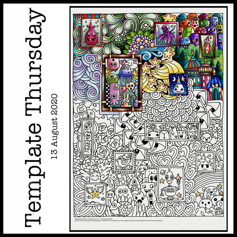
Yesterday, I thought I’d give Clip Studio Paint a go. The bottom part of the template above was coloured in Clip Studio, the top part in Autodesk Sketchbook Pro.
I spent yesterday afternoon, and a bit of this morning, colouring part of the template above in Clip Studio Paint. So, these are my first impressions of Clip Studio Paint and a comparison with Autodesk Sketchbook Pro.
I think it’s impossible to tell the difference between the colouring I’ve achieved with both programs. What is different is the user interface more than anything else.
I’ve long been a fan of Autodesk Sketchbook Pro, and that isn’t going to change. I love the intuitive and rather beautiful interface of the software, the menus on screen and the colour and brush ‘pucks’. Everything is done easily and simply through the quite minimalist, yet powerful, tool bars and menus. Keyboard shortcuts are available, but I prefer to use my pen directly on the screen as I work. It makes working digitally as natural as working with traditional media.
As I’m familiar with the Affinity suite of programs from Serif, working out what the different menus and tools,, which are similar to Photoshop, wasn’t as confusing as it would’ve been in the past. Thanks to working with Sketchbook Pro, I have a better understanding of what the various tools do.
While the tools and options are all accessible on the screen, I find it frustrating and time consuming as I seem to have to perform more steps in Clip Studio Paint to do the same task as I would in Sketchbook Pro. I’m sure there must be keyboard shortcuts, which may help streamline the process somewhat. However, I work directly on the screen with Sketchbook Pro and the only time I use my keyboard is name the file before saving it, or if I want to add text to the art. Usually, they keyboard is out of the way so that I can adjust the angle and distance of the screen to suit my comfort.
I do prefer the way I can choose colours in Autodesk Sketchbook Pro, as well as the ease of creating a custom palette. Sketchbook Pro also comes with a separate Copic color palette. Being able to move them around the screen means I can pop them where I like, make them easily and quickly accessible for me.
Don’t get me wrong, there’s a comprehensive colour palette and various options of viewing colours in Clip Studio Pro, but I like the more intuitive and streamline way of doing it in Autodesk Sketchbook Pro. It’s just personal preference more than anything.
Having the colour puck makes it easy to alter the saturation and tone of a chosen colour really quickly. The brush puck makes changing the size and opacity a breeze. I keep the pucks close to where I work for convenience.
Again, there’s nothing wrong with how all this is done in Clip Studio Paint, but I just prefer the ease with which I can do everything in Sketchbook Pro.
The Sketchbook brush palette is a great tool too; I have all my favourite brushes available in one, easily accessible place. A click on this palette and I can access all the brush sets I’ve either downloaded or created so I can add or remove brushes as I need to.
The zoom and rotate touch functions only work separately. I found this a clunky and awkward way to work. I think that’s because I’m used to doing both at the same time and at will in Sketchbook Pro.
What I did like are the many more choices of brush effects in Clip Studio Paint. However, I think I can replicate many of them in Sketchbook. There are some interesting brushes in Clip Studio Paint, but nothing that I couldn’t replicate if I found I really wanted to use them.
Anyway, I will persevere with Clip Studio, working with it from time to time to become more familiar with it. The ability to draw vectors may be helpful in the future, but then I have Affinity Designer on my ‘puter, which is Serif’s version of Adobe Illustrator.
Also, I’m hoping I can find a way in Clip Studio Paint to work in CMYK rather than RGB. When I convert files to CMYK for printing, the colours shift and I’d like to work in roughly the colours that would be printed.
Overall, I think it’s a good, affordable application. It’s a fraction of the cost of any Adobe Product. I paid £40 for the Clip Studio Paint version; that’s a one-off purchase and you have free upgrades for life. You also get access to online resources created by other Clip Studio Paint users.
This price is on a par with the price of each of the Affinity suite of programs (approx £50 each), and there are regular, free updates to the software.
You can get Autodesk Sketchbook for free, though I subscribe to the pro version monthly for approx. £12; it does have a few more features than the free version. Just because Sketchbook is free doesn’t mean it’s not professional; it is. It doesn’t look powerful, but it is.
How much will I use Clip Studio Paint? That I’m not sure. Perhaps with more use the frustrations I experienced with lessen as I become more familiar with the software. Perhaps I’ll gain fresh ideas on what effects I can try out in Autodesk Sketchbook Pro.
Do I think Clip Studio Paint is a bad program? Not at all. It seems to be powerful and similar to Adobe Photoshop and artists and illustrators are able to create fantastic artworks with it. I’m sure that if you are familiar with the way Photoshop works, you’ll find Clip Studio Paint an easy transition to make.
Personally, I find the way the menus are set up hard work and time consuming to use. I’ve been spoiled with the simple sophistication and intutive nature of the Autodesk Sketchbook interface, no matter which version you use. I find I spend less time clicking on menu after menu to get to what I want to use, and more time creating art in Sketchbook. That may be a function of my familiarity and comfort with the software. What I don’t want is to feel I’m struggling or working so hard to get an effect I’d like when I could do it so simply in Sketchbook.
One thing I know is that Autodesk Sketchbook Pro will be my go-to digital art program. It does all I want to do digitally, and most probably a lot more I’ve not worked out yet.
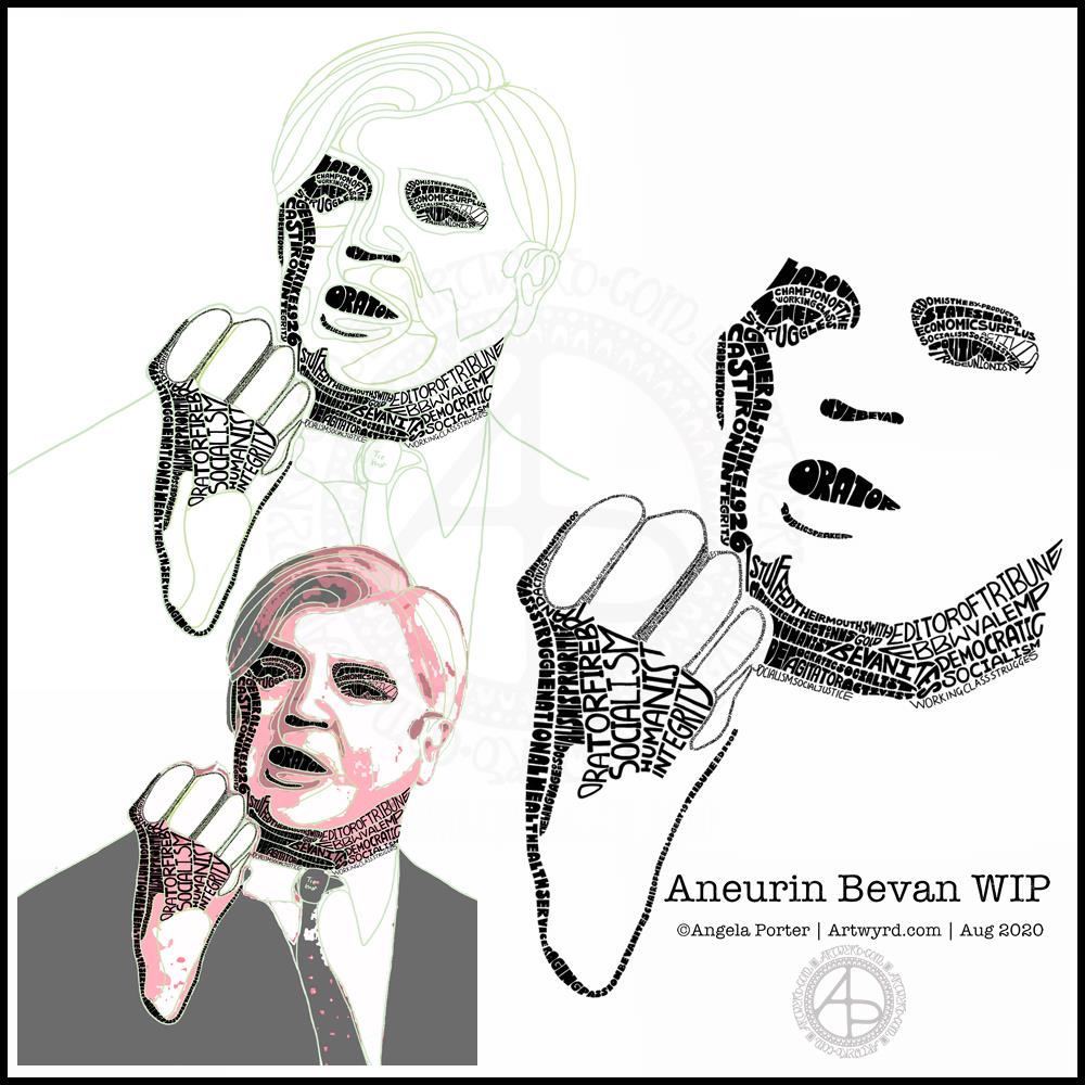
This morning I’ve been working on my typographic portrait of Aneurin Bevan. This portrait is the third iteration. I’m learning as I go along, trying out ideas as they occur to me.
I started with the photograph Nye Bevan and used the posterise tool in Affinity Photo to create areas of contrast. Then, I added colour to these areas to help me differentiate ‘twixt them. I completed this task in Autodesk Sketchbook Pro.
The next stage was to draw lines around these areas of colour, smoothing them out somewhat, and using artistic interpretation where necessary. These are the green lines that delineate the areas for different weights of text. I’ve decided to leave the white areas blank.
The green guidelines have been changed and edited as I work the portrait.
The area that was vexing me most were the fingers. However, I had an idea to use tiny lettering to add some deep shadow. I’m sure I’ll work out how to add some lighter shadow areas later on (my mind is already ticking over that issue) to give more volume to the fingers.
They typography is hand drawn and I’m having to come to terms with the struggle I’m having with my perfectionist side. This isn’t to do with the shapes of the letters, but the weight of them and making sure that they are consistent. As I’m hand-drawing the letters, then they are going to be imperfect, and I need to learn to accept when they are good enough.
Also, those imperfections and style of lettering are personal to me, and that is what will differentiate my work from others.
I’m also struggling with letting go of the desire to be as photographically accurate with the portrait as I can be. This is where learning to simplify the shapes of the different areas of contrast comes in, and recognising they don’t have to be a perfect copy of the photo in order for the resulting portrait to be recognisable as Aneurin Bevan.
One other thing I’ve done is to let go of trying to use full quotes in the portrait. I’m using repetitions of words and short phrases that represent Nye – personally, politically and in terms of achievements. I’ve realised the portrait doesn’t have to be a grammatically correct biography! I will, however, be using quotes to fill in his jacket.
I’m not sure what to do with his shirt and tie yet. It will fall into place soon enough I’m sure.
Working digitally helps me in so many ways. It takes away the frustration of starting over again if I make a mistake, and also minor frustrations. I gain a confidence to try things out, knowing that if they don’t work out I’ve not screwed up the rest of the work I’m happy with.
Working digitally, for me, is like working with pen and pencil on paper. I use a digital pen on the screen of my Surface Studio, just as I would pen on paper. It’s easy to undo and edit changes made. It removes from me the pressure to be perfect first time and helps me to persevere when things aren’t working as I’d like them to.
All the skills I’m learning digitally, in terms of the hand-drawn typography and being more patient with myself and allowing my work to be ‘perfectly imperfect’ is transferable to the work I do with traditional media too.
This week, I’ve harked back to my Doodleworlds book with cute monsters and critters. I’ve included some family portraits which hang above a background of more monsters and critters and my signature entangled style drawing for coloring books.
I got lost in colouring this template this morning. It was fun to use different styles of digital brushes and colour combinations in this one. Sometimes it’s just nice to do art with no expectations other than enjoyment, relaxation and comfort.
I drew the template with a Pentel 07 Energel pen on Rhodia dot grid paper. I scanned it in to the Surface Studio and cleaned the image up digitally. Then, I partially coloured it digitally in Autodesk Sketchbook Pro, adding a background texture that isn’t present in the downloadable image.
Lightning storm
Last night, there was the most amazing lightning storm I think I’ve ever seen. It lasted for more than an hour and there were multiple flashes of lighting most minutes. I really need to learn how to use my camera to take photos of lightning – natures very own fireworks.
Sadly, I haven’t been able to see the Perseid meteor shower this year, and I missed the Neowise comet too. I have seen amazing photos of both, though, and of course the lightning storms of the past few days that have coruscated over the UK.
Heatwave
It’s a little cooler in the house today thanks to the clouds shrouding the sun. It’s humid though as the couple of brief showers last night have been evaporating slowly.
The heat meant I didn’t sleep well again last night. But, waking early meant I had plenty of time to edit the coloring template and add colour to a section of it.
I’m not sure if it’s cool enough to take a walk this afternoon. There seems to be a bit of a breeze picking up from time to time. I really don’t do well in the heat; I wilt very quickly. But I’ll see once I shower what it’s like outside.
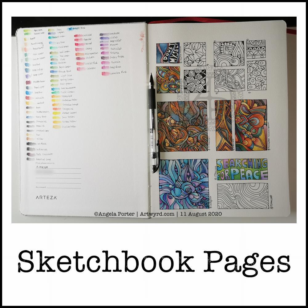
Today, I share a glimpse into my current sketchbook. It’s an Arteza watercolour A4 sketchbook.
I’ve completed all the drawings in boxes now, and am adding colour to them using watercolours, graphitint watercolours, graphitint pencils and/or inktense pencils.
The paper is rather nice to draw on with Faber-Castell Pitt artist pens or a Uniball Signo DX 0.38 pen.
On the cover page I swatched my collection of Inktense pencils, using a damp brush to bring their true colours out.
Inktense pencils are intense in colour when activated with water. Also, once activated with water and dry they are permanent.
I like all the media I’ve used so far on this page. Which I use does depend on my mood. Today, I wanted to choose an inktense palette of colours that is like the rusty colours I’ve been using with watercolours.
I really am drawn to this colour palette in my work at the moment. The dark blues, rich red-browns, blue-greys, earthy-dark greens and the vibrant mustards. One day I’ll look up the psychology of these colours and see how they relate to my mood/life at this time. But not today.
Today, I need to focus on adding colour to some templates for the Entangled Gardens colouring book that will be released early next year.
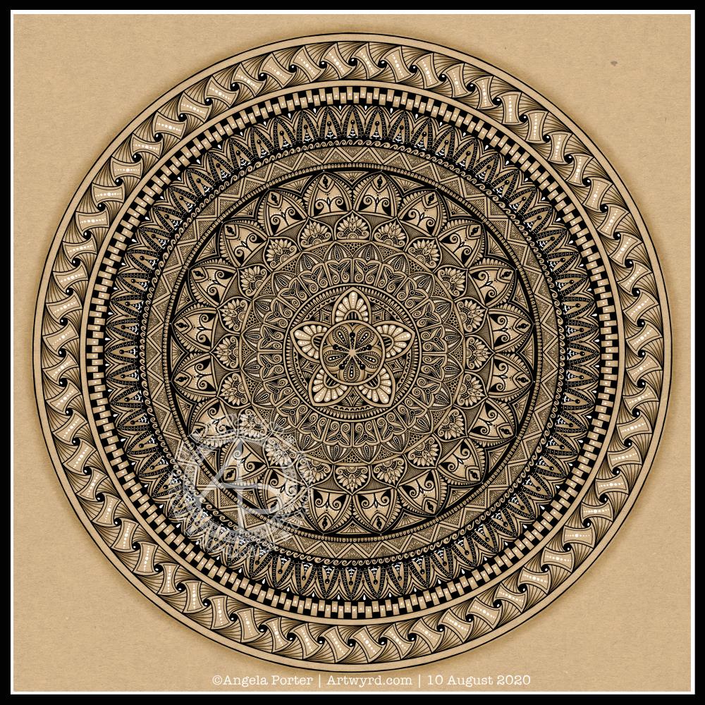
I actually started this mandala yesterday morning, but I did most of the work on it this morning.
Black, white and craft paper, with some warm grey shading to help to bring out a sense of volume to areas of pattern.
The number five.
I chose, to start with, five-fold symmetry.
The number five symbolises balance and harmony. It also can represent freedom, independence, adventure, curiosity, intelligence, individualism, courage, and important life lessons to be learned from your experiences.
Five can also be symbolic of a problem, but there are solutions to the problem. As five also symbolises inner wisdom, the solution comes from our own inner wisdom. Once a solution is identified, then a plan of action needs to be developed through passion, emotions, ideas or work. Then it needs to be followed through.
Star symbolism
The central motif of the mandala is reminiscent of a five-pointed star.
Stars are symbols of guidance and are often considered protective symbols. They are also associated with wishes, mysteries and magic. Most often, they represent something that is good, beautiful or positive. They are symbols of hope, truth and spirit.
The colour brown
Brown is a natural colour that evokes a sense of strength, approachabilityapproachability and reliability. It is often associated with resilience, dependability, security and safety.
Feelings of loneliness, sadness and isolation can also arise with brown, especially when used in large amounts, like a vast, expansive rocky landscape or desert. But it also can bring to mind feelings of warmth, comfort and security as brown also represents a hearth, the heart of a home, and so it represents a deep connection to one’s home.
Of course, brown also represents connections with the earth and so nature. It is a wholesome colour.
Symbolism and my art
I’m finding looking into the symbolism of numbers, colours and motifs quite interesting. I don’t often think overly hard about the colours I use when I create art, especially my daily ‘warm up’ art practice.
However, it is interesting to look at the meanings of colours, motifs I choose and how they relate to what I am currently experiencing on a personal level.
I woke this morning knowing I needed to draw a mandala and dragonflies. Sometimes I have no idea why, but this is what flowed from my pen.
Soft teals and lavenders colour the dragonflies and mandala. Calming, restful, meditative. The bodies of the dragonflies are ornate, but the wings are not so, which is unusual for me. Perhaps because I feel I’ve lost my ability to fly at this time, I’m doubting myself an awful lot.
Carl Jung used mandala drawing to help inform him, and his clients, about what was going on in the unconscious and needed to be brought into the conscious mind to be processed. The unconscious mind works through symbols and metaphors. So, what do dragonflies (four in number), teal and lavender symbolise?
Dragonflies are said to symbolise wisdom, change, transformation, light and adaptability in life. They are also a symbol of the realm of emotions and so invite you to dive deeper into your feelings. They also symbolise a change in perspective of oneself by removing the doubts that we cast on our own sense of identity in order to reveal our authentic self.
When they appear to you, they are a reminder that there is a need for lightness and joy in your life.
As I’m delving into the realms of symbolism, what about the colours?
Teals are calming and emotionally healing. They also represent self-awareness. This colour promotes an open communication between the heart and spoken word, in both directions.
Lavender represents gracefulness, calmness and creativity. There is also a sense of fragility, sensitivity and vulnerability connected to this colour. It is also considered a grown-up pink.
The teals and lavenders I’ve used in this artwork are both quite subdued, which actually does describe how I am feeling at this time.
And what about my choice of four dragonflies? What does the number four symbolise?
Four symbolises what is solid, what can be touched and felt. It also represents the justice and stability that you need in your life. It also resonates with loyalty, trust, wisdom, determination and patience. It is a reminder not to give up on your goals and to reflect on your passions and aspirations. Believe in yourself, your abilities, your talents and show them to the world. It is also a number that symbolises the protection and guidance of angels.
It seems my mandala has drawn concerns from my unconscious mind into the light of day. I find it interesting how the symbols and colours I used relate to what I am working with on a personal level at this time.
It is said that all artists reveal a lot about themselves in their artwork. I think I do that a lot more than I realise.
Over the past couple of days I’ve been doing some work in a new Arteza Watercolour Sketchbook, slightly larger than A4 in size.
I am really happy with Arteza’s professional watercolour paper, though I do wish it was whiter in colour. So, I thought I’d try out their watercolour sketchbooks. They’re sturdier than my custom discbound sketchbook, so easier to cart around with me as I need.
I rarely do huge works of art, unless it’s digital work, so I like to work in little boxes on the page. I have drawn all the designs with Faber-Castell Pitt Artist pens as they are waterproof. Like all watercolour papers, there’s a texture to them and this does wear the fibre-tip of the pen away. I can live with that as I tend to wreck them quickly as I am a bit heavy handed when it comes to pens.
Talking of texture, this paper is less textured than the cotton professional watercolour paper. It is also double sided, with the other side being smooth in texture. This smoother texture is much more to my liking.
Although this paper isn’t 100% cotton, I find it so much easier to work on than the other pulp watercolour papers I have. The paint doesn’t dry too quickly so I can work wet in wet. The pigments also stick to the paper so that successive glazes don’t shift the underlying layers, something I’m only just discovering the magic of working with.
As I don’t really wet huge areas of paper, there is no warping. Also, though I’ve worked in layers of colour in some areas, there is no breakdown of the paper surface.
All in all, as a watercolour beginner, I like the paper. It works with me and the way I like to apply watercolours, whereas other papers I’ve tried definitely work against me!
It’s also quite affordable, with two 64 page sketchbooks come in at £26.99 on Amazon. This means I can experiment with watercolour to my hearts content without feeling I’m destroying the lovely 100% cotton watercolour paper.
Black lines, or no black lines? That is the question…
I keep switching between black line-art that I colour with watercolour and using light pencil outlines so my designs are worked in pure colour. I can’t seem to settle on one way of working. I like both, but my mood changes from day to day it seems.
At the moment, it seems I need that clear, firm structure in my designs, clear boundaries within which I lay down colour. This is, I think, a reflection of my inner self and the issues I’m working through at this time. Issues that I have no words for.
Even though my art is usually rather controlled with clear structure in it, it still allows me to work through emotions and thoughts that are troubling me.
My mind is ever active, but not with self-talk most of the time. Art allows me to express things I can’t in words. It may be choices of colours, the style of art I gravitate to, the media I choose to use at any time.
On this page, some words have appeared, and those are like bullet points from what I’m working through. Other words are noted in my journal and aren’t shared with others.
Rusty, corroded colours.
There is one design that I have filled with colours that remind me of rust. When I get the right consistency of wet into wet colours, I get these delicious, spiky blooms of colour that really do remind me of rusty textures.
Taking time to look closely at rust, there are lots and lots of beautiful colours, some of which sparkle as they catch the light. It never ceases to amaze me how interesting it is, when examined closely.
Nice, shiny, pristine metallic structures and sculptures are lovely, but how much more interesting they become as they weather and corrosion subtly changes them, adds interest and a different kind of beauty to them.
I can’t tell you how happy I am that I have discovered how to create these rusty colours and textures. They are a completely different colour palette to what I would usually use, but I actually love it! Now I know what I’m doing, I can work on understanding the exact consistency of wet on wet I need, and how to get all the various colours I’d like to incorporate.
As I write this, raku glazes come to mind too. All those glorious colours that various copper oxides produce – magenta, rusty orange, purples, greens, blues, and more. I think I’ll be spending time looking at raku again and working out colour palettes to use in my work going forward.
Typographic portraits update
I’m quietly working at the third iteration of my Nye Bevan portrait. My mind is ticking away with what I need to do, and taking a break allows me to return to it with fresh eyes and a fresh mind.