Friday entanglement – WIP

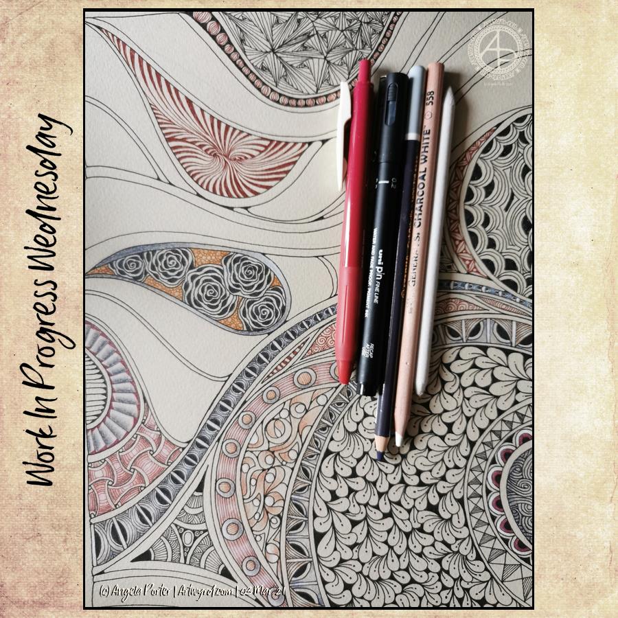
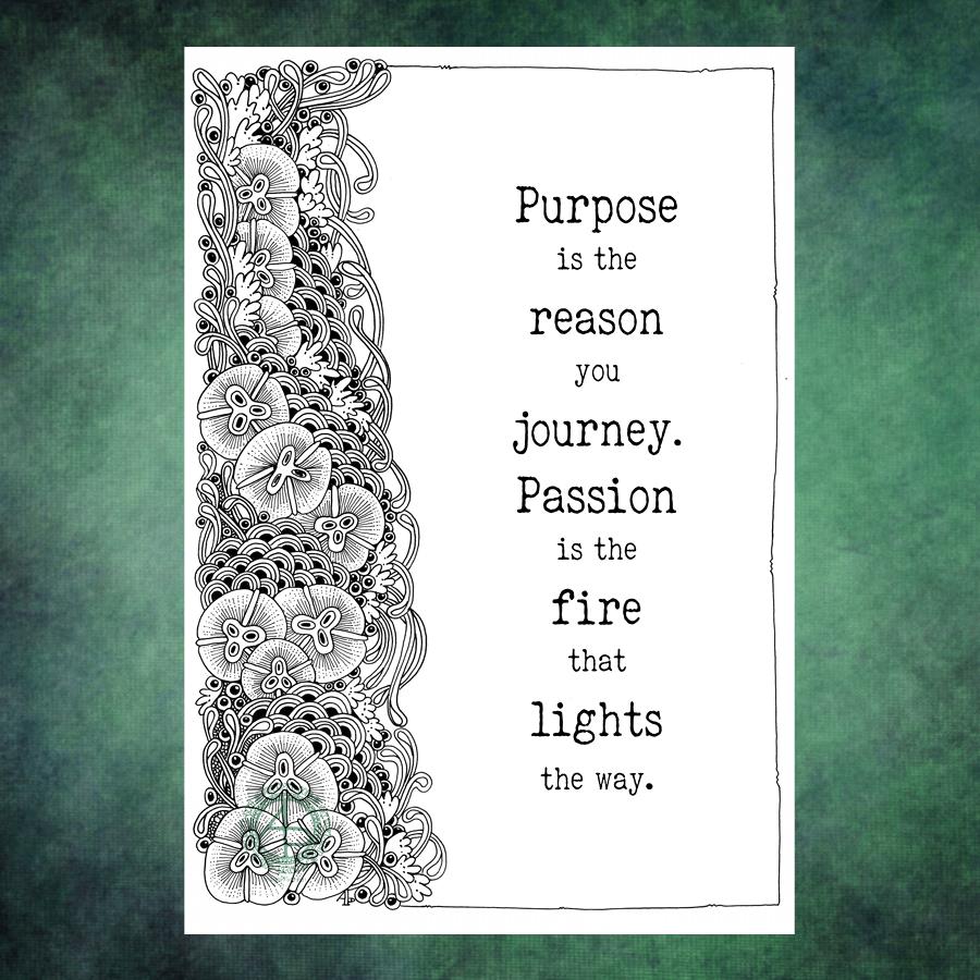
I always relax, feel my whole body let out a sigh of relief as I work on drawings like this one. Purely abstract, line and pattern being the focus, with healthy doses of black giving a very graphic feel to the design.

Playing with line width and pattern to bring layers and depth to the design is always something I’ve enjoyed.

I start with one single line, shape or motif and go from there instead of having an overall plan for the design all sketched out and ready to go. I like this organic, intuitive way of letting the design grow, developing it one pen stroke at a time.

I’m learning, slowly but surely, that areas of white space can be a powerful part of the overall design. It’s been a long journey to realise I don’t have to fill the whole sheet of paper with line and pattern.

I need to have a lot of trust in the whole of this process; that something pleasing will be created after hours of work with very fine nibbed pens.

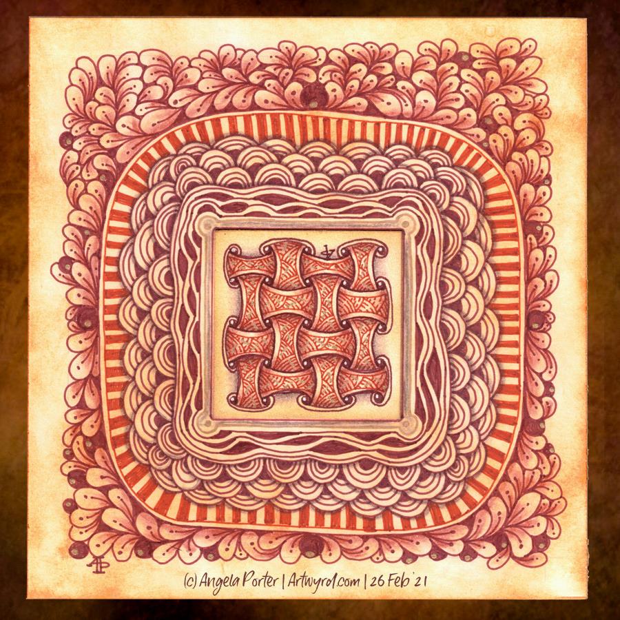
What next when I’ve finished the pen-work? Do I add shadows, colour, highlights with traditional media or digitally? Do I just add a background coloured/textured paper? Do I leave it in it’s very graphic black and white?

Working digitally with a scan of the finished drawing allows me to experiment, though I’ve yet to work out how to add shadows in the way a blended graphite or pastel pencil would do. And I do have a tendency to use much brighter, saturated colours than I would with traditional media.

Perhaps it’s time I sorted out my own digital colour palettes from my traditional media. That is something for another day, however. For the rest of the day, I’m going to lose myself in completing this drawing.

Tuesday Tangles

A pair of tangled drawings today.

The tall, thin one is approx 10.5 cm x 29.7 cm in size – a piece of smooth, heavyweight cartridge paper. Colour has been added with a mixture of fineliner pens and graphitint pencils with a damp brush.

The smaller tile is 4″ x 4″ (10cm x 10cm) piece of the same paper. Again, I’ve used graphitint pencils and a damp brush to add colour. A white gelly roll pen has been used to add highlights to the image.

Both drawings have also had shadow added with a graphite pencil and paper tortillon.

I love the graphic nature of a pure black and white drawing. However, there is something almost magical in the way that colour and shadow/highlights can bring a drawing to a lucious 3-D appearing work of art.

I’m also loving the softer tones of the graphitint pencils with a damp brush. The water activates the colour a little and allows me to drag it out to create a gradation of colour, along with a darker, shadowed area.

The cartridge paper is not the best for using damp brushes on, but the texture that results actually isn’t all that bad.

My mind is wandering to the square tile, and wondering if I could create it in polymer clay … a thought to try out at a later time, maybe.

Weekend Tangles

One drawing I’m working on and three Zentangle tiles that are complete.

TheA4 drawing is very much full of contrast and drama, very ‘graphic’ in nature. It’s not finished yet, but I’ll get there with it for sure.

The smaller tiles are rather geometric in nature with repeating patterns. I find drawing this kind of art soothing and pleasing too. I also enjoy the combination of the vintage brown tones with the black and grey. They just seem to work so well together.

I turned to work on the smaller ’tiles’ as I was feeling a tad overwhelmed last night. I really do find smaller pieces of art help me to settle back down. The repetitive nature of the patterns is soothing in itself.

I seem to be constantly circling around and returning to Zentangle – watching YouTube videos, looking at artwork online, and creating my own. I’ve been thinking about becoming a CZT – a certified zentangle teacher. I’m dithering about it, and I don’t know why that is. It’ll sort itself out I’m sure.

Saturday entanglement

This was very much intuitive art. I just let it grow as it needed to grow.

Unipin pens and a white Gelly Roll pen on Daler-Rowney smooth heavyweight cartridge paper. A4 in size.

Entangled Art – almost finished!

It is almost finished too. I’m dithering about the un-shaded arcs, and whether gold and /or white gel pens need to be used to add small accents and highlights. I can also see places where colour/shading is needed. However, there is no rush for it to be done!

The paper is 12″ x 9″, so I can’t scan it in one image. It’s Daler-Rowney Murano paper for chalk pastels and coloured pencils. So, as well as having fun just filling the page with shapes and patterns, I took the opportunity to try different kinds of pencils to add colour, shadow and highlight. I certainly enjoyed experimenting with gel pens and various kinds of pencils to create this drawing.

It looks a lot better in the photo than in real life, even with the weird banded light on the photo.

Template Thursday

A spring-themed template this week, and a challenge, over on the Angela Porter’s Coloring Book Fans facebook group.

The challenge is a month long and I’ve asked the members to hold off posting their completed templates until 31st March so they can all be posted together. I thought it would be fun to do that way.

Anyway, the challenge is to use a limited colour palette plus black and white to colour this week’s template, or any other flowery template for the 31st March. I’ve chosen some springtime colours. It’s going to be interesting to see how different people use the colours to complete this challenge.

Work In Progress Wednesday

Oh, the things I do when I wake up in the middle of the night. Fully alert and unable to get back to sleep for a couple of hours.

I just drew a pattern of curves and arches on the page of grey-ish pastel paper and started to fill the sections in with various patterns, zentangle and otherwise. I’ve used chalk pastel pencils to add colour and shading to some areas.

A total work in progress, for no other reason than because I couldn’t sleep.

Monday Mandala

Yet again, a lovely way to start a Monday. Mandalas are always a pleasure to draw/paint/create. I particularly love creating them digitally for many reasons, not least is the opportunity to experiment and learn new skills. It removes the worry of making a ‘mistake’ on paper and either having to start again or try to make that ‘mistake’ a part of the work. Often, that ‘mistake’ will be worked into the drawing, but not always and if I know it’s there, it bothers me, even if no one else can see it. The perfectionist in me gets a tad upset at it.

Having said that, there are a couple of things I’m not happy with in this mandala, but I can live with them.

One thing I do like is the colour palette of copper/bronze colours and that steely blue-grey. Vintage colours seem to be my thing at the moment for sure.

Purpose and passion…

What to do with an entangled design that seems to want to take up just one side of a page? Add a quote!

The design was drawn on Bristol Board with a fine Uniball ‘eye’ gel pen and a 01 Unipin pen for the fine lines. The quote was added in Affinity Designer.

It was a quote that just ‘spoke’ to me this morning. Art is one of my passions and something I indulge myself in daily, whether for work or pleasure. I’m so grateful I can combine my work with my passion. Not only that, my coloring templates and books allow others to share in my passion and expressing theirs through colour.

I do get disheartened at times. I doubt myself often. I often judge myself very harshly, especially if I compare my work to others. It’s not always plain sailing. But, I’ve learned that if I persevere, I end up with work that I’m happy with, including this one.

Entangled Art

Just trying out new 05 fineliner pens in vintage tones.

The central motif/pattern was worked on a small square of cotton watercolour paper (2″ x 2″ or 5 cm x 5 cm) coloured with Tea Dye Distress Ink. The larger panel beneath is a piece of Bristol Board (6″ x 6″ or 15.5cm x 15.5cm) coloured with Rusty Hinge Distress Ink.

I used various shades of Carbothello chalk pastel pencils and a paper tortillion to add colour and shadow. Gold higlights and a border around the central motif were added with a metallic gold Gelly Roll pen.

I’ve just noticed I really didn’t do a good idea at adding my initials so they were oriented harmoniously! Still, this really was just a trying out something kind of thing. I’d seen a Zentangle video about the use of cartouches – frames around writing or an illustration. And thought I’d try it out, in my usual clumsy kind of way.

I do like the idea of creating frames around other small pieces of art or precious items. That may be something I do going forward.