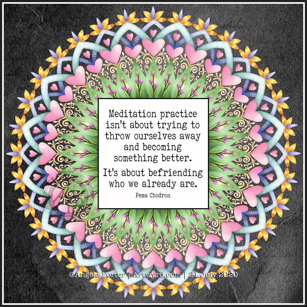
Today’s artistic offering is a mandala with a quote about meditation.
The simple typography was done in Affinity Publisher. I used Autodesk Sketchbook Pro to create the mandala.
I just needed some quiet time this morning. I spent quite a while meditating before breakfast. Then, my attention turned towards art.
I knew I wanted to include a quote in today’s art, and I found this quote about meditation that resonated with me.
Meditation and mandalas go together like bread and butter!
The mandala design is quite simple and bold, in quite subtle colours, for me.
It’s going to be a quiet day for me today. A self-care day. I may not get anymore work done on my typographical portrait, but I will be immersing myself in arty and/or creative activities for sure.
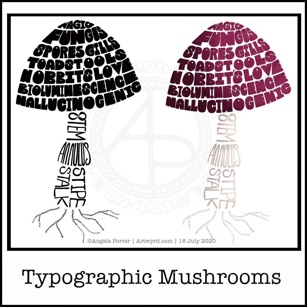
Just a little something I wanted to try out – using hand-drawn typography to create illustrations. I chose a mushroom, for no other reason than I like mushrooms.
It’s more about practising the hand-drawn typography or hand lettering than anything else.
What I realised, when I completed the black and white version, is that I could’ve varied the weight of the letters to produce highlights. That’s for another day, I think.
I also had to try adding colour, and in that way adding highlight and shadow.
I like both versions, but I think I like the coloured one a bit more.
I mentioned I’m following the Sarah King Domestika course – Hand-Drawn Typographic Portraits. I have started work on my first portrait, but it’s going to take me a while to do. In the meantime, little projects, like the mushroom, will give me plenty of practice as well as a chance to work out my process and way of working, as well as how I’d like to use it so it adds a note of harmony to my artistic song.
I started with a pencil sketch of the mushroom. Then, I added the words in rough with pencil. I scanned the sketch into Autodesk Sketchbook Pro. I then used my Microsoft Surface Slim Pen, to hand-draw the typography. Even though I’m using digital media. Autodesk Sketchbook Pro is a lot like working on paper, but it streamlines the process and allows me to skip a lot of the tedious steps. It also lets me take a black and white drawing and add colour quite easily.
I’ve done this while I’m waiting for a migraine-type headache to subside enough that I can return to bed and sleep the dregs of it away. I’m nearly at that point now as I’m beginning to feel tired and sleepy. So, I’ll get the rest of the social media postings done, and then crawl back into bed to sleep.
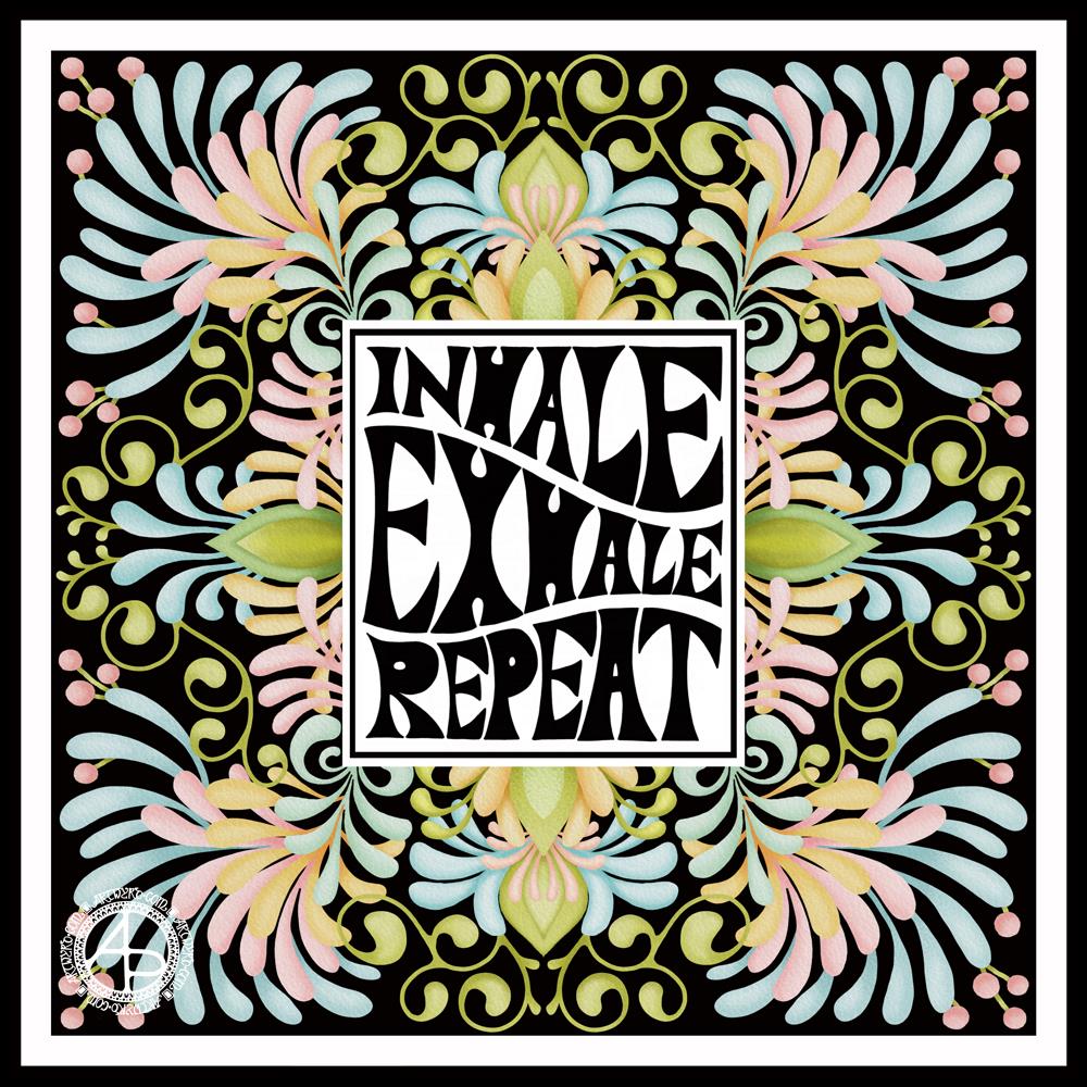
I started with the hand-drawn typography. I’ve just started another Domestika course — Hand-Drawn Typographic Portrait by Sarah King. The first exercise is to letter words boxes divided by wavy lines. Then, creating letters in different weights. And of course, practice is something that needs to be done.
There was just something about her approach to this that grabbed me, and so, I now have many boxes with words and quotes in.
The first lesson shows how to use Photoshop to edit your lettering outlines and fill them with black. I found the process rather clunky and long-winded. Perhaps that’s because I’m used to working in Autodesk Sketchbook Pro with a pen on a screen as if they were pen and paper, that I could do this in my own way.
So that’s what I did. I used one of my pencilled samples to create the typography for the centre panel.
Then, it was adding the background. I just went with the flow on that one. I made use of the symmetry tools in Sketchbook Pro, and just had fun with a limited colour palette and my favourite kinds of shapes.
The course is about portraits. However, I have zero interest in drawing people. However, the techniques shared will spark ideas for how I can use them.
I’ve long been trying to incorporate words, quotes into my artwork and struggling to find my own style. I’m not sure if this will help, but I’m really quite happy with this particular artwork.
It all began with a drawing in my A5 sketchbook. I then wanted to use it for digital art, and this is the result.
I’m really happy with the flower design. The black lines work in this instance; they give a stained-glass feel to the design.
I’m not at all sure about the background, however.I think I’ve just gone over the top, again. I just can’t seem to leave ‘white space’ in my art.
As a result, I tried some gold patterns on a rich, dark colour. Whatever I tried, just didn’t seem to work. Perhaps I could’ve created the line art in gold instead of black before adding colour. That may have worked out OK.
I’ve left it as it is, for now, as I’m tired and hungry. I’ll look at it with fresh eyes at some point. For now it’ll do, even as an example of art to remind me to work out when enough is enough!
Even though I’ve ended up a bit frustrated with my efforts on the background, I still enjoyed the process of creating this morning. It does make my inner light shine that bit brighter, and we all really need that extra bit of shine at this time of pandemics and more going on in the world.
I wanted a quote that went with the art, so I chose one about blooming and that sums up how I feel when I create, be it art or crafty pursuits. Even when the art goes in a direction I’m not happy with, there’s still a happiness inside that comes from just creating. There’s also a positive feeling about things not working as I want them to, artistically. It’s an opportunity to learn something, either artistically or personally. Today, the lesson is a reminder that I need to learn to leave ‘white space’ in my art.
Last night, I had a play around with one of my latest watercolours in an app that creates patterns from your artwork. The process was mesmerising. I didn’t realise that they now do metamorphosing patterns like these two!
The top image is directly from the artwork, the bottom one has been lightened, the colours more saturated and adjusted slightly.
I fell in love with metamorphosing tessellations thanks to the works of M C Escher, like so many other people. I love the detail, observational skills and the way he plays with the illusion of space.
Anyways, creating these patterns, albeit digitally, was fascinating and something I can definitely lose myself in for hours! Being able to adjust colours in Autodesk Sketchbook Pro or Affinity Photo is an added fascination too.
I like both colour variations of the same metamorphosis above.
I have made both available in my RedBubble Shop on a wide range of quality products. Please take a look and support my art by sharing with others. #findyourthing
This week, I’ve created a rather abstract but typically entangled ‘Angela’ kind of template.
If you’d like to download the template to colour, you do need to be a member of the facebook group – it’s free to join and free to download the template (terms and conditions of use apply).
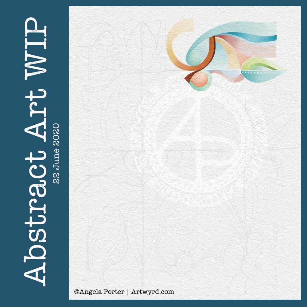
I’ve had some time this morning to do some more to this abstract art piece. I’m still learning about digital art and how it can work for me, but I’m feeling quite pleased with how this is growing, bit by bit.
As I work on it, I’m changing it from the sketch, which is often the case; the sketch is just a suggestion, and outline, a whisper of an idea.
The crisp, clean lines of digital art really appeal to me in this piece, as do the more muted colours.
Plenty more left to do on it, so daily updates will continue.
I’ve had a lovely couple of hours working on this particular piece of art. It is an abstract pattern, but the emphasis will be on shape and colour.
I drew the design out on paper and scanned it in to complete the artwork digitally in Autodesk Sketchbook Pro.
I was inspired by the work of Shell Rummel, and it reminded me of the type of art I did in my early arty exploratory days.
I wanted a watercolour feel to the art, so I’ve chosen to use rather soft colours and to try to keep the palette relatively limited. I also want to keep the extra patterns/lines to a minimum, though I do want some more detailed interest in places, such as the dots along the centre line of a leaf motif. This is going to be hard for me to do; I usually insist on filling every space with pattern and colour.
It’s also odd for me to work from a pencil sketch, usually I’m straight to pen on paper (or pen on screen). I do find it a lot easier to get my ideas/outlines onto paper than I do on the screen, and my lines flow. I think it’s because I get a better idea of the overall design as I do have a habit of zooming into whatever area I’m working on.
Overlaying a watercolour paper texture takes the art from the rather mechanical feel of digital art to something more textured and interesting, warmer and ‘human’ in feel.
This will take me a long time to complete, most probably over several days as I do have to do other stuff at this time. But it’ll be a nice thing to do as my ‘warm up’ art in the morning.
Tonight, at 10:43 BST, the Sun appears to enter Cancer, as viewed from the Earth. Of course, it’s the Earth that is moving around the Sun. Today, marks the official start of summer, but it also marks the time when we have the days of most light here in the Northern Hemisphere, and we’ll soon notice there’s not quite so much daylight at the end of our days.
This year, English Heritage are live-streaming the solstice sunrise tomorrow morning on their facebook page. You’ll have to be up early (or just not go to bed!) as they start streaming from 04:07BST, with sunrise at 04:52BST. I’m certainly going to do my best to watch it. This is one of the good things to come out of the pandemic. The live stream hasn’t been done before. I would never go to Stonehenge on either Solstice as there would be too many people and far too much noise and bustle for me, but this is a nice way to see it as it happens, not recorded and shown after the fact.
I’ve always felt an affinity with the cycle of the seasons and marking the solstices and equinoxes has felt far more natural to me than any religious celebrations. The scientist in me appreciates the facts around these dates in the calendar, my heart and soul appreciate them in different ways that are personal to me.
I found this quote about the solstices, and it sums up a little bit about how I feel about them.
The artwork shows a lot more about how I’m feeling today – not quite with it, spaced out, emotional and well out of sorts. I had an idea in mind, but I just couldn’t execute it to my satisfaction today. It looks like I need another self-care day. Which is fine. I’ve learned that sometimes it’s best to go slow in order to go fast. By taking time out from commitments, I return to them in a better frame of mind and emotional state and I’m more able to fulfil them to my satisfaction for sure.
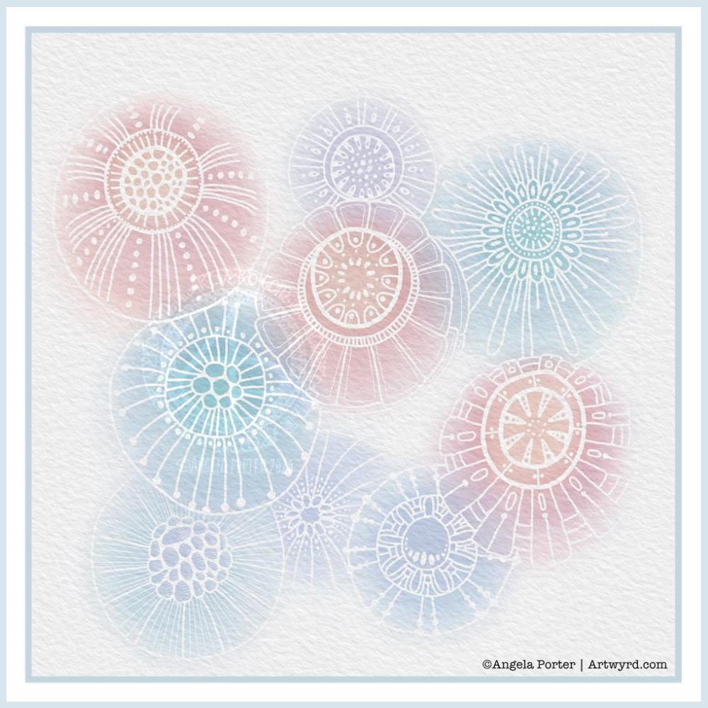
Another morning, another play around with watercolours, this time digitally.
Soft balls of watercolour, fuzzy edges, with white ink details added on top. Layers of transparent colour.
I overlaid a watercolour paper texture, which helps give the right ‘feel’.
This is my favourite attempt at digital ‘watercolours’ so far. I definitely like using white ink in this instance; black ink was just too harsh, hard and jarred uncomfortably with the softness of the watercolours.
I tried lots of ways of adding colour; not just brushes, but different brush effects. In the end I was happiest with white ink.
A nice way to spend a couple of hours as I wake up.