Colorist app update

Doodleworlds1

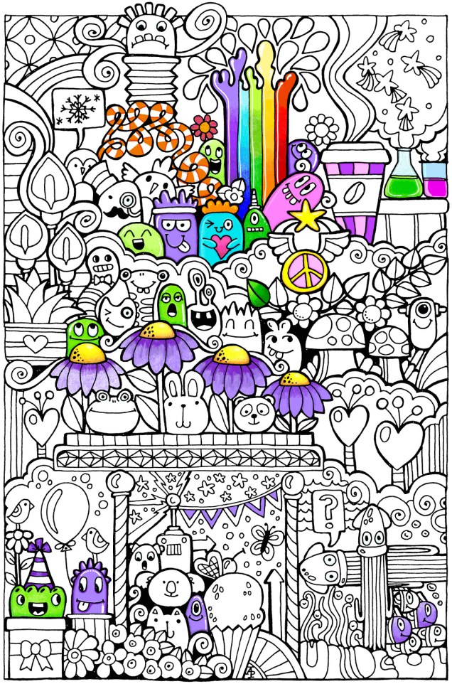
I was pleased to be told by Shelly and Kelly at Faction Apps that there’s been an update to the Colorist app.  That means I had to have another play!

The image above is one from my first book for the Colorist app – Doodle Worlds.  Many areas have been filled in using the original pencil tool, which is great as it allows for overlaying of colours as well as being pressure sensitive if your device allows for that (my Microsoft Surface Book certainly does!).

It took me a while to get used to how the pencil works in the app, but that’s not a problem as either the undo or eraser tools allow you to completely remove anything you’re not happy with.  (The eraser is also useful for removing colour to create a highlight!).

Bucket Tool

One of the new tools is a bucket-fill, which is great for filling areas with flat, solid colour.  I used this tool for the pink monster.  The pencil tool can then be used to add shading/highlights over the base colour.

A useful tool is the bucket tool as it allows for quickly filling areas with a solid colour, even teeny-tiny areas thanks to the ability to zoom in on the image! This saves some time and effort, which can then be spent on carefully adding the shading and highlights to the area.

Marker Tool

This is my favourite addition to the tool box in the Colorist app!  I love the solid colour it lays down. The colours aren’t transparent, however, so blending isn’t yet possible with them ( perhaps that’ll appear in a future update of the app).  Markers (especially Chameleon pens) are my favourite way of adding colour to drawings like this on paper, so I look forward to this tool being developed more in the future (fingers crossed and maybe a bit of pleading from me!).

What I love most about this tool is that I can draw and doodle and add texture and pattern to the image with the solid lines that I prefer in my art. I did this with ease on the flower next to the orange and white stripey twisty thing.

The wide range of colours available in the colour palette mean that highlights and shadows can be achieved, so long as a subtle blend from one colour to another isn’t required.  However, I’ve just thought that a clever use of the pencil tool may allow this to happen.  I’ll have to try that out!

Eyedropper tool

I didn’t make any use of this tool, but I’m likely to in the future as it means that you can easily select a colour you’ve previously used in the image being coloured without going to the palette and ttrying to remember just which shade of, say, blue it was you used.

Sketching in the Colorist App
Angela one

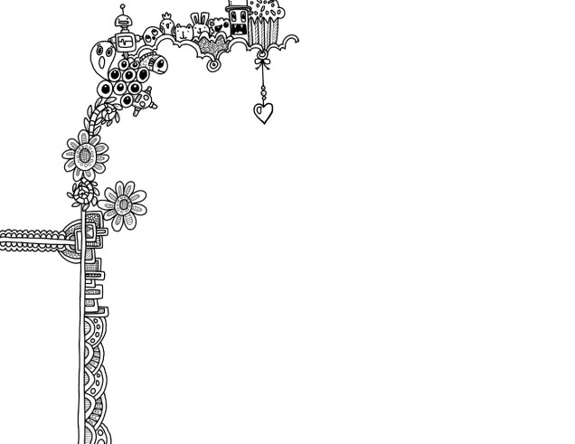
The ability to sketch within the app, and save the drawings too, is the fab new feature.  I really like this, especially with the marker pen tool.

Usually, I use Autodesk Sketchbook  for drawing on my Surface book.  One of the weird things about drawing on the Surface with the pen is that there always seems to be some wobble in the line, even if the line drawn is smooth.  Autodesk has a smoothing tool, which in the Pro version you can set to a level that suits the art  you are doing at the time.

Although the Sketch function in Colorist doesn’t have the smoothing tool (yet?) it works just as well as Sketchbook for the kind of doodly, abstract, whimsical art I do.  The image above is a drawing I did in Colorist last night, it took an hour or so to achieve.

I enjoyed using this function, though not being able to rotate the digi-paper meant it was a tad awkward for me to draw certain things.  However, Colorist isn’t designed as a  dedicated drawing/art app, but I do wonder if a ‘pro’ version could be developed where a small fee is paid for such a functionality. The latest updates certainly suggest to me that there’s a possibility that this could be a direction the app could take in the future.

My verdict

I really like the updates, especially the marker and the sketch function. Congratulations to all at Faction Apps!

The suggestions I’ve made above for extending the additions in the future are not criticisms of the great updates made, but they would take this app beyond that of being just a colouring app, so I’m well aware they may not happen.

However, I do believe this app could evolve from being a colouring app into something more…

Poppy capsules mixed media

IMG_0622

I’ve decided to do my best to be brave and confident and use my own drawings and designs in my mixed media work.  The poppy seed heads and the ‘zentangle’ patterns are drawn by myself.

The inchie with the quote on – creative journey – is milky as the Glossy Accents on the tile hasn’t dried yet, but it will dry clear and glossy.

Here’s a list of the media I used:

  • Papers – 300gsm watercolour paper, cream paper for pencil and pastel work, marker paper, kraft card, mixed media paper
  • Paints – Paperartsy Fresco paints, Liquitex copper paint, Cosmic Shimmer copper iridescent watercolour paint
  • Pens and pencils – Faber-Castell Pitt artist pens, Derwent Inktense
  • Leafy and flower stencils
  • Sizzix Big Shot and dies for cutting some of the gears and an embossing folder to add texture to one of the background papers
  • Metal gears and keys
  • Glossy Accents
  • Cosmic Shimmer acrylic glue
  • Archival Ink in black and sepia
  • Distress inks
  • Spray bottles – one filled with plain water, the other filled with water and copper Perfect Pearl
  • Gems
  • Wow Holographic Sparkle embossing powder and a Versamark pen
  • Cut and dry foam
  • Various brushes

Romanesque bird ‘punked mixed media

IMG_0621

I’ve come to a standstill on this one.  I don’t think it’s finished but I don’t know what is missing.

The focal point is a small sketch I did of a Romanesque bird; I used coloured pencils on coloured paper followed by Pitt Artist pen.  I also ‘distressed’ it with Distress Inks and water spray.  It is a very, very sketchy drawing, but I feel I need to be a bit more confident in using my own drawings/art in such mixed media art.

I just don’t know what else this needs, though.  I’ve tried out the idea of using wire spirals wrapped with finer wire and beads, and that doesn’t feel it would work, not unless it’s one of the first things I make and use.  Flowers don’t work, neither does foliage…

So, I’ll leave it be for a while and come back to it at a later time…sometimes that’s the best thing to do.

Mixed up mixed media

IMG_0619IMG_0618

I’ve spent some days preparing backgrounds, die-cutting some items for my stash, drawing and just ‘being’.

I started this one yesterday, but finished it today…well, I think it’s finished!

No quote or words on this one…yet.  Maybe something will come to me, or maybe someone will suggest something…feel free to message me if you wish to suggest something!

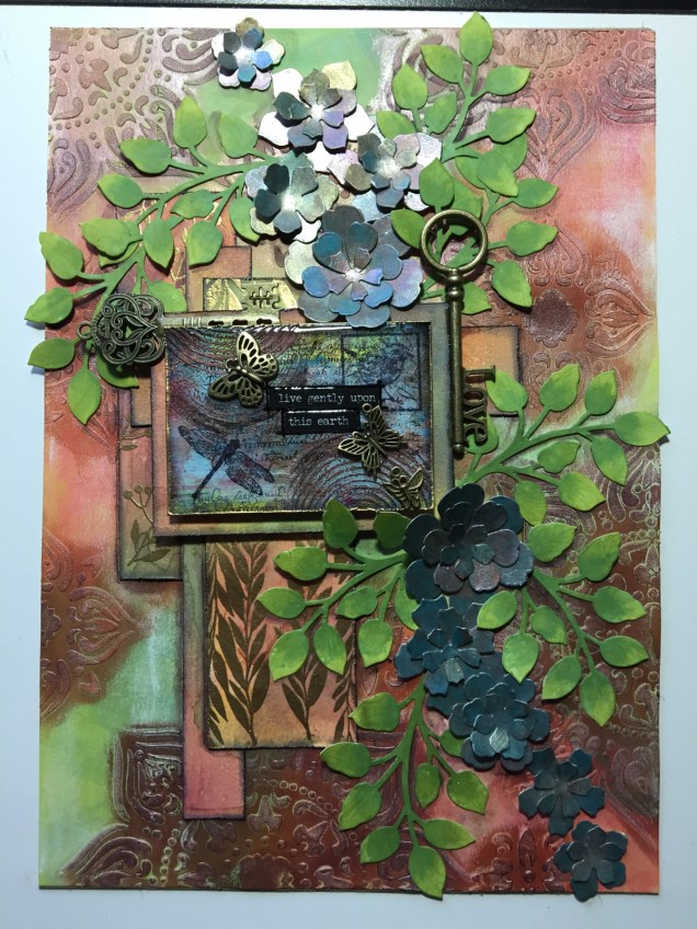
Live gently upon this Earth – Mixed media artwork

IMG_0614IMG_0615

I’ve had a bit of a week with appointments and then yesterday was a day where I needed some self-care.  I did, however, begin work on this particular piece, and I’ve gone crazy on making ATC sized backgrounds ready for work on them, particularly using the Dylusions paints which have laid dormant in my stash for a long, long time.

This particular mixed media pieces has a colour scheme that is not typically ‘Angela’.  There’s lots of god in it, and the flowers look more like succulents than flowers, bu tthey do kind of work!

The close-up image shows the ATC that’s become the focal point of the piece, along with the metal charms and keys that have been added.

See Possibility Everywhere – Mixed media

IMG_0610

A little different, and I’ve found a way to use those ATC cards I made a couple of weeks ago!

I’m not all that happy with the leaves, especially the ones at the top left.  However, I’ve learned to let a piece of art sit and for me to return to it at a later date and fix what needs fixing if it’s still there when I look at it with fresh eyes.

What I do need to think about doing is to get either canvas boards or some other thicker, stiffer surface to work on as this one bend so much.  I’ve managed to flatten it somewhat.

What it does need is to be mounted on another background as it seems like it is like a big tile that needs something to sit on and to show it off.  Again, I’ll let this idea rattle around the subconscious corners of my brainbox and tackle it at a later date.

What I do like is the iridescent ‘crackle’ texture on the background, a finish I also added to the flowers to tie them into the piece.  I thought the gold circles, rays, spirals and wavy lines had messed utall up, but I actually quite like them now.

Maybe not quite as ‘flowing’ as some of the earlier mixed media pieces I’ve created, but I’ve certainly tried different things out and am learning all the time, as well as exploring new materials or ways of working.

Butterflies and flowers – mixed media

IMG_0607

A second done today!  A4 in size, just as ‘Hope – flowerpunked’ is.

I’ve just realised I’ve not done the shadows around various elements, but that’ll have to wait as the drops on the petals are drying.

It’s deuced hard to photograph these well; the butterflies shimmer with different iridescent colours, as do the flowers .  The leaves have a kind of verdigrised bronze look to them. The background is very matte in contrast to the shimmer of the elements affixed to it.  There’s also some vintage paper behind the elements – from a very old science book!  Well I am a scientist as well as an artist.

I’m going to have to find something to do with all these mixed media pieces as storing them is going to be difficult as the latest ones have a lot of ‘dimension’ to them.  On this one both the butterfly wings and the flower centres are raised up somewhat.

I also have to decided if I’mg oing to continue having acrylic nails and nice gel nail finishes as all this mixed media work has just about wrecked them!  I thought that was nigh on impossible, but perhaps not!

Hope – flowerpunked. Art and my mental health.

IMG_0605

Just finished this one.

Hope.

Sometimes I have to walk away from something I’m working on as I despair it will work out to be anything near good enough.  Actually, it’s not sometimes, it’s most of the time!  However, I do persevere.

When I went to bed last night, this one was looking horrible.  I had the background done, the first layers of collaged patterned paper and the kind of hessian looking die-cut added too  I really wasn’t happy with it at all.

However, a good night’s sleep and a bit of inspiration on waking meant I knew where I wanted to go next, especially after I sorted out the jumble of die-cuts I have (note to self-get some way to organise these!).

Once started from the point of inspiration, the picture just grew to it’s finished state (well, I think it’s finished, that may change when I look at it again later on).

Hope.  A really good word here.  There’s always hope that no matter how bad I think something looks, , pushing past that often results in something good.  Indeed, sometimes the work can just be cut into pieces for use in another piece, which is how the iridescent, textured circles came to appear in this one.

Hope.  Making art always gives me hope that I can overcome the trials I face when my anxiety/depression/complex post-traumatic stress disorder kitcks itself up a few or several notches.  Art always gives me a place where I can lose myself in something that is meditative, mindful, self-soothing, and shows me that I can succeed even when the self-critic is telling me I’m useless, I can never get anything right, nothing is good enough, I’m a failure, and so on.

This past week or so, challenging myself to work with mixed media – something I’ve tried in the past and not really felt I was successful at – has been good to help me with the aftermath of a couple of rather strong anxiety attacks.  I’ve not had any for around a year now.

I was surprised by them and at their intensity and how they have impacted on how I live my life at the moment.  I find it difficult to go out into the world, want to hide away from people, and when I do go out it’s often in the dark hours so I’m not seen.

It also surprised me that this is how I used to live every single day for a very long time, most probably most of my life, until a few months ago.

Even though these two episodes have happened, I know I’ll get past them; I have in the past, and I can learn more about the triggers for them and also where this all comes from, which will help greatly in the counsellinge process.

So there’s hope I’ll improve in the long term, and blips are just that.  Just as I’ve hoped that my confidence and skill and expression via mixed media would improve.  I’ve just had a look back at the mixed media I’ve done in the last fortnight or three weeks, and even I can see how it’s all developed, in a positive way.

What’s made the difference for me with mixed media is finding the confidence to do my best to do it my way and to explore it in my way.  I have a lot more exploring to do, and a lot more confidence building in what I do with it. I will journey along this road, along with my drawing and illustration skills, maybe even writing, and with healing what I can of my mebtal health issues.

So, choosing the word hope for it to appear on this piece of art was most appropriate.

Flowerpunked

IMG_0602

This is todays mixed media creation (approx 5.25″ x 11.5″.  I think ‘Flowerpunked’ is a good name for it, or for the series of works like this.

I found a way to lift the flowers up so they have more dimension; wish I’d thought of that when I was adding the cogs., still there’s always the next one!  It’s all a learning process – it never ends!  I also think the stenciled patterns on the background are a bit dark and heavy … and just didn’t quite know what to do about them at the time as I didn’t want to lose the pretty background colours/patterns I’d already created.

Two completed mixed media pieces

IMG_0601IMG_0600