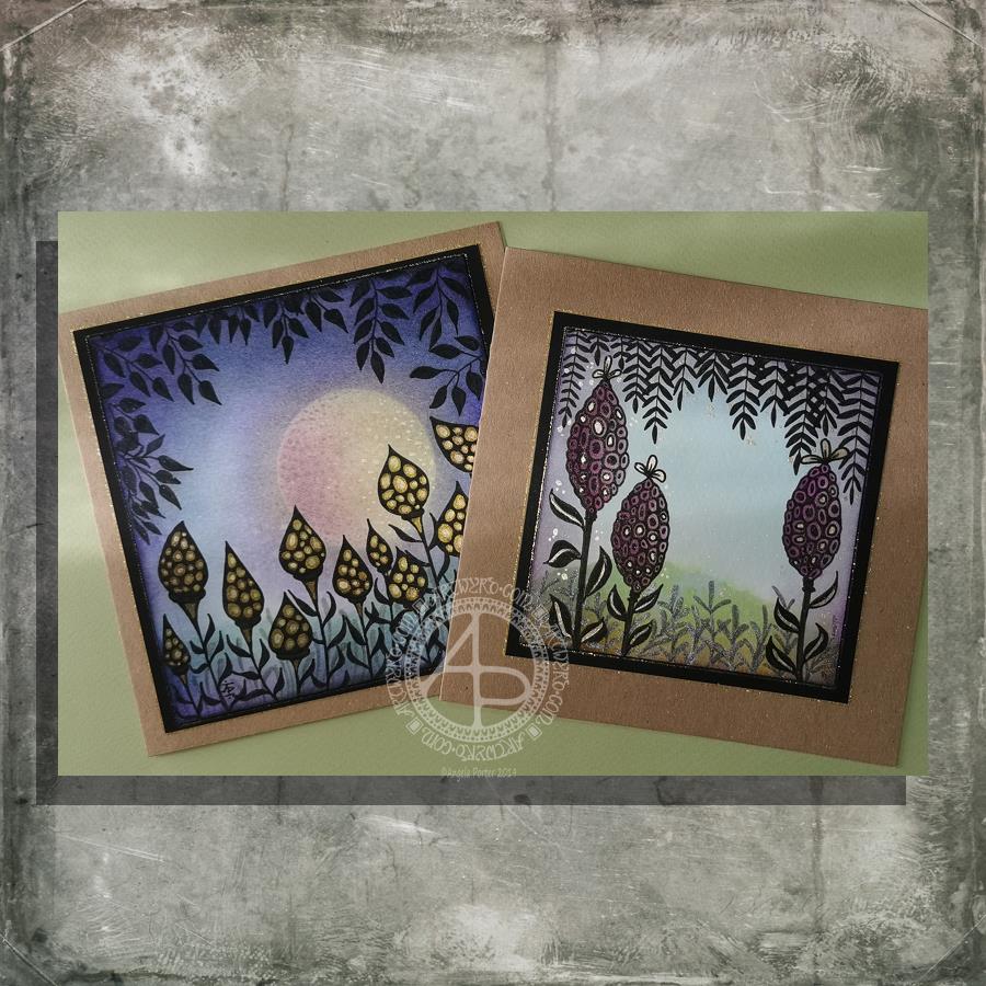
I had a lovely time this morning making the card on the left. Before I started drawing, I added a moon or planet to the background. It really adds something to the card, I think. Something like this is needed on the card to the right I think. However, as I’ve assembled the card it’s not going to be easy to alter!
How I made the cards.
I used Distress Inks and a mini-foam blending tool to colour the backgrounds. I used a circle of paper as a mask for the moon/planet in the left-hand card. To create the land, I used a torn piece of paper to mask off part of the card.
Once I was pleased with the backgrounds, I sprayed the image with a mixture of Perfect Pearls and water and let it dry.
The next step was to draw the designs. I used black and grey Pitt Artist Pens by Faber Castell.
Metallic/iridescent highlights were added; I used Cosmic Shimmer watercolour paints and a fine brush.
The final steps were to adhere the top layer to a black mat, and then this to the card base. Finally, I edged the mat and the top layer with a gold glitter Uniball Signo gel pen.
I have made coordinating envelopes for each card.
My thoughts on the cards.
I think you can tell that the card on the left is the second made. I can see how I’ve learned from the first card. I do like them both.
I would, if I could, add a moon/planet to the right hand card. It would fill that space rather nicely and give a more magical, mystical, ethereal feel to the landscape.
As to the left hand card, I wish I hadn’t done the pods all in black; they appear a tad ‘flat’. In hindsight, I could have used just black outlines and then filled the pod with a colour gradient before adding the metallic highlights.
I also am glad I didn’t try to add a spine to each leaf as I did on the right hand card. However, a highlight at the top of each leaf, suggesting the moon/planet light is reflecting from them.
Oh the whole, however, I am pleased with these cards. They are a new style of working for me. leaving open space is never easy for me, but I’ve managed it with these cards.
Would you like some happy mail?
I’ve already got some recipients in mind for these cards. However, if you’d like some happy mail then send me a message.
I had a lovely time this morning making the card on the left. Before I started drawing, I added a moon or planet to the background. It really adds something to the card, I think. Something like this is needed on the card to the right, I guess. However, as I’ve assembled the card, it’s not going to be easy to alter!
How I made the cards.
I used Distress Inks and a mini-foam blending tool to colour the backgrounds. I used a circle of paper as a mask for the moon/planet in the left-hand card. To create the land, I used a torn piece of paper to mask off part of the card.
Once I was pleased with the backgrounds, I sprayed the image with a mixture of Perfect Pearls and water and let it dry.
The next step was to draw the designs. I used black and grey Pitt Artist Pens by Faber Castell.
Metallic/iridescent highlights were added; I used Cosmic Shimmer watercolour paints and a fine brush.
The final steps were to adhere the top layer to a black mat and then this to the card base. Finally, I edged the mat and the top layer with a gold glitter Uniball Signo gel pen.
I have made coordinating envelopes for each card.
My thoughts on the cards.
I think you can tell that the card on the left is the second made. I can see how I’ve learned from the first card. I do like both cards, though.
I would, if I could, add a moon/planet to the right-hand card. It would fill that space rather nicely and give a more magical, mystical, ethereal feel to the landscape.
As to the left-hand card, I wish I hadn’t done the pods all in black; they appear a tad ‘flat’. In hindsight, I could have used just black outlines and then filled the pod with a colour gradient before adding the metallic highlights.
I also am glad I didn’t try to add a spine to each leaf as I did on the right-hand card. However, a highlight at the top of each leaf, suggesting the moon/planet light is reflecting from them.
Oh the whole, however, I am pleased with these cards. They are a new style of working for me. Leaving open space is never easy for me, but I’ve managed it with these cards.
Would you like some happy mail?
I’ve already got some recipients in mind for these cards. However, if you’d like some happy mail then send me a message.
I’ve already got some recipients in mind for these cards. However, if you’d like some happy mail then send me a message.


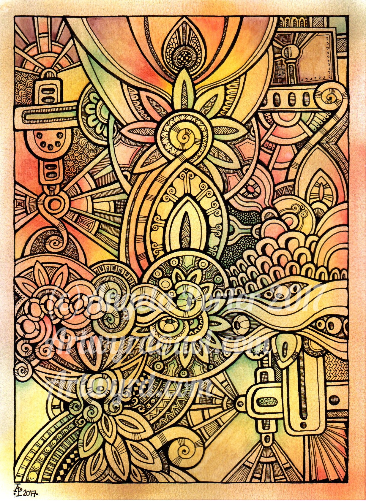
 This little pattern was created using Inktense pencils from Derwent, and a Pitt Artist Pen from Faber-Castell. Oh, I also used a Kuretake Zig water-brush to blend out the Inktense pigment.