Monday Mandala

My first mandala created in Clip Studio Paint Pro! It was a different yet similar experience to that I’d get in Autodesk Sketchbook Pro. In fact everything is similar, but different. It’s going to take me a while to work out how it all works.

I enjoyed the process, and the challenges it presented me weren’t huge. They were more opportunities to learn than to be frustrated.

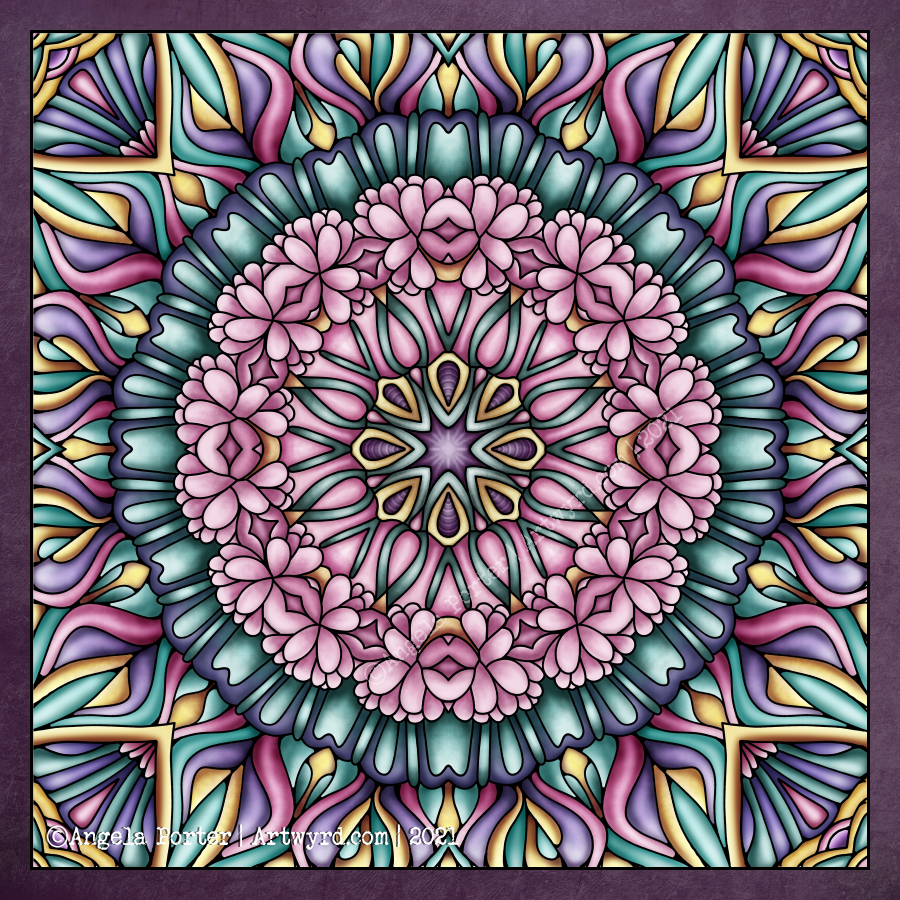
One thing I really do need to look into are the settings on the symmetry tools. They didn’t work the way I expected them to, hence the rather unusual way the patterns are repeated around the centre. The fact that they work this way means that there’s a wider range of possibilities for such designs going forward. That is exciting!

I’ve mentioned in previous blogs how I’ve been dissatisfied at times with my artistic expression. It felt stale, samey, and just not working. Every now and again I have a need to explore new things, to shake it up a little. This is turning out to be one of those perfect confluences of frustration, opportunity and freshness.

It has to be said, though, that there are times when I return to what is more familiar, comfortable too. But when I do return to them, I do so with the lessons and outlooks gained from these fresh experiences. And so, my artwork develops, which is a good thing indeed.

Nature

Nature – an entangled artwork. It looks like batik, silk painting or stained glass!

The design was drawn in pen on bristol board and then coloured digitally in Clip Studio Paint Pro using a textured watercolour brush.

I’m determined to find my way around this piece of software, along with Affinity Designer at some point. The effects are the same as Sketchbook, but just not quite so easy to find the tools I want to use at first. It’s all a case of familiarity and I’m definitely outside of being familiar with the software at the moment.

Having said that, all that I’ve learned about layers, the various effects that can be applied, brush settings and so on, apply to all digital art platforms. It’s just finding my way around the software and learning more about it.

The one thing that’s top of my list at the moment is setting up a custom colour palette.

I’ve discovered that Clip Studio Paint has symmetry tools – phew! And these tools do a thing or two not available in Sketchbook as well as working slightly differently (and making certain things a lot easier for sure.

So, onwards and upwards I go.

So frustrating!

It’s been a frustrating few hours. I scanned these two drawings in, went to edit and colour in Autodesk Sketchbook Pro, only to find that Autodesk has cancelled the pro, subscribed version and the only one available is the free version.

The free version doesn’t allow me to alter contrast, or work at different dpi, and it is a tad unstable it seems.

Also, there was no warning of this and I had no chance to save all my own custom brushes.

To say I’m gutted is an understatement. Sketchbook Pro has been my pathway into digital art and I absolutely love its intuitive interface.

So, I’m now looking into other software I have on my ‘puter. I learned to edit and colour and add texture layers, background and text using Clip Studio Paint.

It works well, but the interface isn’t so intuitive, it’s so much like the Adobe products, with menu after menu after menu. I can see that it’s more powerful.

Trying to look on the bright side, maybe I’d become way too comfortable with Sketchbook Pro and it’s now time for me to learn new digital skills and extend the ones I already have. So this may be a blessing in disguise.

All I know is that it’s going to be darn frustrating for a while until I get to grips with this new software.

I’m tempted to have a look at Corel Paint, but I suspect it’s user interface is as confusing and not intuitive either.

I still have access to the free version of Autodesk Sketchbook. But it is missing some of the features I loved so much about the subscription version.

Anyways, I discovered the watercolour brushes in Clip Studio and used them to add colour to the top design, and I like these ones very much. I’ll see how I get along with it, but first I need breakfast. Yes, It’s nearly 2:30pm and I’ve not had breakfast yet! So I’m going to eat and then it’ll be onwards and upwards digitally, I trust.

Now I’ve had my moan, here’s some info about the drawings:

14.5cm x 14.5cm Bristol board
Faber-Castell fineliner pen
Colours and textures added digitally using Clip Studio Paint

Template Thursday

Another week has passed us by, and so it’s time for another coloring template for the Angela Porter’s Coloring Book Fans facebook group members.

This week, it’s a more geometric design, albeit with plenty of curves. I was inspired by my art of yesterday. Also, I played around with adding some texture/pattern to areas of the design as there are fairly large spaces in this one – perfect for entangling/tangling/zentangling in, if you’re of a mind to do so.

Digital art – Autodesk Sketchbook Pro.

Mandala Tile

As I was coming around from yesterday’s headache, I plopped yesterday’s drawing into Repper to see what geometric patterns and tiles I could create.

Repper is a browser app that is great fun to play around with and makes the creation of tiling patterns from my artwork so simple.

Rather than save the patterns, I saved the tiles as so many of them looked like perfect inspiration for mandalas.

So, I chose one design, popped it into Autodesk Sketchbook Pro, and used it to inspire this particular pattern.

I chose a colour palette of soft pinks and greens, colours that are related to self-love, self-care, balance and harmony. Perfect for how I was feeling yesterday!

Today, I’m still feeling somewhat tired and fragile. That’s mainly due to a really poor night’s sleep. Emotionally, however, I feel a lot better than I have the past few days. There was an emotional storm brewing and it the headache was the torrential downpour that was needed to clear the skies by forcing me to take care and shelter myself.

So, the rest of today is going to be a quiet. nurturing kind of time to shake off the lingering wisps of stormy clouds.

Template Thursday

And a new colour palette challenge too!

Not only is it Thursday but it’s also a new month and also April Fools’ Day.

I needed to draw some cute kawaii goodness the other day, and as the characters are fooling around in the template I thought it would be perfect for this week’s template.

Unusually for me, I’ve gone with a cute pastel rainbow color palette for the month long color palette challenge.

The template, and the color palette challenge, are via the Angela Porter’s Coloring Book Fans facebook group. Free to join, free to download and join in, all that I ask is that you follow the terms and conditions of use.

I loved seeing everyone’s coloured version of last month’s colour palette challenge and template on the group. So much fun, and so many different ways of using the same few colours to bring life to the lineart template.

Drawn on A4 paper with Unipin 05 pen.
Coloured digitally.

Template Thursday

This week’s coloring template for members of the Angela Porter’s Coloring Book Fans facebook group, is full of botanical goodies and not an arch or geometric pattern in sight!

The design was drawn on A4 cartridge paper with an 05 Unipin pen. I then scanned the drawing in, tidied up little bits of it. I added colour,background and texture digitally.

I seriously worry about my choices of colour these days! I’m far more comfortable with either monochrome or a limited colour palette, with the focus being on highlights and shadows.

If you’d like to print a copy of the template, then all you need to do is pop along to the facebook group.

Entangled roses? WIP

Yes, another WIP (work in progress). I’m fairly happy with the drawing, and I may re-draw it with less detail for this week’s coloring template. I’ll see how I get along.

This one is vexing me in terms of adding colour. I think that because elements of this are far less abstract my brain kicks into making things like life. I think I need to find a way to kick my brain into using shadow and light to bring dimension rather than focusing on colour.

This frustration may be because I’m feeling more than a little anxious and a bit like a startled rabbit. I have an appointment in a short while, and that means going into the world where there are people.

Design drawn on A4 heavyweight cartridge paper with Unipin pens.
Background and colour added digitally.

Monday Mandala

Monday is mandala day! I never tire of creating mandalas, Angela style. It’s always a really lovely way to spend Monday morning and some of the afternoon.

This weeks is a combination of some organic patterns with quite geometric designs. There’s some Zentangle patterns in the design for sure.I’ve used a vintage colour palette once again.

I haven’t used any black outlines for this mandala. I’m not sure which way I prefer – black line drawing or not. Drop me a comment to let me know which you prefer.

Entanglement WIP

A little more colour added to this drawing, including some shadows and highlights to the areas of background colour. I always have a lot of fun and fascination adding shadows and highlights and the illusion of dimensionality the add to the design.

I’m still really enjoying the vintage-y, steampunkish colour palette.

As it’s sunny here, if a tad blowy and cool, I’m going to call it a day working on this art. Instead, I’m going to try to muster the courage to go out into the world and take a walk, and if not a walk, a drive long enough to top up the battery on Binky, my SmartCar.