Trying out Vintage Gel Pens from Arteza

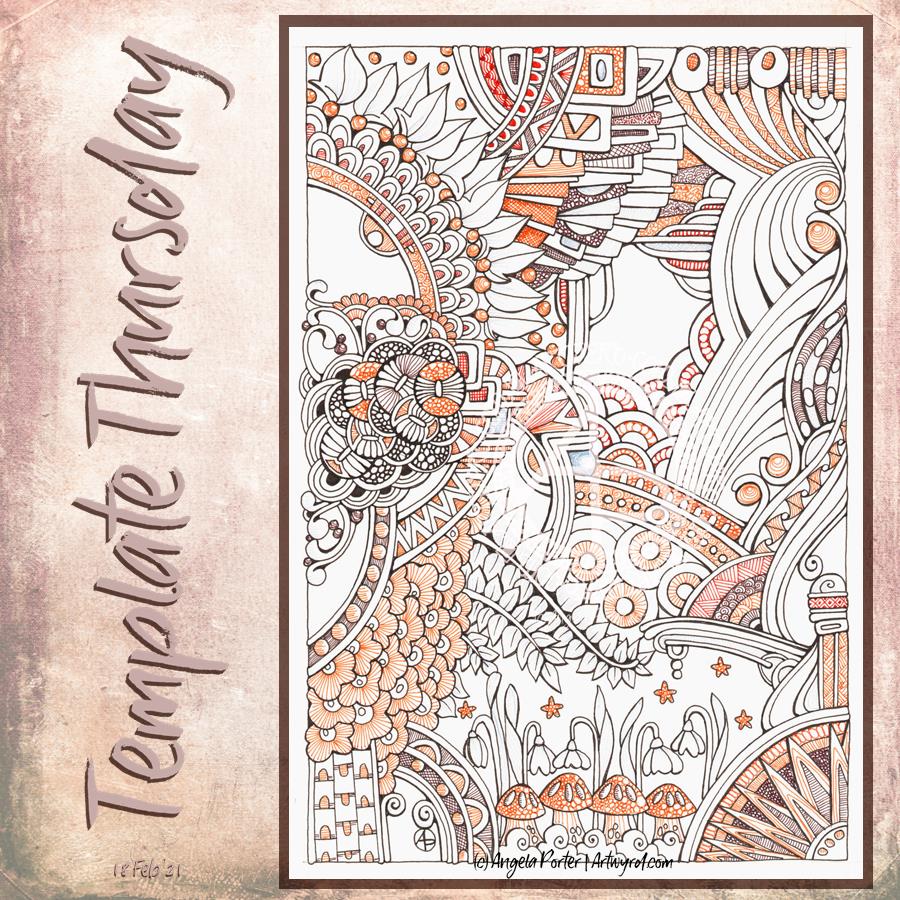
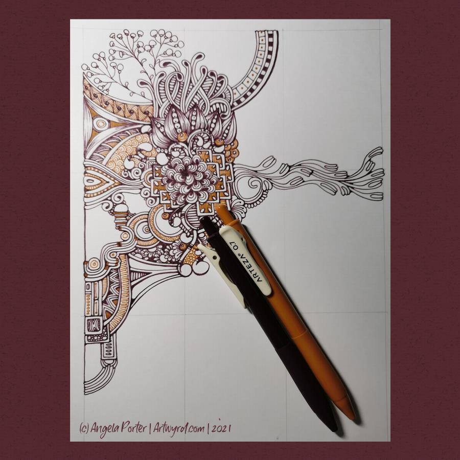
All my life, I’ve had a love of bright colours. I’ve shied away from the more earthy, natural or vintage tones. Recently, however, I’ve been using a lot of brown and more subdued colours in my art. When I saw Arteza had a box of vintage coloured gel pens, I thought I’d give them a go! So, I got out a sheet of bristol board and started to draw with the Vintage Grape Purple and Ginger pens.

Usually, I have huge problems with gel pens. The ink doesn’t flow smoothly due to the way I hold the pen (very upright) and it tends to blob. The pen soon stops working as well – and I don’t choose cheap pens. However, I was very pleasantly surprised at how smoothly the ink flows from these pens. No globs. It dries quickly. I can colour small areas smoothly. And the colours are rich. A bonus is I’m able to get the pen to produce thinner lines when I ‘flick’ the pen to add hatching lines.

Normally, I’d only draw in black. However, the darker tones of these pens may very well change my mind, for some projects any way.

The pens are non-toxic and acid-free. They are definitely smooth writing – the first gel pens I can say that work that way for me. And they do dry quickly, so no smudging!

So, one happy artsy me today. Always nice to have new pens that play nicely with me!

Mandala Monday

It’s Monday, so it’s time for a mandala. This one includes lots of Zentangle tangle patterns, many quite organic in nature.

I, again, chose a monochrome colour scheme, and enjoyed playing with light and shadow to add dimension to this artwork. Perhaps not quite as contrasting as I’d like, but still interesting.

Digital art – Autodesk Sketchbook Pro, Surface Slim Pen and Surface Studio.

Sunday Work In Progress

This is one of a couple of drawings I have on the go at the moment. The scan has washed out and altered the colours a tad. The gradations of colour are a lot smoother too. But I think you get the idea.

This was was drawn with Copic Multiliners on heavy smooth cartridge paper by Daler Rowney. I’m using Staedtler and Chameleon fineliners to add texture/pattern to the drawing. The larger areas of colour were achieved with Carbothello pastel pencils and a paper tortillon.

I was going to stick to a monochrome colour scheme, but some of those tendrils, fronds and leaves just needed a touch of a muted green. And then that led me to including that central ‘orb’ of turquoise (which isn’t as pale or lacking gradient as it appears).

I’m getting to the point where I need to decide how much white space to leave in the design, and where I’m going to add colour and/or texture and pattern. I also need to think about whether some of those coloured spaces need either more shadow or lightening up a bit. That means it’s time for me to take a break from this particular artwork and go and do another or something else completely different!

Before that, there are elements in this design that I really like – the strange columns/antenna at the top and bottom left, the organic trellis of fronds in the largest part of the design. That horizontal bar towards the top. however, just jars with the rest of th design.

Entanglement – 19 Feb ’21

Yesterday’s coloring template for the Angela Porter’s Coloring Book Fans facebook group all coloured and shaded. I used Chameleon alcohol markers to add the colour and some shading. I also used a graphite pencil and a tortillon to darken the shading and add shadow to the lighter areas. It’s turned out OK.

Template Thursday

This week, I decided to create a coloring page / template that is in the ‘Angela’ Entangled style, similar to yesterday’s artwork.

I made the motifs bigger and less patterned for the coloring template, however. To add colour to my version of the template I used a mixture of brown fineliners by Staedtler and Stabilo. Instead of solid colour, I used patterns and textures to add colour and complexity. I did use a pale grey fineliner to add details to the snowdrops and leaves, but the scanner didn’t pick it up. Ho hum.

After I’ve had lunch, I may return to the drawing to add shadows to bring out some dimension and depth. I’m not sure what medium I’ll use, though alcohol makers may be the best option, perhaps. I’ll see how I feel when I get to it.

Of course this is the template of the week for the members of the Angela Porter’s coloring book fans facebook group. And this week there’s a challenge to colour this template, or another of their choice, in a monochrome colour scheme.

If you’d like to print the template and join in with the challenge then just pop along to the group!

Tiny Abstract Art

5″ x 3.09″ (12.7cm x 7.84cm) Tea Dye Distress Ink coloured Moulin du Roy watercolour paper.
01 Sakura Pigma Micron Pen.

Little art

More small pieces of artwork today. These are perfect for when I’m feeling overwhelmed by a large sheet of paper. Also, they are sources of ideas for patterns and motifs for future work. I do need to spend some time with all this art and add some of the newer motifs and patterns to my visual dictionary/zibladone. Or, just stick them all into a sketchbook. At least then I’d know where they are!

It’s snowing outside. It’s cold outside, and warming up inside as I put the heating on a couple of hours ago. I think I may curl up in bed today with Din Djarin and Grogu. I still have three episodes of Season 2 to watch, and that sounds like a good plan to me!

Entangled Monograms

I’ve enjoyed doing these! The squares are 3.25″ x 3.25, 3.5″ x 3.5″ or 4″ x 4″ in size. The circles are almost 3.5″ in diameter.

The tiles were cut from a variety of papers – watercolour, bristol vellum and heavyweight smooth cartridge paper. I used Distress Inks to colour the paper tiles before drawing on them.

I’ve used Sakura Pigma Micron pens (05 and 01), along with some brown and one blue-green Stabilio fineliner pens.

I like them all, But my favourites are the ones that are much more geometric in nature – my initials and the A in particular. My least favourite is the E; the background to the letter just feels disjointed. I think that’s why I like the more symmetrical, geometrical designs more.

I’ve enjoyed using one or two tones of colour to add variety, interest and ‘dimension’ to the tiles. I’ve not added any shadow or highlight to these. That’s when things tend to go wrong for me as far as traditional media is concerned!

It also occurred to me that if I were to draw these on a different shaped paper, I could add dangle designs to them. (My book “A Dangle A Day” is still available). Maybe I’ll try that out in a while. Of course, I’d like to get a full set of monograms done too.

Small Art

Here’s just some of the smaller pieces of art I’ve done over the past week or so. They’re all entangled, zentangle, zentangle inspired. The biggest is 9″x9″, the smallest around 3.5″x3.5″ in size.

All have been fun to created, but I’m really not sure about colour choices, the backgrounds colours of the papers I used and so on.

I have yet more in the pile created over the past two or three weeks! They’ve been comforting to do, even if I’ve doubted myself with them and what I was doing. That’s often the case when my emotions are all over the place, as they still are to some extent.

All I know is that though it is bitterly cold outside, the sun is shining and I really do need to go for a walk, take in some fresh air, and blow some cobwebs from my mind. Well, that’s my plan. It may change once I’ve showered and so on!

Inking all done!

Waking at stupid o’clock meant drawing until I could go back to sleep. I got all the inking done for this particular drawing. Now, the colouring needs to be completed.

Materials:
21cm x 21 cm (8.25″ x 8.25″) piece of Claire Fontaine Paint-on mixed media paper – natural colour
Aged Mahogany Distress Ink and a piece of cut and dry foam to distress/grungify the paper
03 and brush Uniball Unipin fineliner pens
01 Sakura Pigma Micron pen
Staedtler Triplus fineliners
Chameleon fineliners
Water brush
White Sakura Gelly Roll pen