Entangled Monograms – D and F

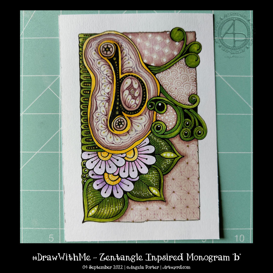
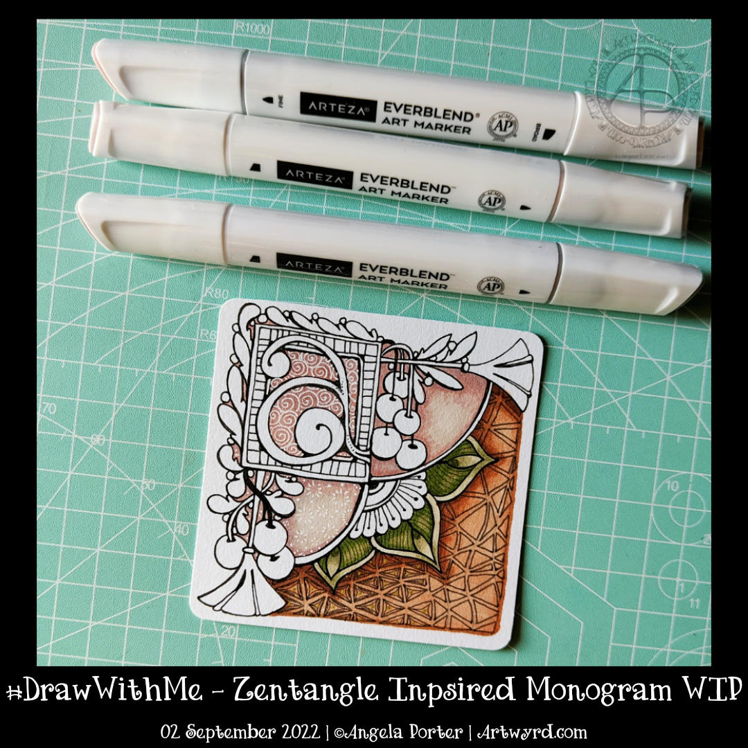
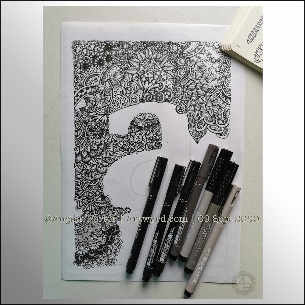
Over the past couple of weeks, I’ve been experimenting with monograms and my style of art. It’s fun trying out different things, and it leads to new insights into how I can express myself.

My self-expression is constantly changing and evolving. Sometimes I seem to make some breakthrough and go forwards with it for a while. But something happens, like a slip into poor mental and emotional health, and I retreat into my familiar styles. That doesn’t mean progress is not being made. When I look back, I can see how even my ‘comfort art’ has subtly, or not so subtly, changed as the breakthrough shares its influence subconsciously.

I keep returning to hand lettering, hoping to find out how I can make it work for me. Monograms really do seem to be the way forward.

I’m also thinking about my relationship with colour palettes. I really do struggle at times with the colours I put together, particularly when using traditional media. They seem like a good idea at the time…but…that isn’t always how I feel about them as I continue to add colour.

Contrast can be a thing I struggle with too. I really do think very simple colour palettes – monochromatic or analogous, are likely to be the way for me to go at the moment. They always seem to work nicely, monochromatic, especially as I can focus on contrast far more.

Digitally, I feel I do better, but again a limited palette is the best thing for me.

I know that, like my drawing/design skills, this will improve with time and practice. But I get so frustrated when I make the same silly mistakes over and over with colour choices.

“B” Entangled Monogram WIP

Accompanying YouTube #DrawWithMe Video.

Today was a day for quiet art, with some colour. I’ve started in a new A5 Sketchbook – A Royal Talens Art Creations one. It seems monograms are the theme for this one, at least for now!

It was a nice way to spend an hour this afternoon. It’s been very warm here in the Valleys of South Wales, UK, today. Thankfully, the sun has moved around from the front of the house and it’s feeling cooler now, just a bit.

Anyways, back to the art.

I drew the basic outlines of the design. I knew I wanted to add colour before adding the details of patterns. It also meant I could just enjoy adding colour without worrying about having to reink the lines affected by the paint; that’s always a recipe for disaster for me!

To add colour, I used soft yellows, greens and pinks from the Kuretake Gansai Tambi Art Nouveau set of watercolours.

I really, really love these watercolours. I love the way the imperfections and water-spots create a wonderful background texture. I think I’ve finally accepted that imperfections can be perfectly acceptable and wonderful! I now want to work out how I can replicate this in my digital and tradigital art. But not now. Not today.

Today, I’m flagging in energy once again. I could just go to sleep. But if I do that, I may not sleep well tonight. So, instead I will go get a drink and make something to eat. And maybe do some more art!

Entangled Monogram WIP 6 June ’23

I drew this design partly as I settled and calmed down for sleep, then completed it when I awoke at stupid o’clock until I was ready to settle back to sleep. Now, I’ve started to add colour – Derwent Chromaflow with Gamsol to blend the colours out. Oh and gold ink for the ‘L’ and the border around it.

This design was drawn on a 21cm x 21cm (8.25″ x 8.25″) piece of Canson Imagine mixed media paper. I used TWISBI Eco fountain pens filled with black Dokumentus ink, fine and extra fine nibs.

This is part of my preparation to throw myself into designing colouring pages for DayDreams. Getting back into my signature kind of art, maybe not this detailed, but …

There’s still plenty of colour to add. Then, there’s the highlights and sparkle and any other details that may be called for. A good level contrast is needed to bring out the illusion of dimension to this!

Monogram “b”, Zentangle Inspired

To view the accompanying video which shows most of the drawing and adding background patterns and colour, click on this link!

I’m continuing with my exploration of monograms and patterns. This one is a bit odd with the ba sitting above a pool or pebble..or something. But I quite like the patterns I’ve used to embellish it. I’m also rather fond of the background patterns, especially the very faint ones to the bottom right.

I’m not too fussed about the greens, yellows and the colours I used for the flowers. Pretty much every colour apart from the background colours and the colours of the patterns around the b!

Must write a HUGE reminder and stick it where I can see it “WORK IN MONOCHROME!”

All the same, it’s a learning exercise for me, as drawing always is. The ones that turn out not quite to my liking at the ones I learn most from. Having said that, I still haven’t learned that ‘work in monochrome’ thing yet! One day, maybe, I will.

Monogram ‘a’ – Zentangle Inspired Art

I’ve mostly finished this 3.5″ (11cm) square ’tile’ with a monogram. It’s changed a little since my last blog post this morning.

Apart from completing the colour, I coloured over the brown section in the bottom right. I used dark and light grey Gellyroll Moonlight pens to add the crazy ‘N’Zppel’ Zentangle pattern. It needs tidying up and perhaps some highlight within the inner black spaces.

But for now, it will do. I think I need a break from it to eat and do other things for a while.

Zentangle Inspired Monogram WIP

Click on this link to watch the Draw With Me tutorial video on YouTube

This morning, I thought I’d share how I’m exploring creating some Entangled art, particularly monograms, via YouTube.

This little drawing is 11cm by 11cm, which is approximately 3.5″ square – took about an hour or so to get to this point. I wasn’t sure of the green, but I think it’ll work out just fine. There’s quite a way to go yet, but that will have to wait for another time.

The materials I used are:
* 03 black Sakura Pigma Micron
* Various Arteza Everblend marker pens
* Various fineliners in grey and green
* A white Sakura Gellyroll pen
* A metallic gold Uniball Signo pen

Little art

More small pieces of artwork today. These are perfect for when I’m feeling overwhelmed by a large sheet of paper. Also, they are sources of ideas for patterns and motifs for future work. I do need to spend some time with all this art and add some of the newer motifs and patterns to my visual dictionary/zibladone. Or, just stick them all into a sketchbook. At least then I’d know where they are!

It’s snowing outside. It’s cold outside, and warming up inside as I put the heating on a couple of hours ago. I think I may curl up in bed today with Din Djarin and Grogu. I still have three episodes of Season 2 to watch, and that sounds like a good plan to me!

Entangled Monograms

I’ve enjoyed doing these! The squares are 3.25″ x 3.25, 3.5″ x 3.5″ or 4″ x 4″ in size. The circles are almost 3.5″ in diameter.

The tiles were cut from a variety of papers – watercolour, bristol vellum and heavyweight smooth cartridge paper. I used Distress Inks to colour the paper tiles before drawing on them.

I’ve used Sakura Pigma Micron pens (05 and 01), along with some brown and one blue-green Stabilio fineliner pens.

I like them all, But my favourites are the ones that are much more geometric in nature – my initials and the A in particular. My least favourite is the E; the background to the letter just feels disjointed. I think that’s why I like the more symmetrical, geometrical designs more.

I’ve enjoyed using one or two tones of colour to add variety, interest and ‘dimension’ to the tiles. I’ve not added any shadow or highlight to these. That’s when things tend to go wrong for me as far as traditional media is concerned!

It also occurred to me that if I were to draw these on a different shaped paper, I could add dangle designs to them. (My book “A Dangle A Day” is still available). Maybe I’ll try that out in a while. Of course, I’d like to get a full set of monograms done too.

Monogram “a”

I got this monogram finished yesterday evening. I think I may have been a bit heavy handed with shading in some places. However, overall I like it and I like the volume or dimension that the shading adds.

I definitely enjoy working in such a detailed, intricate and organically intuitive kind of way. Having the monogram as a design to work around does help quite a bit.

On a kind of related point, I had a new A5 dot grid notebook delivered yesterday so I can start to make a collection of motifs and patterns as I use them or create them. The idea is I can winnow out those that I never/rarely use. The reason for this is that the dot grid notebook I’ve kept as a visual dictionary for the last couple of years is just about full! I will keep it as a reference, but it’s time to start a new, more relevant one I think.

I have a snazzy, teal coloured notebook, covered in vegan faux-leather. It has 218 numbered white pages that are a tad thicker than the usual dot grid notebook pages, The paper is velvety smooth and a pleasure to write/draw on. It’s made by Wordsworth & Black and I came across it on Amazon. Oh, the ink doesn’t feather, bleed through or ghost on the pages. I paid £15 for it and I’m very happy with it so far.

WIP Wednesday

Wednesday is work in progress (WIP) day. So, I thought I’d share my monogram “a” and the progress I’m making on it.

There’s a clutch of pens there! I decided to see if I could add grey to heop areas of the design stand out more, as well as adding some depth and dimension. I figured I had nowt to lose if I tried as the the design was becoming all much of a muchness to my eye. Looking at the image above, it seems to be working well in some areas!

I started using some grey unipin pens to add shades of grey to the design. They worked kind of well enough, but they were picking up pigment from the black and moving it around.

So, I thought I’d see what greys in Pitt Artist Brush pens I had and found some warm greys. They worked better as the colour could be laid down more smoothly.

I do have some new motifs to add to my visual dictionary, a corner of which you can see at the top right of the photo.

I’m not sure if I like adding the greys more than if I don’t add them. I suspect I’ll like them more as I work with them as I love the sense of volume that has appeared in various areas thanks to the contrast they confer on the design.

Let me know what you think – drop me a comment.