This week, it’s a more geometric design, albeit with plenty of curves. I was inspired by my art of yesterday. Also, I played around with adding some texture/pattern to areas of the design as there are fairly large spaces in this one – perfect for entangling/tangling/zentangling in, if you’re of a mind to do so.
Not only is it Thursday but it’s also a new month and also April Fools’ Day.
I needed to draw some cute kawaii goodness the other day, and as the characters are fooling around in the template I thought it would be perfect for this week’s template.
Unusually for me, I’ve gone with a cute pastel rainbow color palette for the month long color palette challenge.
The template, and the color palette challenge, are via the Angela Porter’s Coloring Book Fans facebook group. Free to join, free to download and join in, all that I ask is that you follow the terms and conditions of use.
I loved seeing everyone’s coloured version of last month’s colour palette challenge and template on the group. So much fun, and so many different ways of using the same few colours to bring life to the lineart template.
Drawn on A4 paper with Unipin 05 pen. Coloured digitally.
At the start of March, we launched the first month-long colour palette challenge for the members of the Angela Porter’s Coloring Book Fans facebook group. I also posted a template that could be used for those who have access to a printer (or any template from any of my books if not).
Here is my coloured version of the template.
I like working with limited palettes. I don’t find limited choices confining or a challenge. Instead I find myself liberated from the choice of colours to use when completing an artwork. I end up with a more coherent/cohesive artwork than if I’m allowed to play in the sweetie-shop of the limitless colours of the digital realms. The limited palette makes me focus on the work in a different way, usually on shadow and highlight, as shades of these colours are always allowed!
In hindsight, these colours wouldn’t be a natural choice for me to use. I chose colours that reminded me of spring-time flowers and leaves and the lovely clear blue skies we ca get. Black and white are there, of course, for various shades, shadows and highlights.
So, tomorrow there’ll not only be a new template, but a new color palette challenge. I already have the template drawn and good to go, I just have to choose the colours to use.
At the start of March, along with the weekly template, I set a color palette challenge for members of the Angela Porter’s Coloring Book fans. I asked for all of you who took part to hold off sharing your wonderful colorations until the last Wednesday of the month, which happens to be tomorrow!
I’ve finished colour the template using the rather spring-like colour palette, and here is a fragment, a snippet of my completed template.
I’ve finished the line art for this particular design. Now, it’s adding colour to it, which is going to be a long job.
I’m trying out a color palette of greens, peaches and dusky pinks, but I’m not sure about them, or maybe I’m not fussed on the background. I’ll see how I get along. It’s definitely a work in progress.
I’m not sure what happened with the design. I had intended to leave open space in the design to add a lighter, airier feeling to parts of it. That just didn’t happen. I’m not sure about some areas, but I do know that colour can make all the difference to a design.
A4 Marker Paper Pentel disposable fountain pen, 02 Uniball Unipin pen, and a 0.38 Uniball Signo Dx pen Backgrounds and colours added digitally using Autodesk Sketchbook Pro
Note – I’m not paid, sponsored or supplied with any products.
The design was drawn on A4 cartridge paper with an 05 Unipin pen. I then scanned the drawing in, tidied up little bits of it. I added colour,background and texture digitally.
I seriously worry about my choices of colour these days! I’m far more comfortable with either monochrome or a limited colour palette, with the focus being on highlights and shadows.
If you’d like to print a copy of the template, then all you need to do is pop along to the facebook group.
Monday is mandala day! I never tire of creating mandalas, Angela style. It’s always a really lovely way to spend Monday morning and some of the afternoon.
This weeks is a combination of some organic patterns with quite geometric designs. There’s some Zentangle patterns in the design for sure.I’ve used a vintage colour palette once again.
I haven’t used any black outlines for this mandala. I’m not sure which way I prefer – black line drawing or not. Drop me a comment to let me know which you prefer.
A little more colour added to this drawing, including some shadows and highlights to the areas of background colour. I always have a lot of fun and fascination adding shadows and highlights and the illusion of dimensionality the add to the design.
I’m still really enjoying the vintage-y, steampunkish colour palette.
As it’s sunny here, if a tad blowy and cool, I’m going to call it a day working on this art. Instead, I’m going to try to muster the courage to go out into the world and take a walk, and if not a walk, a drive long enough to top up the battery on Binky, my SmartCar.
Another abstract drawing that is a work in progress. This time, the drawing is done, but I’m working on adding colour to it.
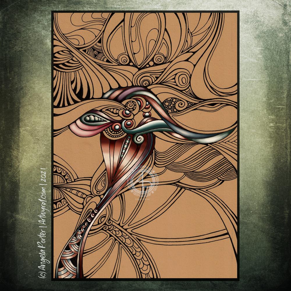
To draw this one, I used a hard Tombow fudenosuke pen with natural coloured mixed media paper. I enjoyed working with the broader lines in contrast to the fine line work of the previous abstract entanglement drawing.
I have made the background darker than the original paper, and I do intend to leave areas in this colour. For now, I’m working with colour to develop a sense of dimension. Of course, I’m adding colour digitally. Every now and then, I circle back to traditional media, and I think that diversion serves to remind me of how much I prefer to add colour digitally.
I keep circling around this. I like to draw designs with pen on paper. I get a much better sense of the flow of the design that way. But I like to add colour digitally. And so, it’s time for me to do what I can to accept this is how it is meant to be for me. I may dabble with traditional media from time to time, but digital art, at least as far as adding colour is concerned, is where I love to bring my drawings to life.
So it seems to be that from time to time I need that diversion to remind me of what really makes my artsy heart happy. A diversion or a break from the usual? Either, neither, both I suppose.
I do love the richness of these rather vintage, steampunk-ish colours against the warm, tan background.
A little bit of wisdom on a Wednesday. A Zentangle frame and a quote. Vintage colour palette. Geometric patterns, repeating patterns, all put together to try an idea I woke with out. Whether it works or not, I don’t know. But was fun creating this little bit of art.
There are bits I’m not too happy about, the shadowing behind the humpy bumpy border around the quote itself in particular. But you have to try things out. No matter what they end up like, there’s always lessons to learn, things to store away for future use. And this, perhaps is one of those things.