Monogram B – another version

©Angela Porter 2018

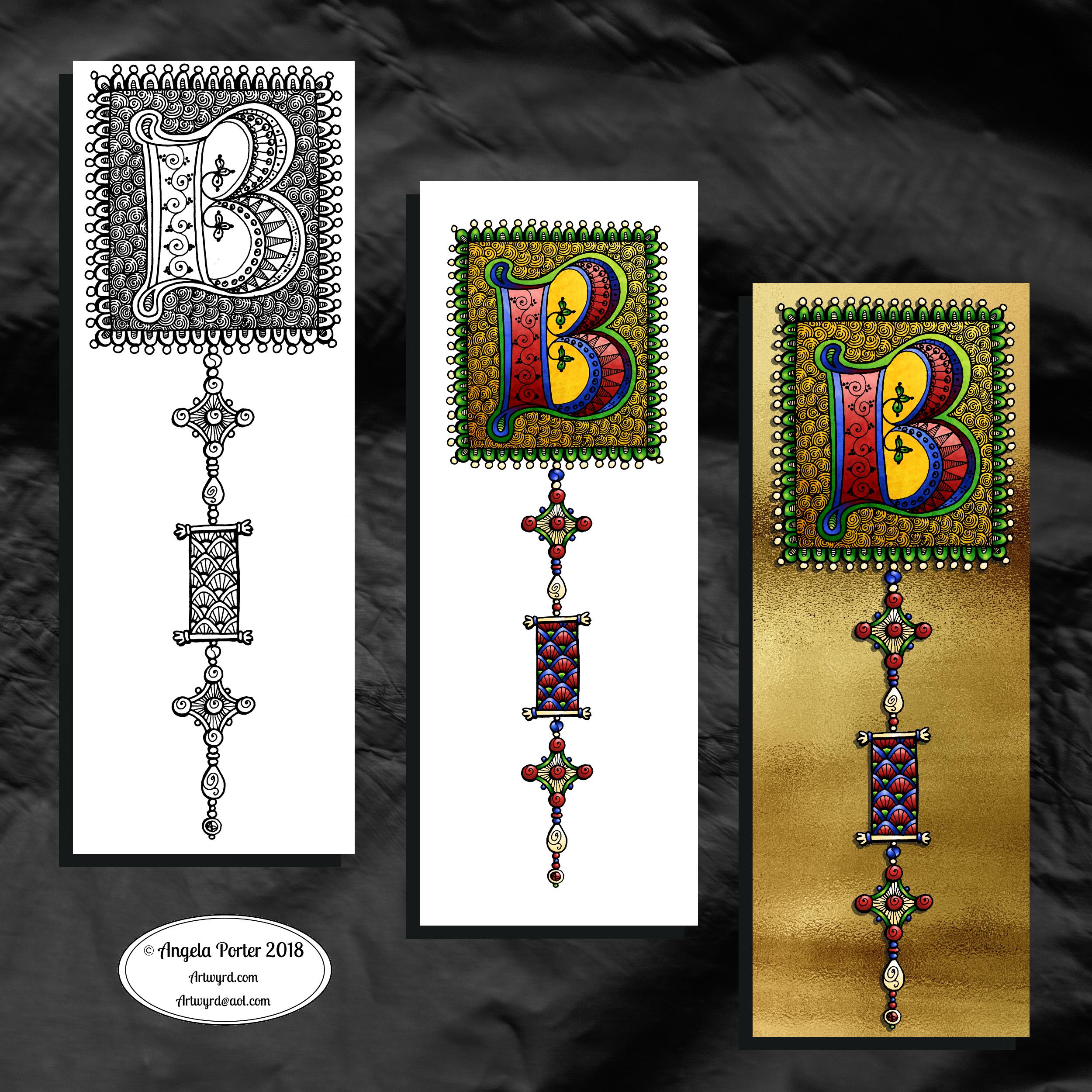
This version is totally digital. I used the pen and ink drawn version to re-draw the design in Autodesk Sketchbook Pro, making use of a glitter texture.

I think I got my head around how to do this, and colour the images in and I’m kind of pleased with it, though I’d like a bit more of a highlight/shadow on the glitter bits. That will take some thought and experiments as to how to achieve that, but for now my head is overloaded with working in layers and with digital art techniques I’ve barely used before.

I’m pleased with how it looks rather medieval in style – medieval drawn using modern technology. This version doesn’t even exist in physical form, which is crazy!

I have no idea how this would print out as, say, a book mark or note card. As it’s a fairly high resolution file on my computer it would print as a photograph. Of course, there wouldn’t be any real glittery sparkle and shine.

Yes, I’m fairly pleased with this and for myself for figuring it out how to do it, though there’s lots of improvements that could be made.

I think I’d like finer ‘glitter’ on the texture background I used – that’s just a matter of creating another tiled image via GiMP. However, until I do something I never quite know how it’s going to work out, nor do I know if it’s going to be a good idea.

It certainly satisfies a part of me that likes glitter and sparkle and shiny things.

All I have to do now is try to remember how I did this so that I can repeat it in the future, if I’m so inclined.

I am waiting for some metallic inks to be delivered today, so no doubt I’ll be drawing with them on paper.

Mongram B

© Angela Porter 2018

One monogram dangle design, three different versions.

The first is just the black and white line art. This was drawn with Uniball Unipin pens on dot grid paper then scanned in so the dot grid and faint marks could be removed as well as making a transparent background. This dangle design is much more ornate in terms of pattern than is in my book ‘A Dangle A Day’ but is still easy to do if a bit time consuming.

The second is the line art coloured digitally with some texture added.

The third has the coloured line art floating on a golden sheet.

I’ve not quite managed to get my head around how to convert the black and white line art into golden line art where I can add colour. I suspect it’ll have to be re-drawn, which I’ll most probably do while I’m waiting for a delivery.

I kind of like the gold background, but it is a bit too much as well.

Which version do you like best? Let me know your thoughts!

Monday – a dangle design

©Angela Porter 2018

A quiet start to Monday morning here with a spot of hand lettering and dangle drawing.

This is my first draft of a design, which is a bit wobbly in places and there are some ink smudges too.

I pencilled in the basic shapes of the letters, inked in the outlines and then added the inner decoration.

The dangles were drawn with pen directly on paper. The use of dot grid paper helps to keep things vaguely level usually, but this morning that’s not quite gone to plan. Of course as it’s December I’ve gone with December themed charms and a Moon for Moonday Monday!

I have a few tasks to do and then I may just re-draw this, or at least colour it in. Colour makes all the difference.

This could be a bit of a big dangle design to use in a BuJo, but just the word with one dangle to the left would make a charming header with dangle for a day. The beauty of dangles is that you can just add to them as you go through the day. If the charms are small enough you could even add ones that will go with your BuJo entries – event, note, task and so on.

I think that would work well for a big and busy day.

A Dangle A Day is released on 8th January 2019.

©Angela Porter 2018

I did go away and create this sample BuJo page showing the kind of thing I meant above. The hand lettering has worked out a lot better. I also like the blue gradient I’ve used to colour the letters with. A grey shadow was added to the left and bottom of the letters too. I also like the cute little date box. The ornate ends on the bar through it give it a ‘feel’ that goes with the lettering.

I did have fun doing this. It’s maybe not something I’d do everyday in my BuJo. My BuJo is very much a working one, with lots of mistakes and rubbishy writing going on as I scribble down things. However, I do enjoy hand lettering, especially more so as I’m beginning to accept that I have to accept my own way of forming letters is perfectly acceptable and that I can work with that.

I have to remember that others don’t see my hand lettering (or art) as I do. They see it with fresh eyes, without the close up work that goes into it, without the small flaws that I see and are magnified by my inner critic into hideous blemishes and fatal errors in the work.

I can quieten the crtiic when it comes to my drawings/art, mostly. Except on any bad days I have in terms of my mental and emotional health. Because hand lettering is something that is a new focus for me, the inner critic feels it’s empowered to be hypercritical of anything I do. It’s only by doing, by doing what I can not to ignore the critic, but to check what it’s telling me as being valid or invalid and learning what I can from the valid points to improve in the future.

Christmas Dangle Design

©Angela Porter
Design from ‘A Dangle A Day’, authored and illustrated by Angela Porter

It’s Friday so it’s #dangleday. Today, I wanted to share a Christmas Dangle with you from my book ‘A Dangle A Day’. In the book I show how this design was drawn, step by step.

When I created this design, I first drew it in pencil on dot grid paper. The next step for me was to scan it in to the computer and then re-draw it step-by-step, saving each step as I went. For the book, the final step was to colour the design and then write the instructions to go with the images. My tools for this were a Microsoft Surface Book, a Microsoft Surface Pen and Autodesk Sketchbook Pro.

I wanted to include as many Christmas-themed charms to create the dangles as I could and still keep the design balanced. I also kept the length of the dangles uneven. The waviness in the ends of the dangles echoes the waviness of the fairy lights above the hand lettered word ‘Christmas’.

What I did this morning was to print the black and white line art design on an A4 sheet of paper. Then I used Chameleon Duo Tones and Color Tops markers to colour it in.

These pens make it easy to create gradations of colour, such as on the hand lettering. These gradations add ‘dimension’ to the charms and dangles. I keep the darker shades to the left and bottom of the designs so that there’s a consistency across the whole image. I also used a pale grey marker to add drop shadows to the left and bottom of the design elements; again this helps to add dimension to the design.

Finally, I added some highlights with a white Sakura Gelly Roll pen. I also added some sparkles around the fairy lights and individual stars with a gold glitter Uniball Signo gel pen. After all, it wouldn’t be Christmas without some sparkle!

Used individually with a monogram or Christmassy image the dangles would make lovely book marks. Printed at A5 in size, the design would make a fabulous BuJo page for the big day itself. It would also make a lovely design for greetings cards or note cards.

Of course, it would be easy to change the word at the top to, perhaps, Winter or Yule and use fewer dangles to suit the length of the word. Personally, I like to use an odd number of dangles wherever possible – it gives a more balanced design.

Winter Dangle Designs 3 December 2018

Winter Dangle Designs – 3 December 2018

I have had some fun designing these, as always!

I did use some circle, oval and hexagon templates to help me design the wreaths and snowflakes. The dot grid paper helped me draw mostly straight lines for the dangles.

I did sketch them in pencil first before inking them in with a Uniball Unipin pen. Colouring was done with various Tombow dual brush pen markers and some sparkly elements added with Uniball signo sparkle gel pens.

These would look lovely as greetings cards. In fact, I’m thinking of redrawing them digitally and using them to make my own christmas cards this year. Printing out the black line work and then colouring them with traditional media. In the past couple of years I’ve designed my christmas/winter/yule cards digitally and had them printed professionally. This year, I think I’ll do it the way I suggest in my book ‘A Dangle A Day’.

They’d also look great as note cards or as pages in a BuJo, planner, scrapboook or journal. They’d lend themselves to cute bookmarks too.

These relatively simple and small dangle designs are perfect for practicing hand lettering too. And in these four dangles I’ve used four different lettering styles.

I’ve also kept the finished designs simple by not adding any drop shadows, except around the ‘HO! HO! HO!’. Not only that, a lot of the colouring is very simple too.

I do hope you’ll have a go at designing your own, maybe using these as a bit of a guide.  If you do, I’d love to see what you’ve created.

Another December Dangle Design

As one of my current goals is to improve my hand lettering I thought it would be fun to practice it with another dangle design.

For this one, I used some dangles from my book ‘A Dangle A Day’ to build the dangle designs with a wintry, Christmassy vibe to the finished design, thanks to the traditional Christmas colours of red, green and gold, along with with some blues, purples and cool pinks thrown in.

Of course, I could’ve chosen a non-traditional series of colours too, for fun. For example, the baubles on the dangles and the wreath could be done in pink, purple and blue. Whatever your decor at this time of the year it can be reflected in your colour scheme for your dangle design.

From the initial sketch to posting it on this blog it’s taken me around 6 hours to complete. 

Yes, I started with a sketch and then inked it in traditionally, pen on paper. I scanned that drawing into GiMP so I could remove the dot grid and the faint echoes of erased pencil lines. This was followed by coloring the image. For this I used marker and blender brushes . The last steps were to add texture to the design, a coloured background, a drop shadow and then the watermarks.

I used a Microsoft Surface Pen, a Microsoft Surface Studio and Autodesk Sketchbook Pro to complete the digital colouring and so on.

The charms on the dangles are a lot easier to draw than they appear, it’s the colour that really brings them to life and gives them dimension.

It’s always fun to string charms together to make these dangles. I often tend towards more symmetrical designs, but ones like this are good to do too. They all have their own charm, pardon the dreadful pun there.

I take you designing dangles step by easy step in my book ‘A Dangle A Day‘. There are lots of examples of dangle designs in the book that are ready to use, but it’s easy to rearrange things to suit your particular needs. The release date is 8 January 2019, a new style of creativity to start in the New Year, and throughout the year as all the seasons and many different celebrations are covered in the book, along with suggestions for projects using dangle designs.

December Dangle Design for BuJo

It’s Friday, so that means it’s #dangleday! As it’s the last day of November it seems appropriate that I design a dangle design that would look fantastic as the monthly title page for a BuJO, journal, planner or just a fun design to color and frame or, printed out smaller, used on a greetings card.

As usual these days, I sketched the design out on dot grid paper and then scanned it in. I used Autodesk Sketchbook Pro and a technical drawing pen ‘brush’ to ink the design, as well as make adjustments to the design.

The final steps were to add a background colour and watermark it for sharing on the internet.

Naturally, I used my Microsoft Surface Pen along with my Microsoft Surface Studio to do the digital drawing. I think I’m going to print this design out so it will fit in my BuJo and colour it with traditional media.

I’m going to make this available as a coloring template in the Angela Porter’s Coloring Book Fans facebook group. So, if you’d like to download and print the template, pop along to the group and join in!

This is quite a complex dangle design to look at, but it’s not that complex to create. In my book ‘A Dangle A Day’, released on 8 January 2019, I take you step by step through the process with loads and loads of examples of monograms and dangle designs for all seasons and all occasions, along with ideas of how to use them. There’s also a fair number of tips and encouraging words within the book.

If you do download, print and colour this design, I’d love to see how you’ve coloured and used it! You can find me on twitter, Instagram and facebook.

Inspire – 28 November 2018

Today’s hand-lettering is just a variation on the one I posted on Monday.

For this one, I’ve used simple patterns to fill the white space in the letters and added a ‘line shadow’ to left and below the letters. To do this I used a Uniball Unipin 0.5 pen.

I like the graphic nature of just black and white as well as the intricacy of the patterns.That intricacy is something that warms the cockles of my artistic heart.

I didn’t only add details to the letters – I’ve added details to the dangle too! Simple additions but add a feeling of complexity.

I feel at the moment I’m in a position both in terms of demands on my time but also in how I feel about myself and my artistic nature to explore hand-lettering so it’s an ‘Angela’ thing that I’m comfortable with.

Not just comfortable, confident in my skills too. So, re-working a fairly open hand lettered word like this in different ways. 

So, it’s possible you’ll see variations on a word appearing on this blog, my Instagram, deviantART, Twitter and facebook accounts as time goes on.

We’re rapidly approaching December so it’s time for a number of personal artistic pursuits :

  • my christmas/winter cards for 2018 need to be designed and printed
  • ‘freebie’ templates need to be designed for the Angela Porter’s Coloring Book Fans facebook group.
  • BuJo spreads and design elements

I’m sure there’s some other things that need doing, but this morning they escape me. Of course I’m going to note these things in my BuJo.

I’ll also be starting work on a new book for Creative Haven by Dover Publications.

So a nicely ‘busy enough’ time ahead. 

Yesterday, I had a lovely day out to Aberglasney Gardens for lunch with my pal Liz. It was hammering down with rain during our journey there, but the rain cleared up by the time we’d finished a leisurely lunch. 

It had been many years since I’ve visited Aberglasney and I’d forgotten how interesting it is. I’ll return sometime soon with sketchbook in hand for sure!

My evening and night until well past midnight were taken up designing a birthday card for someone. The design was finally uploaded to Moonpig ready for posting today near midnight. To say I was, and still am, shattered could be an understatement today! Still, I can have a semi ‘self-care’ day today to recover.

Inspire – hand lettering

©Angela Porter 2018

Yesterday, after completing the basic hand-lettering reference sheet and my blog musings about believing in myself, I was inspired to hand letter something. So the natural choice was the word inspire. I also added a little dangle to the initial letter.

I used dot grid paper to help me keep the letter sizes and heights consistent, though I can see there are places where the width of the letters has varied. I’m working on telling myself that is fine, that it is all part of my hand lettering style and journey, that it adds that ‘human’ quality of perfectly imperfect to the design.

I scanned the design into the computer and used GiMP to remove the dot grids and then create a transparent background.

I could’ve printed the word out and used traditional media to colour it, but I decided to use Autodesk Sketchbook pro along with a Microsoft Surface Pen and Surface Studio to digitally add colour, a drop shadow for the image and a colourful background. Today, I chose to use the gradient tools as I have a limited amount of time before I head out for an appointment.

Colour certainly brings the lettering to life!