It’s Template Thursyay!

Link to a Time Lapse Coloring video on YouTube

It’s Thursday, so it’s time to release a new coloring template into the magical colorists that form the Angela Porter’s Coloring Book Fans facebook group.

I did a bit more coloring of the template this morning, and filmed the process. A time lapse video is the result and can be found on YouTube.

I know it’s two Doodleworlds style templates in a row, but I really needed some whimsy in my life.

Of course, it’s always amazing to see the many different ways people add colour to my templates. Creativity is a wonderful thing!

Template Thursday…on a Wednesday?

Time Lapse Doodleworlds Pen Drawing on YouTube

It’s that time of the week again – the sneak peek of this week’s coloring template for the Angela Porter’s Coloring Book Fans facebook group.

It’s another Doodleworlds style template this week, simply because I needed some whimsy in my day today! Plenty of detail and variation in motifs, with some entangled arches too.

There is a time lapse video of the drawing – which took over two hours to complete.

The template will be available to members of the facebook group tomorrow.

Entangled Art | Adding Colour Part 2

Link to today’s Vlog on YouTube

As I enjoyed my first mug of tea of the day, I continued to add colour to this entangled drawing.

The success of blending colours yesterday inspired me to do more of this. Little by little, I’m starting to get some sparkles of confidence in adding colour.

Inktense pencils do make this easy in a way. It’s a lot easier to control the application of colour.

Control – it’s that word again in respect to the addition of colour. Watercolour vexes me as I want to control a medium that isn’t easy to control it seems. Perhaps the exploration of watercolour and Ecoline watercolour inks are cul de sacs for me. They’re interesting to explore but lead nowhere except back to where I started, almost. I return with extra knowledge and experiences that can then be applied to other media.

Indeed, the way that I apply colour digitally has partly inspired me in this artwork. But remembering my dabbling with abstract art back in my A level days gave me a few insights into my relationship with colour.

As a scientist, all my observations – drawn or written – had to be accurate, representative of what I could see. Colours had to be correct, as I could see, so others could check what I had seen and confirm those observations are correct.

As an artist, I can put that requirement to one side; but it’s not easy to do so, especially when I’m drawing from observations.

I have little problem adding colour to my cute, whimsical, entangled coloring templates. They’re not meant to represent anything ‘real’. They’re abstract in their own way. Though, when the motifs are based on observations, then I get into trouble with colour.

Remembering the abstract oil paintings I did back in the days of A level exams, I used colour to convey the mood, feeling that went with the time, place, experiences I had when taking photographs to use to work from. The final paintings were in colours that represented these personal, emotional, and sometimes intellectual responses.

Going forward, I need to remember this in my work and to transfer it to artwork. The actual colour of something is not as important as I think it is, and to remove that pressure from myself. If I want a record of the ‘real’ colours, I can take a photograph. But to record my experience, I need to give myself permission to express my feelings, emotions and my response to it in whatever colours suit me at the time. I need to allow my intuition and imagination a greater role in my work with colour

Hopefully I’ll get there, and I probably am little by little. The value of the vlogs is that I have to start to give words to the thoughts that come as I create, and this blog allows me to expand on them.

To give words to the ephemeral, abstract, metaphoric thoughts that wander around my head is to manifest them. The words result in conscious awareness of the thoughts. The awareness is then something that can be learned from, acted upon and put into practice.

I’m learning to externalise what has usually been an internal and fleeting process of thought and analysis, and it’s an intriguing and interesting experience for sure.
Entangled Art | Adding Colour Part 1

Link to today’s vlog on YouTube

I’m at a bit of an impasse with my other entangled drawing works in progress. So, I’ve started to add colour to this one.

Shadow was added with a grey Pitt Artist Pen on Saturday, along with some of the colour. I think my morning ‘art and a cuppa’ will continue for the next few days, with videos being released of the process.

I’m doing my best to work with a limited colour palette. I started with reds, oranges, yellows and browns. this morning I thought a couple of complementary colours were needed to lift the colours a bit. So blue and green was added.

Inktense pencils and a damp brush are being used, and the specific colours used so far are – Cherry Red, Madder Brown, Baked Earth, Mustard, Sienna Gold, Deep Indigo, Blue Aquamarine and Spring Green.

I did post a photo of the drawing with just reds/oranges/browns on Instagram on Saturday. Adding the blues and green is making the colours seem so much brighter. That’s the magic of complementary colours – colours opposite each other on the colour wheel.

The way that complementary colours, particularly blues with reds/oranges/yellows, is something I am really fold of. I think it harks back to the album covers designed by Roger Dean, to mention one artist! Being a child in the sixties and seventies and the preponderance of psychedelic art at that time.

My original plan was to use an analogous colour scheme (colours next to each other on the colour wheel). But as my mood is so much better and back to normal, complementary colours are totally necessary now!

Entangled Pen Drawing 07 Aug 21

Link to today’s vlog on YouTube

It’s been a right weird morning. I started to work on yesterday’s drawing, but found myself at a bit of an impasse with it. So, rather than continue and risk messing it up entirely, I decided to start another.

For this one, I coloured the paper with Peeled Paint, Evergreen Bough and Chipped Sapphire Distress Inks before starting to draw.

I find working on coloured paper a real pleasure, much of the time. It sets a mood, a feel for the artwork to develop and grow upon. It can inspire me. I like that.

The one thing I didn’t do was scan the coloured paper in. My printer/scanner is having a serious amount of hissyfitting with the WiFi at the moment, disconnecting itself for no reason at all it seems. Weird, as I’d scanned in several drawings prior to this. Ho hum.

Template Thursyay!

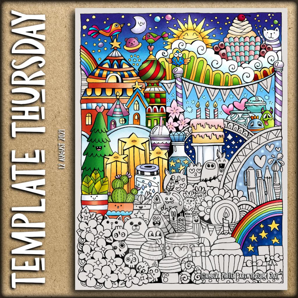
It’s Thursday, so it’s time for another coloring template / coloring page for the members of the Angela Porter’s Coloring Book Fans facebook group.

This week it’s a cute, whimsical and silly Doodleworlds design. Oddly, there’s not a skull in sight! Still, it’s a lovely mood booster, and I need that at the moment.

There’s also a new color palette challenge for August in the group – bright, cheerful and tropical colours. I used the palette to partially add colour to the template.

The template was drawn on A4 Canson Imagine mixed media paper. I added the colour digitally using Clip Studio Paint.

I’m looking forward to seeing how the template is coloured by group members, even using a limited color palette. It’s always great to see how people approach the template differently.

Template Thursday … on a Wednesday?

A sneak peek of this week’s template for the Angela Porter’s Coloring Book Fans facebook group members. And it’s another Doodleworlds style template.

I have a video on youtube, catching up with the last few days’ art as well as starting to colour this template with chalk pastel pencils. Disaster struck as I continued after the video, so turned to digital colouring.

The template will be available in the facebook group tomorrow. Now, I need to take a nap as I really haven’t had enough sleep the past three nights and I’m barely keeping my eyes open.

Abstract Entangled Art | 03/08/’21

This is now finished! Between drawing, adding colour and embellishments, it’s taken somewhere between six and seven hours, I think.

Materials used:
* SeaWhite all media paper, 8″ x 8″ (195mm x 195mm)
* Uniball Eye Pen – micro
* Uniball Signo DX 0.38 Pen
* Derwent Graphitint pencils
* Brushes and water
* Derwent Drawing Pencils
* Cold Grey IV Pitt Artist Pen
* White and yellow Sakura Soufflé pens
* Clear Sakura Glaze pen

I actually managed to keep some white space in the design! I may have slightly overdone the dottiness. I did mess up by trying to use the Derwent Drawing pencils to add some darker tones to the green ‘leaves’.

Overall, I think this is good enough to move on to the next project, which is likely to be Thursday’s coloring template.

It’s been nice to lose myself in some art for the sake of art. Especially as my emotional weather is still damp, dull and grey and making me doubt myself. It’s been an emotional rainy spell that’s been brewing for a while, and that’s why I’ve returned to the familiarity and comfort of my entangled art.

I always circle back to entangled art, regardless of my experiments with other media and styles and getting frustrated with colour!

My tricksy emotional weather is only exacerbating my frustrations with colour. I know I need to get the coloured plates done for the Whimsical Cats colouring book, but as I am at the moment I will only get myself into a right royal kerfuffle. So, it’s time to just enjoy drawing, maybe using some colour – time for monochrome colour schemes I think.

Abstract Entangled Art WIP | 02/08/21

Today has been a day of working with colour on various drawings in my sketchbook. This one is the one I’m most happy with; it’s been a bit of a frustrating day, colourwise.

This drawing was finished earlier today, and before adding any shading I wanted to add colour. This time, Derwent Graphitint pencils were my medium of choice, along with a brush and water.

I really like the softer, earthier, more vintage-y tones of these pencils. I was getting frustrated with the brighter colours of the Ecoline watercolour inks and Derwent Colorsoft Pencils.

So caught up in the process of adding colour (along with joys and frustrations), I didn’t realise how much of the day had gone! It’s now about tea-time here in the UK, and normally I do my social media postings mid-morning.

I am tired today. Tired because I was up way too late last night. My mood is weird – I’m content yet at the same time feeling rather sad and teary for no reason that I know. My EMDR therapist told me that in the West, we are convinced we can only feel one emotion at a time, but in the East it’s accepted that you can feel more than one at a time. I certainly experience that quite often.

The sad and teary may be a manifestation of the tiredness, but it’s nice to know the touchstone of contentment is present in the core of my being. Contentment is always present, no matter what other emotional weather is being experienced. It’s a storm anchor that helps me keep balanced during the less settled periods of emotional weather. For like all weather, emotions do pass in time. For me, I’ll feel much better when I’ve had a good night’s sleep I’m sure.

Abstract Entangled Art | 01/08/2021

Yesterday, I took quite a large wedge of time to intensify the colours and adding shadow and embellishments to the art in my last blog post.

To do this, I used Derwent Colorsoft pencils, along with a blender pencil. The embellishments were added with White Sakura Soufflé, gold Sakura Metalic Gelly Roll, and clear Sakura Glaze pens.

It’s difficult to show the effect of the glaze pen on the artwork, though you can pick some up in the top right of the artwork on the left.

Is this the magic formula for me working with colour? A limited colour palette, simple watercolour washes, shadows added with a grey pen, intense colours with pencils, and embellishments with various pens? Maybe.

The drawing to the right was testing this idea out, though I didn’t use a grey pen to add shadows but a grey pencil. I really enjoyed how the coloured pencils added colour and depth to the artwork.

Too many dots? I don’t know. Probably. I do tend to get carried away with them!

I have learned that I can’t use the Zest-it blending fluid anymore – my asthmatic chest doesn’t like it at all! The Derwent blending pencils are a bit abrasive and moved some of the black pigment from the drawing. So, I switched to a Faber-Castell Blending pencil, and that worked just fine.

I also noticed that the blending pencil made the colours more vibrant – both the coloured pencils and the background watercolour wash. I think it’s because it leaves a glossy sheen, which I bring out by ‘polishing’ with a paper towel.

So, lots of learning and experiences yesterday and this morning, and perhaps progress in my use of colour by mixing media to my advantage.