It’s Friday so it’s #dangleday! E is for … echinacea (cone flower), envelope, earphones, Earth, eight (or eleven, or eighteen or eighty – you get the idea), eight-sided octagon, eighth-notes (semiquavers).
Purple and gold are complementary colours so I chose them for the pusscat, the monogram and the octagon with my initials in it. I chose silver as the colour for the frame around the monogram simply because it’s my favourite metal and I fancied a change from gold beads and so on. Pink hearts and earphone accents. Yes, the headphones had to have cat ears on them, and yes, I have a pair like this, but the ears are blue.
Cute kitties, cute charms and letters. Looking at the monogram now, the letter could do with a shadow around it, but it’ll do as is.
I sketched the design on dot grid paper. After scanning the sketch in, I inked it in using a Microsoft Surface Pen on my Microsoft Surface Studio screen. When I was happy with the line art, I added colour and texture to the dangle design. The final steps were to create a coloured and textured background and a drop shadow for the design.
A nice way to spend a couple of hours on a cool, grey, damp Friday morning.
If you like dangle designs and would like to try your hand at drawing your own then my upcoming book ‘A Dangle A Day’ is available to preorder ahead of it’s release in January 2019. In the book I take you through drawing monograms and dangle designs in easy steps. The book includes lots and lots of examples and ideas for designs too.
Oh, it’s also #furbabyfriday over on the Angela Porter’s Coloring Book Fans facebook group. We’d love to see your furbabies there.
A busy couple of days
It’s been a nice way to spend a couple of hours this morning. A relatively easy and relaxing couple of hours too. I really need a day of self-care after a couple of crazy days for me.
Wednesday I had a very anxious kind of day. Anxious in a good way but it was also very emotionally draining. I spent the day on a media training course with Sarah Hibbert at the Mind Cymru offices in Cardiff. The day was all about learning how to be effectively interviewed by the media in reference to Time to Change Wales and it’s campaign to end stigma and discrimination around mental ill-health. A large part of the day was spent being interviewed and recorded on video camera then watching ourselves back and having feedback about how well we did and how we could improve.
It’s horrible seeing myself on video. I cringe so much. It provokes the inner critic so it rises up and attacks me, noticing every little flaw, mark, error, how the camera exaggerates features and so on.
It was a good day, the training was really excellent and gave lots of things to consider going forward.
I came home exhausted, barely able to string two words together. Having to travel in the rush hour so it took me nearly an hour and a half to get home, a journey that is usually less than half an hour, didn’t help at all.
I then tried to get to sleep early as I had to be up and into the shower at 5:15am so I could be dressed and ready to leave home around 6:10am to head out to Pembrokeshire College in Haverfordwest for around 8:30am, picking the lovely Russell up on my way.
The staff at the college had a wellbeing day and Russell and I were both involved for Time to Change Wales, with me giving two anti-stigma talks in the morning.
The day was lovely, the people were friendly and welcoming and some told me my talk was inspirational and I was brave for telling my story. The receptionist was an absolute darling; when I handed in my visitors badge she handed me a roll of papers saying ‘This is for you’. I had no idea what it was, thinking it may be a certificate for taking part in the day. When we had a look she’d gone online and found and printed loads of memes with wonderful words on that she thought would help me. I was really, really touched by her gesture.
The journey there and back again, a 200 mile round trip, went quickly as Russell and I chattered about all kinds of things. Russell did amazingly during the day as well, as he always does.
When I got home, I managed to empty the remains of the mocha in my travel mug over my handbag, and inside it. There’s no way I can salvage/clean the bag. It also went over my bullet journal, so I’ve ordered a new one as this one is wrecked. So today is a bujo-less day for me as the new one won’t arrive until tomorrow.
I had a very quiet evening, retired to bed earlier than usual and had a good 8 or 9 hours or so sleep. This is unusual for me, and I must’ve needed it.
I missed doing art over the last couple of days, but it’s been nice meeting new people, even though it does exhaust me, me being an introvert.
Digital or traditional art? My perspective.
Today, as I’ve said, it’s a self-care day, so art is definitely on the cards, as well as some flute practice I think.
I also have to think about, and ask for opinions on, digital drawing vs traditional drawing.
I love doing both. They both have their pros and cons.
I use a Surface Pen on the Surface Studio screen in just the same way I would use a pen or pencil on paper. I hold the pen the same way, I make lines and marks the same way. The only difference is that the paper is virtual and doesn’t exist unless I print it out.
With digital drawing I can make use of tools such as mirror and symmetry to help me with some elements of my art, particularly mandalas.
I rarely use tools like line smoothing and predictive lines (if anything predictive lines annoy me, they never end up as I want them). I do use line smoothing if I’m drawing a long straight-ish or curved line, but I still end up with wibbly bits.
I like to have the wibby bits, and I’ve carefully set up the pen ‘brushes’ I use so that they mimic Sakura Pigma Micron pens or Uniball Unipin pens in how the edge of the line is uneven due to ink bleeding.
Depending on what I’m doing, I do make sketches in pencil or pen on paper, scan that in and use it as a guide for my digital drawing.
The big advantage to working digitally, however, is the ease with which corrections and adjustments can be made.
I have, on very, very, very rare occasions, ‘copied and pasted’ a design element to create a design; so rare that I think I’ve done that once, maybe twice in the three years or so that I’ve been working digitally.
I love to draw traditionally too, with pen on paper. It’s a different kind of sensory experience, no better or worse than digital drawing. Just different.
It can be frustrating when an error is made or ink is smudged or the pencil line won’t erase properly. I then can use my digital tools to clean up the scanned in image, sometimes seamlessly erasing and re-drawing the area that needs correcting. No one notices when I do this as I’ve honed my skills and my pen ‘brushes’ so that they are as near the drawing pens I use on paper.
What can cause me problems digitally is that I lose sense of the scale of the patterns/designs I’m drawing and I can get way too intricate for traditional colorists to add colour to them. That’s why I often sketch at least an outline of the design out and scan it in draw the finished line work digitally. This is all because of the ability to zoom in to the area I’m working on. So, I often need that pencil/pen on paper guide to keep my drawing at the right kind of complexity.
Before I worked digitally, I thought that it would be easier, simpler than working traditionally, that the skill level would be lower, that anyone could achieve fantastic results.
However, I’ve found that opinion is completely false.
Yes, digital tools make certain aspects of drawing a bit easier, such as symmetry. However, it’s just as difficult to draw digitally as it is traditionally. It’s taken me a long time to get my pen ‘brushes’ set up so they mimic my traditional pens. It’s taken me a long time to be able to draw on the screen with the same precision and smoothness of lines as I can on paper. It’s been like learning to write and draw again.
I’ve had to learn, and continue to learn, a whole new skill set that you don’t need with traditional pen and paper.
I can do things digitally that I could never do with traditional media.
Digital drawing, digital art is NOT traditional art’s poor cousin. Drawing digitally, as well as coloring digitally, does not mean I’ve gone over to the dark side at all.
I’ve had comments made about mandalas I’ve drawn digitally, taking as much time over them as if I’d drawn them traditionally, that it’s a pity that they’re digital, as if my skill, my creativity is less because I use the digital tools. That made me feel pretty worthless at the time, to be honest, and comments like that say a lot either about the tastes or prejudices of the person making the comment.
They liked the mandala until they saw it was digitally created, which meant they no longer liked it.
More recently someone showed me a comment about one of my coloring books where the person didn’t like it because I’d drawn the images digitally so I’d sold out and gone to the dark side. There was none of the human touches or faint lines where pencil had been erased (erm, there’s never any of that in my work as I’m asked to clean it all up!), that the lines are too perfect, too much copying and pasting was used (never – except in one template) and so on.
Again, this said a lot about their prejudices. I work hard to keep the human touches in my art work – the wibbly lines, the imperfect circles and so on. The pens that have the irregular edges.
It’s almost like those who choose to do digital art are somehow less than traditional artists – less skilled, less hardworking, less human, less creative, less talented.
I don’t think I am. I think I do a fairly good job with digital and traditional media, often mixing the two together such as when I digitally color a traditionally drawn design.
I don’t think I’m lazy by drawing digitally – it takes me longer, even when I use the symmetry tool for mandalas, to create a mandala as I’m able to add more details.
I like to think I have a good level of skill in traditional art and that I’m getting better with the digital art.
I’m sure I don’t take full advantage of the digital medium as I seem to try to work in it as I would as a traditional artist! I just treat it as a different brand of pen, a different kind of paper, and a different kind of coloring medium, with the ability to layer and use a huge color palette.
I work hard to keep my style of drawing quintessentially ‘Angela Porter’ no matter whether I draw traditionally or digitally.
In my next book for Creative Haven, Entangled Forests (available for pre-order), I actually have a mixture of digitally drawn and traditionally drawn templates in there.
That’s a reflection of me, how I like to work, and how I can get the effects that I want in the drawing.
However, even with the traditionally drawn images there’s some digital ‘art’ going on as I have to scan them in, clean up smudges and errors and make corrections based on suggestions from the editorial team at Dover Publications Inc, and you’d be hard pressed to find these corrections and clean ups, though you may work out which is drawn digitally and which is drawn traditionally if you look hard.
One of the things on my list of things to do is to start a YouTube channel where I can show how I create my art. Perhaps that will help to end the stigma and discrimination that exists around digital artists, so that I, and others don’t get comments such as ‘ I liked it until I saw it was digital’ or ‘I used to like them until they sold out and gone to the dark side of digital drawing’.
A couple of years ago this would get to me. I’d lose my confidence in myself, I’d doubt myself, I’d want to give up. But not now. I take it in my stride. You can’t please all people all the time, especially as art is such a personal kind of thing.
However, comments such these say far more about the person making them and their likes/dislikes than they do about my art. On the back of a comment about me having sold out, it turns out that my newest book ‘Entangled Butterflies’ was fully stocked in a Walmart on Monday; by Thursday it had sold out, and one of the members of the Angela Porter’s Coloring Book Fans facebook group had let me know they’d had the last copy.
I don’t know what’s occurring with WordPress, but the colours of this particular dangle design aren’t quite so grey and dull. I’ve noticed over the past couple of weeks that when I upload an image the colours change. Never used to do that…
Anyways, today’s dangle design was fun to draw and I chose to use a different color palette than is usually for me. It’s not more pastel, it’s more subdued perhaps. I actually quite like it, which has surprised me!
I do tend towards bright colour palettes, bright and vibrant. For me to choose a more subdued one is very unusual, but it’s something I think I may work with more now as I rather like this one.
Also, I’ve chosen just 7 colors that I’ve used tones/shades of – cool grey, cool violet, antique pink, a blue-green, a yellow-green, soft blue-grey and old gold tones.
Again, using just a few base colors rather than a whole host of different colours is not my usual way of working. What I’m beginning to realise about this is that it gives a much more cohesive look to the finished design. With the colours being more subtle, it also gives a much more grown-up even, dare I say it, more sophisticated look to what is a rather simple and whimsical kind of design. It particularly works well with the monogram ‘C’.
In fact, the cute kitty is really the only whimsical element of this design. The others are simple, yes, but not quite so cute and whimsical. However, I wouldn’t remove the kitty-cat as cats are the theme of this series of monogram dangle designs.
I’ve said it before that I really struggle with seeing my art as others see it. I often think my art, like this, is rather childish, simple, unsophisticated, naive with no real artistic value at all.
This is part of how I think of myself and it’s part of my CPTSD. I’m working on it. For me to recognise that I’ve done nice things, things I feel proud of is a step or two forwards. However, there’s that nasty inner critic that does its best to derail any positive thoughts I may have about myself or the things I do.
Anyways, onto the nitty gritty of how I created this dangle design.
The steps I took were:
sketched out the design on dot grid paper
scanned the sketch into Autodesk Sketchbook Pro
used a technical pen ‘brush’ to ink in the design
worked out the color palette I wanted to use
coloured the design, in this case using gradient fills for speed
added shadows to the design
created a drop shadow
created a coloured background
added texture to both the design and background
I sketched the design out last night, and it took me between 2 and 3 hours to complete the steps above as this is a relatively small design.
If you’d like to learn how to create your own dangle designs, then my upcoming book ‘A Dangle A Day’ is a good place to start. You can pre-orderit so it’s arrives on it’s release date in January 2019.
B is for birthday balloons, birthday cupcakes, birthday gifts…baking … beads …beautiful cats, beautiful flowers…bullet journal (BuJo)…
It’s Friday and it’s taken me a couple or three days to get this monogram dangle design finished, mainly because yesterday was another jolly jaunty day with Liz (more of that on my other blog – Curious Stops and Tea Shops – when I get to write it, that is).
Today’s dangle design features some cute kitties, as is the theme of my current series of monogram dangle designs.
I started by sketching out my ideas in pencil on dot grid paper then scanning it into Autodesk Sketchbook Pro. The next step was digitally inking in and adjusting the design. Finally, colour and texture was added to the design before adding my watermarks. My digital tools were my trusty Microsoft Surface Pen and Microsoft Surface Studio.
I like the design, not so sure about the colour choices though. I also got a bit heavy handed with the added textures in some places.
After I’ve got my other tasks done today, I think I may print this design out and colour it with my Chameleon markers and see the difference. It looks like we’re going to have some heavy rain and some strong winds here today, so cwtching up indoors with some nice arty stuff to do could be the way to spend some of the day.
Friday means it’s #dangleday. My tutorial book about designing dangles, called ‘A Dangle A Day’ is available to preorder. In it I take you step by step through simple hand lettering, monogram dangle designs, and other kinds of dangle designs, showing how you too can draw and design your own. There’s lots and lots of examples in the book as well as suggestions of how to use them as greeting cards, notecards, bookmarks and framed pictures, as well as in BuJos, planners, diaries, scrapbooks…how to use them is limited only by your creativity!
I got lost in drawing and coloring this dangle design this morning!
I had it in the back of my mind that I’d like to do a series of monogram dangle designs with a kitty or critter theme along with following the letters of the alphabet.
For A it just had to be an angel kitty!
I started with a pencil sketch, then, after scanning the sketch in, I inked it in using my trusty tool trio – Autodesk Sketchbook Pro, Microsoft Surface Pen and Microsoft Surface Studio. Colour and texture was added and a lot of use of layers has been made and a couple of new ‘tricks’ for my digital art spellbook have been learned.
The first was about making solid areas without the black lines by using the fill tool, first in white to block out the sections, then using it as transparent to remove the black.
The second was figuring out how to use layers so I could use a natural blend brush on these sections without messing up bits I was happy with. This may seem an easy thing to those of you who are digital art experts, but I’m slowly learning what I need as I need to learn it!
Finally, I explored the use of a natural blend brush and really enjoyed working with it, once I’d figured out how it works.
I really, really enjoyed doing this one. Cats as a subject for my more whimsical, doodley type art are something I want to do more of. Maybe other critters too; I also have a soft spot in my heart for ravens, koalas, badgers, and many others!
I wonder what B is for… will turn out to be? Birthday Badger? Bookworm Kitty? Baker koala? Any suggestions? Leave me a comment here, or on facebook, on twitter (@artwyrd), or on instagram (@angela_porter_illustrator). I’d welcome suggestions and maybe I’ll draw your particular one, not just for the letter B, but for any other letter of the alphabet.
Of course this is a dangle design, and monograms, handlettering and dangle designs are some of the topics I cover in my tutorial book ‘ A Dangle A Day ‘ which is published in January 2019, but can be pre-ordered now.
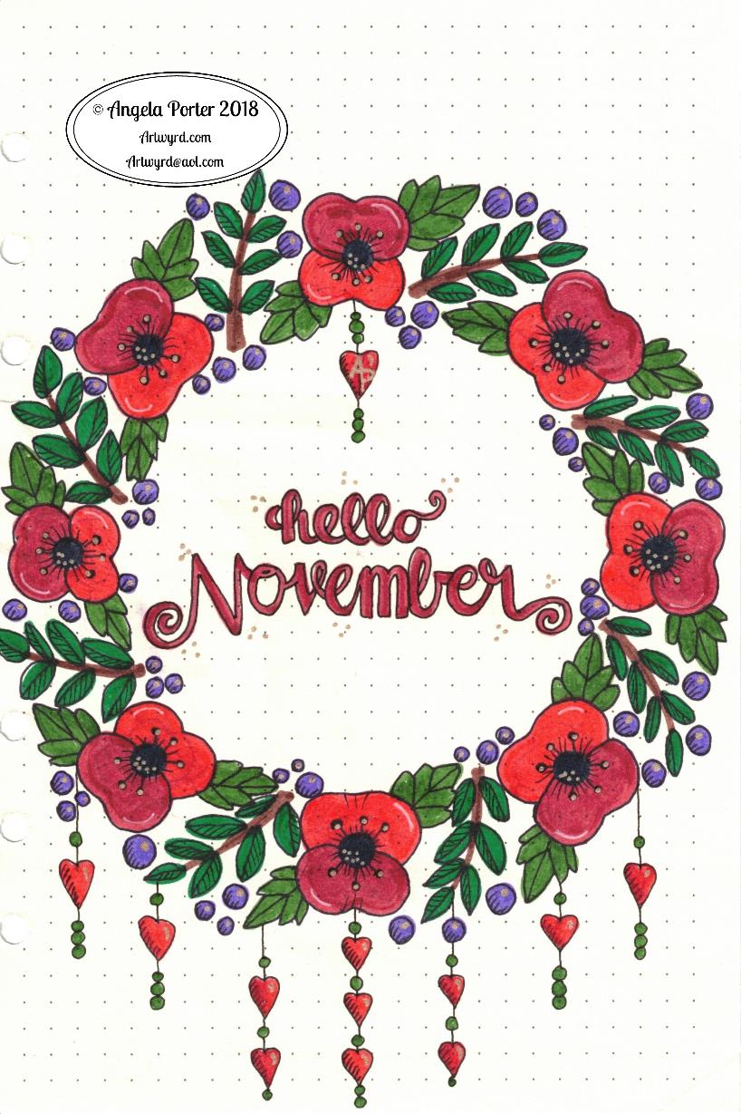
I wasn’t happy with my first version, so I thought I’d use it as a start to create a digital version of my November BuJo page.
Done with the magic of my Microsoft Surface Pen and Studio and Autodesk Sketchbook Pro.
The only place I made use of gradient fills were the hearts, the rest was coloured as if I was using marker pens, with the use of a blending tool.
A couple of simple dangles add some interest to the space below the wreath of poppies, foliage and berries.
I kept the colour scheme really simple to the reds, greens and dark greys so that the design is much more cohesive. The use of a texture brush makes the colouring a little less perfect, as it does on the background too.
I also added a drop shadow to give the illusion that the design is floating a little bit above the page.
My current thoughts on BuJo-ing
My current BuJo is a very minimalist one, though I enjoy designing pages like this. I found I was spending more time on my BuJo in terms of prettying it up rather than using it in a functional way. I do add dangles to the daily logs, when I feel the urge to.
This means I’m making far more use of my BuJo than I was when it was just an artistic/creative endeavour.
Not that there is anything wrong in that. It’s just that I wanted to immerse myself in bullet journaling in a way that it could help me with memories, thoughts, tasks and so on, in a way that I wasn’t doing previously.
And, not worrying if it’s not perfectly written/drawn/recorded is quite liberating actually! It takes a lot of pressure off BuJo-ing.
If I’d thought about it, I could’ve left a page blank at the start of the November logs for a pretty page like this. However, everything is getting rather more mixed up in my BuJo than when it was in my first versions of BuJos, and that makes me feel it’s working more for me as a record of my life, as well as planning a little more, though I don’t over-work that. Keeping track of ideas and notes and events is far more important to me, a more reflective kind of BuJo.
What I love about the BuJo system is it evolves as you need it to. You’re not limited by someone else’s structure, such as in a planner or diary. As your needs for it change, it changes.
Now, that doesn’t mean I don’t make use of colour. Of course I do! That helps in the index to pick out different kinds of contents and helps me separate tasks from events from notes – the symbols are great, but colour really helps me see them. That is a personal preference.
Collections, as always, are really important, and after reading a fair amount of Ryder Carroll’s book on the Bullet Journal Method the idea of threading and indexing back to earlier BuJos actually makes sense to me and seems to be a really valuable thing for me to do as I move forward with this.
As I’m typing away my mind is working on how I could work pretty pages into my working BuJo. I don’t think it’s working pages I need, more like book marks or maybe a postcard or a print out of my design I can use as a book mark …
Oh, the one thing I do pretty up a little bit are my monthly logs, with a pretty border next to the name of the month and year. At present they’re just black and white linework and I rather like the graphic nature of them.
What’s surprised me is how I’ve gone with this more minimal way of doing it. I mean, I love to see how people organise their BuJos ahead of time and so on and the beautiful things they create and there is absolutely nothing wrong with this and if it’s someone’s way to express themselves and/or be creative then I’m definitely all for it!
However, for me I’ve found that setting my daily logs up ahead of time can be a problem as some days I need a LOT more space than I’ve allowed for, and I do like to to make notes in the daily log.
What I have to do is work out if I’m going to do more than the monthly cover and monthly logs for my BuJo or whether I’m still going to come up with ideas for the weekly/daily logs or trackers and collections just for fun.
I don’t know the answer to that rhetorical question at the moment. It will work itself out over time I’m sure.
I have wondered about making some of my monthly cover designs and others available as digital downloads so people can print and add them to their BuJo’s, or use as greetings cards or note cards or or or … leave me a comment with your ideas!
I’m a tad late with the design for the November cover page for my BuJo. It’s very sketchy and rough and the scan has missed the edge of the page to the left. I used Crayola Supertips for the colours and a variety of black drawing pens, a white gel pen and a gold Sakura gelly roll pen for the outlines and highlights. Of course it’s a dangle design too – but a very simple dangle design with just hearts dangling from the wreath. No one ever said that dangle designs themselves have to be complicated, but dangles can add fun little embellishments to other things, such as this wreath.
November to me always means poppies. My dad passed away 10 years ago on the 10th November. He was nearly 87 and a veteran of WWII, Korea and Burma. He saw the effects of fascist Nazi Germany on the everyday citizens there. He was at the opening of a concentration camp. He never spoke of what he saw. In fact, he only mentioned it once when he was very, very drunk after celebrating Hogmany here in the Valleys of South Wales. As soon as he realised what he’d said, he refused to say any more about it and you could see the pain of the memory etched on his face and in his eyes. He joined the British Army to bring an end to the hate and the genocide and the desire for the end of freedom of speech and beliefs and human rights.
He was a kind, caring man who would do his best to help anyone, no matter of their religious or political persuasion. He did so without any expectation of anything in return. He loved to make wine and would share bottles of it around the community. Even when he couldn’t drink much anymore, he would still make wine and would give it away. He enjoyed the process of making it and he enjoyed seeing other people have the pleasure of drinking the wine. This is a quality I only recently recognised in myself.
Last weekend, I took my amigurumi monsters and knitted pumpkins to the hallowe’en coffee morning. All the pumpkins had new homes with people asking me ‘are you sure you want to give them away after the time you’ve put into making them?’
My answer was that I enjoy making them and if I can find new homes for them, my home would be too full for me to make any more. I added that it’s lovely to see other people enjoy them. At a meeting last night I was told some of the boys at a youth club were fighting over the pumpkins and the lady who’d taken them said ‘I’m sorry, I had to give them to the boys’. My reply was, ‘It’s ok, I’ll make some more for you and them. I enjoy making them and that others enjoy having them warms my heart too’.
Something else I realised about my dad as I’m writing this is that he loved the old war films – John Wayne’s films, Dambusters, 633 squadron and the like. I think they gave him an alternative narrative, something less painful for him to remember about the wars he was involved in. I remember him just throwing his medals back into their box dismissively. He didn’t think he was brave. He didn’t think he was a hero. I think they just reminded him of the horrors he must’ve seen. I do know he wanted me to have his medals when he passed away, he said I would understand what they meant to him. I think I do.
His medals didn’t come to me, as my mother decided she knew better than he did about where his medals and other belongings should go. I’m not bitter or upset about that, as the words my dad said in the hope I’d get him and understand him one day were the real legacy from him, not objects.
We used to have long conversations when he followed me out to my car when I left after a visit to the family home. I always knew I’d need to leave an hour before I needed to so we could have these long chats without my mother talking over him or telling him to shut up or making fun of him. I think he and I are a lot like each other in many ways.
He developed Alzheimer’s a few years before his passing. He caught pneumonia, was admitted to hospital and they found he had a tumour in one of his lungs. Eight months later he passed away. At first I’d sit with him and he’d talk to me about his younger days, his childhood, things he’d never told me before. But as the days and weeks went on his memories faded away until he was unaware he was in a hospital.
I visited him as often as I could as even though he didn’t know who I was consciously, having someone with him would calm him and he’d be more settled.
I was with him when he passed away, and even then he helped me to learn and understand various things.
These are just a few things I remember about my Dad. He wasn’t perfect, no person is. But, he was the person who took me to music lessons and choir practice and came to the concerts I was involved in. He took a genuine interest in what I was doing and he features in many of the very few pleasant memories I have from childhood and beyond.
So, forgive me my indulgence writing about things not related to arty things. Except that in many ways they are.
My art isn’t full of profound meaning and commentary on society and so on. I make art that is pretty, colourful, often abstract, sometimes whimsical. What I hope is that it makes people smile, gives them some pleasure, some joy in looking at it. By sharing it I share my pleasure, my joy, the peace that I find in doing art with others. As I do in making knitted pumpkins and amigurumi monsters and other things and gifting them to others. Just as my dad enjoyed making wine and also enjoyed the pleasure it brought to other people.
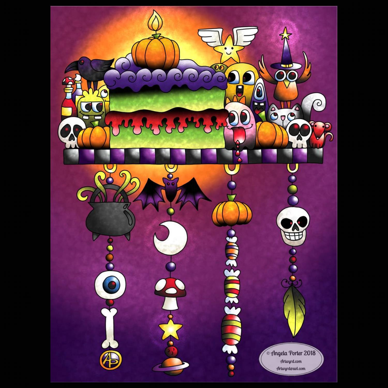
It’s All Hallows Eve, or Hallowe’en or Samhain as you prefer. It’s also the last day of Inktober 2018. Here is my offering based on the prompt of ‘slice’
Well, it had to be a celebratory slice of cake, complete with a pumpkin candle and all kinds of cutely spooky monsters and critters and so on.
This was, as all have been, fun to do. I quite like the grungy look I’ve achieved with the use of texture brushes and slightly duller colours along with black as a component of the gradients.
I sketched this in pencil on dot grid paper, scanned it in and used Autodesk Sketchbook Pro to draw and colour this dangle design.
Yes, it just had to be a dangle design to round off the month of Inktober!
My Microsoft Surface Studio and Microsoft Surface Pens were my magic tools to help me create this.
Now I see it in a smaller size, I can see where some highlights and lowlights would help to increase dimension in places. However, it’ll do as it is as I do have to finish the templates for my new book Entangled Forests. Yes, the cat is out of the bag on the theme of this coloring book for Creative Haven by Dover Publications. You can pre-order it on Amazon and it’s due for release in July of 2019. I should have all the templates completed today, then it’s just colouring a couple of them as examples in the book.
Before this book, Entangled Butterflies is due out in November 2018 and A Dangle a Day in January 2019.
I said (typed?) it yesterday – I’ve enjoyed Inktober, for many reasons, and I hope you’ve enjoyed seeing what I’ve created using the daily prompts.
Oh, as it’s Hallowe’en, there’s a little event going on over on the Angela Porter’s Coloring Book Fans facebook group. I provided a hallowe’en themed coloring template at the start of this month and asked everyone to hold off posting their finished versions until today. I’m hoping for a flurry of postings throughout the day to give a lovely, cutely spooky feel to the group throughout this day! I have my own version of the template to post there in a short while too, and I’ll post it here later on today as well.
However you spend your All Hallows’ Eve, have fun and keep safe too!
I decided to use mongrams with dangles to form today’s prompt ‘Jolt’ for Inktober 2018. I also wanted to use a bright colour scheme to jolt eyes awake, perhaps.
I started by sketching the design out on Clairefontaine Grafit dot grid paper. I scanned the sketch in then inked it in and coloured it digitally using my trusty trio of Microsoft Surface Studio, Microsoft Surface Pen and Autodesk Sketchbook Pro.
I have absolutely no idea what the designs in the dangles have to do with the prompt ‘jolt’. They just came to me as I was drawing them out, and today that’s good enough for me!
Inktober 2018 is almost over and it’s perhaps time to reflect on it all.
It’s the first time I’ve taken up any art challenge, apart from contracts for work that is. I thought it could be a bit of an onerous thing to do, time consuming and so on. Well there have been days where it has been a bit like that, but I’ve also had days where it’s been a relatively quick process too.
I have enjoyed having a daily prompt to get the creative juices flowing and to encourage me to draw every day. Not that I don’t draw everyday. However drawing with a prompt is different for me.
Well, I do draw with a theme, such as when working on a book. But that theme is the overarching focus for a series of illustrations. To have a different prompt each day and without the drawings having to fit to a particular size or format and just for fun is something that is different.
It’s had me thinking outside of my artsy box at times, at others it has let me draw styles that don’t usually make it into my books. With that, my mind is working on what I can do with these kinds of images. My mind is working on that…slowly.
I have been wondering if I’m going to take up another challenge in the coming month(s) and I’m not sure about that at the moment. If anyone has any suggestions, please feel free to leave a comment!
I certainly have some ideas listed in my BuJo to think about and work on in the coming days/weeks/months.
It’s been a good thing to do, this Inktober thing, and part of me is sad to see it come to an end.
Will I do Inktober 2019? I don’t know. It will all depend on what’s going on in my life in a year’s time, but if possible I think I will.#
Just a reminder, my book about how to design and draw dangle designs and monograms – ‘A Dangle A Day’ – is available for preorder
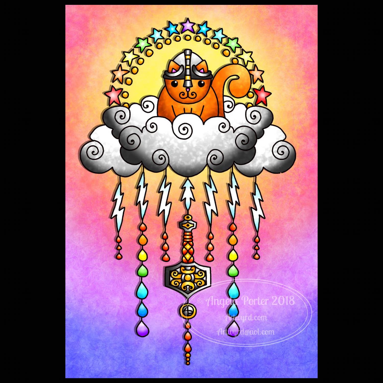
Re-drawn and coloured digitally. I used my usual digital tools – Microsoft’s Surface Pen and Surface Studio along with Autodesk Sketchbook Pro.
Thunder Kitty had to be ginger! I couldn’t resist some rainbow stars and raindrops either, as well as adding to the dangles on the original sketch.
Nice way to spend an hour or two on a Sunday afternoon after having had a sleep – I really was exhausted after the stress for me surrounding the craft corner at the coffee morning, doing the craft morning and an evening with people, as lovely as all the people were.
The introvert me likes spending time with arty crafty projects.


 I decided to use mongrams with dangles to form today’s prompt ‘Jolt’ for Inktober 2018. I also wanted to use a bright colour scheme to jolt eyes awake, perhaps.