Hello January! A Dangle Design

©Angela Porter 2019

What a bright, sunshiny morning it is here in South Wales in the UK. The first sunshine of the new calendar!

I’ve been up for around 3 hours and have had a fairly artsy time.

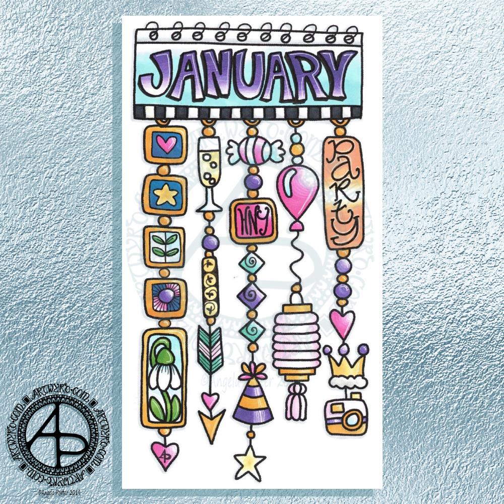
My first job was to print out the lineart for this dangle design, which is one of many in my book ‘A Dangle A Day’ which is due for release on 8 January 2019 – just a week away!

In the book, I take you through how to draw this design, one step at a time. Not only this design, but well over 100 more – designs for all seasons and many, many celebrations and occasions.

This design I drew in Autodesk Sketchbook Pro using a Microsoft Surface Pen and Microsoft Surface Book. For the book, I coloured it digitally. Today, I printed out my black and white lineart and then coloured it using Chameleon Color Tones and Color Tops marker pens. I also added some details to some elements of the design using a 08 Uniball Unipin pen and a white Sakura Gelly Roll Pen.

Yesterday, I said I need to to spelunking through my stash of mixed media and cardmaking supplies to find forgotten supplies I could use to embellish my designs.

This dangle design would make a lovely monthly cover page for a BuJo (bullet journal), planner, diary or journal. It would also make a pretty greetings card or notecard to drop a line to a friend wishing them a wonderful January. Change the words and colours to suit the occasion or recipient! It would also be a lovely, whimsical, cute design for a winter party invitation.

I realised then that my old watermark wouldn’t do for this year. So I hand lettered a new one. I made my symbol, the one I hide away in my artwork, part of the design, along with a little intricate but simple geometric pattern around it. A little touch of the uncials for my blog address, along with a typed copyright statement and it’s done and saved! I may end up changing it a little, or having variations on the theme, as time goes on. But I’m fairly happy with it.

So, I’ve already had a productive morning! It may be a Bank Holiday in the UK, but I really do need to focus on those templates that need colouring for Entangled Forests…and I may venture forth into the peopley world later on today, maybe.

Monogram J Dangle Design

©Angela Porter 2018

Yesterday I said I wanted to turn one of the J monograms into a dangle design, and that’s exactly what I’ve done here!

I do seem to be favouring teals and pink as a colour combination for these letters lately. The colours were added using a combination of Copic markers and Chameleon Color Tones pencils. Again, I chose to use Copics simply because I wanted a ‘wash’ of pale colour to which I could add shading with the pencils. I also used a metallic silver pencil to add some subtle silver elements as well as a white Sakura Gelly Roll pen to add some white dot embellishments.

For the charms in the dangle, I drew inspiration from my recent delving into things Medieval to create some that are a bit different to my usual kind. A heart seemed to be an obligatory charm for me to include.

I worked on Daler Rowney Marker paper and used Uniball Unipin pens for the black lines.

There’s quite a nice juxtaposition between the sharp, angular lines of the monogram and the rather softer, rounded shapes of the charms.

I also could’ve dug into my neglected stash of media from my days of mucking about with mixed media and card making and so on to find Stickles, NUVO drops, foil glue and foil, sequins, sparklies and so on to add more sparkle and shine to the design. Something I need to think about again in the future. I’d also have to work on sturdier paper than the Marker paper.

I feel that the dangle could be a bit longer to give a more elongated and elegant design. However, I ran out of paper! I may have been able to squeeze one more charm in at the bottom … but it would’ve been a squeeze!

Note to self – when doing monogram dangle designs on A4 paper, make the letter a little smaller so the dangle(s) can be longer!

Today, my attention must turn to colouring the 2019 templates I designed for members of the Angela Porter’s Coloring Fans facebook group for the New Year’s Day Color Explosion event, starting at midnight as 2018 turns into 2019. I think some may jump the gun on that though! Still, it’s a bit of colourful fun.

It’s only just over a week until ‘A Dangle A Day’ is published. In the book, I take you step by step how to create over 100 dangle designs for yourself, as well as giving some advice about hand lettering, using dangle designs, and creating your own using elements in the book, or your own too. I really do hope you will all give drawing dangle designs a go – they look complex, but, as I show in the book, they only take a few simple steps. They also suit my rather intuitive way of designing, drawing, creating. However, they also work for those who like to plan things out first.

Monogram R

©Angela Porter 2018

I started work on these early this morning – around 7am. And I’ve finished for now – it’s around 9am. I’ll return to them later today or tomorrow as I have a lil trip out for lunch with a friend.

Some different kinds of styles appearing in this little bunch!

The big R at the top is mostly done – it just needs some colour I think. It’s also similar in style to the previous monograms, starting with the yellow K did a couple of days ago. It’s been drawn with 08 Unipin and 04 Sakura Pigma Sensei pens. Green metallic embellishments have been added with a metallic Sakura Gelly Roll pen.

The R at the bottom, with the thick lines, was drawn using a Tombow Fude brush pen. Not easy to control the thickness of lines, so I used a Uniball Unipin pen to tidy up the lines and add the bits on the end. Not sure how I’m going to progress with this one.

The two in the middle row have been drawn with the Unipin and Sensei pens.

The R to the right was drawn with a Uniball Unipin brush pen, which is a bit easier to control the line thickness than the Tombow Fude pen. I did neaten up the lines and ad more using the Unipin and Sensei pens.

The bigger the letter, the more space for embellishments – the paper size is A4 (approx 8″ x 10.5″) in size and it’s white and very smooth Daler-Rowney Bristol Board. The smoothness of the paper makes it so easy to draw smooth, even lines on it. It won’t take water colours or watercolour washes, but markers and coloured pencils work fine on it. Tombow Dual Brush pens and similar tend to cause the paper to pill. Of course, I can always use a scanned image to colour them digitally.

Yes, I could also add dangles to each monogram. However the purpose of this exercise is to practice my hand lettering, particularly in this rather ornate and embellished style. Dangles can be added in the future.

I cover drawing monogram dangle designs in my book ‘A Dangle A Day’, which is due to be published in just over a week! Exciting!

Some L monograms

©Angela Porter 2018

Three variations on a theme! All hand lettered and hand drawn on Daler-Rowney Bristol board (A4 in size).

For each I used black 08 Uniball Unipin and 04 Sakura Pigma Sensei pens. Here’s the other media I used for each monogram:

  • Top – Copic markers, Herbin Copper ink with a glass pen.
  • Bottom left – Copic Markers for the base colour, Chameleon color tone pencils for added depth of colour, gold metallic Sakura Gelly Roll pen.
  • Bottom right – Chameleon color tone pencils for the colour and a silver Uniball Signo pen for the metallic highlights.

It’s taken me around 5 hours or so to complete the set of three. I’m still feeling my way with this style of hand lettering.

For the monograms coloured with Copic markers I started by drawing the letter with the Copic markers and then added the black line work before adding the metallic highlights and Chameleon pencil shadows. I love having a solid shape to embellish with line, pattern and metallics. However, white space is only possible by adding lines outside of the main shape. Which is fine. I could add white space inside the letters either by leaving some in the design before coloring, or using white ink to cover up the copic colours. These two letters look a lot more solid and heavy.

For the L coloured with the Chameleon pencils I drew the black line work first. The advantage of this is that I can leave white space within the letter. this gives a bit of a lighter, airier feel to the letter, which is helped with the less dense colour of the Chameleon coloured pencils.

I’m not sure if I like the metallic petals in the top monogram; the ink spilled over the black lines and I tried to add them back in to define the petals but it just seemed to sink beneath the metallic pigments.

Also, the glass pen with copper ink that I used to add the metallic highlights to the top monogram was a lot finer than the Sakura gelly roll so it was easy for me to add tiny patterns and shapes. The Uniball Signo silver pen gave a much finer line than the Sakura Gelly Roll so it was easier to add highlights to the bottom left monogram, but I knew I’d not be able to get as much fine details or patterning with it as with the glass pen.

Overall, I’m fairly pleased with the finished results. I’ve learned that I’d like to leave white space in my monograms when I’m hand lettering them in this way. Maybe if I want to use Copics in future I should use a pale colour to draw the shape of the letter and then use darker tones to add dimension and depth to the design, allowing the lighter colour to act a bit more like white space. Of course, I can always draw the design with black lines first and then add the colour. Each has it’s advantages and disadvantages.

I’m not sure which is my favourite. I rather like the one on the bottom right. As it’s smaller in size I’ve not quite managed to go over the top with the embellishment. I like the white space within the letter. I also like the more subtle colours I’ve used.

I think I’ll take my attention to a different letter now, another I’ve not done a monogram for before, well not outside of my soon to be released book ‘A Dangle A Day‘. Of course, the monograms in the book are all dangle designs too. It would be easy enough to add dangles to these designs for sure, well it would be if I’d left enough space for them!

However, my reason for doing these monograms is to add to my repertoire of hand lettering styles. These may not be entirely unique in the realms of hand lettering, but I do want to work with them and find my own way through this to something that people can look at and say ‘that’s Angela Porter’s work that is’ in the same way they do when they’re familiar with my coloring books and my style of drawing there.

Medieval Monogram Dangle Design ‘C’ – 18 December 2018

©Angela Porter 2019

I’ve spent around two and a half hours on this monogram. I’m still playing with metallic/glitter textures rather than black line work.

I still haven’t ‘cracked’ how to achieve a more dimensional look to the gold lines/beads. No doubt I’ll have a bright idea to try sometime soon.

Medieval, Anglo-Saxon, Celtic and Romanesque art and architecture has long been an inspiration for me, though it’s not often I express it in such an obvious way. This definitely has a medieval ‘feel’ about it, but there’s also a more modern take with the rectangular dangle charms and the very  contrasting gradient colours that fill the patchwork pattern inside of the letter.

I was thinking of adding more complex patterns inside some of these patchwork sections. However, I decided that could be way too busy and went with the dots.

Dots are  a very common embellishment in Anglo-Saxon and Celtic manuscripts. After adding dots to those patchwork panels, I had to go and add them elsewhere. Such a simple thing, the humble dot, but how much it can add to a design.

I love the plain blue panel behind the C, so the letter doesn’t get entirely lost in the background pattern – my favourite little spirals. I like the thicker lines around the letter too, but they’re too ‘flat’ for my liking at the moment. The little square-ish gems in the main outline help to break that thick gold line up, adding a bit more opulence in the process.

I love the dimension in those rectangular panels, particularly the lower one. The high contrast gradations in colour really give it some dimension. I wasn’t at all sure about using the pale yellow to orange color gradations anywhere in the design, but once I’d completed this particular ‘charm’ I absolutely loved it!

Although I don’t show such complex monogram dangle designs in my book ‘A Dangle A Day‘, this design really isn’t all the complex to do. 

Talking of ‘A Dangle A Day’, Lydia at #quartocreates sent me a link to a nice review of the book by Funky Frugal Mommy.

This is a piece of digital art using my Microsoft Surface Pen and Surface Studio along with Autodesk Sketchbook Pro and some texture files purchased via Creative Market.  I did start with a pencil sketch of the monogram and dangle design which was then redrawn digitally.

Another, possibly the last, version of ‘B’ monogram dangle design

©Angela Porter 2018

The previous and latest version of the monogram dangle design. The variation is the background paper colour as well as a drop shadow for the design.

I had a lot of fun as well as some frustration when I found it difficult to do what I wanted to do, though I got there in the end, I think.

I certainly have a few more tools in my digital art toolbox.

Autodesk Sketchbook Pro really makes it easy to create art like this. Though this may have been simpler for more accomplished, learned digital artists, for me it was a bit of a process. However, I have managed to create something I could only dream about doing in traditional media, I think. 

The skills required are, in my opinion, equally as demanding, whether working digitally or traditionally. Don’t forget, this started out as pen and ink line art on paper – very traditional! I just made use of digital tools to develop it into something that definitely has a medieval feel to it but in a modern medium. Indeed, all the lines/patterns were re-drawn digitally using a pen and the screen as ‘paper’ to arrive at these final versions. I did make use of the color-fill tools to colour these ones in, but the addition of textures makes them less digitally perfect and more ‘perfectly imperfect’.

This certainly has inspired me to create a whole series of such monograms over the coming days, weeks or months. Goodness alone knows what I can do with the digital versions as having them printed wouldn’t result in any sparkle where there’s sparkle. However, I do have an idea about foiling my line art, as well as working with metallic inks once more. Indeed, I had a deliver of Encres A Decorer by Herbin yesterday and dug out my glass pen to use with them. So some experimentation with those is likely (as well as digging out my dip pens and nibs too). I think I have some calligraphy ‘parchment’ or ‘vellum’ paper lurking somewhere in my stash as well.

Finally, I think I’m getting comfortable with my style of hand lettering. It sure ain’t perfect. It’s sure ain’t as slick as that of others. But it’s mine, not theirs.

Of course, some of the ideas/tools/techniques I’ve used here I can make use of in my more usual style of art. For today, I want to work on a design for the Angela Porter’s Coloring Book Fans facebook page to help celebrate the changing over of the calendars at midnight on New Year’s Eve as it turns into New Year’s Day. A liminal point of time between one thing and another. A boundary between the old year and the new. 

So, finish my toffee nut latte mocha morning drink I will, then it’s to some hand lettering and drawing, while keeping warm and dry on a chilly, rainy and windy day.

‘A Dangle A Day’ is released on 8 Jan 2019.

Mongram B

© Angela Porter 2018

One monogram dangle design, three different versions.

The first is just the black and white line art. This was drawn with Uniball Unipin pens on dot grid paper then scanned in so the dot grid and faint marks could be removed as well as making a transparent background. This dangle design is much more ornate in terms of pattern than is in my book ‘A Dangle A Day’ but is still easy to do if a bit time consuming.

The second is the line art coloured digitally with some texture added.

The third has the coloured line art floating on a golden sheet.

I’ve not quite managed to get my head around how to convert the black and white line art into golden line art where I can add colour. I suspect it’ll have to be re-drawn, which I’ll most probably do while I’m waiting for a delivery.

I kind of like the gold background, but it is a bit too much as well.

Which version do you like best? Let me know your thoughts!

Hand lettering all done!

©Angela Porter 2018

I finished this up this morning, now the migraine has lifted. I completed the embellishment of the letters. The next task was to scan the work in and remove the dot grid background in GiMP, as well as tidy up any smudges and so on.

Once I was happy with the result, I printed out the words so I could colour and add metallic highlights.

To colour, I used Chameleon Color Tone marker pens. For the metallic highlights (dots) I used a mixture of Uniball Signo glitter gel pens and metallic Sakura Gelly Roll pens.

Adding colour really helps with the read-ability of the letters. I chose to add simple color gradations and kept to one colour for each day of the week.

I really enjoyed doing this – it started as a sketch and I’ve ended up with some hand lettering that looks quite nice.

I will, at some point, do a sampler of this hand lettering style. That would be a great reference for myself, but perhaps a source of inspiration for others.

I’ve mentioned it before, but I really want to create a dangle design monogram for at least one of this style of lettering. I think that’s the next thing on my list of ‘to do’s’ on a day where I’m taking it all a bit easy; although the migraine has lifted I still feel a tad ‘fragile’.

Hand lettering and monograms are an integral part of my style of dangle designs. Although lettering as complex as this isn’t covered in ‘A Dangle A Day’, I still offer suggestions and step by step instructions for creating dangle designs. 

A Dangle A Day is published on 8th January 2019. 

Hand Lettering – WIP Wednesday

©Angela Porter 2018

I woke this morning with a dreadful migraine. Two emotionally draining days – therapy on Monday, an anti-stigma talk for Time to Change Wales yesterday – can cause such a reaction in me. It’s my body’s way of saying ‘Woah there Angela! Enough! Time out is needed! Self-care! Nothing else stressful for today at least, please!’.

So I’m heeding my body’s message. I was due to take all my accounts stuff to my accountant, but my vision and concentration is impaired enough that for now I don’t feel safe to drive. I know that with a quiet day and a nap later on I’ll recover. 

Even though my eyesight is affected a bit, doing art actually seems to help with the headache. I think it’s a mindful activity that lets my mind and emotions relax.

So, I wanted to complete my days of the week in a Lombardic style script, and here’s my work in progress. You can see my pencil lines, both as a guide for letter heights and for the shape and spacing of letters. By drawing the outlines in pencil first it means I can easily make adjustments as I ink them in.

Next steps, when my head has cleared a fair bit more, will be to add the patterns in the letters. This really does help to define the letter shapes I think.

I definitely want to try some of these letters with dangles on them. Perhaps that’s what I’ll do while I’m waiting for this migraine headache to shift somewhat.

A Dangle A Day’ is due for release on 8 Jan 2019

Hand lettering practice

©Angela Porter 2018

Today has been a bit of a busy day. I woke still drained from yesterday’s EMDR therapy session. No EMDR though as I was just too emotional and ‘raw’ to go through it, so it was a lot of talking around how one trigger event had caused several trauma ‘streams’ to rise and flood and confluence. I was stuck at that confluence where white water rapids had formed and I was being buffeted about in the eddies and currents and waves.

So, it was self-care last night when I got home, which involved a bag of chips from a local chippy, with curry sauce, Harry Potter and the Goblet of Fire and starting to crochet an amigurumi ‘dumpling cat’ from a new book that was delivered yesterday. Then, there was the journal writing before I went to bed.

This morning I had to be up early to go give an anti-stigma talk to a group of police officers. That drained me emotionally once again. However, it was a good thing to do as they all found my talk really interesting and useful. My Time To Change Wales champions hat was polished up a little bit once again.

I came home and finally had some breakfast and ended up in bed to sleep. That’s one of my coping strategies when I’m so emotionally drained. I still feel dazed and dazzled by it all, but am on a bit of a more even keel now.

I didn’t want to let the day pass without doing something with pen and paper or screen. Hand lettering seems to be my thing at the moment so I thought I’d have a go at hand lettering some of the days of the week.

For reference I used the Lombardic Capitals set in ‘Decorated Lettering’ by Jan Pickett. 

They appeal to me partly because the space inside the letters lends itself so much to adding patterns, but because of their oldy-worldy nature. I love Anglo-Saxon, Celtic and Medieval illuminated manuscripts and this style of lettering, in a slightly more modern form, appeals to me.

I discovered it’s a lot easier to form the letters when you draw them big – hence why their size increased from Monday to Wednesday.

Dot grid paper is a godsend as it helps with the consistency of size of the letters, though I suspect that as I become more comfortable with my skills that I may experiment more with that.

A nice way to spend an hour or so this afternoon, and I have the rest of the days to look forward to doing, along with adding patterns to the open letters.

Mind you, the letters without patterns would look lovely just coloured with colour  gradients, and I’d love to add metallic highlights/accents too.

First, I need to get a bit more proficient at hand lettering and working on plain paper.

Of course, I can always scan my lettering in and remove the background and dotgrid so I can print it out on paper suitable for a colouring medium such as watercolours and metallic paints.

Cheating? No. I don’t think so. I would’ve already done the work in the first place. Printing and colouring is, to me, perfectly acceptable.

But that’s for another day. For now, I had to get myself sorted to pop out for the evening.

I’m also musing about adding some dangles to the letters – dangles with charms that are reminiscent of medieval ornament or jewellery, for example.