Monogram B Dangle Design

©Angela Porter 2019

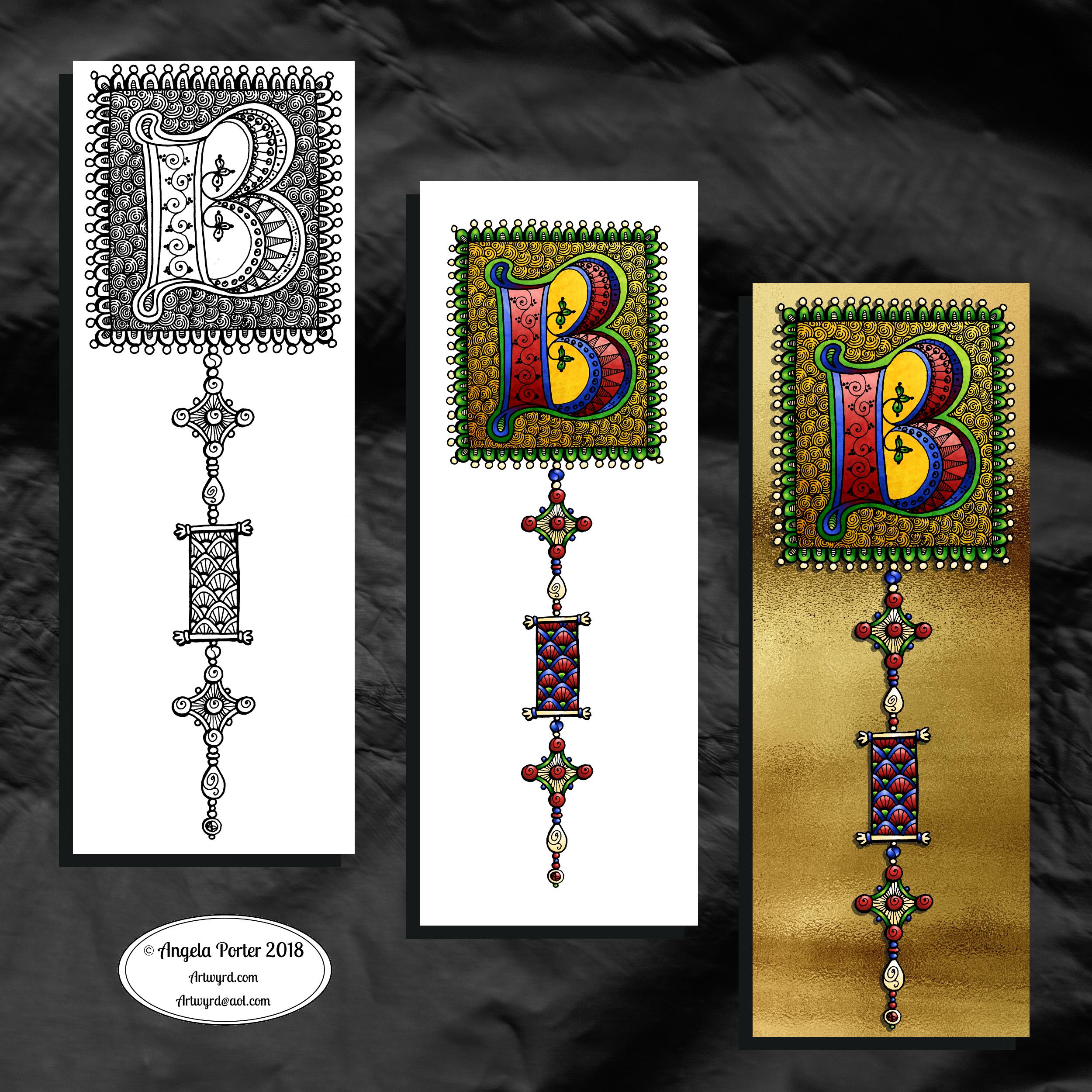
Originally, I drew the original version of this design with pen and ink on paper. I wanted to edit the design and add a dangle to it, so decided to work digitally (Microsoft Surface Pen, Microsoft Surface Studio and Autodesk Sketchbook Pro).

By working digitally, I could edit and amend the design easily, using the original sketch as a guide. You can see that I made quite a few changes. I’m much, much happier with the blue version. The pink one is pretty and a good start, a way to experiment, but the blue one is the more polished, finished version, and not just because it’s been drawn digitally!

For the original sketch, I used a copic marker to draw out the basic letter shape and then used Unipin and Pigma Sensei pens to add the lie details. The copic is patchy, but that’s because it was a quick sketch.

I like the increased amount of white space in the new version – it does add a bit of a stained glass look to the design. I also like the stylised roses inside the ‘B’ in the revised version; adding the patterns inside the rose rather than on the edge helps the rose to stand out from the coloured section by giving a mostly white border.

Once I’d thickened the main beams of the letter, I added dots to carry the lines on. Then, I decided it could be fun to echo these dots by carving out dots in the flared ends of these lines. These dots have lightened those lines up, adding some airiness as well as interest.

Oddly, as I look at them I am minded of a very Old  Bridge here in my home town. The bridge was built by William Edwards in 1756. When it was built it was the longest single span bridge in the world. The addition of 3 holes at each end of the bridge allowed it to bear the weight of the stone and not collapse. It is these holes, the lightness they gave to the design that I recalled when I was thinking about those ‘holes’ in my blue B.

I really wanted to add a simple dangle to this monogram – the letter is ornate enough that it could be too fussy if I’d added more than one dangle, or made the dangle ornate. Of course one of the charms had to be a heart! Simple beads and a diamond charm complete the dangle. My dangles often remind me of jewellery!

It’s not very often I show any kind of editing or reworking of my artwork, that’s because I do tend to work very intuitively and don’t really draft my work. Sometimes, I may do a pencil or pen sketch for an illustration for one of my colouring books, especially if it’s a kind of ‘scene’.

Since I’ve been working digitally, however, I do seem to be doing a lot more of the sketching out or working more roughly and using this as the sketch for the digital art.

An added advantage is that this satisfies my need to work with traditional media. Also, by working on paper I get a better idea of the scale of the finished artwork.

I think I’ve said it before that I do struggle with a sense of scale when working on a screen due to the ease of zooming in and out. Paper is a fixed size so I can appreciate the scale far more, and it seems easier for my brain to get a better idea of the whole design.

It’s all part and parcel of my artsy journey, figuring out what is best for me and not trying to work like others or being worried about how others judge me and my process. More than anything though, it’s about me learning not to be such a harsh judge and critic of myself. One negative review, and my inner critic gives itself a rocket boost and any belief in myself is kicked to the outer edges of the known universe. That’s why I don’t read reviews – I struggle enough with my own inner critic without battling others’ opinions.

I’m learning it’s far more important that I appreciate my own work rather than looking to others for approval. It’s always wonderful when people tell me they love my work. It’s always valuable when people, particularly my editors, give me honest feedback on what needs to be changed to improve things – they see things I miss by working all too close to the artwork.

I’m learning that it’s more important for me recognise that what I create is mostly good enough, sometimes I’m really pleased with what I’ve done, sometimes I can see something is truly awful or that there is room for improvement.

Reflection on my work is important as it helps me to learn, grow and develop, and helpful input is always welcome.

When I look at this blue B monogram dangle design, I can honestly say I smile. It’s an example of a design I am pleased with. It’s intricate, but not overly so. There’s empty space within the design

Less than a week now until ‘A Dangle A Day’ is released – my book showing how you too can create dangle designs, one step at a time!

Hello January! A Dangle Design

©Angela Porter 2019

What a bright, sunshiny morning it is here in South Wales in the UK. The first sunshine of the new calendar!

I’ve been up for around 3 hours and have had a fairly artsy time.

My first job was to print out the lineart for this dangle design, which is one of many in my book ‘A Dangle A Day’ which is due for release on 8 January 2019 – just a week away!

In the book, I take you through how to draw this design, one step at a time. Not only this design, but well over 100 more – designs for all seasons and many, many celebrations and occasions.

This design I drew in Autodesk Sketchbook Pro using a Microsoft Surface Pen and Microsoft Surface Book. For the book, I coloured it digitally. Today, I printed out my black and white lineart and then coloured it using Chameleon Color Tones and Color Tops marker pens. I also added some details to some elements of the design using a 08 Uniball Unipin pen and a white Sakura Gelly Roll Pen.

Yesterday, I said I need to to spelunking through my stash of mixed media and cardmaking supplies to find forgotten supplies I could use to embellish my designs.

This dangle design would make a lovely monthly cover page for a BuJo (bullet journal), planner, diary or journal. It would also make a pretty greetings card or notecard to drop a line to a friend wishing them a wonderful January. Change the words and colours to suit the occasion or recipient! It would also be a lovely, whimsical, cute design for a winter party invitation.

I realised then that my old watermark wouldn’t do for this year. So I hand lettered a new one. I made my symbol, the one I hide away in my artwork, part of the design, along with a little intricate but simple geometric pattern around it. A little touch of the uncials for my blog address, along with a typed copyright statement and it’s done and saved! I may end up changing it a little, or having variations on the theme, as time goes on. But I’m fairly happy with it.

So, I’ve already had a productive morning! It may be a Bank Holiday in the UK, but I really do need to focus on those templates that need colouring for Entangled Forests…and I may venture forth into the peopley world later on today, maybe.

Monogram J Dangle Design

©Angela Porter 2018

Yesterday I said I wanted to turn one of the J monograms into a dangle design, and that’s exactly what I’ve done here!

I do seem to be favouring teals and pink as a colour combination for these letters lately. The colours were added using a combination of Copic markers and Chameleon Color Tones pencils. Again, I chose to use Copics simply because I wanted a ‘wash’ of pale colour to which I could add shading with the pencils. I also used a metallic silver pencil to add some subtle silver elements as well as a white Sakura Gelly Roll pen to add some white dot embellishments.

For the charms in the dangle, I drew inspiration from my recent delving into things Medieval to create some that are a bit different to my usual kind. A heart seemed to be an obligatory charm for me to include.

I worked on Daler Rowney Marker paper and used Uniball Unipin pens for the black lines.

There’s quite a nice juxtaposition between the sharp, angular lines of the monogram and the rather softer, rounded shapes of the charms.

I also could’ve dug into my neglected stash of media from my days of mucking about with mixed media and card making and so on to find Stickles, NUVO drops, foil glue and foil, sequins, sparklies and so on to add more sparkle and shine to the design. Something I need to think about again in the future. I’d also have to work on sturdier paper than the Marker paper.

I feel that the dangle could be a bit longer to give a more elongated and elegant design. However, I ran out of paper! I may have been able to squeeze one more charm in at the bottom … but it would’ve been a squeeze!

Note to self – when doing monogram dangle designs on A4 paper, make the letter a little smaller so the dangle(s) can be longer!

Today, my attention must turn to colouring the 2019 templates I designed for members of the Angela Porter’s Coloring Fans facebook group for the New Year’s Day Color Explosion event, starting at midnight as 2018 turns into 2019. I think some may jump the gun on that though! Still, it’s a bit of colourful fun.

It’s only just over a week until ‘A Dangle A Day’ is published. In the book, I take you step by step how to create over 100 dangle designs for yourself, as well as giving some advice about hand lettering, using dangle designs, and creating your own using elements in the book, or your own too. I really do hope you will all give drawing dangle designs a go – they look complex, but, as I show in the book, they only take a few simple steps. They also suit my rather intuitive way of designing, drawing, creating. However, they also work for those who like to plan things out first.

Monogram ‘C’ with a dangle

© Angela Porter 2018

I was browsing through ‘Decorated Lettering’ by Jan Pickett yesterda and came across something I thought I’d like to try. This something involved drawing a letter using coloured pencils or watercolour pencils then adding patterns and embellishments afterwards.

I usually do the patterns and embellishments first, then add the colour. But I also know that if I were to use coloured pencils, watercolour pencils or other media over my line art (traditional art time here!) then the black lines can become masked a little by the colours.

So, I had to try this out.

I grabbed a pad of Daler-Rowney Mixed Media paper along with my Inktense pencils and a fine water brush and began the process of creating the design in colour.

I did use a pencil to sketch out the shapes very lightly, even using an eraser to make them lighter still. Pencil can become trapped under colours and become difficult to erase.

As I knew I’d be posting it on Christmas Eve, I thought a monogram C along with a simple Christmas themed dangle would do the job just nicely. Red, green and gold had to be the colours used too.

For each part of the design I used two or three different colours to achieve the colour gradients. Once I’d finished this step I scanned the drawing/painting/design in and you can see it on the left. Scanning does tend to wash out the colours a little – they are a little more saturated, honest, but not much more.

Then the fun begins. I decided to use a 0.7 Copic Multiliner outline the design elements and add some of the patterns and lines. I then used a 0.25 Copic Multiliner to add some of the finer lines, particularly around the dangles.

I was toying with the idea of using a dip pen or brush and gold ink, but thought I’d play it safe this time and go with rather graphic black lines.

My final steps included using green and gold metallic Sakura Gelly Roll pens to fill in small sections and add dots. I regret the outlines around the stars.It’s made them way too heavy and cumbersome I think. However, as this was an experiment, was me trying something a bit different, it’ll do.

Although I carefully drew out the design elements and added the colour to ensure that the shape was maintained, adding water to activate the Inktense colours meant there were places where I didn’t keep to the shape exactly. I used the finest water brush that I have, but I really could’ve done with not being so lazy and grabbing a fine brush and a pot of water. However, as this was just a bit of a play the waterbrush worked.

Also, I realised that I could fix any wobbly edges with the black lines and any overspill could be incorporated into the embellishment lines/patterns quite happily.

So, I didn’t start over. I went with the imperfections in the ‘just colours’ version.

Next, it was the fun bit – adding lines and patterns. My favourite thing! This time it was adding them to the shapes formed by colour, which is backwards to how I usually work.

There were times when I was getting a little stressed about the lines not looking right or I was making a mess of it all and I’d have to start again.

However, I reminded myself it’s an experiment, it’s trying something new to me and I just need to trust myself and go with it. Which I did. After all, working directly with black pen with no pencil lines, as I mostly do when I draw, means that what you put down stays down!

Adding metallic colours to these patterns as well as the dots around the lines meant that I became happy with what I’d done.

What I could’ve kicked myself for, however, was using the mixed media paper. This has a grainy texture to it and the pens just didn’t want to leave clean lines on it. I do have smooth watercolour paper lurking in my stash, but the mixed media paper came first to hand. Also, some of the smooth watercolour papers – the hot pressed ones – aren’t as white as the mixed media paper and I didn’t want the vibrant colours of the Inktense pencils to be dulled. Mind you, a watercolour paper would’ve helped the colours to flow and not be quite so patchy I think.

Overall, I’m fairly happy with this. It is ‘perfectly imperfect’ in its own way. Learned from the process. Enjoyed challenging myself to do something a little different. It’s certainly something I’ll be doing again, perhaps with different media. Copics or Chameleon markers spring to mind, as do Tombow Dual Brush pens and the Kuretake Clean Colour Real Brush pens, though not exclusively these. I do have watercolour pencils here somewhere, and Distress Ink pads and refils so they’re a possibility too. And, of course, I have plenty of coloured pencils.

I definitely have a love affair with digital art these days, but I also love using traditional media. They’re both important to me and allow me to express my creativity in different ways, that are really the same in so many ways.

Traditional media really makes me have to accept imperfections in colouring and line work as I create. Digital art means it’s easier for me to create those perfect colour gradations and to blend colour and add texture and so on. Also, it’s so easy to have really vibrant colours with digital art, something I really struggle with when using traditional media. I do love vibrant colours, if you hadn’t noticed!

‘A Dangle A Day’ is being published 8 January 2019.

Yuletide dangle design

©Angela Porter 2018

Tomorrow is the Winter Solstice, or Yule. So, I wanted to create a dangle design for Yuletide, and wish you all the blessings of the season.

On the Winter Solstice here in the Northern Hemisphere, it is the shortest day and from here on in the amount of daylight begins to increase once again, albeit very slowly at first.

People gather at prehistoric monuments, such as Stonehenge, Newgrange and Avebury, to watch the sunrise on this day. These monuments have Winter Solstice alignments. That’s why I’ve got a pair of big stones framing the sun.

Of course I had to include holly, mistletoe and some evergreens in the design, along with stars, hears and a couple of cute robins.

It is a digital piece of art which started life as a pencil drawing on dot grid paper. The design was scanned in and re-drawn using a Microsoft Surface pen on the screen of my Microsoft Studio in Autodesk Sketchbook Pro. I did make use of the mirror symmetry tool to help me with the symmetrical nature of the design. I hand lettered the sentiment in the ribbon.

I did colour this quickly using gradient fills – yesterday I really wasn’t up to doing much. I am feeling a bit better today, though drained after a quick visit to my local town to run a couple of errands. I’m really easy to startle at the moment and me being jumpy at every noise and the number of people out and about was something I kind of expected but hoped I wouldn’t experience today.

I’m safely back home now and am starting to calm down a little, though I feel exhausted. So, the rest of the day will be spent quietly for sure.

I do have a Winter Solstice mandala to share tomorrow, and I’m rather pleased with this one. So, do pop back tomorrow.

‘A Dangle A Day’ is published on 8 Jan 2019.

Another, possibly the last, version of ‘B’ monogram dangle design

©Angela Porter 2018

The previous and latest version of the monogram dangle design. The variation is the background paper colour as well as a drop shadow for the design.

I had a lot of fun as well as some frustration when I found it difficult to do what I wanted to do, though I got there in the end, I think.

I certainly have a few more tools in my digital art toolbox.

Autodesk Sketchbook Pro really makes it easy to create art like this. Though this may have been simpler for more accomplished, learned digital artists, for me it was a bit of a process. However, I have managed to create something I could only dream about doing in traditional media, I think. 

The skills required are, in my opinion, equally as demanding, whether working digitally or traditionally. Don’t forget, this started out as pen and ink line art on paper – very traditional! I just made use of digital tools to develop it into something that definitely has a medieval feel to it but in a modern medium. Indeed, all the lines/patterns were re-drawn digitally using a pen and the screen as ‘paper’ to arrive at these final versions. I did make use of the color-fill tools to colour these ones in, but the addition of textures makes them less digitally perfect and more ‘perfectly imperfect’.

This certainly has inspired me to create a whole series of such monograms over the coming days, weeks or months. Goodness alone knows what I can do with the digital versions as having them printed wouldn’t result in any sparkle where there’s sparkle. However, I do have an idea about foiling my line art, as well as working with metallic inks once more. Indeed, I had a deliver of Encres A Decorer by Herbin yesterday and dug out my glass pen to use with them. So some experimentation with those is likely (as well as digging out my dip pens and nibs too). I think I have some calligraphy ‘parchment’ or ‘vellum’ paper lurking somewhere in my stash as well.

Finally, I think I’m getting comfortable with my style of hand lettering. It sure ain’t perfect. It’s sure ain’t as slick as that of others. But it’s mine, not theirs.

Of course, some of the ideas/tools/techniques I’ve used here I can make use of in my more usual style of art. For today, I want to work on a design for the Angela Porter’s Coloring Book Fans facebook page to help celebrate the changing over of the calendars at midnight on New Year’s Eve as it turns into New Year’s Day. A liminal point of time between one thing and another. A boundary between the old year and the new. 

So, finish my toffee nut latte mocha morning drink I will, then it’s to some hand lettering and drawing, while keeping warm and dry on a chilly, rainy and windy day.

‘A Dangle A Day’ is released on 8 Jan 2019.

Mongram B

© Angela Porter 2018

One monogram dangle design, three different versions.

The first is just the black and white line art. This was drawn with Uniball Unipin pens on dot grid paper then scanned in so the dot grid and faint marks could be removed as well as making a transparent background. This dangle design is much more ornate in terms of pattern than is in my book ‘A Dangle A Day’ but is still easy to do if a bit time consuming.

The second is the line art coloured digitally with some texture added.

The third has the coloured line art floating on a golden sheet.

I’ve not quite managed to get my head around how to convert the black and white line art into golden line art where I can add colour. I suspect it’ll have to be re-drawn, which I’ll most probably do while I’m waiting for a delivery.

I kind of like the gold background, but it is a bit too much as well.

Which version do you like best? Let me know your thoughts!

Monday – a dangle design

©Angela Porter 2018

A quiet start to Monday morning here with a spot of hand lettering and dangle drawing.

This is my first draft of a design, which is a bit wobbly in places and there are some ink smudges too.

I pencilled in the basic shapes of the letters, inked in the outlines and then added the inner decoration.

The dangles were drawn with pen directly on paper. The use of dot grid paper helps to keep things vaguely level usually, but this morning that’s not quite gone to plan. Of course as it’s December I’ve gone with December themed charms and a Moon for Moonday Monday!

I have a few tasks to do and then I may just re-draw this, or at least colour it in. Colour makes all the difference.

This could be a bit of a big dangle design to use in a BuJo, but just the word with one dangle to the left would make a charming header with dangle for a day. The beauty of dangles is that you can just add to them as you go through the day. If the charms are small enough you could even add ones that will go with your BuJo entries – event, note, task and so on.

I think that would work well for a big and busy day.

A Dangle A Day is released on 8th January 2019.

©Angela Porter 2018

I did go away and create this sample BuJo page showing the kind of thing I meant above. The hand lettering has worked out a lot better. I also like the blue gradient I’ve used to colour the letters with. A grey shadow was added to the left and bottom of the letters too. I also like the cute little date box. The ornate ends on the bar through it give it a ‘feel’ that goes with the lettering.

I did have fun doing this. It’s maybe not something I’d do everyday in my BuJo. My BuJo is very much a working one, with lots of mistakes and rubbishy writing going on as I scribble down things. However, I do enjoy hand lettering, especially more so as I’m beginning to accept that I have to accept my own way of forming letters is perfectly acceptable and that I can work with that.

I have to remember that others don’t see my hand lettering (or art) as I do. They see it with fresh eyes, without the close up work that goes into it, without the small flaws that I see and are magnified by my inner critic into hideous blemishes and fatal errors in the work.

I can quieten the crtiic when it comes to my drawings/art, mostly. Except on any bad days I have in terms of my mental and emotional health. Because hand lettering is something that is a new focus for me, the inner critic feels it’s empowered to be hypercritical of anything I do. It’s only by doing, by doing what I can not to ignore the critic, but to check what it’s telling me as being valid or invalid and learning what I can from the valid points to improve in the future.

Winter Dangle Designs 3 December 2018

Winter Dangle Designs – 3 December 2018

I have had some fun designing these, as always!

I did use some circle, oval and hexagon templates to help me design the wreaths and snowflakes. The dot grid paper helped me draw mostly straight lines for the dangles.

I did sketch them in pencil first before inking them in with a Uniball Unipin pen. Colouring was done with various Tombow dual brush pen markers and some sparkly elements added with Uniball signo sparkle gel pens.

These would look lovely as greetings cards. In fact, I’m thinking of redrawing them digitally and using them to make my own christmas cards this year. Printing out the black line work and then colouring them with traditional media. In the past couple of years I’ve designed my christmas/winter/yule cards digitally and had them printed professionally. This year, I think I’ll do it the way I suggest in my book ‘A Dangle A Day’.

They’d also look great as note cards or as pages in a BuJo, planner, scrapboook or journal. They’d lend themselves to cute bookmarks too.

These relatively simple and small dangle designs are perfect for practicing hand lettering too. And in these four dangles I’ve used four different lettering styles.

I’ve also kept the finished designs simple by not adding any drop shadows, except around the ‘HO! HO! HO!’. Not only that, a lot of the colouring is very simple too.

I do hope you’ll have a go at designing your own, maybe using these as a bit of a guide.  If you do, I’d love to see what you’ve created.

Another December Dangle Design

As one of my current goals is to improve my hand lettering I thought it would be fun to practice it with another dangle design.

For this one, I used some dangles from my book ‘A Dangle A Day’ to build the dangle designs with a wintry, Christmassy vibe to the finished design, thanks to the traditional Christmas colours of red, green and gold, along with with some blues, purples and cool pinks thrown in.

Of course, I could’ve chosen a non-traditional series of colours too, for fun. For example, the baubles on the dangles and the wreath could be done in pink, purple and blue. Whatever your decor at this time of the year it can be reflected in your colour scheme for your dangle design.

From the initial sketch to posting it on this blog it’s taken me around 6 hours to complete. 

Yes, I started with a sketch and then inked it in traditionally, pen on paper. I scanned that drawing into GiMP so I could remove the dot grid and the faint echoes of erased pencil lines. This was followed by coloring the image. For this I used marker and blender brushes . The last steps were to add texture to the design, a coloured background, a drop shadow and then the watermarks.

I used a Microsoft Surface Pen, a Microsoft Surface Studio and Autodesk Sketchbook Pro to complete the digital colouring and so on.

The charms on the dangles are a lot easier to draw than they appear, it’s the colour that really brings them to life and gives them dimension.

It’s always fun to string charms together to make these dangles. I often tend towards more symmetrical designs, but ones like this are good to do too. They all have their own charm, pardon the dreadful pun there.

I take you designing dangles step by easy step in my book ‘A Dangle A Day‘. There are lots of examples of dangle designs in the book that are ready to use, but it’s easy to rearrange things to suit your particular needs. The release date is 8 January 2019, a new style of creativity to start in the New Year, and throughout the year as all the seasons and many different celebrations are covered in the book, along with suggestions for projects using dangle designs.