Sketchbook Page

Arteza Premium Watercolour Sketchbook Review

Over the past couple of days I’ve been doing some work in a new Arteza Watercolour Sketchbook, slightly larger than A4 in size.

I am really happy with Arteza’s professional watercolour paper, though I do wish it was whiter in colour. So, I thought I’d try out their watercolour sketchbooks. They’re sturdier than my custom discbound sketchbook, so easier to cart around with me as I need.

I rarely do huge works of art, unless it’s digital work, so I like to work in little boxes on the page. I have drawn all the designs with Faber-Castell Pitt Artist pens as they are waterproof. Like all watercolour papers, there’s a texture to them and this does wear the fibre-tip of the pen away. I can live with that as I tend to wreck them quickly as I am a bit heavy handed when it comes to pens.

Talking of texture, this paper is less textured than the cotton professional watercolour paper. It is also double sided, with the other side being smooth in texture. This smoother texture is much more to my liking.

Although this paper isn’t 100% cotton, I find it so much easier to work on than the other pulp watercolour papers I have. The paint doesn’t dry too quickly so I can work wet in wet. The pigments also stick to the paper so that successive glazes don’t shift the underlying layers, something I’m only just discovering the magic of working with.

As I don’t really wet huge areas of paper, there is no warping. Also, though I’ve worked in layers of colour in some areas, there is no breakdown of the paper surface.

All in all, as a watercolour beginner, I like the paper. It works with me and the way I like to apply watercolours, whereas other papers I’ve tried definitely work against me!

It’s also quite affordable, with two 64 page sketchbooks come in at £26.99 on Amazon. This means I can experiment with watercolour to my hearts content without feeling I’m destroying the lovely 100% cotton watercolour paper.

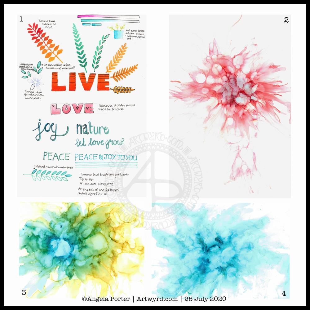
Black lines, or no black lines? That is the question…

I keep switching between black line-art that I colour with watercolour and using light pencil outlines so my designs are worked in pure colour. I can’t seem to settle on one way of working. I like both, but my mood changes from day to day it seems.

At the moment, it seems I need that clear, firm structure in my designs, clear boundaries within which I lay down colour. This is, I think, a reflection of my inner self and the issues I’m working through at this time. Issues that I have no words for.

Even though my art is usually rather controlled with clear structure in it, it still allows me to work through emotions and thoughts that are troubling me.

My mind is ever active, but not with self-talk most of the time. Art allows me to express things I can’t in words. It may be choices of colours, the style of art I gravitate to, the media I choose to use at any time.

On this page, some words have appeared, and those are like bullet points from what I’m working through. Other words are noted in my journal and aren’t shared with others.

Rusty, corroded colours.

There is one design that I have filled with colours that remind me of rust. When I get the right consistency of wet into wet colours, I get these delicious, spiky blooms of colour that really do remind me of rusty textures.

Taking time to look closely at rust, there are lots and lots of beautiful colours, some of which sparkle as they catch the light. It never ceases to amaze me how interesting it is, when examined closely.

Nice, shiny, pristine metallic structures and sculptures are lovely, but how much more interesting they become as they weather and corrosion subtly changes them, adds interest and a different kind of beauty to them.

I can’t tell you how happy I am that I have discovered how to create these rusty colours and textures. They are a completely different colour palette to what I would usually use, but I actually love it! Now I know what I’m doing, I can work on understanding the exact consistency of wet on wet I need, and how to get all the various colours I’d like to incorporate.

As I write this, raku glazes come to mind too. All those glorious colours that various copper oxides produce – magenta, rusty orange, purples, greens, blues, and more. I think I’ll be spending time looking at raku again and working out colour palettes to use in my work going forward.

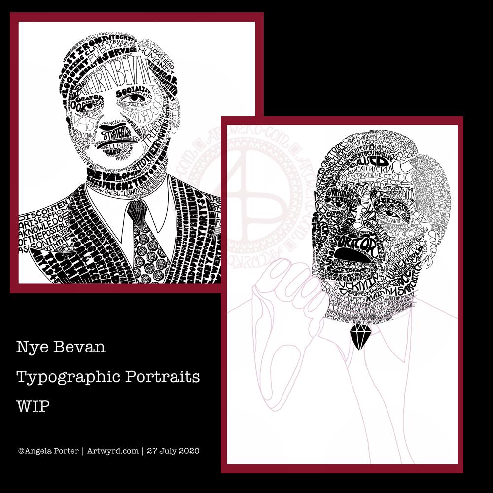
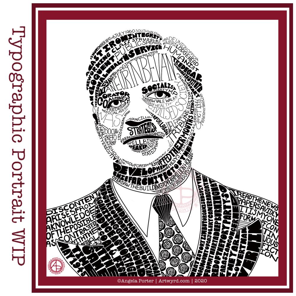
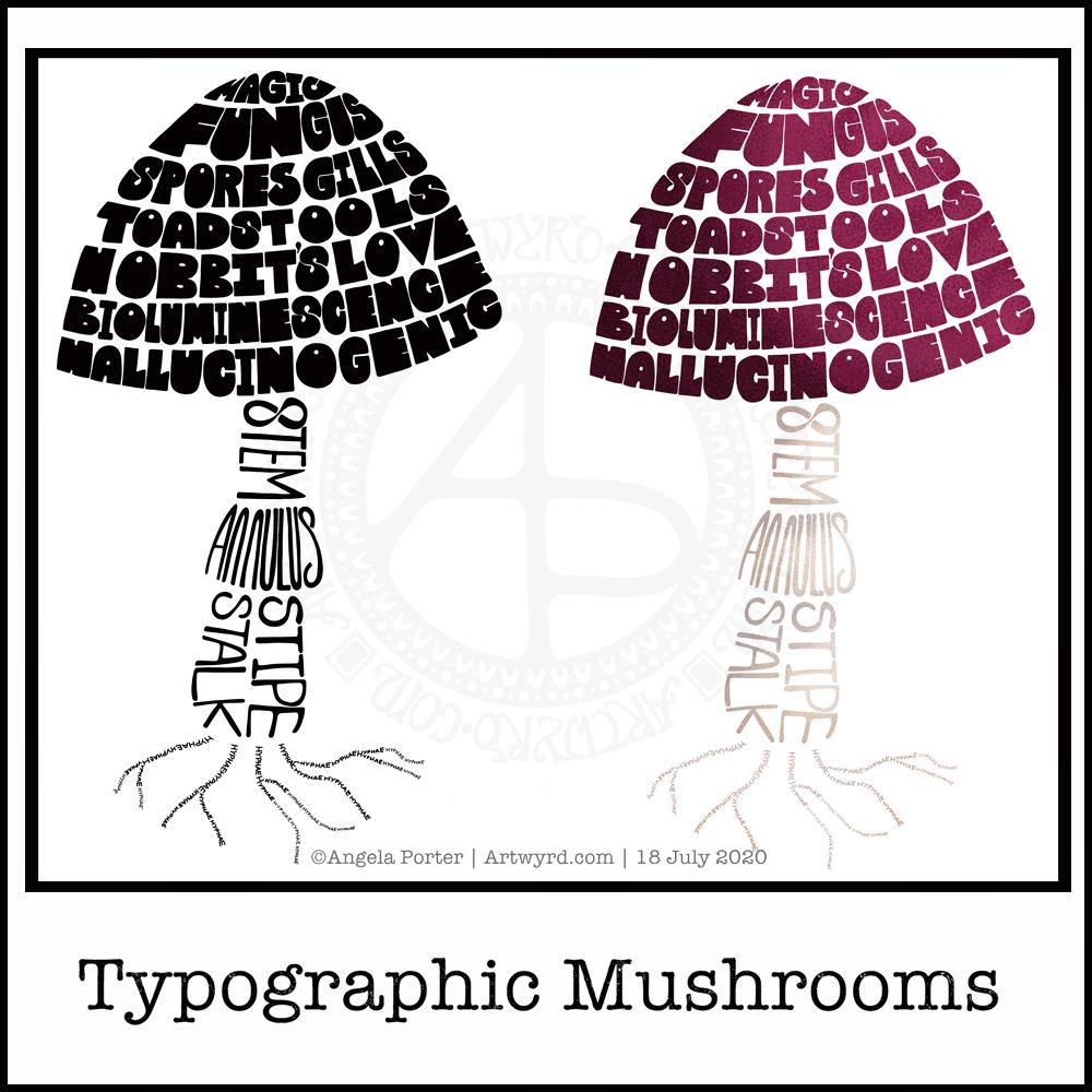
Typographic portraits update

I’m quietly working at the third iteration of my Nye Bevan portrait. My mind is ticking away with what I need to do, and taking a break allows me to return to it with fresh eyes and a fresh mind.

Hello August!

The calendar page turns over and we’re into a new month.

August always heralds the end of summer and start of autumn, my favourite season. It is the last full month of summer here in the Valleys of South Wales. The evenings come noticeably earlier, always a sign that the year is continuing on its endless cycle of seasons.

We have a grey, damp and blustery start to the first day of the month. There are shafts of sunlight finding their way through gaps in the clouds, but there’s a deliciously refreshing snap to the cool and fresh air after the night-time rain.

I thought I’d create a really simple mandala design for the start of this month, one that is full of warm colours, but that hint of autumnal tones in the background.

I kept things simply stylised in the design. If nothing else, working on it made me smile, inwardly as well as on my lips.

I woke early-ish today and did some work on one of the typographic portraits I’ve been doing. Then, in my rush to get to the shower, I clicked the wrong button and lost my work. Thankfully, it’ll be easy enough to do it again. I also think that with the version I’m working on, I’m finding my way with the process. I have a lot of the portrait left to do, but I feel less frustrated with it and have a clearer idea of what I’d like to achieve now I’ve taken a few days break from this kind of work.

Before I settle back to the typography, I am going to take a walk in the fresh air of the morning. Well, after I’ve done my social media posts!

Wednesday Wisdom

This was a perfect, small and quick project to do this morning as I was waiting for my weekly delivery from Able & Cole.

Some practice of hand-lettering /hand-drawn typography practice, starting with roughing the design out in pencil on dot grid paper. Then, inking it in digitally in Autodesk Sketchbook Pro.

The addition of a rainbow background was the perfect way to bring a smile to my face this morning. When don’t rainbow colours cheer a person up? The bold, black letters on top of it really make the colours glow bright.

The quote is a perfect bit of wisdom for Wednesday, not that it’s a bad day for me at all. Apart from me suffering from a lack of sleep once again. The morning sunshine has lifted my mood, and the cool air flowing in through the open window is both beautifully fresh and wonderfully refreshing. I have bright and happy music on as I work, just to add to the upbeat start to the day.

Typographic Portraits WIP

I’ve been working on another portrait of Nye Bevan while I take a break from the first one. I really think I’ve gone over the top with detail in this one. I wanted to do one of him in one of his typical oration-giving stances, but I really do feel I’m messing it all up. I really think that’s because I am trying to get too much in the way of quotes into the portrait.

So, I’ll be going back to the drawing board (or in my case, the Surface Studio screen) to try this one again.

Having said that, I’ve had a lot of hand lettering /hand drawn typography practice and have played around with the brush settings to find one that will work for me!

I also have just noticed that there’s not much differentiation between the different weights of text in the second version, and that adds, I think, to the more confusing appearance of it.

I was struggling with the values of the gesturing fist in the second image. So, I put the photo into Affinity Photo and used the Posterise tool to simplify the areas of shade for me. There’s still a personal interpretation to be done on how I translate these areas into spaces of text.

Hands, feet and faces. These were always the parts of humans I struggled with when doing life drawing.

Drawing typographic portraits is a new endeavour for me. I’m learning, experimenting. One of the main lessons I have to take away today is to not over complicate such a portrait! But there is a fine balance betwixt having enough detail to capture the essence of the person, and having too much so that the essence of who they are is lost.

The first portrait I did, on the left, does look better, but I do think it lacks a bit of detail in the face.

The second one, on the right, is way too busy!

So, my task is to find that point where less really is more.

So, I’ll take a break from them, again, and regroup and try once more!

Practice, practice, practice!

I did spend some time working on a second typographic portrait of Aneurin Bevan yesterday, using a photographic reference that had more detail in it in terms of grey scale.

Before bed, I wanted to relax with some colour (1). For some reason, I pulled out my set of Tombow Dual Brush pens and tried working with them on an A5 piece of Arteza mixed media paper. Hand lettering with gradients, with and without black outlines resulted, and then I wanted to try drawing with colour gradients.

To create gradients, I held the tip of one pen on top of the tip of the other. I then used the lower pen to draw or write with. I used the bullet nib for the lower examples. I used the brush nib for the larger lettering and also the leaves and flowers and so on.

I made some notes as I went, to remind me what I did and what I liked about them. I used a Uniball Signo DX 0.38 pen to do this, which is also waterproof. So, I used it to add lines.

This morning, I wanted to start my arty day experimenting with alcohol inks, once again (2, 3 and 4). All because I’d watched a YouTube videos where people use a straw to blow the ink and alcohol blending solution/rubbing alcohol/isopropyl alcohol/propan-2-ol around the yupo paper.

One helpful piece of advice I heard along the way was it’s best to use only a small amount of alcohol ink. Which is what I did. One drop to start with and then add more ink of the same or different colour(s) as needed.

It took me a while to work out not to blow as hard as I could, and to try different angles to hold the straw at, as well as moving the ink in different directions.

I’m much happier with the results this time, though the scans have bleached the colours out a little. I really must work out the best settings on my scanner so that this doesn’t happen.

Anyway, I need to find a way to seal the alcohol ink so I can draw on top of it without wrecking the pens. I also want to do some better scans so I can make use of these alcohol ink backgrounds in digital art.

Today I want to continue work on the typographic portrait. This second one seems to be building up more quickly than the first one. I think that’s all due to me becoming familiar with the process and accepting that my hand lettering based on my handwriting is good enough. I’m also working out my own ways to fit letters to curves and the shapes at the ends of the sections.

So, all of these activities – using waterbased media, hand lettering, hand drawn typography, and alcohol ink backgrounds all have one thing in common – practice, practice, practice!

Typographic Portrait WIP

Phew! This has taken me many, many hours to do, along with a lot of frustration and alterations. However, it’s getting there, possibly.

This is both the first portrait I’ve done, as well as the first large typographical project.

I’m following a Domestika course – “Hand-Drawn Typographic Portrait” by Sara King.

I’m not entirely sure that I’ve fully succeeded. I seem to have a lot of white space, and that is all to do with the photograph I used. I thought it had enough detail in terms of tones of light and dark. I guess not! Or maybe this is just part of my style.

There are areas on his jacket to the bottom left and right that need pattern or image put there. I have yet to work out what to do about the shirt. Also, I need to try removing the lines around the jacket and collar too.

Aneurin “Nye” Bevan was the main architect of the UK’s National Health Service after WWII. He’s also considered one of the best political orators of all time. There’s an Aneurin Bevan website if you’d like to know more.

While this is hand-drawn, I chose to work digitally. My Surface Studio allows me to work with a digital pen directly on the screen as if I was drawing on paper. This makes it easy to edit as I work.

I now need a break from this particular artwork, so I can look at it with fresh eyes (and any feedback people offer on it) and then return to it another day.

Mandala

Today’s artistic offering is a mandala with a quote about meditation.

The simple typography was done in Affinity Publisher. I used Autodesk Sketchbook Pro to create the mandala.

I just needed some quiet time this morning. I spent quite a while meditating before breakfast. Then, my attention turned towards art.

I knew I wanted to include a quote in today’s art, and I found this quote about meditation that resonated with me.

Meditation and mandalas go together like bread and butter!

The mandala design is quite simple and bold, in quite subtle colours, for me.

It’s going to be a quiet day for me today. A self-care day. I may not get anymore work done on my typographical portrait, but I will be immersing myself in arty and/or creative activities for sure.

Typographic Mushrooms

Just a little something I wanted to try out – using hand-drawn typography to create illustrations. I chose a mushroom, for no other reason than I like mushrooms.

It’s more about practising the hand-drawn typography or hand lettering than anything else.

What I realised, when I completed the black and white version, is that I could’ve varied the weight of the letters to produce highlights. That’s for another day, I think.

I also had to try adding colour, and in that way adding highlight and shadow.

I like both versions, but I think I like the coloured one a bit more.

I mentioned I’m following the Sarah King Domestika course – Hand-Drawn Typographic Portraits. I have started work on my first portrait, but it’s going to take me a while to do. In the meantime, little projects, like the mushroom, will give me plenty of practice as well as a chance to work out my process and way of working, as well as how I’d like to use it so it adds a note of harmony to my artistic song.

I started with a pencil sketch of the mushroom. Then, I added the words in rough with pencil. I scanned the sketch into Autodesk Sketchbook Pro. I then used my Microsoft Surface Slim Pen, to hand-draw the typography. Even though I’m using digital media. Autodesk Sketchbook Pro is a lot like working on paper, but it streamlines the process and allows me to skip a lot of the tedious steps. It also lets me take a black and white drawing and add colour quite easily.

I’ve done this while I’m waiting for a migraine-type headache to subside enough that I can return to bed and sleep the dregs of it away. I’m nearly at that point now as I’m beginning to feel tired and sleepy. So, I’ll get the rest of the social media postings done, and then crawl back into bed to sleep.

Inhale, Exhale, Repeat

This was so very enjoyable!

I started with the hand-drawn typography. I’ve just started another Domestika course — Hand-Drawn Typographic Portrait by Sarah King. The first exercise is to letter words boxes divided by wavy lines. Then, creating letters in different weights. And of course, practice is something that needs to be done.

There was just something about her approach to this that grabbed me, and so, I now have many boxes with words and quotes in.

The first lesson shows how to use Photoshop to edit your lettering outlines and fill them with black. I found the process rather clunky and long-winded. Perhaps that’s because I’m used to working in Autodesk Sketchbook Pro with a pen on a screen as if they were pen and paper, that I could do this in my own way.

So that’s what I did. I used one of my pencilled samples to create the typography for the centre panel.

Then, it was adding the background. I just went with the flow on that one. I made use of the symmetry tools in Sketchbook Pro, and just had fun with a limited colour palette and my favourite kinds of shapes.

The course is about portraits. However, I have zero interest in drawing people. However, the techniques shared will spark ideas for how I can use them.

I’ve long been trying to incorporate words, quotes into my artwork and struggling to find my own style. I’m not sure if this will help, but I’m really quite happy with this particular artwork.

Summer Solstice 2020

Tonight, at 10:43 BST, the Sun appears to enter Cancer, as viewed from the Earth. Of course, it’s the Earth that is moving around the Sun. Today, marks the official start of summer, but it also marks the time when we have the days of most light here in the Northern Hemisphere, and we’ll soon notice there’s not quite so much daylight at the end of our days.

This year, English Heritage are live-streaming the solstice sunrise tomorrow morning on their facebook page. You’ll have to be up early (or just not go to bed!) as they start streaming from 04:07BST, with sunrise at 04:52BST. I’m certainly going to do my best to watch it. This is one of the good things to come out of the pandemic. The live stream hasn’t been done before. I would never go to Stonehenge on either Solstice as there would be too many people and far too much noise and bustle for me, but this is a nice way to see it as it happens, not recorded and shown after the fact.

I’ve always felt an affinity with the cycle of the seasons and marking the solstices and equinoxes has felt far more natural to me than any religious celebrations. The scientist in me appreciates the facts around these dates in the calendar, my heart and soul appreciate them in different ways that are personal to me.

I found this quote about the solstices, and it sums up a little bit about how I feel about them.

The artwork shows a lot more about how I’m feeling today – not quite with it, spaced out, emotional and well out of sorts. I had an idea in mind, but I just couldn’t execute it to my satisfaction today. It looks like I need another self-care day. Which is fine. I’ve learned that sometimes it’s best to go slow in order to go fast. By taking time out from commitments, I return to them in a better frame of mind and emotional state and I’m more able to fulfil them to my satisfaction for sure.