Sketchtember 2021 | Day 1

Link to today’s vlog on YouTube.

I’ve decided that it would be quite nice to take part in a monthly art challenge, perhaps as a warm up to Inktober next month. Maybe.

So, I looked around at the challenges I could find, and settled on one from @DecayingDots on Instagram and Twitter. Their list of prompts is all herbs/plants. That, unlike others, inspired me to take up the challenge.

It’s been a long time since I used a sketchbook truly as a sketchbook. It may take me awhile to get back into such things. I do have some lovely, pre-coloured pages to make use of as a start.

Not only will I practice my kind of sketching – which is usually with a pen – I can practice hand lettering and handwriting. My idea is not only to sketch the day’s plant/leaves, but to add notes and information. Those notes may be about the plant, or about the colours I’m using, or even recipes/uses for the particular herb.

As it’s a sketch challenge, there’s also no pressure to complete every drawing, or even to do perfect drawings. It’s all about observational drawing for me.

Now, as i don’t have green thumbs (I can kill any self-respecting plant in a matter of hours, well days maybe) and I’m not feeling able to visit shops or gardens at this time ( social anxiety is a heckofa thing), photographic references will have to do. But that’s ok.

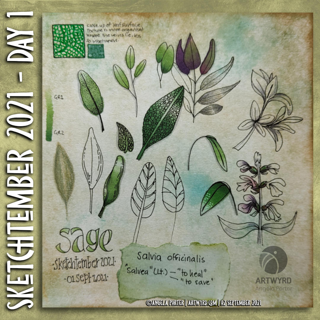
So, here’s my page for day 1, which is all to do with sage. In today’s vlog I talk about this page, the media I’ve used, and I add some drawings to day 2’s page – Rosemary.

I’ve got some work still to do on both pages I think … but that’s the fun of a sketchbook. It’s not meant to be finished at one go, pages can be revisited and added to as needed!

Chameleon Color Tones Coloring

Link to today’s vlog on YouTube.

After filming yesterday’s vlog, I decided to try using marker pens with a drawing I’d done on a Distress Ink background. The drawing on the left is the result of this experiment.

To add colour, I used Chameleon Color Tones marker pens. I chose colours that would be similar to those in the background.

I really enjoyed adding colour to this drawing. I’d forgotten how much I enjoy using the Chameleon pens and the ease of achieving gradients with these pens.

I completed the drawing with embellishments of white and yellow Sakura Soufflé pens, muted Sakrua Gelly Roll Moonlight pens, and some shiny areas of clear Sakura Glaze pen.

I was so happy with the result, that I started work on the drawing to the right, some of which I do in today’s vlog.

I really love the way that the background tones down the brighter colours of the marker pens. Which shouldn’t surprise me as marker pens are transparent! But it did surprise me!

Something else that I was struck with was how similar using markers is to how I add colour digitally. I haven’t made that connection before, but it is likely to inform me on my way forward in adding colour to my artwork. I may be trying to force water-soluble media and coloured pencils into behaving like markers, which is something that they’re not meant to do. I find it hard to work with the looser, possibly more chaotic water-based media, even though I love the effects that other seem to achieve with them. No matter what I do, I’m never totally happy with the end result, something I’ve blogged and vlogged about an awful lot.

Working with alcohol markers has shown me that I can work well with colour, with the medium that matches my artistic style – precise and controlled. The more chaotic, loose, aspects of this work come from the Distress Ink coloured backgrounds.

Now, if only I can accept this and focus on using markers in my work more than other media. Well, apart from digital coloring that is!

Pink and Purple Entangled Art

Link to today’s vlog on YouTube.

I realised that the pinks and purples I added to this drawing were just a bit too bright and vibrant for my current tastes. I decided to use an aubergine Graphitint pencil with a waterbrush to tone them down somewhat. And I think it’s worked. I’m much happier with this now. I even like the areas where I’ve added just graphitint.

I’m not quite sure how I’ll finish adding colour. Do I add some Carbothello to the graphitint areas? Do I just continue with Graphitint alone? I don’t know for sure.

Saturday Sketchbook | A Week Ink Art

Link to today’s vlog on YouTube.

My vlog today is a flip through of all the art I’ve been doing in the past week, both in sketchbooks and on paper.

The image above shows my bedtime drawing last night. I’m not happy with it, but it is what it is. Finishing the drawing followed by the addition of colour and shadow/highlight may change my mind about it. As may the passage of time and a fresh view of it.

This is but one of quite a few drawings done this week. The rest can be seen in today’s vlog.

Pen Drawing and Distress Ink Background

Link to today’s vlog on YouTube.

I woke to morning sunshine and the lovely coolness of an autumn morning. I feel so much more alive on mornings like this. The coolness is so refreshing, invigorating. Although we’re not quite into autumn yet, there are hints it is on the way. Hints of leaves changing colour. Sunlight is much more golden rather than the bright quality of summer light. It really is wonderful!

It put me in the mood to create a coloured background (or two) to draw on. This time, I’m using a vintage brown gel pen from Arteza. Usually I’d use black, but I’m starting to explore the possibilities of other colours, particularly on such distressed, grungy backgrounds.

Today’s vlog starts with the creation of two coloured backgrounds, then starting to draw the design. This drawing isn’t finished, yet. When it is complete, then it’ll be time to add colour and/or contrast and highlight. Finally, it’ll be time to add embellishments.

I know that when these gel pens are dry they are water resistant, so the world of coloured media is open to me. I am likely to keep the colours with in the green and brown palette of this background, however.

Template Thursday | ATCs and Cards

Link to today’s vlog on YouTube.

This week’s coloring template / coloring page for the members of the Angela Porter’s Coloring Book Fans Facebook group is a bit different.

Instead of one large image, I created a sheet of eight, slightly smaller than ATC sized drawings.

ATCs (Artist Trading Cards) are 3½” x 2½” in size. The original idea was for artists, crafters, creatives to make small pieces of art and to swap them with other artists as a way to share and collect art. The idea was to swap and not sell, though people do sell them now, but many more do swap and collect work from other artists.

In today’s vlog, I colour and embellish one of the designs. Then, I turn it and another into first ATC cards and then into greeting cards.

This idea came about through a conversation with a group member who asked permission to create ATCs from my coloring templates for the group.

I do not have an Angel Policy for any of my templates in the group to allow them to be sold in any form. However, gifting or swapping them, or items made using them, is fine so long as the artist (me) is credited and the items are not sold.

For the individual coloring books, terms and conditions are mentioned in the books and should always be referred to.

Color Palette Challenge for August 2021

Link to today’s vlog on YouTube. In it I draw some of the coloring template for tomorrow.

It’s the last Wednesday in the month, so it’s the end of this month’s color palette challenge.

I chose to add colour to the first coloring page of the month for Angela Porter’s Coloring Book Fans facebook group. The colours are bright, cheerful and tropical. I always enjoy a limited palette, though I also mix colours to add some variation in colours, particularly the greens.

I spent the morning drawing this week’s template for the facebook group. If you’d like a sneak peek of some of it, have a look at today’s vlog.

Painting with Distress Inks

Link to today’s vlog on YouTube.

I woke with a stinking headache this morning. So, spending some time adding colour to an entangled drawing, along with a couple of headache pills, was just what was needed. And listening to a podcast or three.

I decided to use Distress Inks as paints, along with a Caran d’Ache waterbrush. Here’s a list of the colours I used:
Forest Moss, Fossilised Amber, Weathered Wood, Broken China, Dusty Concord and Seedless Preserves.

Hindsight is a wonderful thing, and I think I really should’ve stayed away from Dusty Concord and Seedless Preserves – the purple and pink colours. Either other analogous colours and/or browns/greys would’ve worked so much better.

I keep doing this with colour. I’m so used to choosing complementary colours that I still reach for them. In this case it’s understandable as I chose some of the colours that were in the background.

Note to self – monochrome-ish or analogous colours!

To help tone these brighter pink and purple colours down, a liberal use of dot highlights from a white Sakura Soufflé pen was needed! I’ve not finished adding embellishments yet.

Nor have I started intensifying shadows. I’m not sure whether to use biro or either a graphite pencil or a chalk pastel and a paper tortillon. My head isn’t clear enough to decide about that! As the headache is wearing off, my need to sleep the last of it off is increasing.

Adding Color WIP

Link to today’s vlog on YouTube.

Yesterday, I added pieces of paper coloured with either Distress Ink or Distress Oxide to pages in one of my sketchbooks. These pages had been previously coloured with Distress Inks.

I wasn’t at all sure that what I was doing was a great idea. So, I decided to add patterns to one page using a micro Uniball Eye pen. I still wasn’t sure, but a bit more confident in my idea. So, I started to add colour to see if that would make me happier with what I was doing.

To add colour, I started with some Tombow Dual brush pens in rather vintage, autumnal colours that work well with the background.

As the Distress Ink tends to alter the properties of the paper, I thought I’d try the Ecoline Brush pens. And, they were so much easier to blend out with a waterbrush. Actually, the Distress Ink makes it much easier to blend the Tombow Dual Brush pen ink out too.

So, I’m quite happy with the result. Now, I can complete the drawing and finish up adding colour. And I look forward to working on the other pages in the sketchbook too.

Entangled Drawing | Adding Colour Part 5

Link to the Adding Colour Time Lapse Video

This morning, I spent nearly two hours adding colour to this drawing. It’s getting close to being completed. Well, the adding colour part. There’s embellishing to be done too!

I’ve used Inktense pencils through out, along with a damp brush to activate and blend the colours.

As well as colouring new areas of the design, colour was added to intensify various areas that were appearing too insipid. I still have some of this to do to bring out a sense of volume in various elements.

I’m fairly pleased with this, though in hindsight adding the shadows with a grey Faber Castell Pitt Artist pen first may not have been the best idea. Still, it’s a learning experience, again.