Tuesday – time for self-care

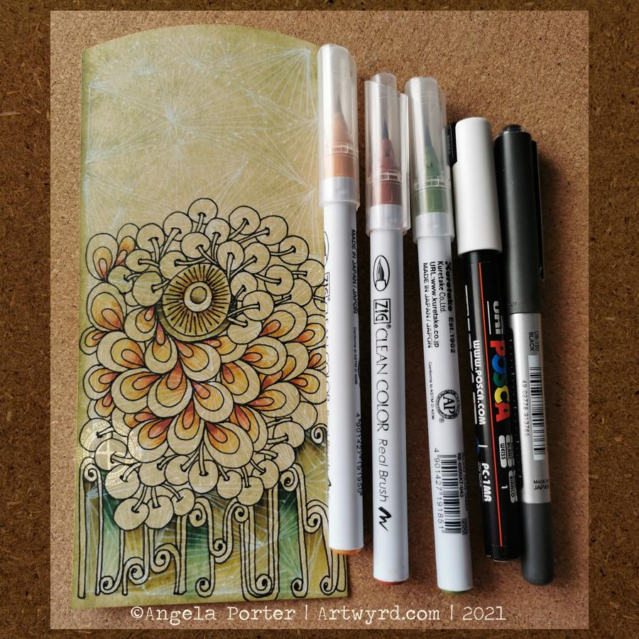
Well, I pushed on yesterday and finished this particular drawing. Lots of texture/patterning has been added. I’ve also temporarily added a pale grey-blue background until I decide how I want to add shadow/highlight/colour to this particular drawing.

I won’t be doing that today, however. I’m still feeling all out of sorts and I really don’t trust myself with colour, shadow and highlight. I’ll get frustrated and irritated with myself. I also woke with a headache that isn’t clearing up anytime soon it seems.

So, today is likely to be another day of binge watching stuff. Yesterday it was The Killing on Disney+. A dark tale of murder and the crazy awful ways humans tangle their lives with others it seems.

It’s an American version of a Danish noir murder/mystery series. I started watching the Danish version, with subtitles, quite a few years ago, but mislaid the DVDs. It’s full of twists and turns in the story line, and a surprising ending to the first story line – the murder of Rosie Larsen. And it’s nice to be surprised by such a tale for a change.

So, I think I’ll spend a fair amount of today finishing watching season 3 and making a start on season 4, the final season.

Once the headache clears, I may turn my attention to some arty stuff. I’ll see how it goes. Self-care is important, not just physically but emotionally too. I know from bitter past experiences that if I push myself to do things when I’m not up to it, whatever I do usually ends up disastrously. I still feel the guilt of giving myself time and space to return back to a point of balance, but I know that when I do return to that point the guilt will fade away and be replaced with relief and a sense of gratitude that I didn’t give into to the guilt. There’ll also be a touch of pride that I’m strong enough, now, to recognise when I need this time to just lose myself in fiction, do nothing else, and let whatever is the cause of the imbalance work itself through.

I suspect the headache is an expression of that imbalance and is the way my mind, body and soul have of telling me, “Woah there Angela! You have to stop and take a break from this, now! You’ve pushed yourself too far, so I’m going to get you to stop and do other things for a while.”

I am learning to listen to what I need, rather than what I think I should be doing. So, today, I will listen to them.

Monday meanderings

Frustration

This is my current drawing. I’m adding tiny patterns to various areas of the ‘skeleton’ of the design. That’s making me feel a little happier about it, but I’m still not all that satisfied with this drawing.

It just feels disjointed, incoherent. Just a tumble of bits and pieces that just happened to fall together. I started with the monogram “a”, thinking I’d do a series of drawings with little monograms like this kind of hidden in the design. But I don’t think this has worked out at all.

I think this drawing is a snapshot of that shows I’m feeling out of sorts with my art at the moment, and that is a reflection of me feeling out of sorts with myself.

I know I can be hard on myself when it comes to art, or anything actually, and I’m sure others will view this differently to how I do. Maybe there’s even a story in the drawing of how my emotional weather has shown itself in how I’ve put together the patterns and motifs.

This happens from time to time – I get into a funk with my art. Eventually, however, I find my way again, often a slightly new way, and off I go again! So I’m not worried about this. I just know I need to be kind to myself and perhaps take a little break from arty stuff, though with what I don’t know. Whatever I’m trying at the moment is irritating me, even digital art.

“This, too, shall pass,” shall be my mantra until it does pass.

Bread making

One thing that’s not frustrating me is my foray into baking with a bread machine. I’ve had success with a delcious spelt flour loaf. At first I thought it was a disaster as it was flat on the top. But, it’s absolutely fine when cut – pleasantly moist, as airy as proper wholemeal bread can be, and nutty in flavour.

I’ve also just baked a spiced fruit loaf, the second I’ve done, and I know how delicious it will be! My home is filled with the delicious and heart-warming smells of sweet spices and yeasty goodness.

That’s all the baking I’ll need to do for a couple of days, however. There’s only so much bread I can eat! And I really don’t want either to go to waste.

Experiment in Entangled art

Today, an unfinished experiment into ‘tranzending’ layers.

I dug out a piece of natural mixed media paper that had been coloured with some Distress Inks. My aim was to see if the white under pattern would work with such a piece of paper.

It did. You can see the underlying pattern coming through the more darkly coloured areas. Also, the Zig clean colour real brush pens (what a mouthful of a name!) worked beautifully on the background. I was careful to choose colours that would work sympathetically with the Distress Ink background. Distress Inks are water-reactive so any wet media will reactivate them

I haven’t finished colour this one; it was just an experiment. The final part of the experiment was to add a layer of Distress Micro-glaze. This seals in the art, making it waterproof and just about impossible to work on again. Why did I do this? Well, the micro glaze is a bit like a gloss varnish and it enhances the colours, making them more vibrant and more transparent too. I wanted to see if the glaze would move the black ink and/or the posca pen. It didn’t. Sure, there was some black pigment on the paper towel I used to polish the surface, but not much.

The microglaze is likely to be handy should I choose to decorate envelopes in the future. It may be useful in other ways.

There’s a constant spiralling round of techniques and media with me. And I usually end up returning to digital art in one way or another. What is interesting to me, though, is how these experiments give me ideas for things to try out digitally. My mind is ticking over those ideas at the moment and I’m likely to go and them out in a short while.

March’s Color Palette Challenge

At the start of March, we launched the first month-long colour palette challenge for the members of the Angela Porter’s Coloring Book Fans facebook group. I also posted a template that could be used for those who have access to a printer (or any template from any of my books if not).

Here is my coloured version of the template.

I like working with limited palettes. I don’t find limited choices confining or a challenge. Instead I find myself liberated from the choice of colours to use when completing an artwork. I end up with a more coherent/cohesive artwork than if I’m allowed to play in the sweetie-shop of the limitless colours of the digital realms. The limited palette makes me focus on the work in a different way, usually on shadow and highlight, as shades of these colours are always allowed!

In hindsight, these colours wouldn’t be a natural choice for me to use. I chose colours that reminded me of spring-time flowers and leaves and the lovely clear blue skies we ca get. Black and white are there, of course, for various shades, shadows and highlights.

So, tomorrow there’ll not only be a new template, but a new color palette challenge. I already have the template drawn and good to go, I just have to choose the colours to use.

Entangled Art WIP 29/03/21

I’ve finished the line art for this particular design. Now, it’s adding colour to it, which is going to be a long job.

I’m trying out a color palette of greens, peaches and dusky pinks, but I’m not sure about them, or maybe I’m not fussed on the background. I’ll see how I get along. It’s definitely a work in progress.

I’m not sure what happened with the design. I had intended to leave open space in the design to add a lighter, airier feeling to parts of it. That just didn’t happen. I’m not sure about some areas, but I do know that colour can make all the difference to a design.

A4 Marker Paper
Pentel disposable fountain pen, 02 Uniball Unipin pen, and a 0.38 Uniball Signo Dx pen
Backgrounds and colours added digitally using Autodesk Sketchbook Pro

Note – I’m not paid, sponsored or supplied with any products.

Sunday drawing

I started this drawing yesterday evening. It’s not finished yet and, as always, I’m not entirely sure where it’s going. Intuitive art is me it seems!

This is being drawn on A4 marker paper with a Fountain Pentel pen – which is a disposable fountain pen with a plastic nib that allows different thicknesses of lines to be drawn. It’s actually rather nice to draw with.

I’ve added a light creamy-brown background digitally.

Wednesday En-tanglement

Natural Paint-on paper by ClaireFontaine approx 8.25″ x 8.25″ (21cm x 21 cm )
Flower motif – Tim Holtz’s Ephemera
Various other papers as mats.
Black fine Uniball ‘Eye’ pen
Gold Sakura Gelly Roll pen
White Sakura Souffle pen
White and brown pastel pencils

Today’s offering is another entangled/zentangle cartouche around a piece of vintage ephemera.

I’m trying to learn lessons of past attempts at these kinds of frames or cartouches. The layers of borders seem to work well for me. They’re balanced and cohesive. Also, the colours used help to bring them together as well.

Tuesday En-Tanglings

Central focal image – Tim Holtz’s Ephemera.
Various designer series papers as the mats for the focal image.
Overall artwork size approx 7″ x 8″ (18cm x 21cm)
Distress Ink to colour papers and mats. Mossy green Staedtler Triplus fineliner. Black 03 Unipin pen. Mossy green and black Carbothello pastel pencils.

This one I am happy with. For cartouches/frames I prefer to work in borders rather than a rambling series of patterns and motifs. This seems to satisfy my love of symmetry/balance, yet still allows the use of organic patterns. I really did breathe a sigh of relief when I completed this one.

I am considering adding either colour or metallic ink to the seeds in the outermost border, possibly some shadow within each triangular motif as I realised I forgot to do that.

I did start work on another similar project. I’m really not happy with the penwork. So, I’m going to remove the central motif and mount it on a new piece of paper on which I can draw the borders/frame/cartouche. Not everything has been lost in this case.

Monday Meanderings

It’s Monday. A bright sunshiny early spring morning, but with plenty of dove-grey clouds floating in the sky.

I’ve been working on this drawing and ‘cartouche’ idea and I realise that I need to consider the idea of proportion. Either the focal point piece of ephemera needs to be bigger, or the background piece of paper and drawing smaller. Still, you have to try things to learn from them, eh?

This kind of drawing really harks back to past work I’ve done. Thicker lines, clunkier details, very little white space. It feels crowded, overwhelming with detail and pattern. I think that describes how I’ve been feeling too lately, and it’s reflected in my artwork.

What I do with this drawing now is uncertain. It may just sit in the archives, digital and physical, an example of a lesson to be learned.

Hello Spring!

It’s the Vernal Equinox here in the Northern Hemisphere – Autumnal Equinox to those of you south of the equator, so hello autumn to you!

And, typically of me, my arty offering today isn’t really all that springline, apart from the nesting birdies that is!

Some more Zentangle cartouches have been done by me. The central images are all from packs of Tim Holtz’s ephemera – Field Notes or Botanicals. I gave these a bit of a shiny glaze with some gloss medium; it helps to bring out the colours.

I’ve used a variety of media and paper for these. The squares are either 3.75″ x3.75″ or 4″ x 4″ in size. The rectangular cartouche is 3.3″ x 5.2″ in size.

I quite like all of them, though part of me is irked by the lopsided box around the beetle!

These take a surprisingly long amount of time to complete. It’s very pleasurable time, especially as I lose myself in the process.