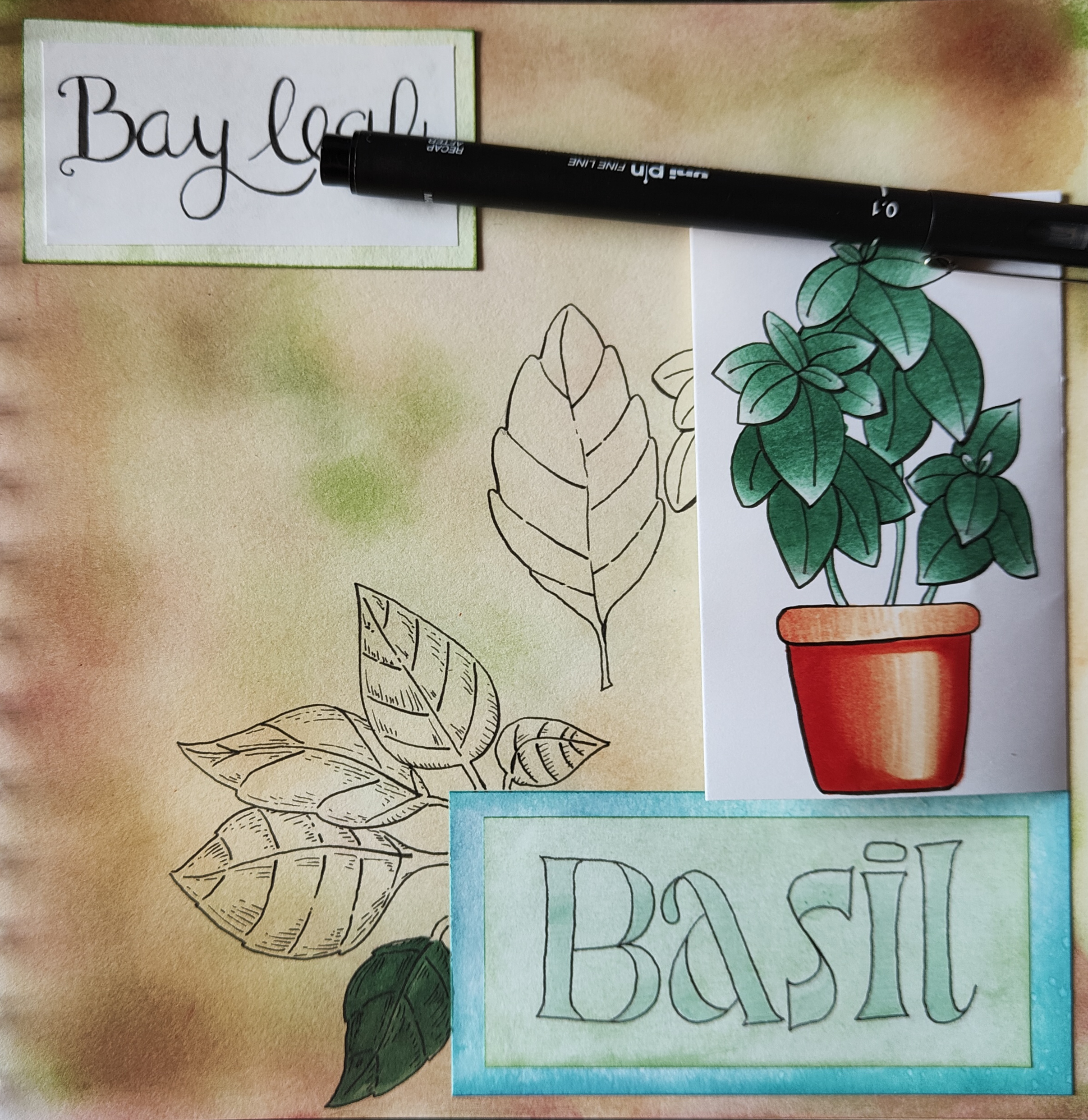
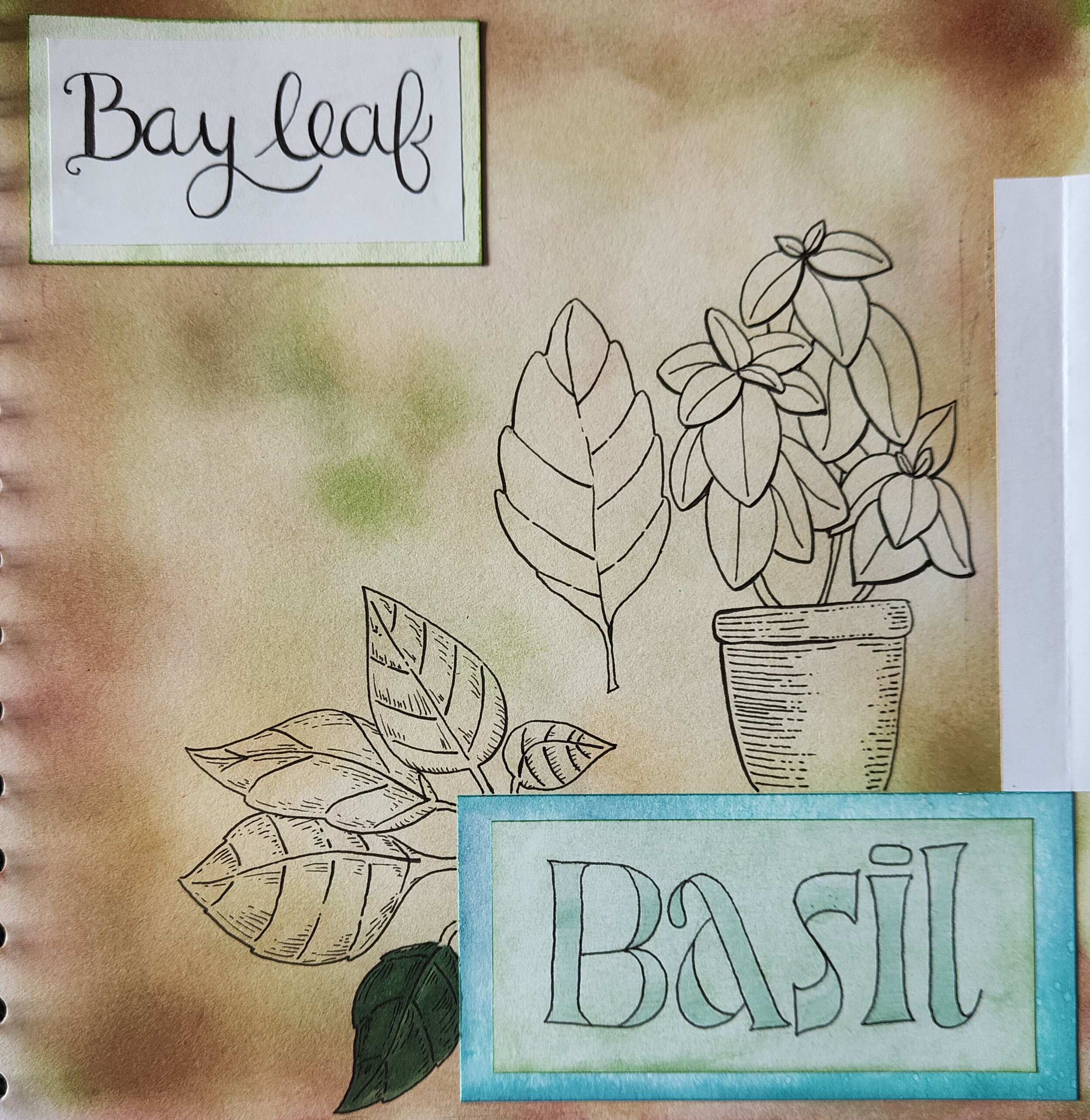
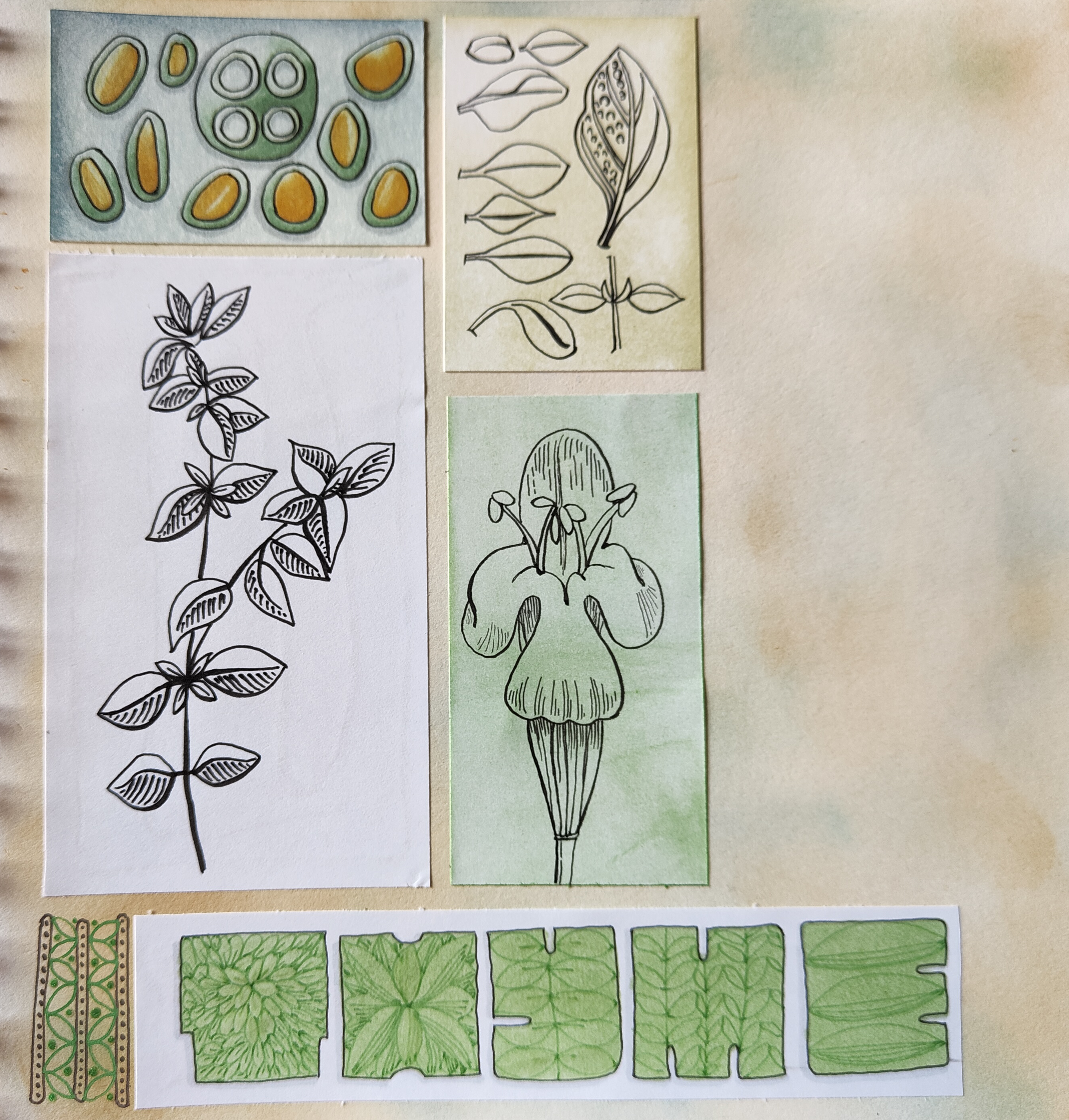
Continuing with DeadlyDots’ prompt list for Sketchtember. Thyme was day 4’s prompt, and Basil is today’s. I’ve got the title for tomorrow done (Bay leaf).
Plenty of pen drawing and some coloring with Chameleon color tones markers. A little bit of messing around with patterns on the thyme page.
It’s an enjoyable process, though today I think I’ll take a little break from it and turn my attention to projects that need some work done on them, and maybe new drawings to be done.
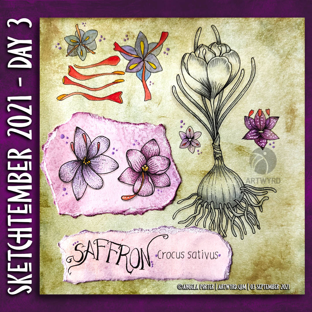
Here are my sketchbook pages for days 2 and three of Sketchtember. I’m using DecayingDots’ list of herbs and spices for this one.
I’m enjoying working in a different way to my usual entangled art. And, I’m making some awful mistakes/art in these pages. However, these are learning moments, not least of which it’s ok to do things that are grim, mainly my use of colour. But, if I didn’t try things out and learn from the mistakes I’d not progress at all.
What I think it shows me is that pen drawing, with just shading or monochrome colour is my strength, colour my weakness. As if I don’t keep saying that, yet I keep going back to using colour.
Today’s vlog focuses on Day 3 – Saffron. Tomorrow’s vlog will be a look at all the art I’ve worked on in the past week.
I’ve decided that it would be quite nice to take part in a monthly art challenge, perhaps as a warm up to Inktober next month. Maybe.
So, I looked around at the challenges I could find, and settled on one from @DecayingDots on Instagram and Twitter. Their list of prompts is all herbs/plants. That, unlike others, inspired me to take up the challenge.
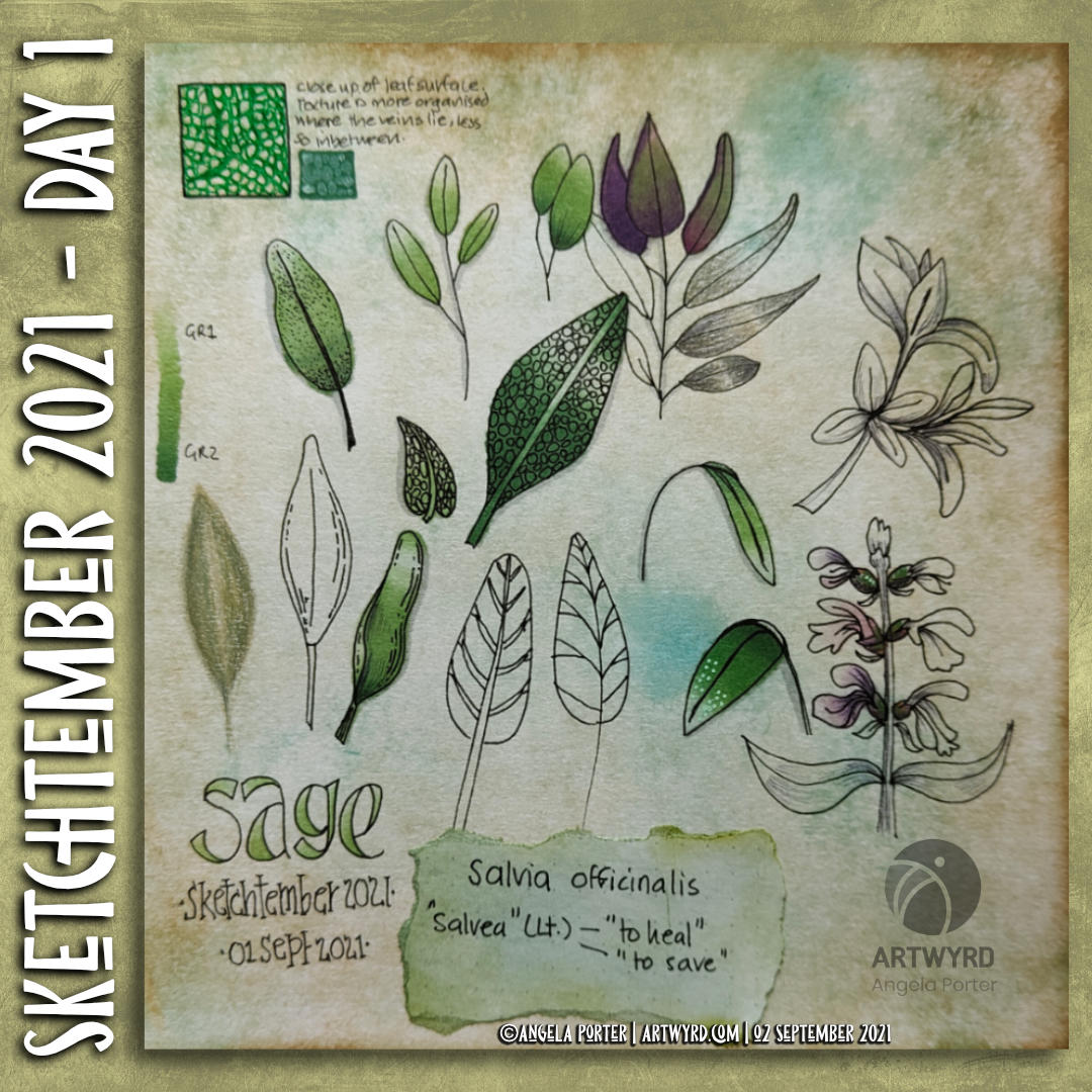
It’s been a long time since I used a sketchbook truly as a sketchbook. It may take me awhile to get back into such things. I do have some lovely, pre-coloured pages to make use of as a start.
Not only will I practice my kind of sketching – which is usually with a pen – I can practice hand lettering and handwriting. My idea is not only to sketch the day’s plant/leaves, but to add notes and information. Those notes may be about the plant, or about the colours I’m using, or even recipes/uses for the particular herb.
As it’s a sketch challenge, there’s also no pressure to complete every drawing, or even to do perfect drawings. It’s all about observational drawing for me.
Now, as i don’t have green thumbs (I can kill any self-respecting plant in a matter of hours, well days maybe) and I’m not feeling able to visit shops or gardens at this time ( social anxiety is a heckofa thing), photographic references will have to do. But that’s ok.
So, here’s my page for day 1, which is all to do with sage. In today’s vlog I talk about this page, the media I’ve used, and I add some drawings to day 2’s page – Rosemary.
I’ve got some work still to do on both pages I think … but that’s the fun of a sketchbook. It’s not meant to be finished at one go, pages can be revisited and added to as needed!
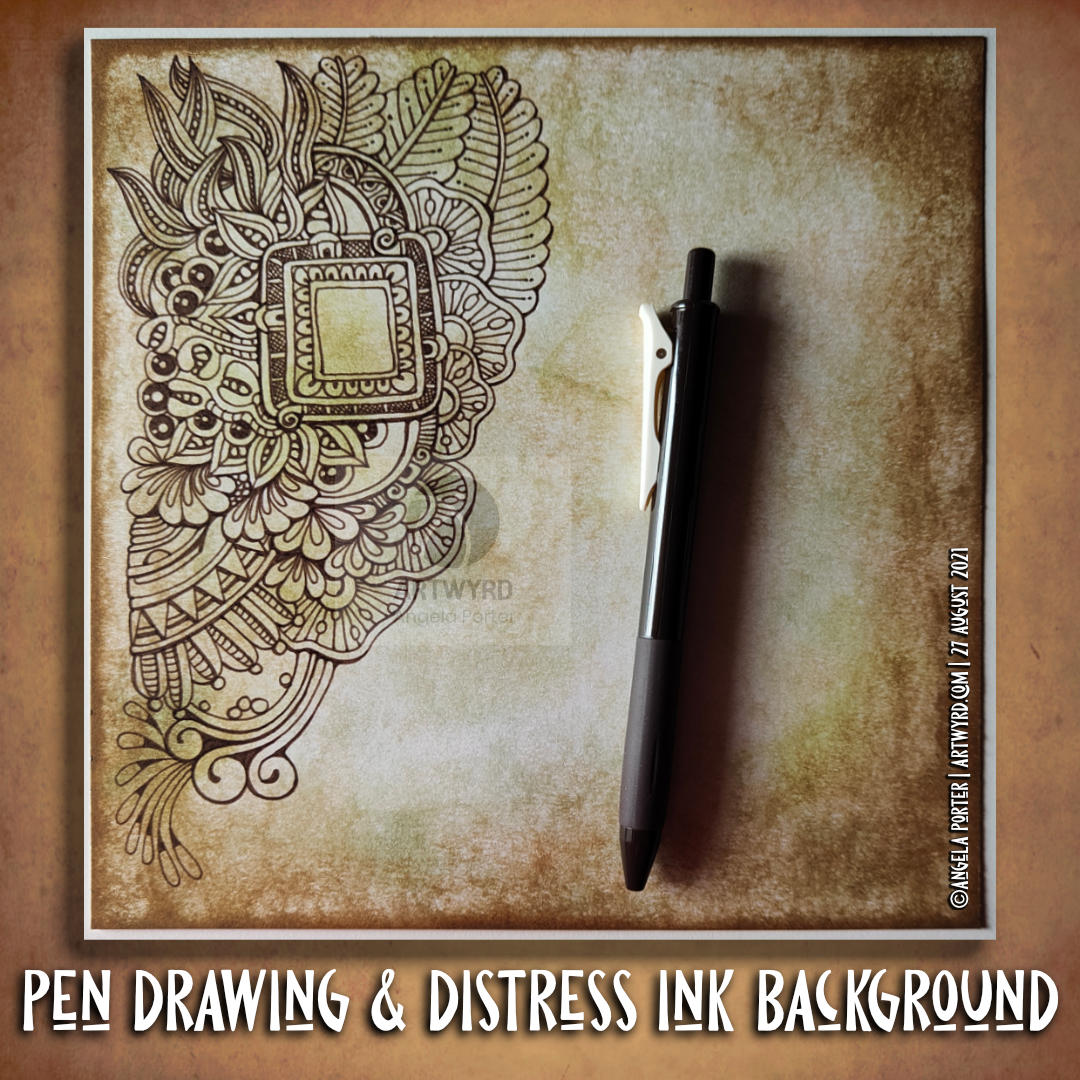
After filming yesterday’s vlog, I decided to try using marker pens with a drawing I’d done on a Distress Ink background. The drawing on the left is the result of this experiment.
To add colour, I used Chameleon Color Tones marker pens. I chose colours that would be similar to those in the background.
I really enjoyed adding colour to this drawing. I’d forgotten how much I enjoy using the Chameleon pens and the ease of achieving gradients with these pens.
I completed the drawing with embellishments of white and yellow Sakura Soufflé pens, muted Sakrua Gelly Roll Moonlight pens, and some shiny areas of clear Sakura Glaze pen.
I was so happy with the result, that I started work on the drawing to the right, some of which I do in today’s vlog.
I really love the way that the background tones down the brighter colours of the marker pens. Which shouldn’t surprise me as marker pens are transparent! But it did surprise me!
Something else that I was struck with was how similar using markers is to how I add colour digitally. I haven’t made that connection before, but it is likely to inform me on my way forward in adding colour to my artwork. I may be trying to force water-soluble media and coloured pencils into behaving like markers, which is something that they’re not meant to do. I find it hard to work with the looser, possibly more chaotic water-based media, even though I love the effects that other seem to achieve with them. No matter what I do, I’m never totally happy with the end result, something I’ve blogged and vlogged about an awful lot.
Working with alcohol markers has shown me that I can work well with colour, with the medium that matches my artistic style – precise and controlled. The more chaotic, loose, aspects of this work come from the Distress Ink coloured backgrounds.
Now, if only I can accept this and focus on using markers in my work more than other media. Well, apart from digital coloring that is!
I realised that the pinks and purples I added to this drawing were just a bit too bright and vibrant for my current tastes. I decided to use an aubergine Graphitint pencil with a waterbrush to tone them down somewhat. And I think it’s worked. I’m much happier with this now. I even like the areas where I’ve added just graphitint.
I’m not quite sure how I’ll finish adding colour. Do I add some Carbothello to the graphitint areas? Do I just continue with Graphitint alone? I don’t know for sure.
A late summer, rather cool and sunny start to the day is something I’m luxuriating in, and that means arty pursuits.
I’ve completed one drawing, which I kind of review at the start of today’s vlog over on YouTube. I’m not too happy with the colour I’ve added at all. I started with Ecoline watercolour inks, but they felt too bright and jarring with the distressed, grungy, quite dark background. So, I then tried out distress inks, but I’d already gone down the rabbit hole of poor colour choices. When I’d finished adding colour, I had some rather dull, uninspiring colours that really didn’t fit in with other parts. So, I tried using coloured pencils to lift the colours, with not much success. Finally, I tried some chalk pastels, which helped somewhat. Finally, I added embellishments with a variety of gel pens,w hich helped to lift the colour somewhat, bu kind of seem over the top.
So, to shift my disgruntled arty mood, I thought I’d go back to an earlier drawing and use a really simple set of colours – cerise and purple – to add colour and shadow to the drawing. And white to help bring out highlights if needed, though I will use various gel pens to embellish this when I’m done. This is the drawing you can see at the top of the post.
I’m liking what’s happening with this drawing. I do have to layer the chalk to get an intensity of colour when using the tortillon to blend the colour out as well as working the chalk into the paper. I’m enjoying the way the different colours will blend nicely with each other. And I like the simple colour choices too.
I keep saying I’m going to complete drawings with monochrome, or nearly monochrome colour palettes. And I keep forgetting to do this when I leave a host of colours near me!
I shall persevere with this particular drawing, and see how I feel about once it’s all coloured.
As to the other one, well it’s being put to one side for a few days so I can return to it with fresh eyes and a fresh mind. Perhaps I’ll see it in a different way then.
I woke to morning sunshine and the lovely coolness of an autumn morning. I feel so much more alive on mornings like this. The coolness is so refreshing, invigorating. Although we’re not quite into autumn yet, there are hints it is on the way. Hints of leaves changing colour. Sunlight is much more golden rather than the bright quality of summer light. It really is wonderful!
It put me in the mood to create a coloured background (or two) to draw on. This time, I’m using a vintage brown gel pen from Arteza. Usually I’d use black, but I’m starting to explore the possibilities of other colours, particularly on such distressed, grungy backgrounds.
Today’s vlog starts with the creation of two coloured backgrounds, then starting to draw the design. This drawing isn’t finished, yet. When it is complete, then it’ll be time to add colour and/or contrast and highlight. Finally, it’ll be time to add embellishments.
I know that when these gel pens are dry they are water resistant, so the world of coloured media is open to me. I am likely to keep the colours with in the green and brown palette of this background, however.
Instead of one large image, I created a sheet of eight, slightly smaller than ATC sized drawings.
ATCs (Artist Trading Cards) are 3½” x 2½” in size. The original idea was for artists, crafters, creatives to make small pieces of art and to swap them with other artists as a way to share and collect art. The idea was to swap and not sell, though people do sell them now, but many more do swap and collect work from other artists.
In today’s vlog, I colour and embellish one of the designs. Then, I turn it and another into first ATC cards and then into greeting cards.
This idea came about through a conversation with a group member who asked permission to create ATCs from my coloring templates for the group.
I do not have an Angel Policy for any of my templates in the group to allow them to be sold in any form. However, gifting or swapping them, or items made using them, is fine so long as the artist (me) is credited and the items are not sold.
For the individual coloring books, terms and conditions are mentioned in the books and should always be referred to.
It’s the last Wednesday in the month, so it’s the end of this month’s color palette challenge.
I chose to add colour to the first coloring page of the month for Angela Porter’s Coloring Book Fans facebook group. The colours are bright, cheerful and tropical. I always enjoy a limited palette, though I also mix colours to add some variation in colours, particularly the greens.
I spent the morning drawing this week’s template for the facebook group. If you’d like a sneak peek of some of it, have a look at today’s vlog.
A very small penny dropped yesterday. I realised that what I’m doing is pen and wash, or ink and wash, or line and wash. I’m not entirely sure that a label is required, but it seems to fit.
I’m adding watercolour of one kind or another – Inktense, Ecoline, Mijello Mission Gold, Distress Inks, etc – to a pen drawing. Why I haven’t made that connection to the description of the method/process? I have no idea! Still, I have made that connection and a realisation that it gives a sense of artistic legitimacy to my work. That is a function of my insecurities when it comes to my artistic espression.
Yes, that’s right. Insecurities. Lack of confidence. Lack of belief in myself. Self-questioning about what on Earth I’m doing.
It is always nice for me when pieces of a rather abstract, metaphoric jigsaw fall into place, giving me a more coherent view of my method, my artistic voice.
These pieces always fall into place at the right time for me. I’m ready to accept that line and wash is what I do well, when I work within ‘an elegance of limits’ to quote the team at Zentangle. In this case a limited palette of colours harmonious with the background.
As well as working on this particular drawing, I have included some views of recent work in my sketchbook in today’s vlog. This other work shows me trying to work out how to add more contrast to the wash of colour. Fine ballpoint pen, graphite pencil and tortillon or coloured drawing pencils/chalk pastels are what I’m exploring. Eventually, I will settle on a method that I particularly like. I’m not happy with any of these at the moment.
I will continue to explore an figure it out. That’s what I’ve done with adding colour to my drawings, and that’s what I’ll do when it comes to increasing contrast with shadows and highlights.
Of course, I’m talking here about traditional art. When it comes to digital art, I think I have found a way I’m comfortable with in adding colour to pen drawings. I’m not quite there yet with traditional media, as well as finding the traditional media I like to work with.