A little bit of wisdom on a Wednesday. A Zentangle frame and a quote. Vintage colour palette. Geometric patterns, repeating patterns, all put together to try an idea I woke with out. Whether it works or not, I don’t know. But was fun creating this little bit of art.
There are bits I’m not too happy about, the shadowing behind the humpy bumpy border around the quote itself in particular. But you have to try things out. No matter what they end up like, there’s always lessons to learn, things to store away for future use. And this, perhaps is one of those things.
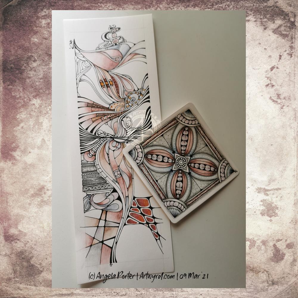
The tall, thin one is approx 10.5 cm x 29.7 cm in size – a piece of smooth, heavyweight cartridge paper. Colour has been added with a mixture of fineliner pens and graphitint pencils with a damp brush.
The smaller tile is 4″ x 4″ (10cm x 10cm) piece of the same paper. Again, I’ve used graphitint pencils and a damp brush to add colour. A white gelly roll pen has been used to add highlights to the image.
Both drawings have also had shadow added with a graphite pencil and paper tortillon.
I love the graphic nature of a pure black and white drawing. However, there is something almost magical in the way that colour and shadow/highlights can bring a drawing to a lucious 3-D appearing work of art.
I’m also loving the softer tones of the graphitint pencils with a damp brush. The water activates the colour a little and allows me to drag it out to create a gradation of colour, along with a darker, shadowed area.
The cartridge paper is not the best for using damp brushes on, but the texture that results actually isn’t all that bad.
My mind is wandering to the square tile, and wondering if I could create it in polymer clay … a thought to try out at a later time, maybe.
Mandalas are so much fun to do. In this one are lots of zentangle patterns – can you spot them?
Soft blues and greens play against the coppery tones used in the structure of the mandala. Soft, yet not washed out with plenty of contrast betwixt the highlights and shadows. I’m actually really happy with the color palette I’ve used here, as well as some subtle texture patterns that may not be visible on this smaller, lower resolution image.
What I do like is the light, almost lacy feel to the outermost ring.
A lovely way to spend a few hours on a Monday morning. Indeed, I got so engrossed in this that I’ve not had breakfast yet and it’s gone midday!
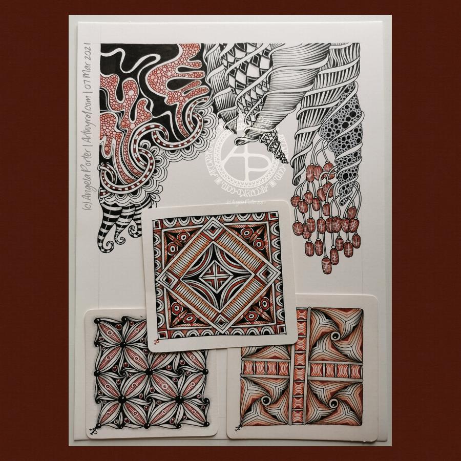
One drawing I’m working on and three Zentangle tiles that are complete.
TheA4 drawing is very much full of contrast and drama, very ‘graphic’ in nature. It’s not finished yet, but I’ll get there with it for sure.
The smaller tiles are rather geometric in nature with repeating patterns. I find drawing this kind of art soothing and pleasing too. I also enjoy the combination of the vintage brown tones with the black and grey. They just seem to work so well together.
I turned to work on the smaller ’tiles’ as I was feeling a tad overwhelmed last night. I really do find smaller pieces of art help me to settle back down. The repetitive nature of the patterns is soothing in itself.
I seem to be constantly circling around and returning to Zentangle – watching YouTube videos, looking at artwork online, and creating my own. I’ve been thinking about becoming a CZT – a certified zentangle teacher. I’m dithering about it, and I don’t know why that is. It’ll sort itself out I’m sure.
It is almost finished too. I’m dithering about the un-shaded arcs, and whether gold and /or white gel pens need to be used to add small accents and highlights. I can also see places where colour/shading is needed. However, there is no rush for it to be done!
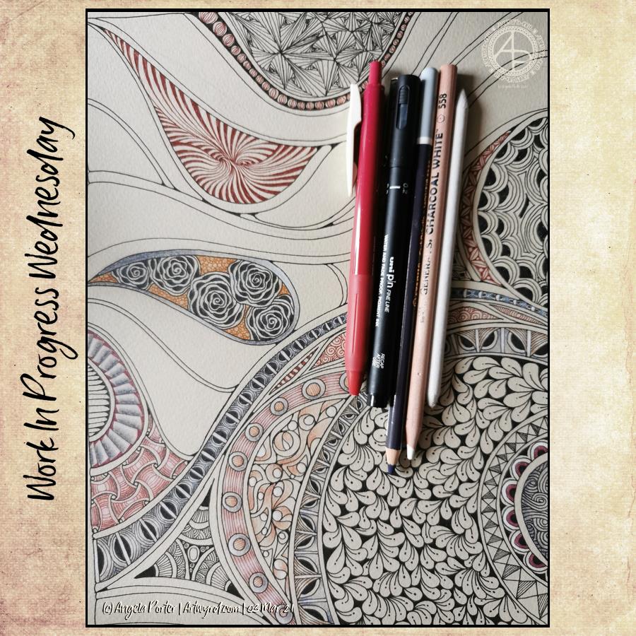
The paper is 12″ x 9″, so I can’t scan it in one image. It’s Daler-Rowney Murano paper for chalk pastels and coloured pencils. So, as well as having fun just filling the page with shapes and patterns, I took the opportunity to try different kinds of pencils to add colour, shadow and highlight. I certainly enjoyed experimenting with gel pens and various kinds of pencils to create this drawing.
It looks a lot better in the photo than in real life, even with the weird banded light on the photo.
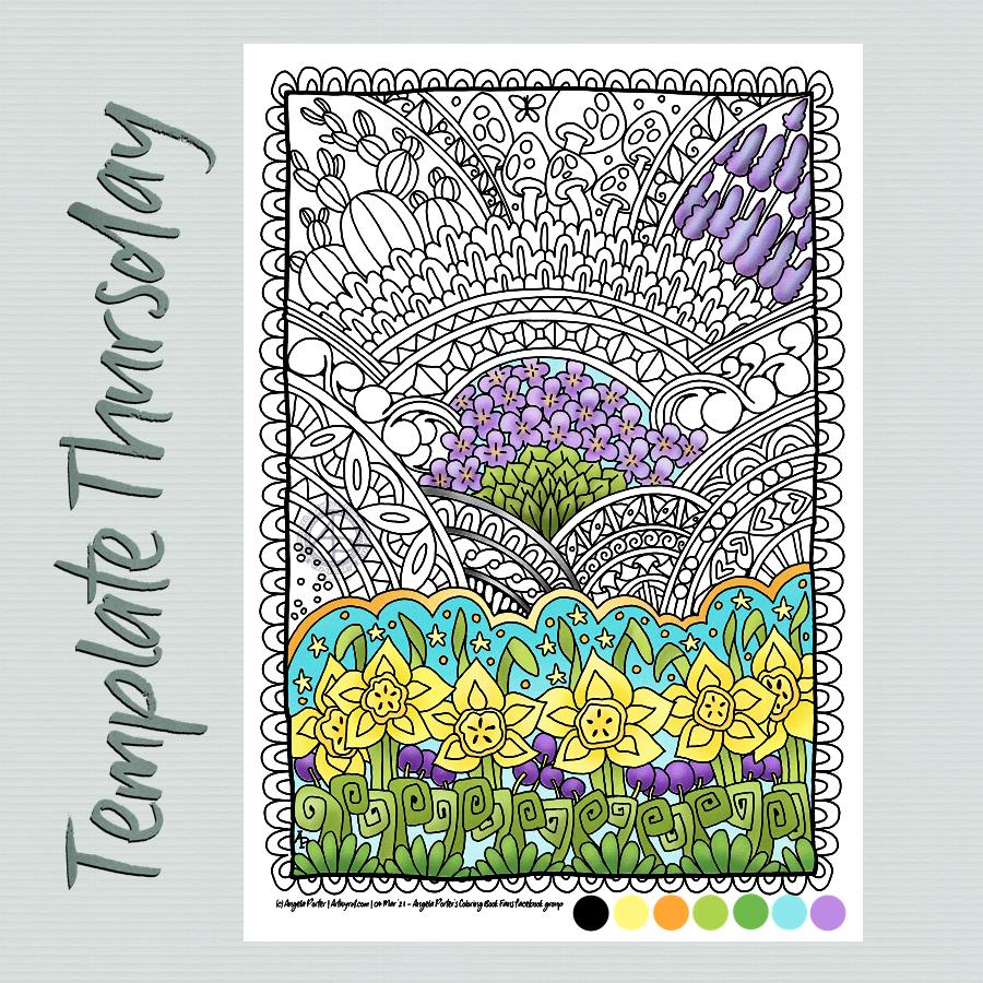
The challenge is a month long and I’ve asked the members to hold off posting their completed templates until 31st March so they can all be posted together. I thought it would be fun to do that way.
Anyway, the challenge is to use a limited colour palette plus black and white to colour this week’s template, or any other flowery template for the 31st March. I’ve chosen some springtime colours. It’s going to be interesting to see how different people use the colours to complete this challenge.
Oh, the things I do when I wake up in the middle of the night. Fully alert and unable to get back to sleep for a couple of hours.
I just drew a pattern of curves and arches on the page of grey-ish pastel paper and started to fill the sections in with various patterns, zentangle and otherwise. I’ve used chalk pastel pencils to add colour and shading to some areas.
A total work in progress, for no other reason than because I couldn’t sleep.
My artistic mood today was for another mandala. Again, I’ve used vintage colours to complete this one. I realised, once I’d collapsed all the layers and saved it, that the outer pattern ring is ‘off’ from vertical/horizontal. Blooming typical! Oh well.
Mind you, in my defence, I was also ‘adulting’ at the same time, so wasn’t quite paying the attention I usually would.
All the same I’m quite pleased with this one, though that central space may need something. I don’t know at the moment. I need tea and some lunch!
Yet again, a lovely way to start a Monday. Mandalas are always a pleasure to draw/paint/create. I particularly love creating them digitally for many reasons, not least is the opportunity to experiment and learn new skills. It removes the worry of making a ‘mistake’ on paper and either having to start again or try to make that ‘mistake’ a part of the work. Often, that ‘mistake’ will be worked into the drawing, but not always and if I know it’s there, it bothers me, even if no one else can see it. The perfectionist in me gets a tad upset at it.
Having said that, there are a couple of things I’m not happy with in this mandala, but I can live with them.
One thing I do like is the colour palette of copper/bronze colours and that steely blue-grey. Vintage colours seem to be my thing at the moment for sure.